MINI Revamped Their Branding And Logo And It’s – More Minimal
MINI has revealed their new logo that will start appearing on the brand’s products from March 2018.
German agency, KKLD has worked on the reduced design as authenticity and long-term value define the new brand image, which will be seen in the new logo, font and the visuals. MINI will also be taking care of the new approaches to communications in the launch of the new MINI Cooper Clubman campaign.
The MINI Serif special font also strengthens the new brand image. The typeface was developed from a manual-set by Swiss designers for publishing and to resemble a modern cut, two years ago. The font, MINI Serif reflects the brand’s strong design orientation, shows its quality and sees the contrast between tradition and modernity. The new MINI font is geared towards the user, easy to read and gives content the room it needs.
Sebastian Mackensen, head of MINI, emphasized:
Since its creation in 1959, the MINI brand has always stood for ideas, inspiration and passion. We want to continue the MINI success story and have refined our brand strategy and refreshed the brand’s visual identity – starting with the campaign for the new MINI Clubman. We aim to make more people avid MINI fans – with a new brand identity and new offerings in the future.
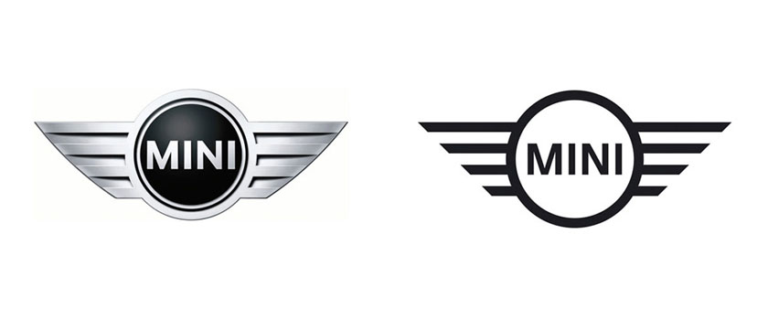
The new logo will be used as a product label for all the models of the MINI brand, at the rear, on the bonnet, at the center of the steering wheel and on the remote control. The brand is saying that the new logo reflects the tradition of the British brand, which now dates back by almost 60 years.
As told on BMW’s official blog, the design features are detailed to minimize the artwork to be much more modern, flat design. The wheel with the wings and the brand name is still printed in capital letters at the center and the deliberate avoidance of shading and grey tones creates a starkly contrasting black-and-white effect that conveys the authenticity and clarity of the new brand identity, its two-dimensional character also allowing universal application.
The new MINI logo draws on the three-dimensional style of depiction that has existed since the relaunch of the brand in 2001, applying this to a form of visual expression known as “flat design” that homes in on the key graphic elements.

