


Top 13 Inspiring “Meet The Team” Page Examples By Digital Agencies
A digital agency should absolutely include one key section on its website: the “Meet the Team” page. According to research, 72% of consumers feel a deeper connection to a brand when they see employees sharing about it online—proving just how …
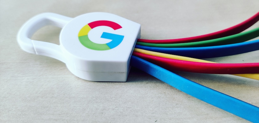
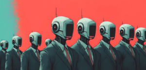
How Will Google’s Project Mariner Redefine Usability and User Testing?
Following Google’s announcement about the highly anticipated Gemini 2.0 in early December, the world’s most popular search engine unveiled a plan for its first-ever artificial intelligent (AI) agent. Project Mariner is a research prototype built on Gemini 2.0 that is …
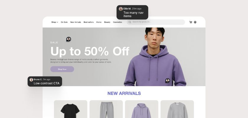
5 Website Design Mistakes Killing Your Conversions (And How to Fix Them)
Even the best-looking sites can fall short if users get confused, lost, or overwhelmed. In this post, we break down five common UX mistakes — from messy homepages to clunky forms — and show you how to fix them for …
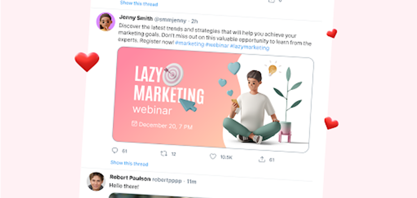
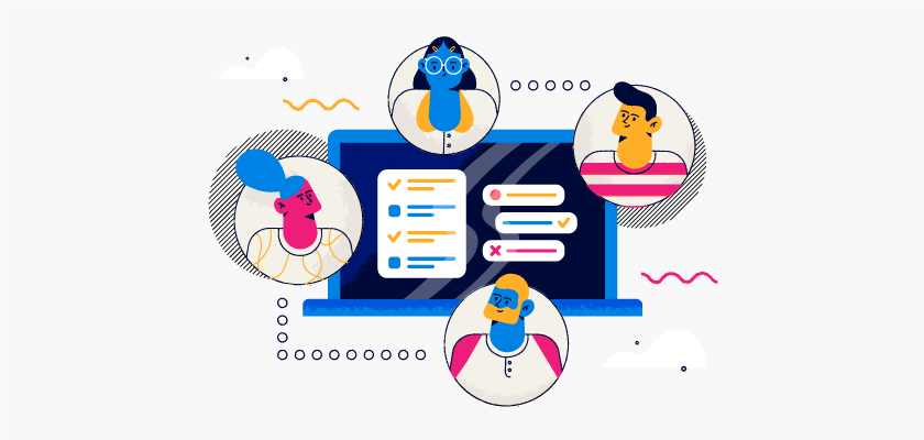
Working Smarter: Real Design Efficiency Tips and Mega Creator’s Practical Benefits
If you’ve ever stayed up until 2 AM finishing design revisions or struggled to find that specific asset you swear you saved somewhere, you’re not alone. After 12+ years in this field, I’ve made just about every workflow mistake possible. …
Top UI & UX Design Agencies for Startups in 2025
Having a startup is like having to fight in many different battlefronts. Similarly, having a small business does not mean that it is an easy job to handle. UI / UX design agencies enable you to achieve success by supporting …

The Free Mockups Guide to Create the Absolute Best Picture
Finding the absolute best mockup to represent your clothing, your business cards, and your packaging can totally be a game changer, yet it can also be quite resource-intensive, as experiments can add up. Fortunately, there is an ocean of free …

14 Top Web Design Agencies to Build Your High-Impact Website in 2025
Your website is the first impression your brand makes online, and it only takes seconds to captivate or lose your audience. Do you know that the first impressions are 94% design-related and users form an opinion about a website in …

Best Web Design Events to Attend in 2025
Web design events are here to gather information about the latest trends and innovations. Prestigious speakers can transform your perspective on particular problems. The other benefit of these conferences is meeting like-minded professionals which can benefit you lifelong. So, before …
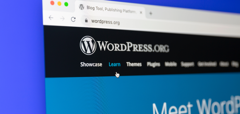
How Better Hosting Speeds Up WordPress Sites?
Speed matters for WordPress sites — maybe more than you might think. A slow-loading site isn’t just inconvenient. It can lead to frustrated visitors, higher bounce rates, and missed opportunities for conversions. A study by Portent revealed that a website …
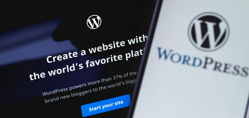
How Managed Hosting for WordPress Saves your Agency Time and Money?
Agencies often believe that managing their own WordPress hosting saves money — but does it really? The time spent troubleshooting server issues, handling security risks, and managing essential but time-consuming plugin updates can pile up fast, cutting into the hours …

Artificial Intelligence for Web Design: Tools, Trends, and Techniques
The role of AI for web design has evolved significantly, transforming how websites are built and enhancing their functionality. No longer limited to basic automation, AI is now deeply integrated into the web design process, offering designers a powerful tool …
Logo Design in 2025: Best Practices And Key Tips For Success
To design efficient and memorable logos in 2025, you need a blend of creativity and strategic thinking. As the trends and technologies in graphic design continue to evolve, understanding them is essential to staying ahead of the curve and delivering …