Website Redesign Case Studies
As an experienced UX agency, we specialise in impactful website redesigns that elevate products to new heights. By understanding the unique needs of each client, we deliver tailored solutions that ensure exceptional user experiences.
Read on to find out our past approaches.
The National
The Challenge
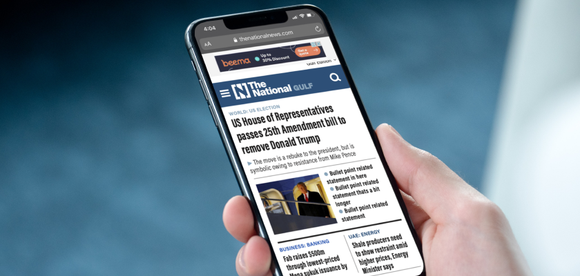
The National, an English-language newspaper for readers around Dubai, Abu Dahbi and the Gulf region, came to UX Connections for help with their existing news website.
They were looking to expand internationally, and therefore the goal was to position The National as the leading Middle Eastern news website by improving its usability and appearance. Meanwhile, an engaging experience was required so that readers could enjoy the stories to the fullest extent.
The Solution
How we approached this case can be split into expert review and usability research. The expert review assessed the UX and UI of the website, providing recommendations around the pain points as well as opportunities. In the next phase, our consultants then created a prototype that brought those recommendations alive and conducted usability research on it alongside the website.
In line with The National’s objective of global expansion, the usability research was carried out across multiple locations and user types.
User Centred
To provide the recommendations that best capture users’ needs, our consultants conducted stakeholder interviews, and competitor analysis, and integrated the findings with their review.
Based on those, they explored the visual in two possible styling directions, modern and traditional, and created navigation wireframes for mobile and desktop.
Tactical Personas
We also delivered detailed tactical personas. Our team created two groups of personas – one of the news industry in general, and the other of The National users.
We summarised the overall findings of these two groups and crafted twelve detailed personas in total. The personas were put into use as The National developed the digital product.
US Integrity
The Challenge
US Integrity identified suspicious behaviour by analysing the changes in betting data against a benchmark of usual betting activity in order to keep sporting competition fair and transparent. They were looking to redesign the user experience of their website and mobile platform so that it was an easier, smoother experience.
The key areas of improvement were ease of use, accessibility, and engagement. They wanted to ensure the user is confident that they will be notified of integrity flags as they happen, and offer them flexibility to access data and reports wherever they are. As their offering focuses on information exchange, they wanted this process to be as intuitive and simple as possible, so they reached out to UX Connections to make that happen.
The Solution
We began by speaking to users to understand the end-to-end customer journeys. After this, and an in-depth understanding of business priorities, a detailed UX Audit was completed to assess the strengths and weaknesses of the existing platform.
We then developed documents such as sitemaps, navigation documentation, and user journeys, which were then used to produce highly detailed wireframes for multiple pages, including the dashboard, reports, and event pages. Emphasis was placed on filtering and translating information on easy-to-understand graphs that were user-friendly and intuitive, making complex data digestible. Finally, a new UI design was implemented and extended across the full site.
Marie Curie
The Challenge
Marie Curie came to us for assistance in redesigning and organising their website. Being a charitable organisation that provides care for people with terminal illnesses and their families, the website is very content-rich. This content was targeted towards a multitude of user groups, such as people with terminal illnesses, carers, healthcare professionals, and volunteers.
Their main challenge was ensuring the content was user-friendly and intuitive for all those who needed to consume it.
The Solution
Our consultants worked to improve the information architecture and navigation of the website. The project started with a thorough discovery phase. This included conducting: stakeholder interviews, competitor analysis, analytics data review, an expert review on the existing site and remote card sorting.
Thereafter, the meganav was redesigned, and so clickable prototypes were built, and usability testing was conducted. This was all to ensure a user-friendly design that was easy to navigate.
Interactive Prototyping
Our team created detailed wireframes optimised for veterinarian users. Wireframes were created for the main navigation as well as for designing a new homepage dashboard. The general layout and structure of the deeper-level pages were redesigned too.
This meant the participants were able to provide relevant and useful feedback since they understood better how the new navigation proposal would work.
Expert Review
The usability testing focused on the full user flow, in order to understand how users navigate to reach certain goals. This was done in a lab environment, together with the UX researcher, ensuring the oversight that was needed in this case.
The results were positive, as participants found the site intuitive and useful. Data also backed this up, as the completion rate was 93.3% across all tasks.
Contact UX Connections for consultation on your website redesign project!

