


Netflix Marketing Strategy & Campaigns: From VHS Tapes to Streaming Giant
Netflix is a focused passion brand, not a do-everything brand: Starbucks, not 7-Eleven; Southwest, not United; HBO, not Dish.
Founded by Reed Hastings and Marc Randolph in 1997, Netflix is now a household name getting more and more popular among people from all around the world. Of course, it is not a coincidence, but rather it is the outcome of the intelligent digital marketing strategies practiced by Netflix.
Netflix is a leading company providing streaming entertainment services with 183 million paid users in over 190 countries watching TV series, documentaries, and feature films in various genres and languages.
But have you ever wondered why Netflix has become such a presence in our lives and continues to be a giant in its industry? How does Netflix advertise?
Now, we will look at the key takeaways from Netflix’s advertising strategy explaining how it aims to protect its central position in the digital content industry.
What’s Inside
- Netflix Marketing Goals and Objectives
- How to Implement Netflix Marketing Strategy To Your Business
- Netflix Target Audience: Demographics & Psychographics
- Netflix Marketing Strategy Mix: Best Practices
- Bonus: Why Does Netflix’s Marketing Strategy Work That Well?
Netflix Marketing Goals and Objectives
Netflix’s digital marketing strategy includes a wide variety of campaigns, social media posts, and opportunities for members to watch any content anytime, anywhere, or on any screen connected to the Internet. Included in Netflix’s digital strategies, Netflix’s social media posts, campaigns, and commercials are quite remarkable, attracting more attention and bringing more members.
Let’s look at the key principles of Netflix’s marketing strategy closely.
Targeted Social Media Strategy
Since social media has been a hot favorite in recent years, Netflix’s social media team uses it intelligently to grab attention and arouse curiosity.
Their social media team does not even give money to sponsored posts. Still, instead, they create original and charming posts to share, which are getting viral and widespread among social media users.
Thanks to Netflix’s social media strategy with a creative and strategic approach, people are encouraged to talk about Netflix and the content below posts. Their social media team asks questions and creates polls stimulating users or fans to continue the casual conversation that places Netflix in trending topics.
They also let everyone know about what is new on Netflix, and also suggest some TV series and movies by sharing related posts on their social media accounts.
Intelligent Use of SEO
While social media may be the star of Netflix’s marketing efforts, its effective use of SEO is often overlooked. SEO plays an important role in Netflix’s digital marketing.
According to Ahrefs, they receive over 267 million visitors monthly and they have acquired over 51 million backlinks, which helps improve their ranking. Through the creation of content and the use of relevant keywords, they can generate significant traffic from keywords with movie titles, such as “Queen’s Gambit” and “The Witcher.” In addition to focusing on primary keywords, they also pay attention to secondary keywords such as “comedy movies,” “thrillers,” and “action movies.”
Hyper-Personalized Emails
In addition to being a role model for social media marketing, Netflix excels in its newsletters as well. Rather than sending generic newsletters with just the latest releases, the company puts significant effort into tailoring them to the individual recipient.
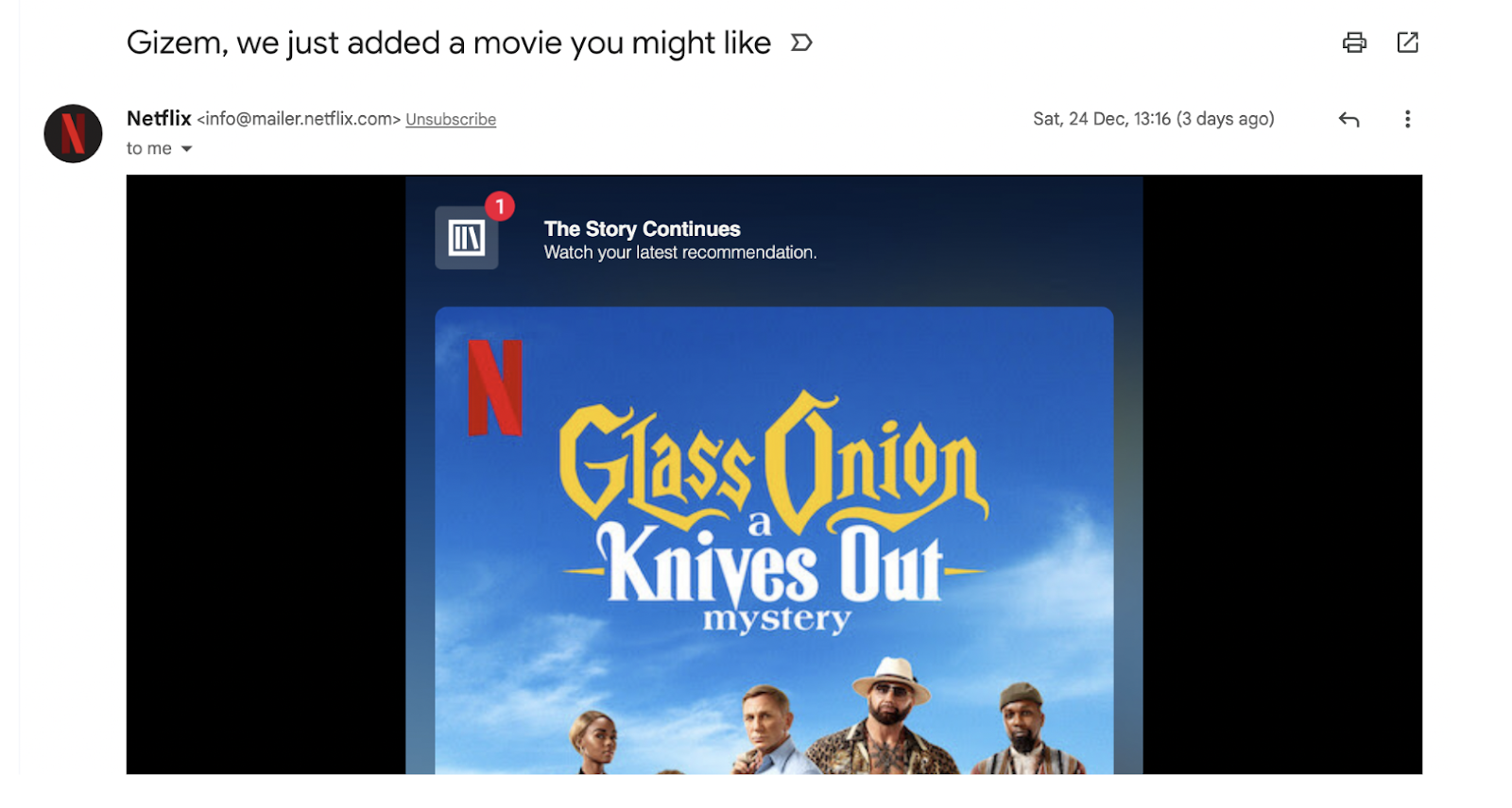
Netflix always avoids beginning their emails with a generic “Hello!” Instead, they use the recipient’s first name whenever possible.
Furthermore, Netflix ensures that all the content in their emails is relevant to the individual recipient. They accomplish this through the use of machine learning, and this way, all recommendations are tailored to the individual’s preferences, encouraging them to continue using Netflix.
Create Hyper-Personalized Experiences like Netflix
Netflix sets the bar for personalization; creating moments that feel tailored to each audience. These agencies bring that same spirit to their work, they create purposeful brands and digital experiences via strategy, design, and storytelling.
Takt
We dug into Takt’s work and saw how they bring a human touch to each project. Their audience-first approach (seen in projects for Wonder Media and the Vancouver Opera) shows that they make media feel meaningful, not just loud.

DIJGTAL
We explored DIJGTAL’s work for Gaming City and MaximBet, where the agency combined immersive digital experiences with performance-focused strategy to help entertainment and gaming brands increase engagement.
Personalized Home Screen (on Web & App)
Netflix’s email marketing is not the only playground for hyper personalization. The team knows how to keep you engaged on Netflix. After spending some time on Netflix and watching something, they suggest some more related ones according to what you have been watching with the help of their data-driven system.
The content on your home page is totally personalized for you. In this way, you can find more TV series, documentaries, or movies in which you are likely to be interested. This way, Netflix offers you a unique user experience on its platform. They even do it on their social media accounts.
Besides, Netflix provides several suggested lists based on information about what is the trend in your country or around the world.
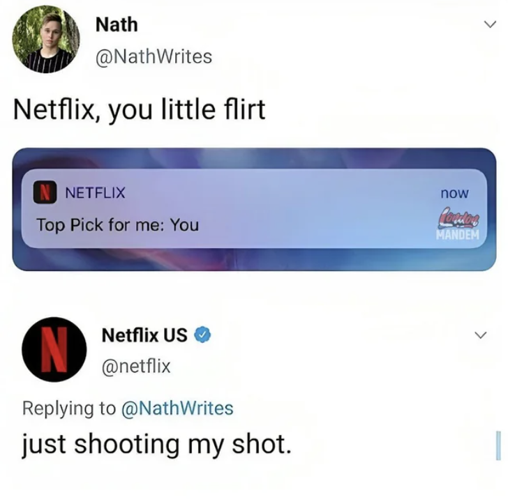
Humor in All Marketing Efforts
There is no doubt that entertaining posts, photos, videos, and commercial films attract incredible attention in this era. Instead of gloomy posts or advertisements, the Netflix team generates original and catchy advertisement content.
For example, Netflix released an ad during the 69th Annual Primetime Emmy Awards.
In the lead-up to the Emmys, the company placed billboards in high-profile locations in New York and Los Angeles with the message ‘Netflix is a Joke.’ This cryptic message sparked some speculation among viewers.
The purpose of the billboards was to enhance the impact of the TVC launch. In the ad, which was a minute long, the company used CGI technology to insert well-known comedians into their existing shows.
Netflix wants viewers to understand that it is producing a significant amount of comedy content through this ongoing project ‘Netflix is a joke’. If we take Netflix’s advertising strategy as an example, they use humor to connect with their customers.
They also share funny posts with funny captions on their social media accounts, creating an overwhelming impression, and those posts are liked and shared by a large number of people.
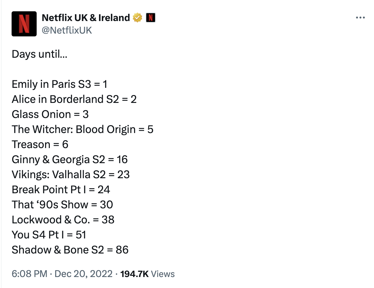
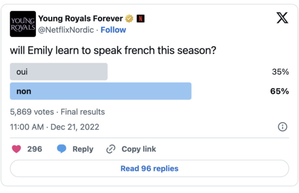
Effective Audience Interaction
Another Netflix marketing strategy fueled by humor is creating sincere interaction with users & audience.
The digital marketing team of the streaming giant takes social media platforms and creates surveys, asks engaging questions, and keeps track of the responses they receive from their subscribers. Netflix uses these to get people to start conversations with them. And to start casual discussions about a variety of topics as well.
Due to Netflix’s teasing and funny responses, they get more responses to their polls and questions. Netflix’s advertising strategy encourages fans to continue the conversation. Netflix is getting more visible as a result of this strategy.
They also let everyone know about what is new on Netflix, and also suggest some TV series and movies by sharing related posts on their social media accounts.
Keeping up with the Latest
Their team knows how to keep you engaged on Netflix with a personalized interface. After spending some time on Netflix and watching something, they suggest some more related ones according to what you have been watching with the help of their data-driven system.
The content on your home page is totally personalized for you. In this way, you can find more TV series, documentaries, or movies in which you are likely to be interested. This way, Netflix offers you a unique user experience on its platform. They even do it on their social media accounts.
Besides, Netflix provides several suggested lists based on the information about what is the trend in your country or around the world.
They also know how to catch up with today’s world and the new generation. After the effects on Instagram and Snapchat became popular, especially among teenagers, Netflix also created several camera effects associated with their platform and content. They demonstrate the success of using multiple social media channels at the same time.
Take Netflix’s meme marketing as a highly updated act. As a part of its humorous marketing approach, the streaming platform uses meme marketing to make its subscribers informed about the shows:
So, with its content that appeals to every style and area of interest as well as its intelligent digital marketing strategies, Netflix seems to be the leading digital entertainment service for a longer time. The Netflix team knows how to get the most out of social media applications and other social networking platforms to engage its target audience as well as enable customer retention.
How to Implement Netflix Marketing Strategy To Your Business
So far, we’ve listed some objectives and related best practices about Netflix marketing strategies. Before diving into campaigns, you may want to consider what you learn from their strategy and how to apply them to your own business:
- Netflix’s success proves that a winning marketing strategy for a streaming platform requires innovation, flexibility, and a focus on producing high-quality, relevant, and original content.
- Do not underestimate the power of trendy approaches calling for new generations; such as meme marketing and moment marketing.
- Tailoring content to interact with your followers on digital platforms is key since the personalization approach builds engagement and stronger relationships with your audience.
- Personalization goes beyond just recommendations. Analyze your audience demographics and preferences to craft targeted messaging and offerings.
Ensure your brand message and user experience are consistent across all platforms, whether it’s a phone, laptop, or smart TV. - Stay ahead of the curve by staying informed about marketing trends and utilizing new tools and platforms to reach your target audience effectively.
Netflix Target Audience: Demographics & Psychographics
Insights into the platform’s key demographics, psychographics, and viewing behaviors say a lot about Netflix’s marketing strategy.
Without searching surveys, it is possible to say that Netflix is popular among younger viewers. However, surveys support that prediction: about 75% of adults aged 18 to 34 are subscribed to the platform.
This means that the streaming giant, available in over 190 countries worldwide, is attracting Millennials and Generation Z. There are no significant gender differences.
From the view of psychographics, no doubt, Netflix caters to audiences who are comfortable with digital platforms and streaming services. Furthermore, the platform is popular with families, as evidenced by the large amount of family and children content streamed.
When considering that the platform releases entire seasons in one go, it is possible to say that it encourages binge-watching. What’s more, its strategy focuses on capturing the attention of pop culture enthusiasts with globally acclaimed shows like Stranger Things and Squid Game.

Even though figures say Netflix’s target audience consists of younger, tech-savvy viewers with a global reach that spans diverse demographics, income levels, and content preferences, the platform states it is for everyone:
Netflix is available virtually everywhere except in China and Russia. Our growth internationally will unfold over many years as we improve our service. In the 130+ new markets we launched in 2016, we started by primarily targeting outward-looking, affluent consumers with international credit cards and smartphones.
Netflix Marketing Strategy Mix: Best Practices
As we mentioned above, Netflix, no doubt, has mastered the art of connecting with its audience through creative, multichannel, data-driven marketing.
Instead of relying on pushy promotions, it focuses on engaging the target market of Netflix via trendy memes, behind-the-scenes content, and authentic character-driven posts. This approach keeps the platform part of the social conversation without ever feeling like a sales pitch.
Of course, Netflix’s marketing strategy goes beyond social media efforts. From immersive guerrilla campaigns to strategic SEO tactics and PPC ads, it knows how to spark curiosity and capture attention.
Now, let’s take a closer look at the strategies that have helped Netflix become a global marketing powerhouse.
Netflix Social Media Campaigns
How can we say a brand is good at social media marketing?
The shortest way is by looking at the number of followers. And, that makes Netflix great in that area. Just on TikTok, the streaming giant has almost 50 million followers. A big part of that success comes from Netflix’s clever and culturally in-tune social media campaigns, which keep fans engaged across every platform.

And yes, Netflix’s social media strategy isn’t necessarily groundbreaking in terms of what they do, but it’s how they execute these tactics that make their approach so effective. Now, let’s be more specific:
🎬 Netflix drops snippets, generating anticipation and hype for the upcoming show.
In addition to that traditional move, the brand starts countdowns before the show releases and shares intriguing hints that drive speculation.
It’s also a way to build a fandom-centric approach; Netflix uses iconic quotes, in-jokes, and character moments while sharing the snippets.
🎬 Releasing behind-the-scenes content like set photos or videos is another powerful marketing tactic Netflix uses to engage its audience. It may seem simple, but it connects to deeper psychological triggers that enhance fan connections.
🎬 Creating funny videos related to the shows that are about to be released is a part of Netflix’s social media campaigns. And it’s a huge reason why their marketing feels fresh, relatable, and highly shareable.
Instead of only focusing on launch day promotions, that type of content helps sustain interest and keeps the show alive in public conversations.
The best part? When these videos showcase characters in humorous or relatable scenarios, it deepens emotional connections with those characters—even before the show launches.
Similarly, Netflix sometimes produces interviews where characters answer fan questions in humorous ways.
🎬 Fans love sharing content that makes them laugh, especially if it relates to a show they’re excited about. That’s why Netflix shares memes:

At that point, it’s possible to say that the platform doesn’t explicitly promote shows with memes. However, they use humor to subtly keep a show or character in the spotlight.
🎬 Netflix is quick to jump on trends. Whether it’s a meme, viral TikTok, or pop culture moment, Netflix is often one of the first brands to create content around it.

While investing in trending content, viral challenges, or pop culture references, the streaming platform does not ignore evergreen content—quotes or iconic scenes from well-known shows.
Netflix Advertising Campaigns
Netflix, actually, is one of the brands showing us how subtle & non-pushy promotion can be done perfectly. Instead of hard-selling, the streaming giant promotes its “products” via wise advertising campaigns, including collaborations, experiential marketing, and guerrilla initiatives.
So, it’s time to focus on the main structure of Netflix advertising campaigns:
🎬 Unlike traditional marketing that can feel aggressive or sales-focused, Netflix’s approach is making their advertising campaigns feel organic, fun, and part of the conversation.
In other words, for the platform, content over product; that’s why they are very good at storytelling.
🎬 Netflix uses Google Ads subtly and focuses on ads that feel organic.
Instead of releasing highly branded search ads alongside aggressive CTAs like “Subscribe Now,” Netflix prefers searches like “Where to watch Nobody Wants This” or “Best rom-coms.”
In addition to that, the platform takes advantage of Google Discover & News to increase organic reach without forcing promotion.

🎬 Another platform Netflix uses wisely is YouTube Ads.
The streaming platform releases such videos on YouTube that viewers do not feel pushed to subscribe somewhere. These videos are like mini-trailers instead of sole promotion pieces.
Both on Google and YouTube, the ads match user intent guides people to explore Netflix naturally.
🎬 LinkedIn also a platform where Netflix does soft-selling through blog-like content. Even though it’s not so popular among streaming channels, it is a good way to build trust and engagement via informative content.

🎬 In addition to marketing efforts in the digital world, Netflix excels at offline and OOH (Out-of-Home) guerrilla tactics.
Remember “The Thing” campaign for Wednesday? Or Squid Game metro station? Or La Casa de Papel airport heist?
So, yes, all of these campaigns show Netflix’s ability to create immersive and unconventional advertising strategies that resonate with audiences and generate organic buzz.
So far, we’ve looked closer at how Netflix uses platforms for its campaigns & ads. Now, we’ll see the top 5 Netflix campaigns.
While curating this list of iconic Netflix campaigns, we avoided looking at standard trailer drops for individual shows. Instead, we filtered for the macro-moments where Netflix stopped acting like an app interface and started acting like an entertainment ecosystem. We chose these specific benchmarks because they perfectly demonstrate how to handle modern consumer psychology—whether that means tackling choice paralysis, honoring corporate history with genuine humility, or bridging the gap between digital streaming and physical reality.
Your Future is on its Way | Netflix
This Netflix campaign was designed to showcase the brand’s massive pipeline of international titles, boundary-pushing sci-fi productions, and next-generation interactive storytelling.
Instead of focusing on past hits, the cinematic visuals acted as a fast-paced collage of tomorrow’s pop culture. The underlying narrative explicitly positioned Netflix as the active, predictive launchpad for the next massive global phenomena that the entire planet will be talking about next week.
Why That Campaign Worked
- Netflix made maintaining a subscription feel like an essential passport to staying relevant in social conversations.
- It aggressively combatted the rising threat of streaming fatigue and competitor fragmentation.
- The bold, confident tone reminded consumers and creators alike that Netflix commands the scale, the budget, and the creative vision to define the future of entertainment.
Play Something
To launch their highly anticipated random-shuffle feature, Netflix targeted the universal, frustrating phenomenon of “choice fatigue.” The exhausting cycle of scrolling through the menu for 45 minutes only to end up going to sleep.
The Netflix marketing campaign used incredibly self-aware, humorous television and digital spots showing everyday users drowning in a sea of thumbnails. The ad introduced the “Play Something” button as an algorithmic savior, allowing the app to take total control of the night based on the user’s unique, hidden viewing habits.
Why That Campaign Worked
- The campaign succeeded because it took a complex, back-end machine learning update and packaged it as a simple, human-centric emotional relief valve.
- It transformed a product feature into a psychological hack for stress-free binging.
Long Live the Red Envelope Era | Farewell to DVDs
Netflix officially wound down its foundational DVD-by-mail service after 25 years of operation. The brand launched a massive, nostalgic love letter to the iconic red envelopes that built the company.
We’ve always loved entertainment and that little red envelope remains an enduring symbol of our mission to make it better for every member. DVDs will forever be in our DNA.
The campaign featured deeply moving retrospective videos, hidden easter eggs across social media, and a final, brilliant promotion where long-time mail-order subscribers could opt-in to receive up to ten mystery DVDs from the remaining inventory as a permanent parting gift.
Why That Campaign Succeed
- Netflix bought decades worth of brand goodwill from hardcore cinephiles.
- This campaign proved that Netflix still values its human roots and respects the loyal community that stood by them before streaming even existed.
The Story of Netflix | 25th Anniversary
To celebrate a quarter-century, this ad traced Netflix’s chaotic evolution from a scrappy Silicon Valley startup fighting Blockbuster to an Oscar-winning global powerhouse.
It woven a narrative that connected the growth of the company directly with the changing habits of the global audience.
Why It Worked
- This wasn’t just a birthday party; it was an undisputed claim to the streaming throne.
- The tone wasn’t arrogant. It thanked the audience for binging alongside them, reframing a massive corporate milestone into a shared personal history of how “we” watch television together.
Step Inside Netflix | Welcome to Netflix House
This experiential launch campaign introduced “Netflix House.” They are massive physical entertainment complexes built across major cities where fans can literally walk into the worlds of their favorite shows.
Why That Campaign Worked
- It transformed passive subscribers into hyper-engaged brand evangelists.
- Netflix allowed their audience to do the heavy marketing lifting. The campaign built instant, undeniable trust by letting people see the pure, unscripted joy of real human beings interacting with their favorite intellectual properties in the real world.
Bonus: Why Does Netflix’s Marketing Strategy Work That Well?
We know that many brands use similar marketing strategies as Netflix – but Netflix’s execution and a few key differentiators have propelled them to the top of the streaming game.
While many offer recommendations and curated content, Netflix has consistently invested heavily in high-quality original productions. They’ve become known for award-winning shows and movies that can’t be found anywhere else – even though they do not offer cinematic value.
Another advantage is that Netflix was a pioneer in the streaming space, establishing itself early on. This gave them a significant head start in building a user base and brand recognition. They’ve leveraged this advantage by continually innovating and adapting, staying ahead of the competition.
On the other hand, unlike some competitors who focus on specific regions, Netflix prioritizes global reach. They invest in international productions and cater to diverse audiences with multilingual content. This broader appeal allows them to tap into a wider market.
And finally, Netflix isn’t afraid to experiment with different content formats and marketing strategies. They take calculated risks, like canceling shows or investing in unconventional genres, which can lead to breakout hits and keep things fresh for viewers.