


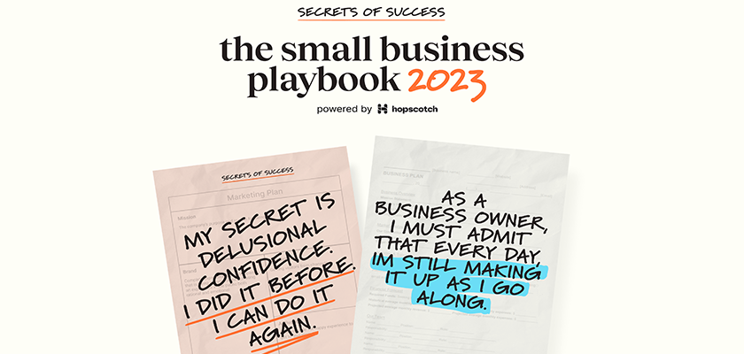
Hopscotch Releases the Secrets of Success: Small Business Playbook
20% of small businesses will fail in their first year. Another 30% will fail in their second year. Why do some survive, while others fizzle? To find out, Hopscotch went straight to the source. Hopscotch asked 150+ small teams to …

Parking and Shared Mobility: a Human Centred Perspective
At fresk.digital, mobility is a topic that lies close to our hearts, due to the experience we have in the field, our project-portfolio and the curiosity that strikes in us due to the interesting innovations that we see happening in …
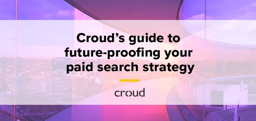
Croud Designed a Guide to Future-Proofing Your Paid Search Strategy
The global, full-service digital marketing agency, Croud has designed a guide to help your agency advance its marketing strategy. In this guide, Croud, explores recent advancements in automation and how paid search marketers can use them to their advantage. You …

Tangent Releases the Ultimate CRO Playbook: 10 Behaviour Hacks to Boost Conversion
Whilst the team don’t really believe in the term ‘growth hacking’ here at Tangent, they are confident that every business can boost its conversion rate through some quick wins. They don’t need to be complicated either – but they do …
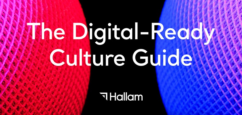
Hallam’s New eGuide is Helping Businesses Join ‘The Digital-Ready Culture’
Through deep research and a range of in-house interviews with their experts, the multi-award-winning strategic agency Hallam has pulled together a new eGuide, ‘The Digital-Ready Culture’. The way businesses operate has changed a great deal over the last 12 months. …

Alliance of Independent Agencies Launches Wellbeing Research Questionnaire for the Marcomms Industry
The Alliance of Independent Agencies, in partnership with Opinium, today launches a global market research study into wellbeing in the marcoms sector. The study, which is open for two weeks, is open to both independent and network agencies of any …

Future-Proofing Your Tech Stack – Explained by Catch Digital
Catch Digital recently completed a piece of digital consulting to help a global technology company understand best practices in terms of tech stacks for B2B organisations, upcoming consolidations in marketing software tools, and how their current tech stack needed to …
Catch Digital Explains the Process of Upgrading to Drupal 9 Update
In this article, Catch Digital explains the process of upgrading to Drupal 9 Update. Now is the best time to start preparing for Drupal 9 whether you are on Drupal 7 or 8 – or even on another platform entirely. …

Catch Digital Web Accessibility Series: Part 1 – Colour Accessibility
Kicking off Part 1 of Catch Digital’s new web accessibility series exploring the different ways that can make the internet accessible for everyone. This month the Experience Design (XD) team at Catch is kicking off the first segment of their …
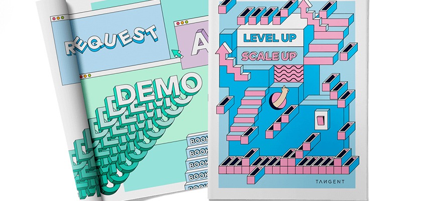
Level Up Scale Up: Tangent’s New Digital Experience Guide for Scale-Ups
Tangent is currently running a “Level up Scale up” campaign and has identified 4 reasons why scale-ups need to reimagine their digital experience. You kicked off as a start-up. You spent half your time finding seed funding. You’ve been going …

Digital Agency Croud Created Guide to Driving Success on Amazon
Croud launches guide to driving success on Amazon to support the marketing efforts of brands. Eighty-nine percent of consumers are more likely to buy products from Amazon than any other eCommerce site, and this number is expected to grow exponentially …

Service Design 101: The Ultimate Guide For Optimizing Customer Experience Through Holistic Service Design
International Quality and Productivity Center (IQPC) has released a very useful guide; Service Design 101. Service Design continues to grow as priorities around human-centered design take center stage. However, many organizations struggle to understand—what is service design. While many principals …