13 Creative Ecommerce Website Designs
A list of creative ecommerce websites that are designed beautifully to connect, engage and convert customers.
Who doesn’t love great aesthetics? Be it the latest Apple product or the garnishing on your food at a fancy restaurant, we are all guilty of opting for things that are pleasing to the eye. Websites are no different. If your website isn’t all that striking to look at, or your products aren’t packaged nicely, or the layout is cluttered, you are leaving money on the table.
On average, ecommerce websites convert 1-4% of their leads, however, some of the best ecommerce websites convert up to 15%. How do they do it?
A lot of factors go into creating conversions, including aesthetics. The best ecommerce websites are usually great looking. That’s because creative design increases the perceived value of your products and makes your website seem more trustworthy.
A great user-experience, an amazing layout, and a spectacular design all add to the conversions, ensuring your users have a pleasant experience, making it easier for them to browse, search and buy your products.
For those looking to venture into the ecommerce business or those looking to revamp their current site, here’s our list of creative ecommerce websites that will give you ample inspiration to get started! If you’re unsure of where to begin, keep in mind that collaborating with creative marketing companies that are experts in their field is also an excellent option.
eCommerce Website Design Ideas for Your Inspiration
A successful eCommerce website design incorporates several essential elements to create a compelling and user-friendly shopping experience. Intuitive navigation is crucial, organizing products into logical categories, and ensuring a seamless journey from product discovery to checkout. In addition, visuals play a significant role, with high-quality images and engaging videos capturing the attention of potential customers. To maintain brand consistency across all marketing channels, many store owners use professional design templates to create cohesive web banners, promotional social posts, and ad graphics that align with their site’s aesthetic. Although visuals are important; however, creative eCommerce website design should not only be visually appealing but also user-friendly and efficient in driving sales and customer engagement.
To boost conversions, simplify the checkout process by implementing a guest checkout option and providing clear call-to-action buttons. Incorporating a robust search functionality with auto-suggestions and filters enables users to find products quickly. Personalization, through tailored product recommendations based on user behavior, enhances customer satisfaction and increases the likelihood of repeat purchases. Security is paramount, showcasing trust badges and secure payment options to build customer confidence. Additionally, integrating social media buttons and sharing options, along with customer reviews, can foster a sense of community and trust. Promotions and discounts can create a sense of urgency, driving sales and customer loyalty.
By implementing these ideas and elements, an eCommerce website can establish a strong online presence, attract and retain customers, and achieve business success. Leveraging eCommerce engineering services can help streamline these features effectively, ensuring a seamless and scalable online shopping experience. Remember, creativity in eCommerce website design should always align with the brand identity and target audience, while prioritizing usability and functionality to optimize the user experience.
Harness the power of creativity and innovation by partnering with web design agencies to craft a captivating eCommerce website design tailored to your brand. They’re experts in unlocking your online potential with their expertise.
Now, let’s take a look at the best creative eCommerce website design examples below!
Creative eCommerce Website Design Examples
Erno Lazslo
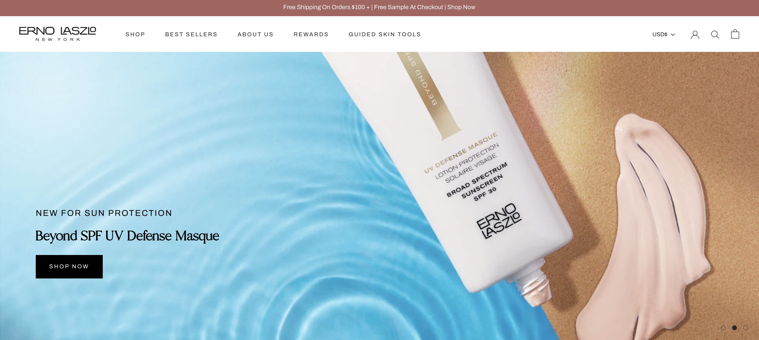
The luxury skincare brand partnered with The Charles to redesign their eCommerce website. As a skincare brand, Erno Lazslo’s website has a soothing sense of feeling. The website has a minimalist feel thanks to its white background. The colors used throughout the site are perfect for a skincare company. The products were presented in a compelling style, high-quality photographs were used on the homepage, and most significantly, there are lots of Shop Now buttons to encourage visitors to make a purchase. When you scroll through the homepage – and especially if you don’t know what you are looking for – the website guides you quite nicely. First, a section listing the top-selling favorites are displayed. This inspires even the most confident buyer to learn more about the options they have. As you go down, the areas categorized according to your skin type and the problem you are experiencing stand out.
The Rewards section at the top main menu are one of the things that we thought were creative. This option encourages a user who has recently discovered the brand to sign up for the loyalty program and become acquainted with the company.
Brompton
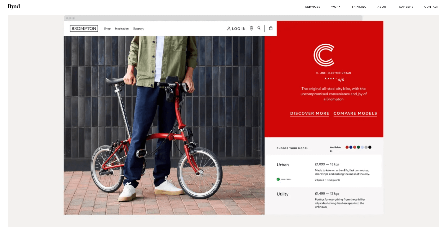
Beyond helped Brompton, the iconic folding bike brand, evolve their eCommerce experience during the pandemic. Faced with closed high street shops, Beyond redesigned Brompton’s website to mirror the in-store, personalized bike buying experience. They focused on integrating the exploration and shopping aspects, allowing users to customize their bikes online with ease. This approach transformed Brompton’s digital presence from merely functional to emotionally engaging, reflecting customers’ personalities in their bike choices, and streamlining the process to ensure a seamless user experience.
Popcornopolis
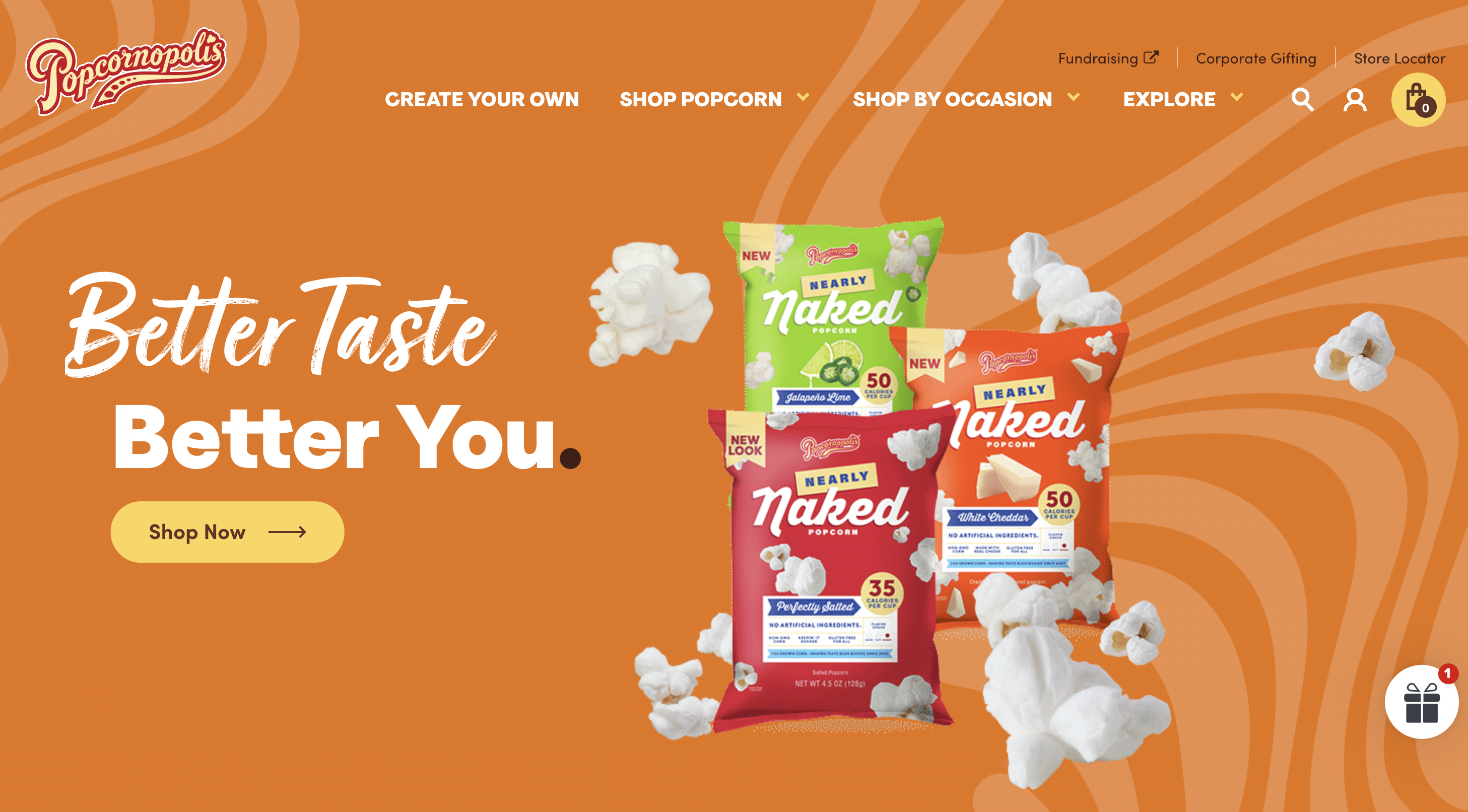
Popcornopolis is a market leader in gourmet packed popcorn, increasing demand for savory and sweet snacks from customers seeking the most reliable, premium goods. A creative eCommerce website design by Isadora Agency features cutout close-ups of Popcornopolis’ 100% authentic ingredients and color-blocked patterns. The site’s strong sans-serif body copy and script headings provide individuality while maintaining readability.
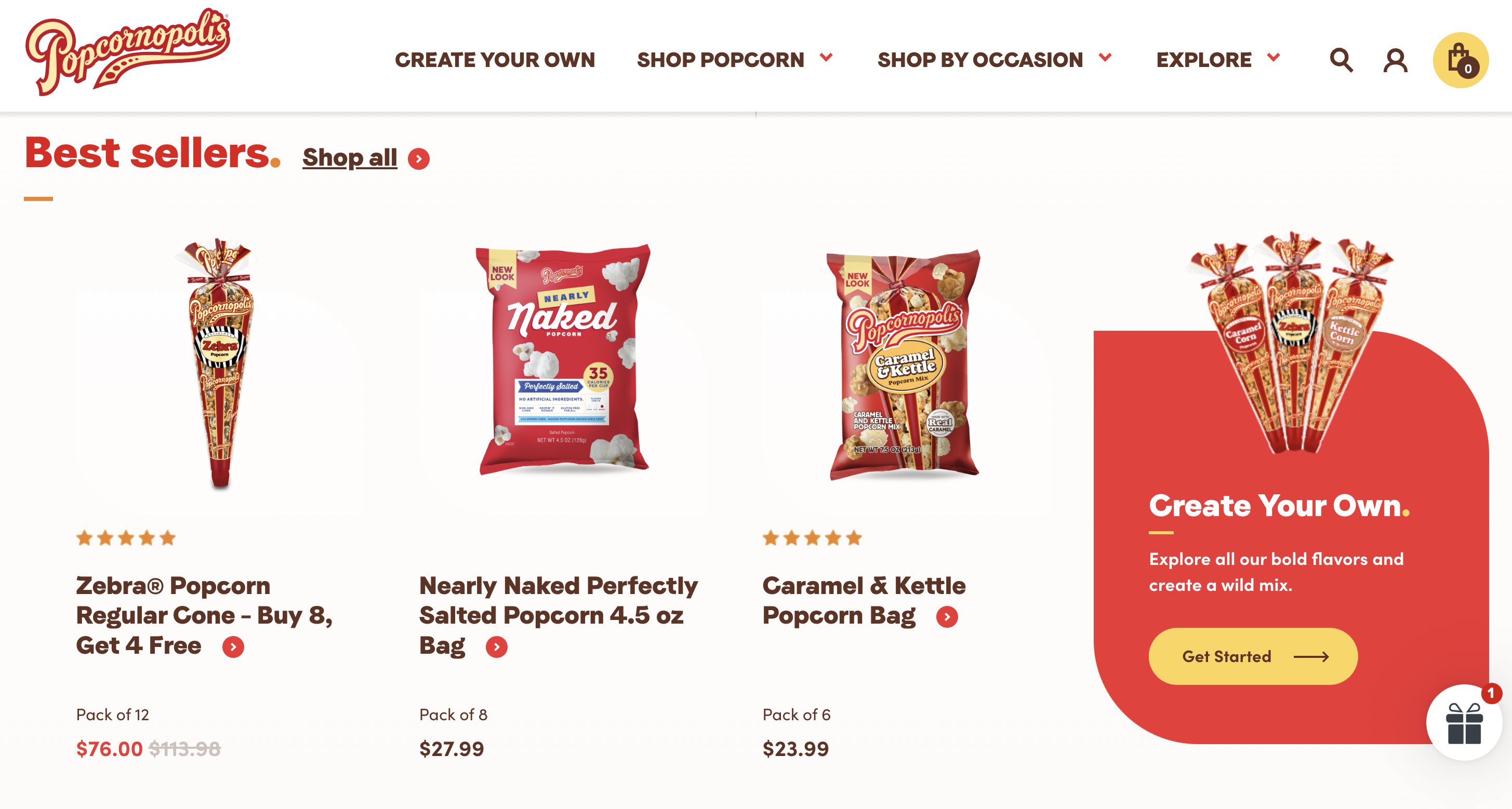
In order to provide a truly shopping-first experience that makes it simple for customers to find the snacks they crave, Isadora pioneered the flexible purchasing choices that users find most helpful and restricted product categories. The website is a true rainbow of vivid, adaptable color that grabs the eye without taking over the screen. Popcornopolis may showcase its newest recipe, a bestseller, or a seasonally popular flavor thanks to the homepage hero, which focuses on just one featured flavor at a time. Every new user will have an alluring experience thanks to the background modifications that complement the flavor, packaging, and ingredient components. Customers can see exactly what will be added to the cart by viewing a huge silhouette product image on the Product delta page. To accelerate and simplify decision-making, the hero section includes user feedback and personalization options.
Welchs Fruit Snacks
The Welch’s Fruit Snacks website is a vibrant and engaging platform that celebrates the joy of snacking. Upon landing on the site, visitors are greeted with colorful images of the delectable treats, setting the tone for a fun-filled experience. Developed by eDesign Interactive, the website offers easy navigation, allowing users to explore the diverse product range and find their preferred flavors. In addition to showcasing their popular fruit snacks, the website provides valuable information about the brand’s commitment to quality and sourcing the finest ingredients. There are also sections dedicated to nutritional information, allergy concerns, and frequently asked questions, ensuring transparency and addressing customer queries.
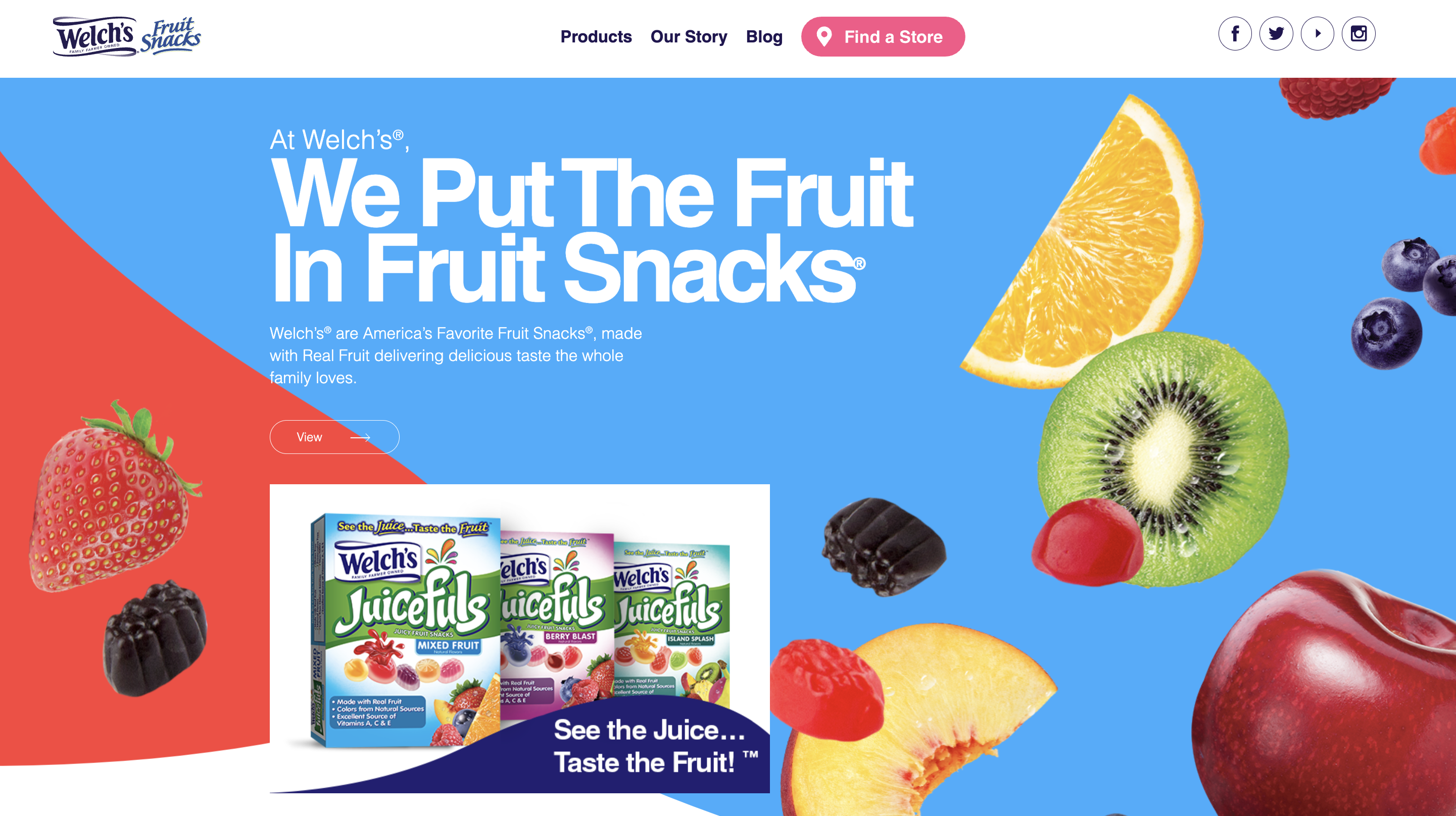
The website also includes interactive elements, such as games and activities for kids, making it an enjoyable destination for families. With its user-friendly interface and celebration of the brand’s delightful treats, Welch’s Fruit Snacks website truly embodies the essence of the brand’s dedication to creating wholesome and enjoyable snacking experience.
Cubo Eyewear
Cubo Eyewear’s website, a project beautifully crafted by Media Lounge, an esteemed eCommerce agency based in the UK, showcases the epitome of creative eCommerce website design. With a keen eye for aesthetics and user experience, Cubo Eyewear’s website effortlessly blends form and function. Media Lounge’s expertise in crafting an engaging online shopping experience is evident through its intuitive navigation, visually captivating product displays, seamless checkout process, and flexible payment options, thanks to the integration with Klarna.
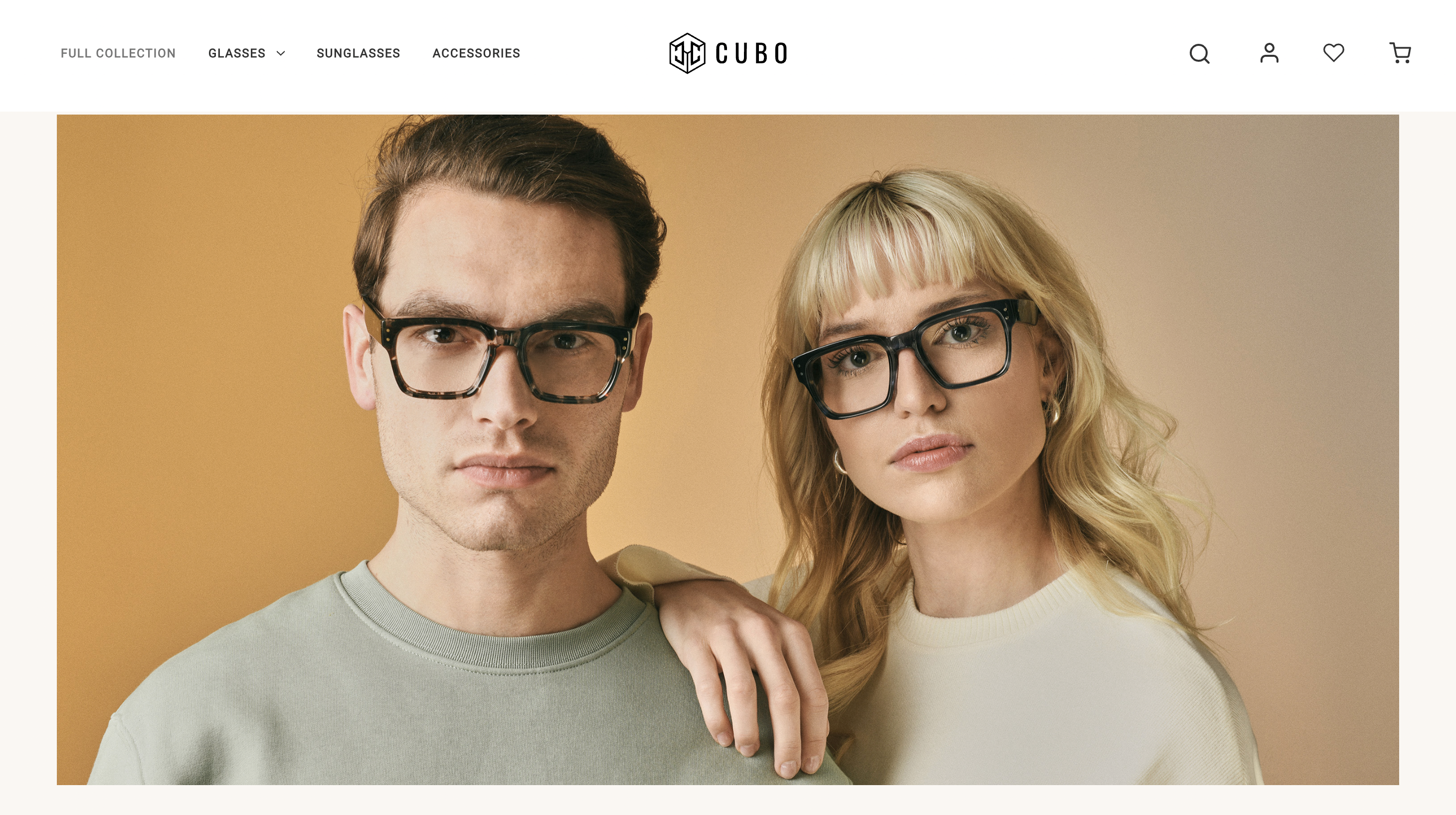
Cubo Eyewear’s website serves as a prime example of how the collaboration between digital agencies and eCommerce brands can results in a visually striking and user-friendly platform that attracts and retains customers.
David Morris
The website of Davis Morris, a high luxury jewellery brand, exemplifies Skywire’s expertise in enhancing eCommerce site design, performance, and user experience (UX/UI). Established in London in 1962, David Morris is celebrated for its exquisite luxury jewellry, featuring the rarest gemstones and impeccable design, coveted by connoisseurs worldwide. As soon as you enter the website, you are greeted by an opening video that sets the tone for luxury and showcases the craftsmanship of the jewelry. Scrolling down reveals the product displays. The fact that the products are close-up and displayed with very large visuals allows you to see almost all the details as if you were looking at them live on the screen.
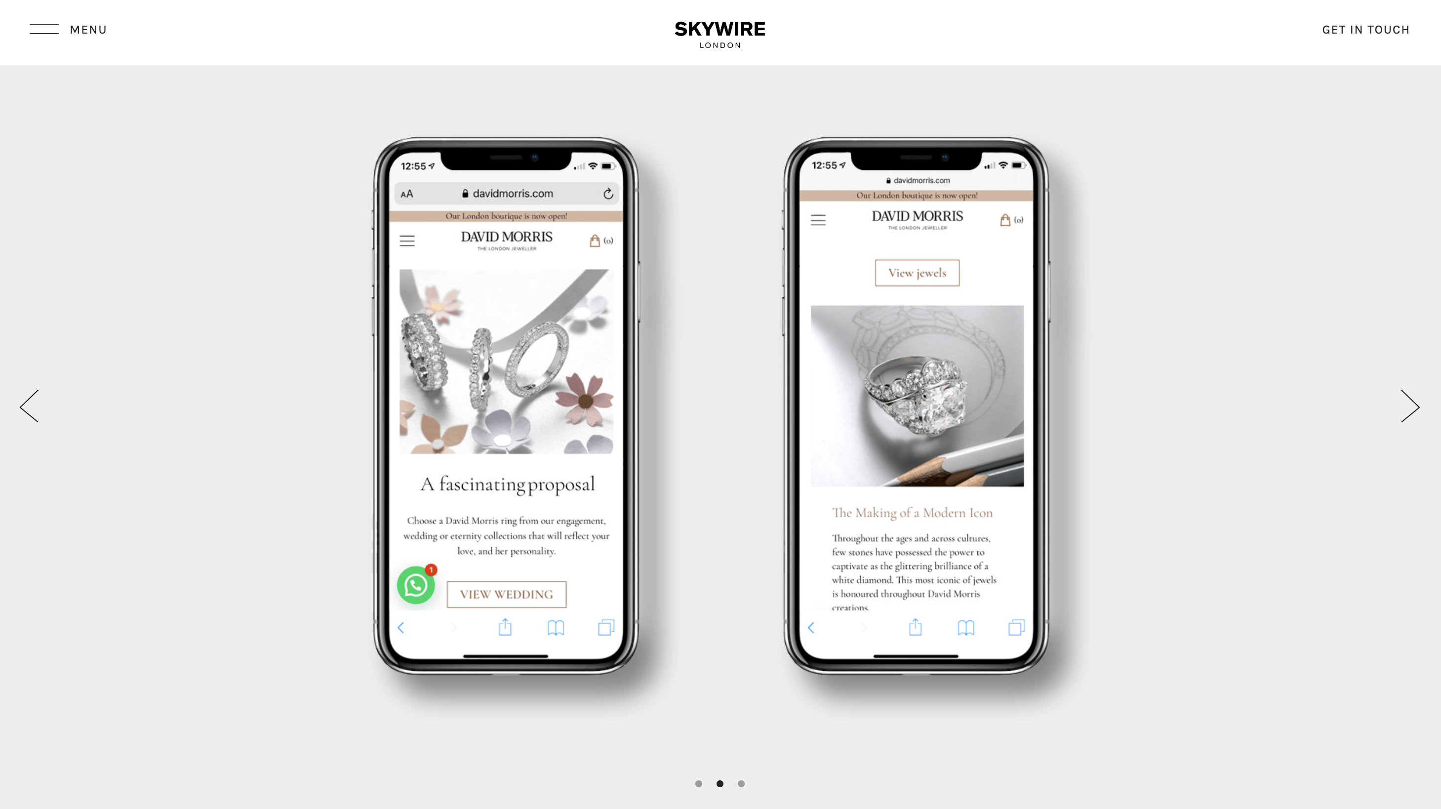
The navigation menu is well-organized with categories like ‘High Jewellery,’ ‘Fine Jewellery,’ and ‘Wedding.’ This clear categorization allows for easy browsing and product discovery. Search functionality might be another feature to explore, allowing users to find specific pieces by name, gemstone, or price range. The approach of Skywire for David Morris focused on several key areas: eCommerce design and development using WordPress and WooCommerce, site performance optimization, conversion rate optimization, creative direction and so much more. This comprehensive strategy elevated the brand’s online presence, while also ensuring an engaging and seamless shopping experience for David Morris’s discerning customers.
v76
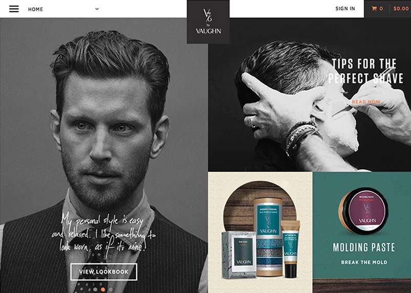
The first thing you feel as a user when you enter the Vaughn website is mystery. This website, which features images with predominantly black and white colors, arouses a feeling of mystery and curiosity in the user due to the choice of colors and fonts. However, one of the things that makes this website creative is the use of different content elements. A website full of quality images, short videos of Vaughn doing the haircut, and showreels where we can review different styles of haircuts. This site is designed to help you buy the products you need for your hair care while simultaneously increasing the visibility of the brand. Although colorful images appear when you least expect it, the predominance of black and white and gray creates a pleasant contrast.
Brdr. Kruger
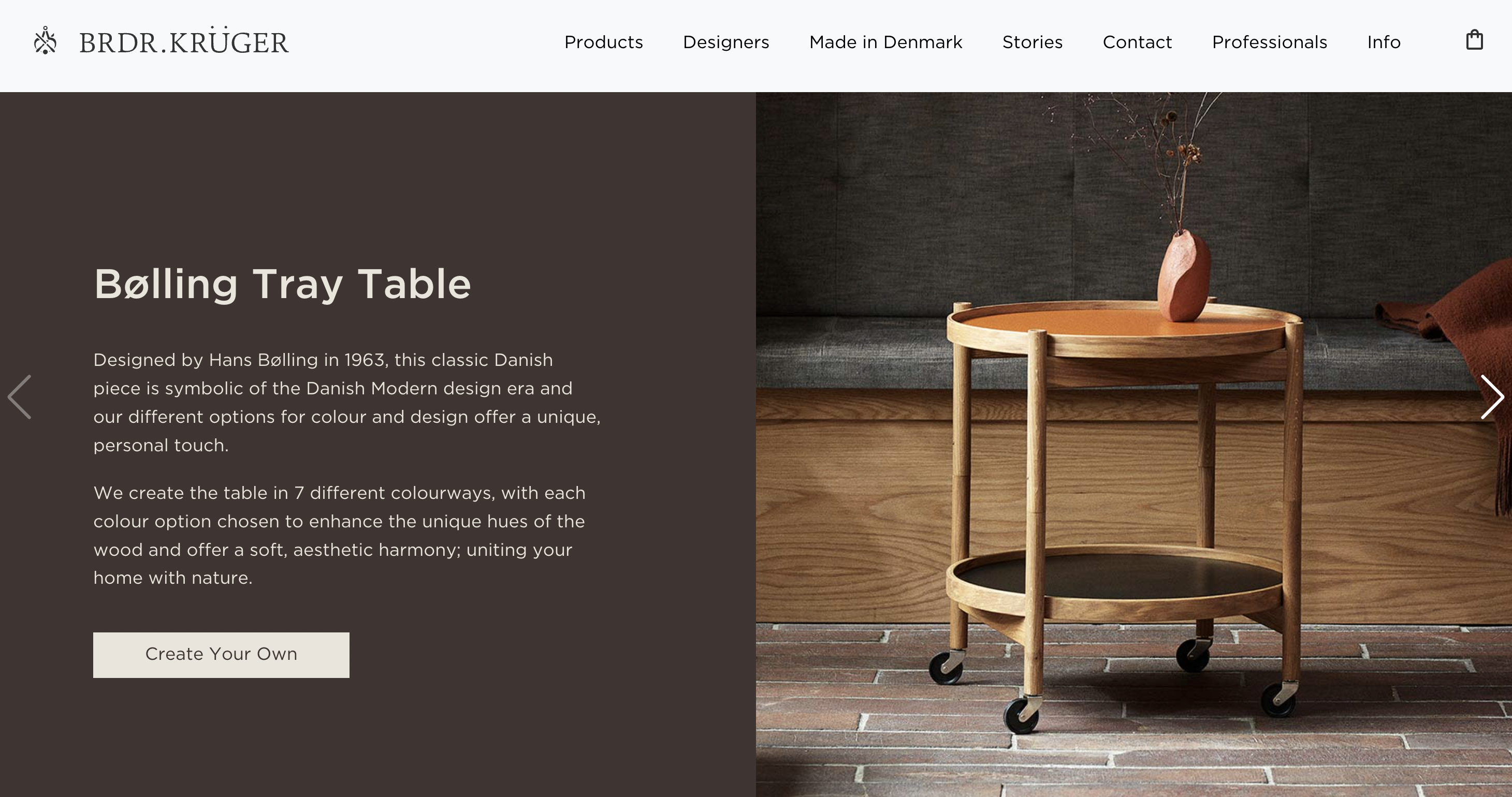
Brdr.Kruger’s website quickly attracts the user with its Scandinavian style. When we say Scandinavian style, we think of calmer, minimal, and stylish designs. The website is an example of a very creative eCommerce website created in the Scandinavian style, just like the products of the same brand. While the brand offers its users the opportunity to discover products with CTAs that it has placed in many places on its website, it also has a Create Your Own button on the quickly accessible homepage. The possibility of accessing this privilege offered by the brand as soon as you enter the website is definitely a very creative idea. The horizontal menu at the top of the pages is designed for you to find the answer to any question you may have, and takes you on a different journey in the discovery of brands and products.
Build
Build’s website is one our favorites. The site has unique features that isn’t particularly common. Once you enter the website, you can see that the homepage is divided into two sections. On the left, high-quality images flow, and on the right, you immediately have an idea what this company is all about! In addition, the menu button is designed uniquely, located on the middle section below. Once you click on it, a menu with a black background appears with variety of options to go through.
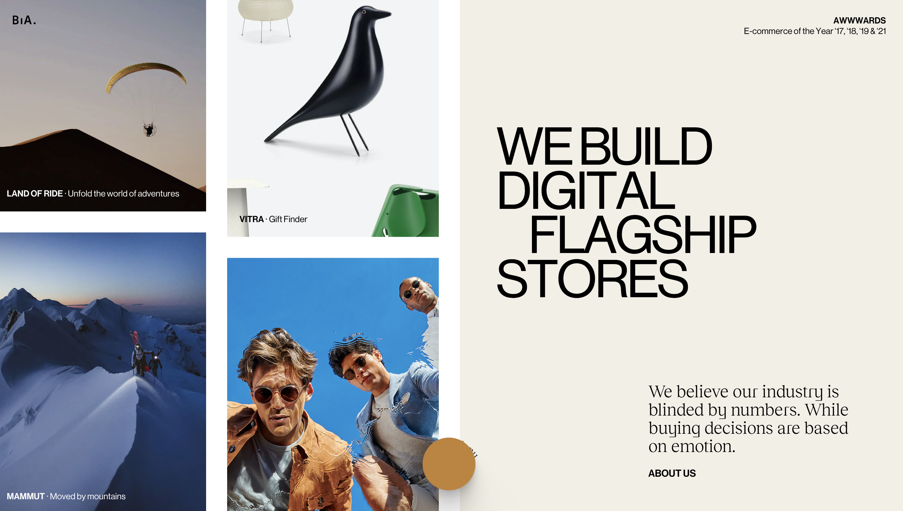
The visuals are out of the ordinary and very high quality. Browsing this website is like playing a game. As you browse through different pages, the user experience increases and becomes very enjoyable. When you scroll down, you can see that the images displayed in the rectangular boxes get smaller and shifted. Different elements like these add a different dimension to the website, offering us a very creative eCommerce website example.
Deejo
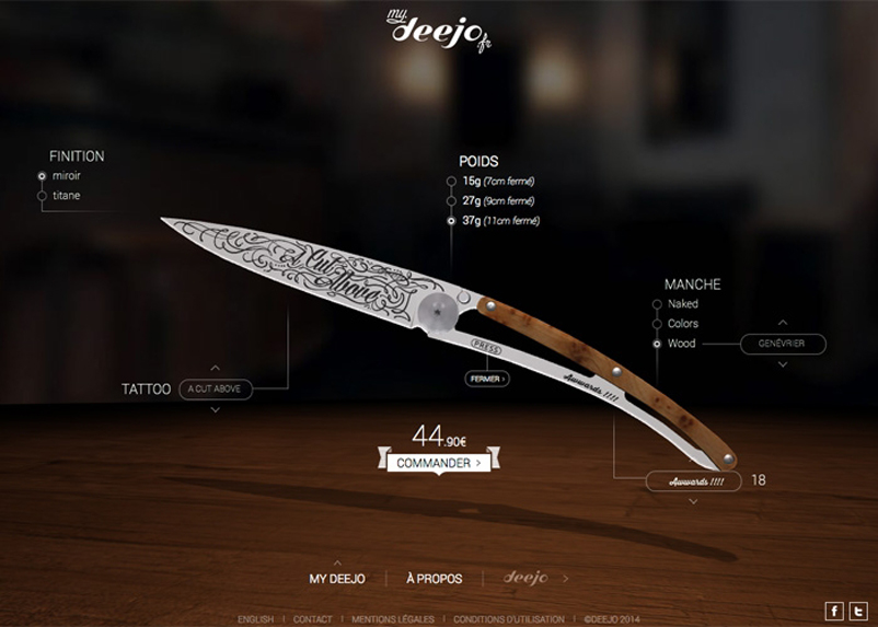
We could definitely say that Deejo’s website is far from being a minimalist, and we like it! The company encourages visitors to buy its items by featuring a range of them on the homepage and including a “shop now” button in each section. As a knife brand, they provide several kinds of knives for various purposes, thus the company placed the categories on the top bar, which is quite helpful for customers looking for a particular product.
Grovemade
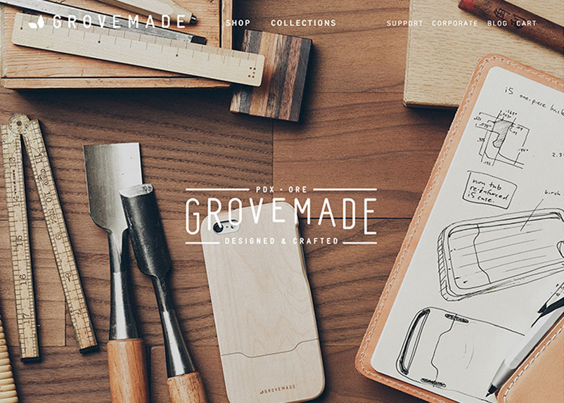
Grovemade is a distinctive brand that crafts exquisite handmade products with a focus on natural materials and meticulous craftsmanship. From wooden desk organizers and leather phone cases to minimalist wallets and precision-machined metal pens, each item reflects the brand’s dedication to simplicity and quality. Grovemade’s website is a testament to their design philosophy, featuring a clean and contemporary layout that highlights their unique products. The website’s intuitive navigation makes it easy for visitors to explore their diverse range of offerings. Striking visuals and detailed product descriptions provide an immersive shopping experience, allowing customers to appreciate the fine details and artisanal craftsmanship of each item. The website also showcases the brand’s commitment to sustainability, emphasizing their use of natural and eco-friendly materials throughout their collections.
Hard Graft
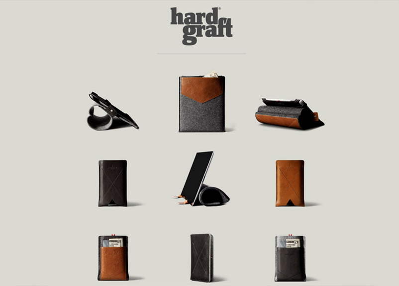
Hardgraft is an Italian-based brand renowned for its high-quality leather goods and accessories. The brand’s name, “Hardgraft,” reflects their commitment to hard work and dedication in crafting each item. Hardgraft’s website is a seamless blend of elegance and functionality, mirroring the brand’s ethos in crafting exquisite leather goods. The website’s sophisticated design and user-friendly interface create an immersive and enjoyable browsing experience for visitors. Upon entering the site, one is greeted with striking visuals that showcase their carefully curated product range. The minimalist layout ensures that the focus remains on the products themselves, allowing customers to explore each item in detail.
Aesthetically pleasing and easy to navigate, the website effortlessly guides users through various product categories, providing detailed descriptions and high-resolution images that capture the essence of each creation. Additionally, the site features a smooth and secure online shopping process, enabling customers to seamlessly add items to their carts and proceed with their purchase. With its seamless integration of style and functionality, Hardgraft’s website serves as an enticing gateway for customers worldwide to discover and acquire the brand’s luxurious leather goods and accessories.
Hunter’s Wine Shop
Hunter’s Wine Shop, nestled in the picturesque region of Marlborough, New Zealand, is a true gem for wine enthusiasts. Renowned for its exquisite selection of wines, Hunter’s Wine Shop offers a diverse array of world-class vintages crafted with precision and passion. With a history dating back to 1970s, this family-owned establishment takes pride in its commitment to sustainability and traditional winemaking practices.
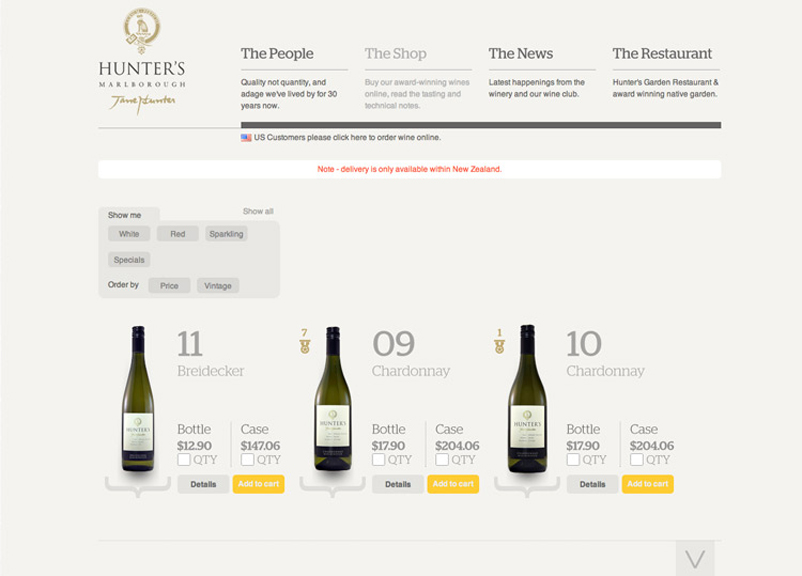
For those seeking to delve into the delightful world of Hunter’s Wine Shop from the comfort of their homes, the brand’s website is an excellent resource. Bursting with rich content, it boasts an elegant design and user-friendly interface, making it effortless to browse and purchase their esteemed wines online. The website also serves as a hub of valuable information, offering insights into the winery’s history, winemaking process, and the distinct characteristics of their various wine collections. Whether one is a seasoned connoisseur or a curious novice, Hunter’s Wine Shop’s website is the deal gateway to uncover the magic behind their exceptional wines and the enchanting Marlborough wine region.
J Hornig
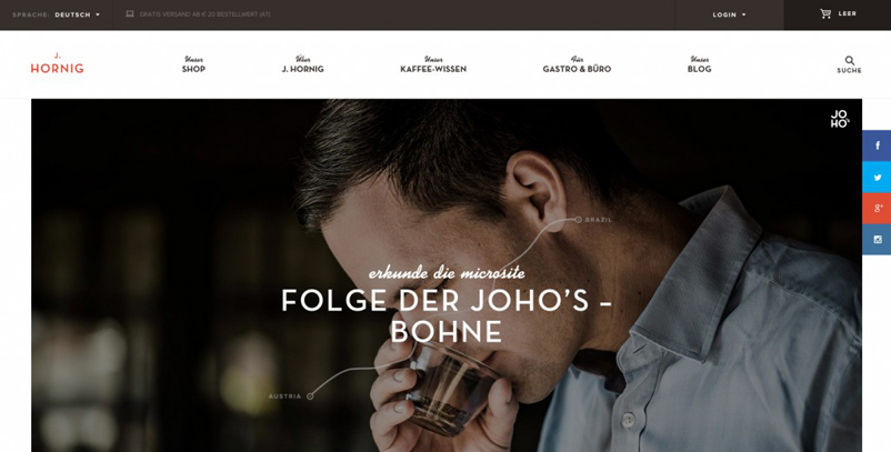
Smiling faces and good coffee content is what we love. Once you enter the site, especially if you’re addicted to coffee like us, you immediately feel the cosy feeling. Unlike other coffee brands, J Hornig created a space for coffee lovers with its carefully curated website.
So, which one is your favorite? If you’re looking for an e-commerce agency for your business you may want to check the link. You can also explore for further reading our e-commerce marketing strategies and best e-commerce tools for startups articles.

