We master the art of storytelling by balancing heart and science; getting intimate with human interactions and data to deliver what matters most. Our sweet spot is in helping to transform complex business problems into ingenious human-led solutions for early-stage startups, enterprise ventures and corporate partners. Consider us rebels with a cause, leaving a mark that can’t be ignored especially through our unique, non-typo name.
About
- HQ
- OFFICES
-
HEADQUARTERS
- ADDRESS: Level 2/230 Clarence St, Sydney, NSW 2000 Australia
- E-MAIL: [email protected]
-
OFFICE
- ADDRESS: 110-1128 Homer St, Vancouver, BC V6B 6K5 Canada
- E-MAIL: [email protected]
-
OFFICE
- ADDRESS: 15760 Ventura Blvd #700, Encino, CA 91436 United States
- E-MAIL: [email protected]
We create meaningful experiences for some of the world’s leading brands with our signature approach to strategy, design, engagement and implementation.
Bringing creative to life through exceptional quality and execution, whilst elevating a brand’s experience across every touchpoint.
We’ll help get your website to appear organically on the first page of search engines like Google or Bing, and ideally as the first listing for specific search terms relevant to your business.
DIJGTAL architect, deliver and build exceptional digital experiences, combining engaging front-end with reliable back-end to power your digital infrastructure.
Sector Expertise
- Car Wash and Detailing Services
Sector Expertise
- Investment Management
- Accounting and Auditing
- Payment Processing
Case Studies

Standing Out in a Competitive Gaming Market: The Power of Culturally Aligned Branding
Client: Gaming City
Industry: Gaming

Standing Out in a Competitive Gaming Market: The Power of Culturally Aligned Branding


Gaming City is a trailblazing online gaming platform that has emerged as a standout player in Dubai, UAE. Designed to offer a world-class gaming experience, Gaming City aims to resonate deeply with the region’s rich cultural heritage while delivering an innovative and exciting digital environment.
DIJGTAL was honoured to play a pivotal role in conceptualising and shaping the brand’s identity from the ground up, contributing significantly to its online ecosystem and positioning Gaming City to become a category-defining brand in the UAE.
The Challenge
The gaming industry in the UAE presents a unique set of challenges. While the region is experiencing rapid digital transformation, it remains deeply rooted in its cultural traditions and values. For Gaming City, the primary challenge was to create a brand that could bridge this gap—offering a fresh and exciting online gaming experience that was not only world-class but also culturally aligned and relevant to the local audience.
In addition, the GCC region’s gaming market is competitive, with many international players vying for attention. Gaming City needed to establish a distinct identity that would differentiate it from other platforms while appealing to a broad audience in Dubai and beyond. The challenge was to design a brand that could seamlessly integrate modern gaming elements with the vibrant cultural heritage of the UAE, ensuring that it would resonate with local users and stand out in a crowded market.
Project Objectives
The primary objectives for the creation of the Gaming City brand were:
– Develop a culturally relevant brand Identity: Create a unique brand for Gaming City that is widely accepted amongst the UAE’s vivid cultural values, and simultaneously appeals to a modern gaming audience.
– Differentiate Gaming City from its competitors: Position Gaming City as a leading brand in the UAE gaming market by creating a distinct and memorable brand identity that stands out from international competitors and resonates deeply with its local audience.
The Approach
To achieve the project’s objectives, DIJGTAL adopted a holistic approach that combined extensive market research, creative design and branding. The key steps in the approach included:
1. Cultural Immersion and Market Research
DIJGTAL conducted in-depth market research to understand the unique cultural context of the UAE. This included:
– Demographics desk research: We conducted an analysis of the UAE population at a macro level to build a comprehensive picture of the potential market.
– A market scan: We examined competitors already operating in the region to identify best practices, potential gaps in the market, and local customs or conventions that should inform our approach.
– Customer discovery interviews: We conducted in-depth, one-on-one interviews with UAE residents to understand their gaming preferences, behaviours, and frustrations. This helped us build proto-personas that encapsulated these insights into actionable profiles.
– Validation interviews: We carried out additional interviews to validate the market interest in our proposed products and refined our hypotheses.
By studying local traditions, values, and consumer behaviour we ensured that the brand identity and value proposition would resonate with our target audience. The insights gained from this research informed the foundational elements of the Gaming City brand including its logo, colour palette, tone of voice and overall visual identity.
2.Brand Identity Development
Building on the research insights, DIJGTAL crafted a brand identity that was both vibrant and culturally meaningful. The brand’s tone of voice struck a balance between modernity and cultural authenticity, focusing on confident yet approachable communication that resonated with the local audience. We also prioritised fostering trust and engagement while emphasising Gaming City’s role as a trailblazer in the region’s gaming industry.
Moving into the visual identity, the Gaming City logo was built around the symbols of the region, with the visual elements reflecting cultural patterns authentic to the UAE’s heritage. The branding process was iterative, with multiple rounds of feedback and refinement to ensure that the final identity was both authentic and engaging to modern gamers within the UAE.
The Outcome
The Gaming City rebranding and marketing project delivered impressive results, positioning the brand as a leader in the UAE gaming market.
Key Results:
– Successful Brand Launch: The new Gaming City brand was successfully launched with a strong cultural identity that resonated with the target audience. The brand quickly gained recognition for its unique approach, setting it apart from other gaming platforms in the region.
– Strong Market Differentiation: Gaming City established itself as a distinctive brand in the competitive UAE gaming market. The combination of a culturally aligned brand identity and a world-class gaming experience helped the platform stand out, positioning it as a leader in the industry.
Conclusion
Gaming City didn’t just launch — it redefined the online gaming landscape in the UAE. Built from the ground up by DIJGTAL, this brand set a new benchmark by seamlessly blending deep cultural insights with strategic brand development. DIJGTAL created an identity that truly resonated with the local audience, and highlighted the power of culturally aligned branding and thoughtful design in driving differentiation, engagement, and long-term success in a competitive market.
Client Gaming City
Industry Gaming
Sector Expertise Video Gaming

Client: Digital Pathways
Industry: Government

Client: MaximBet
Industry: Gaming
Client: Little Tokyo Tattoo Studio
Industry: Beauty & Cosmetics

Client: Taurex
Industry: Finance

Client: 13SICK
Industry: Healthcare

Built for Impact: Empowering Underserved Communities to Begin a Career in Canada’s Digital Economy
Client: Digital Pathways
Industry: Government

Built for Impact: Empowering Underserved Communities to Begin a Career in Canada’s Digital Economy


As a cutting-edge AI tech platform supported by the Canadian Government, Digital Pathways was designed to help people in underserved communities transition into digital careers — but the program had never been tested.
DIJGTAL embarked on a mission to make Digital Pathways a go-to resource for those seeking digital career opportunities by developing a robust marketing strategy backed by research and insights, followed by a three month pilot campaign to validate product market fit.
The Challenge
Digital Pathways aimed to serve people in underserved communities across Canada by providing them with the tools and opportunities to enter the digital workforce. However, the platform was new, and awareness among the target audience was non-existent. The challenge was to build and launch a pilot campaign that would effectively introduce Digital Pathways to these communities, and then motivate individuals to sign up and engage with the platform. DIJGTAL faced several critical questions:
- How do we effectively launch this powerful platform?
- Who is the target audience and what are their behaviours?
- What are their aspirations and challenges?
These unknowns needed to be addressed to ensure a successful campaign.
Project Objectives
The primary objective of the campaign was to achieve a target of 1,000 users on the Digital Pathways platform within three months.
This goal required creating brand awareness, and fostering engagement as well as trust among the target audience.
The Approach
The campaign needed to be impactful, informative, and aligned with the audience’s needs and aspirations. To achieve the main objective, DIJGTAL conducted some market research to better understand the target audience, and then crafted a comprehensive full funnel go-to-market strategy designed to resonate and drive sign-ups.
1. Market Research
DIJGTAL conducted thorough market research by analysing a multitude of data points. Through this process, the team distilled the data down into four key insights as well as identified four major audience segments that would form the foundation of the campaign.
2. Go-to-Market Strategy
The insights from the market research guided the development of a robust marketing strategy that encompassed paid media, social media, content marketing, search ads, display ads, Digital Out of Home (DOOH), native ads and programmatic advertising.
3. Three Month Pilot Campaign
Starting off, a fresh visual style was created, designed to resonate with the target audience. The content strategy was focused on producing compelling content that highlighted the benefits of Digital Pathways and the opportunities it offered. Social media platforms were leveraged to reach the audience where they were most active, and the paid campaigns ensured that the message had the widest possible reach at the lowest Cost Per Lead (CPL). The landing page was designed to be user-friendly, informative, and visually appealing, providing a seamless experience for users interested in signing up.
The Outcome
The combination of targeted marketing, creative content, and strategic execution proved to be highly effective in reaching and engaging the intended audience.
Key Results:
- 35M impressions generated: Reaching audiences across Canada to showcase this brand new platform at a very efficient CPM
- 4.6K users signed up to the platform: That’s 364% above the original target!
- 18% Landing Page Conversion Rate: Clear CTAs, value propositions, and statistics worked to guide people down the funnel from consideration to conversion
The campaign not only met its objective, but also laid a robust foundation on which continued growth and user engagement on the Digital Pathways platform could continue to thrive.
Conclusion
The successful launch of Digital Pathways highlights the importance of understanding the audience, leveraging the right channels, and delivering a message that resonates. DIJGTAL’s collaboration with Digital Pathways is a testament to the power of strategic marketing and creative execution. By addressing the challenges head-on and crafting a tailored approach, DIJGTAL was able to drive significant user engagement in a short period.
Client Digital Pathways
Industry Government
Sector Expertise Artificial Intelligence (AI)

Client: Gaming City
Industry: Gaming

Client: MaximBet
Industry: Gaming
Client: Little Tokyo Tattoo Studio
Industry: Beauty & Cosmetics

Client: Taurex
Industry: Finance

Client: 13SICK
Industry: Healthcare

The Creation of MaximBet: A Global Lifestyle-Led iGaming Brand
Client: MaximBet
Industry: Gaming

The Creation of MaximBet: A Global Lifestyle-Led iGaming Brand


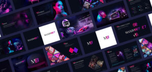
In a pioneering collaboration, DIJGTAL partnered with Carousel Group and heritage giant Maxim Magazine to bring the MaximBet brand to life.
MaximBet sought to revolutionise the sports betting industry by not just becoming a leader in online betting, but by creating a lifestyle-led gaming experience that resonated with a broad audience. To achieve this ambitious goal, MaximBet turned to DIJGTAL to develop a brand that would stand out in an industry known for its uniformity. Although much was achieved throughout the partnership with MaximBet, this case study will focus on how DIJGTAL helped create and bring the brand to life.
The Challenge
The sports betting industry is notoriously competitive, with numerous players offering similar services. The challenge for MaximBet was to break through this crowded market by developing a unique brand identity that could capture the imagination of sports fans and casual bettors alike. The brand needed to be more than just a betting platform, it had to offer an immersive lifestyle experience that would appeal to a diverse audience.
Project Objectives
The primary objectives of this engagement were:
1. Develop a distinctive brand identity that leveraged the iconic Maxim brand:
Create a unique and memorable brand that would differentiate MaximBet from competitors and establish it as a leader in the sports betting industry, resonating with both hardcore sports fans and casual bettors.
2. Create an enticing brand experience:
That encapsulates the luxurious lifestyle of Maxim paired with the excitement of sports betting, drawing in every type of player.
The Approach
To achieve the project’s objectives, DIJGTAL employed a comprehensive and innovative approach around building this challenger brand. The key steps in the approach included:
1. Brand Research and Strategy
DIJGTAL began by conducting extensive research into the sports betting industry, identifying key trends and gaps that MaximBet could exploit.
2. Building a Distinct Brand Narrative
Diving deep into the iconic history of Maxim, the team crafted a brand narrative that embodied the excitement and glamour of the Maxim lifestyle, with the goal of creating unrivalled experiences both online and in real life.
3. Visual Identity and Logo Design
Leaning heavily on the iconic Maxim branding, the MaximBet logo was designed to collide this refined identity with the fast pace of the sports betting world — creating a fresh yet historic logo weighted with a nostalgic nod to Maxim’s heritage. Taking inspiration from the fresh tones of Miami and Las Vegas’ neon lights, the brand elements embodied these electrifying colours throughout a modern design system that could be easily applied across socials, the sports betting platform and into real world experiences.
4. Brand Guidelines
DIJGTAL built a comprehensive set of brand guidelines that highlighted this aspirational lifestyle and how it could be translated across all platforms consistently, creating a living entity that spanned across states.
The Outcome
DIJGTAL positioned MaximBet as an exciting and formidable player in the sports betting industry. And as the brand custodians, DIJGTAL continued to evolve fresh and exciting brand experiences, creating waves in a saturated and outdated market.
MaximBet was successfully launched with a distinctive brand identity that resonated with its target audience. The brand quickly gained recognition in the market, standing out for its unique lifestyle-led approach.
Conclusion
The collaboration between MaximBet and DIJGTAL in crafting the brand’s look and feel was a resounding success. DIJGTAL was able to position MaximBet as a leader in the sports betting industry, setting a new standard for what an iGaming brand can be — blending entertainment, lifestyle, and gaming into a cohesive and compelling offering.
Client MaximBet
Industry Gaming
Sector Expertise Video Gaming

Client: Gaming City
Industry: Gaming

Client: Digital Pathways
Industry: Government
Client: Little Tokyo Tattoo Studio
Industry: Beauty & Cosmetics

Client: Taurex
Industry: Finance

Client: 13SICK
Industry: Healthcare
Crafting an Iconic Digital Presence for a Legendary Australian Artist
Client: Little Tokyo Tattoo Studio
Industry: Beauty & Cosmetics

Crafting an Iconic Digital Presence for a Legendary Australian Artist

Crafting an Iconic Digital Presence for a Legendary Australian Artist
In the heart of Sydney, Australia, Little Tokyo Tattoo Studio has long been recognised as an iconic hub for art, culture, and self-expression. Known for its masterful artists and a reputation that precedes it, the studio has cemented itself as a landmark in the city’s creative scene. However, with the rapidly evolving digital landscape, Little Tokyo faced the challenge of translating its physical presence and unique brand identity into an immersive online experience.
This case study explores how DIJGTAL team worked closely with Little Tokyo to develop a new website that not only showcases their artistry but also introduces the world to the new face of their brand—Tiny.
The Challenge
The primary challenge was clear. How do you capture the essence of a well-established, culturally significant tattoo studio in an online environment? The physical studio buzzes with creativity, personal stories, and a deep connection between artists and clients. We needed to ensure that this spirit wasn’t lost in translation when shifting to a digital platform.
Moreover, with a clientele that ranges from local tattoo enthusiasts to international visitors, the website needed to be more than just a digital business card. It had to serve as an extension of the studio, offering an engaging, user-friendly experience that would resonate with both existing clients and potential new ones.
Project Objectives
- Enhance Online Presence: Create a website that accurately reflects the studio’s brand, aesthetic, and values.
- Improve User Experience: Develop a site that is easy to navigate, with intuitive UX/UI design that caters to both seasoned tattoo lovers and first-time visitors.
- Integrate Marketing Strategy: Incorporate a creative marketing strategy that aligns with the studio’s ethos whilst also driving engagement and conversions.
- Showcase Artwork: Ensure the website serves as a digital gallery for the artists’ work, highlighting their unique styles and skills.
- Introduce Tiny: Present the studio’s mascot, Tiny, as the new face of the brand, creating a memorable connection with users.
The Approach
To tackle these objectives, our team engaged in a multi-disciplinary approach, combining Strategy, Creative Direction, UX/UI Design, and Front & Back-End Development. Here’s how each component played a critical role in the project’s success:
1. Strategy
Our strategy began with a deep dive into Little Tokyo’s brand identity. We interviewed the studio’s founding artist, reviewed his feedback, and analysed competitors in the tattoo industry. This research phase was crucial in understanding the studio’s unique selling points and the values they wished to communicate online.
With these insights, we crafted a strategy that emphasised the authenticity and artistry that Little Tokyo is known for. The marketing plan included considerations for how to resonate with different segments of their audience—ranging from local clients to international visitors looking for a one-of-a-kind tattoo experience in Sydney.
2. Creative Direction
The next step was to translate this strategy into creative outputs that would bring the website to life. We focused on creating visually compelling content that would tell the studio’s story, highlight their artists, and showcase their work.
Central to the creative concept was Tiny, the studio’s newly introduced mascot. Tiny became a guiding figure throughout the website, providing a unique personality for the brand, creating a stronger connection with visitors. Whether it was through graphics or subtle animations, Tiny was strategically integrated to enhance user engagement and brand recall.
3. UX/UI Design
User experience and interface design were pivotal in making the website both functional and aesthetically pleasing. We began by mapping out the customer journey, identifying key touchpoints where we could provide value and improve navigation.
The design needed to balance the edgy, artistic nature of a tattoo studio with a clean, user-friendly interface. We opted for a minimalist design that allowed the artwork to take centre stage while ensuring that users could easily find information about artists, booking processes, and the studio’s history.
Responsive design was another priority, ensuring that the website provided an optimal experience across all devices.
4. Front & Back-End Development
The development phase brought together the creative and strategic elements into a fully functional website. Our front-end developers focused on ensuring the design translated seamlessly into an interactive experience. This included integrating Tiny into the site’s interface in a way that was both engaging and non-intrusive.
On the back-end, we implemented a robust content management system (CMS) that allows the studio to easily update their site with new content, be it artist portfolios, blog posts or their online shop. Security and performance optimisation were also key considerations, ensuring the website could handle high traffic while providing a fast, reliable experience for users.
The Outcome
The launch of Little Tokyo’s new website marked a significant milestone in their digital transformation. The site successfully captures the studio’s essence, providing visitors with an immersive experience that mirrors the creativity and passion found within their physical space.
Key Results:
- Increased engagement: The website has seen a notable increase in user engagement, with more time spent on artist profiles and portfolio pages.
- Higher conversion rates: There has been a significant uptick in online bookings.
- Increase in brand awareness: Tiny has quickly become synonymous with the Little Tokyo brand, featuring heavily across their latest merchandise drops.
Conclusion
By blending strategic insights, creative design, and cutting-edge development, we were able to create a digital experience that not only met but exceeded Little Tokyo’s objectives. The new website serves as a powerful marketing tool and a vibrant extension of the studio’s brand. As Little Tokyo continues to make its mark in Sydney and beyond, their online presence is now as iconic as the tattoos they create.
Client Little Tokyo Tattoo Studio
Industry Beauty & Cosmetics
Sector Expertise Beauty Salons & Spas

Client: Gaming City
Industry: Gaming

Client: Digital Pathways
Industry: Government

Client: MaximBet
Industry: Gaming

Client: Taurex
Industry: Finance

Client: 13SICK
Industry: Healthcare

A Comprehensive Rebrand for a Global Forex Enterprise, Taurex
Client: Taurex
Industry: Finance

A Comprehensive Rebrand for a Global Forex Enterprise, Taurex


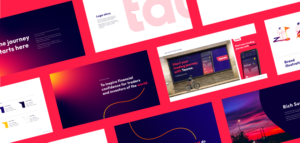

DIJGTAL was challenged with taking an existing forex trading brand, Zenfinex, and turning it into a globally recognised identity capable of delivering world class trading experiences.
In the ever-evolving world of forex trading, standing out in a saturated market is no small feat. DIJGTAL was engaged to create a unique brand narrative and captivating visual identity, a global marketing and communications strategy, plus design a world class trading app experience — all aimed at setting an exciting new standard in the trading landscape. In this particular case study we’ll explore how DIJGTAL reimagined Zenfinex into the brand it is known as today, Taurex.
The Challenge
Taurex was facing several challenges in its quest to gain a competitive edge. The forex market is notorious for its complexity and saturated competition, with numerous established players and new entrants vying for attention. Taurex needed a unique and memorable brand identity that would resonate with a global audience and differentiate it from competitors. Additionally, as the company expanded into new regions and languages, it was essential to create a consistent brand narrative that would inspire trust and confidence that translates across the world.
Project Objectives
Rebrand Zenfinex: Develop a fresh and compelling name and brand identity that reflects the brand’s vision and strategy developed by DIJGTAL, i.e. to inspire financial confidence for traders and investors of the world, and establish itself as a leader in the global forex market.
Ensure Cultural Relevance: Tailor the brand identity to resonate with a diverse audience, considering cultural nuances and language differences.
The Approach
To address these branding challenges, DIJGTAL employed a multifaceted approach, encompassing business strategy as well as research and validation. The process began with the ideation of a unique brand narrative that would serve as the foundation for Taurex’s identity.
1. Research and Brand Strategy
The first step in the rebranding process was to conduct extensive research to better understand the needs and preferences of Zenfinex’s target trading audience. DIJGTAL’s team used qualitative and quantitative methods — including surveys and interviews, to gain insights from over 150 people across 14 countries and 7 languages, in markets where this new brand intended to operate. The research confirmed that the name Zenfinex did not resonate with the intended audience, disconnecting it from who they wanted to be, and how they wanted to be perceived.
From these insights, DIJGTAL developed a brand strategy that would form the foundation of how the brand would live and breathe. A vision and mission statement were developed in-line with five core brand pillars, followed by the development of a distinct tone of voice that allows the brand to stand out from the competition.
2. Brand Narrative and Identity:
The brand strategy led to a new narrative that was anchored in discovery and exploration. In the same way that explorers have connected constellations to navigate their journeys, traders forge financial connections across the globe to build their trading success. We took the constellation of Taurus, the bull symbol of strength and success in the financial world, and combined it with the action of trading to form a new and exciting name, Taurex!
3. Visual Identity and Logo Design:
The next step was to design a memorable visual identity that would represent this captivating new brand. The logo’s design elements and brand mark were created to be globally recognised, regardless of language or location, and become an everlasting identity that could transcend into a cultural icon! The brand’s design systems were developed to be both compelling and versatile, capable of being applied across various mediums and platforms in different cultures and languages.
DIJGTAL developed brand guidelines that would maintain consistency in tone, messaging and visual elements — regardless of the region or language, and continues to grow the brand with Taurex through marketing and product initiatives.
The Outcome
The rebranding of Zenfinex into Taurex positioned the company as a formidable player in the global forex market.
Key Results:
- Establishment of a striking new and unique brand: The new Taurex brand identity was well-received by both existing customers and new audiences. The refreshed logo and visual identity established a strong and recognisable presence in the market, setting Taurex apart from competitors.
- Global brand awareness across five continents in eight languages:Taurex successfully positioned itself as a globally relevant brand, capable of inspiring confidence in traders and investors from various backgrounds.
Conclusion
By partnering with DIJGTAL, Zenfinex was able to create a new brand identity in Taurex that stands out from the crowd, inspiring trust and confidence among traders and investors worldwide. As Taurex continues to expand its reach, the strong foundation laid by this project will undoubtedly support its growth and success in the highly competitive forex market.
Client Taurex
Industry Finance
Sector Expertise FinTech

Client: Gaming City
Industry: Gaming

Client: Digital Pathways
Industry: Government

Client: MaximBet
Industry: Gaming
Client: Little Tokyo Tattoo Studio
Industry: Beauty & Cosmetics

Client: 13SICK
Industry: Healthcare

Transforming Mobile Healthcare: A Redesign for Better Patient-Doctor Connectivity
Client: 13SICK
Industry: Healthcare

Transforming Mobile Healthcare: A Redesign for Better Patient-Doctor Connectivity


13SICK, National Home Doctor Service approached DIJGTAL to build a better understanding of their user journey.
13SICK, National Home Doctor Service
13SICK, National Home Doctor Service is Australia’s most trusted network of after-hours, home-visiting doctors. They provide treatment to patients when they urgently need to see a doctor, but their GP is closed. Their services are conveniently bulk-billed, and help the extended community by relieving the pressure on hospital Emergency Departments.
Business Problem
13SICK wanted to increase the number of app downloads, rate of adoption, and level of confidence in their brand by ensuring their product fully supports people in their moments of need.
They engaged DIJGTAL to build a better understanding of their user journey. In particular, they wanted to identify the emotions that customers were feeling when using their service, and how this might have been impacting the overall product experience.
Approach
DIJGTAL developed an end-to-end product redesign strategy to help uncover existing user pain points, along with identifying and validating new opportunities to enhance the overall mobile experience.
Typically the 13SICK service is used during periods of panic, anxiousness or concern for others. Due to this, it was imperative that DIJGTAL’s research strategy helped capture the wide range of emotional states that people experience whilst using the app.
The agency used this line of thinking to guide their design direction, and then complimented this with robust usability testing to ensure that the end product design and app build functioned as expected and as needed.
Outcome
Overall the product achieved the business and user requirements and successfully elevated the brand in the marketplace, especially via word of mouth after usage.
Client 13SICK
Industry Healthcare
Sector Expertise Health & Wellness Apps

Client: Gaming City
Industry: Gaming

Client: Digital Pathways
Industry: Government

Client: MaximBet
Industry: Gaming
Client: Little Tokyo Tattoo Studio
Industry: Beauty & Cosmetics

Client: Taurex
Industry: Finance
Feed


