5 Unique Branding Ideas & Examples from Innovative Companies
Today’s businesses face far more challenges than they did five years ago. Business trends constantly evolve, affecting everything from consumer preferences to industry standards. To thrive and compete with rivals, companies must concentrate on running effective and unique branding efforts in addition to offering high-quality goods or services.
In the current market environment, building a brand identity can be challenging. Don’t worry. We’ll help you out.
Why Is Branding Important For Your Business?
There is a lot of market competition, and it takes more than a few blows to be noticed. Branding enables your company to stand out from the crowd.
For your product or service to succeed, you need to have the right concept that speaks to your target audience. And since we mentioned the target audience, you need to do some rigorous research to find out who they are. The right branding can make or break your product. A professional logo maker can help you create a memorable brand identity. Therefore, make sure you give it some thought before your launch.
Creating a solid branding for your company has benefits beyond simply assisting in selling your goods or services to your target audience. Effective branding can help you create a loyal customer base, generate hype around your brand, and help develop a community, which would otherwise require a lot of effort, money, and time.
There’s a common misconception that branding is expensive and only major firms would go for it. However, it depends on the market you’re in and the level you’re playing.
The cost of branding can vary. Obviously, utilizing the services of top-notch advisors and perfect execution will cost more. Similarly, branding a global, multi-product company will be significantly more complex and require more resources than branding a small company. So, as in most cases, there’s no one-size-fits-all here. But there’s no harm in looking at some successful companies that made the right move with their branding and getting inspiration from them. So here are 5 of the best and most unique branding ideas and examples from innovative companies that would definitely give you some ideas.
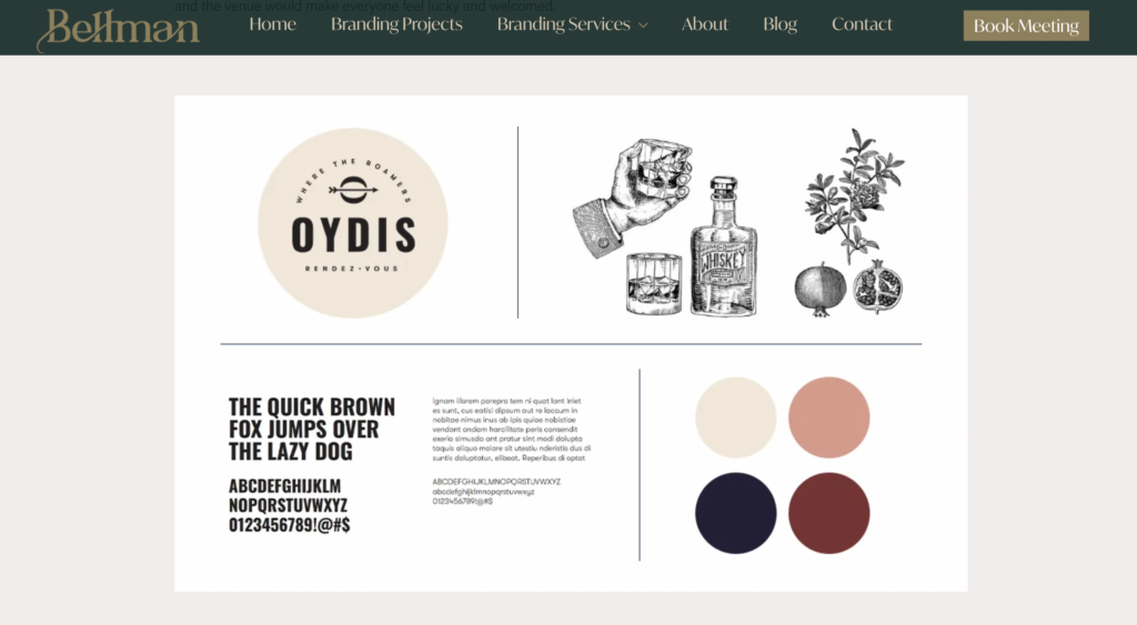
1. Bellman Agency x Branding Ashburton’s First Bar in 100 Years
Bellman crafted a brand story that captured the essence of the vision: a tale of friendship, good fortune, global travels, and wanderlust. (Fun fact: Oydis is the name of the Norse goddess of good fortune.) The brand features vintage illustrations alongside a modern typeface, set against a moody burgundy and navy palette. Prior to launch, Bellman designed a large window sticker to let people know what was soon to arrive, and they helped Oydis kick off their social media account by developing a series of posts.
2. Netflix’s Use Of Data
Let’s face it: Netflix is more than just a platform for streaming distribution. Some of the most globally acclaimed television shows in recent years have been created by Netflix.
Everyone has experienced receiving the boilerplate email that begins, “Hey there, [insert the first name here]!’’ proposing a certain deal. This almost never feels personal. Netflix has consistently shown that they are masters at creating a personalized experience based on customer data with each new marketing campaign they roll out. That makes theirs one of the best branding examples on this list.
But utilizing analytics and data about consumer viewing patterns and demand has been one of the secrets of Netflix’s marketing strategy, thus its success. Netflix invested highly in organizing its data into concepts that have transformed its content and taken trend analysis and personalized recommendations to a whole new level: Even the artworks are personalized according to watch history of the user, let alone data-backed show recommendations, all making the use of data one of the signatures of their brand.
3. Make Use Of Customer Service Like Zara
Customer care service has a significant impact on the brand identity development process. Since shaping perception is at the heart of branding, you have to ensure that your clients and visitors receive the best treatment.
Despite being in a highly competitive market, this European corporation has been able to dominate the industry. Their trick in production is to mimic the newest high-end fashion trends and make them affordable for a bigger mid-price market.
Zara is dedicated to catering to a wide range of customers representing all ethnicities and age groups. These fundamental principles—beauty, clarity, functionality, and sustainability—receive special attention. Since this approach and its customers are Zara’s most valuable brand assets, they are committed to providing outstanding customer service in all of their stores worldwide.
The customer may not always be right but make sure they feel they are being heard. In this case, you might want to give the chatbots a chance to streamline the initial inquiries and create an entry point of responsive customer service.
4. Urban Outfitters’ Constant Design Evolution
Aside from your brand’s logo, every article and piece of merchandise related to your brand paints a broader picture of your company. Meaning that you should invest in brand-related content such as videos, graphics, art, stickers, and written materials, not only for engagement but for branding purposes too. It’s all about reflecting your brand identity right and creating a consistent vision in the eye of our target audience.
A world-renowned lifestyle brand, Urban Outfitters’ visual style is all about edgy and contemporary designs. They’re also almost eponymous in the industry with stylish-but-oddball product pictures at this point. Their photography often includes settings in accordance with current trends for young adults, their target audience. They don’t hesitate to reinstitute their visual style every six months or so for it to evolve with their consumer base’s shifting interests and fast changing trends, even changing the logo and color palette to go along. All this adds up to a unique branding approach, turning change into their signature style.
5. Keep Your Brand Values Transparent Like Glossier
You need a brand makeover? In need of some rebranding ideas? Start with (re)defining your brand values. Make sure they express honesty, integrity, and authenticity. Maintain transparency while displaying these principles. Clients value a brand that encourages a direct line of communication with them.
Glossier changed the game in the cosmetics industry when it created a brand that underscored the importance of openness and honesty. Glossier provides high-end, quality cosmetic products with a no-doing-shady-stuff-behind-closed-doors approach. Leaning on ethical production methods, no animal testing, and providing a few vegan options helped to stand out from the herd.
Glossier is dedicated to environmental causes and uses them wisely to create its brand vision. They use less packaging than most of the other cosmetic brands and their visual tone matches this approach. The brand conveys an easygoing and cool visual language with its soft pink and white color scheme and simple typeface, promoting the power of simplicity and authenticity. Now valued at $1.2 billion, the brand is a true example of why transparency is always a good idea when building your brand in today’s oversaturated FMCG world.
6. Spotify’s Minimalistic Logo
Every brand strives for a unique logo. But creating a unique visual does not mean it should be overdesigned. A simple, minimalistic logo enables you to cement your product in the mind of the consumers without overwhelming them. You can give the minimalistic design a go by using only the most fundamental visual components, a single sans-serif font, and a limited color palette. For a seamless approach to crafting these clean and professional logos, consider using Kittl’s Logo Templates, which offers an array of customizable options to help you design with ease.
A great example of a minimalistic design could be Spotify’s understated highlight green logo. The colorful album covers played on the streaming platform take precedence over a subdued color scheme of green, black, and white. Three horizontally curving lines in a circle, which symbolize the sound waves, is the only design element on it. Looking closely, you’ll see that it’s crooked, giving the logo a humane feeling.
Conclusion
All in all, we’ve been witness to a period where branding ideas and designs are going through a transformation in the last couple of years. Marketing techniques that used to be effective a few years ago are no longer as favorable as they were. And there is certainly a bigger wave of change on the way in terms of marketing approaches.
Social media has been a moving force for brands to become more inclusive, diverse and to celebrate differences rather than eliminating them, helping to create meaningful relationships with their audience. Therefore whether you’re considering a subtle or substantial change in your branding, we suggest you conduct in-depth research on the directions you could take.
Finding a branding agency that specializes in the range of your needs and budget could be one of your initial moves. Because, as we all know, recovering your reputation is way harder than creating one in the first place.


