


Takt is an award-winning Canadian brand and digital agency serving clients across North America and beyond. We build brands, websites, and campaigns that bring clarity to complexity and help organizations move with purpose. Sector-agnostic and strategy-led, we partner with universities, nonprofits, global enterprises, and high-growth companies—including Alphabet, Amazon, NYU, the NHLPA, CBC, and Medtronic. Our work blends strategic insight, thoughtful design, and precise execution to create digital experiences that are intuitive, scalable, and built to last. For organizations facing high-stakes decisions or navigating ambiguous terrain, Takt provides the guidance, craft, and momentum needed to make meaningful progress.
Takt
Gold MemberAward-winning brand and digital agency helping organizations bring clarity to complexity through strategy, design, and story.
Min. Project Budget:
$50,000+
Min. Monthly Budget:
$10,000+
11-50 Employees
19 Awards
About
- HQ
- OFFICES
-
HEADQUARTERS
- ADDRESS: 503 - 134 Abbott Street, Vancouver, BC Canada, V6B 2K4
- PHONE: 604 227 4343
- E-MAIL: [email protected]
-
OFFICE
- ADDRESS: 180 John Street, Toronto, Ontario Canada
- PHONE: 1 647 560-4143
- E-MAIL: [email protected]
-
OFFICE
- ADDRESS: 787 11th Ave, New York, NY 10019, United States
- PHONE: 800-807-0434
- E-MAIL: [email protected]
Services
Digital Product Design
Video Production
Industry Expertise
Education
Discover how we’ve helped leading universities, LMS platforms, and educational nonprofits transform their brands and digital experiences, and succeed in an ever-evolving education landscape.
Sector Expertise
- Vocational & Trade Schools
- Online Education
- Higher Education
Energy
Sector Expertise
- Solar Energy
Entertainment
We combine strategic insight, cutting-edge design, and impactful marketing to captivate audiences and drive lasting growth in the competitive entertainment industry.
Sector Expertise
- Theater & Performing Arts
- Video Gaming
- Streaming Services
- Publishing Industry
- Theme Parks & Attractions
- Museums & Cultural Institutions
Fashion & Retail
Elevating fashion brands for a digital-first world. We’ve partnered with leading fashion brands to design iconic identities, seamless e-commerce experiences, and campaigns that resonate.
Sector Expertise
- Specialty Retail
- E-commerce Fashion
- Fashion Accessories
- Athleisure
Finance
Sector Expertise
- Financial Advisors
- Brokerages
- Banking
- Mortgage Lending
- Asset Management
- FinTech
- Finance Software
Healthcare
Our patient-first approach changes how health practitioners and patients experience healthcare and improve outcomes for all. Check out our featured health projects on our website.
Sector Expertise
- Medical Technology
- Health Research
- Mental Health
- Hospitals & Health Systems
Hospitality
Sector Expertise
- Casual Dining Restaurants
- Bars & Pubs
IT & Technology
Sector Expertise
- Software Development
- SaaS
- E-commerce Platforms
Startup
From defining your startup brand to launching high-impact campaigns, we specialize in transforming bold ideas into unforgettable market leaders.
Sector Expertise
- HealthTech
- MedTech
- Software & SaaS
Clients
New York University
University of British Columbia
Amazon
Alphabet
Queen's University
National Hockey League Players' Association
CBC
Medtronic
Mental Health Association of Canada
See All (2)
Budgets
Min. project budget
$50,000+
Min. monthly budget
$10,000+
Takt Reviews
4.9
Data-aware creative experience partner
TAKT positions itself as a data-aware creative experience partner, combining branding, video storytelling, and website design with measurable engagement and usability outcomes.The agency’s core strength lies in aligning creative storytelling and brand clarity with user experience improvements, supported by data-informed decision-making rather than deep performance optimization or acquisition strategy.
Strongest differentiators
Its strongest differentiators are:- Strong storytelling and brand-driven creative execution
- Data-aware approach to engagement and usability
- High-quality video production and digital experience design
- Reliable delivery across complex stakeholder environments
- Strong engagement, usability, and brand experience outcomes
- Limited visible depth in acquisition strategy, conversion optimization, and performance marketing
- Less emphasis on deep technical infrastructure or engineering ownership
DAN Perspective
TAKT fits best into the category of “creative storytelling and engagement-focused digital experience partners”, making it a strong choice for organizations prioritizing brand clarity, narrative strength, and user experience over full-funnel performance execution.Strategic Depth
Client feedback highlights TAKT’s ability to connect branding, video storytelling, and website experience with measurable improvements in engagement, traffic, readability, security, and global usability.Execution Excellence
Reviews consistently emphasize strong creativity, professional delivery quality, secure and user-friendly digital environments, and positive reception from both internal and external stakeholders.Speed & Reliability
Clients frequently report the ability to meet tight deadlines while maintaining organized workflows, responsive communication, and transparency around timelines and adjustments.Collaboration Quality
Feedback highlights flexibility, professionalism, and transparent partnership dynamics. Minor observations suggest room for improvement in project management tooling, though overall collaboration remains strong.Primary Expertise
Client outcomes strongly associate TAKT with branding, video production, and engagement-driven website design supported by data-informed strategic thinking.Value Creation Pattern
Reported gains cluster around engagement quality, clarity, credibility, usability, and stakeholder satisfaction. Evidence around acquisition efficiency, conversion performance, or infrastructure ownership remains limited.Price–Performance Balance
Reviews highlight transparency in budget management, cost efficiency, and on-budget delivery alongside measurable engagement improvements, indicating strong value perception.Transparency & Scope Clarity
Client commentary confirms openness around timelines and budget adjustments, though detailed evidence regarding contractual flexibility or performance-based pricing remains limited.Client Satisfaction
Client sentiment is strongly positive, driven by collaboration quality, flexibility, and satisfaction with both creative outputs and overall partnership experience.Referability
Clients demonstrate a high likelihood of recommending TAKT and continuing collaboration, indicating sustained trust and positive experience.Our team has summarized customer reviews to provide you with a concise overview of what people are saying about the agency on various review sites.
Awards
- Webby Awards Webby People's Voice Winner in Websites and Mobile Sites - Community 2025
- Web Excellence - Cultural Website Awards for NYU Casa Italiana 2025
- Web Excellence Award - Consulting Web Awarded for Cogency Global (cogencyglobal.com) 2025
- Web Excellence - Education Website Awards for NYU Casa Italiana (Casa Italiana) 2025
- Web Excellence Award - Law Legal Services Awarded for Watson Goepel (watsongoepel.com) 2025
- Web Excellence Awards Top Website (Podcast) 2024
- Web Excellence Awards Top Website (Media News) 2024
- Web Excellence Awards Top Website (Entertainment) 2024
- Web Excellence Awards Top Website (Healthcare) 2023
- Web Excellence Awards Top Website (Wellness) 2023
- Web Excellence Awards Top Website (Startup) 2023
- Ad World Masters Silver Agency of the Year 2023
- CSPN Woman in Leadership Award 2023
- CSPN Leader in People Culture 2023
- CSPN Mentor / Coach of the Year 2023
- IABC Awards Gold Quill Award of Excellence - Communication for the Web 2022
- Inc. Power Partner Award Best International Power Partners of 2025 2025
- Inc. Power Partner Award Best Brand Creative Power Partners of 2025 2025
- Inc. Power Partner Award Best Technology Development Power Partners of 2025 2025
→
Platform Expertise


Case Studies

Adler University Rebrand & Website Redesign — Unifying Mission, Modernizing Experience, and Repositioning a Leading Private University for Its Next Chapter
Adler University Rebrand & Website Redesign — Unifying Mission, Modernizing Experience, and Repositioning a Leading Private University for Its Next Chapter
Takt


Adler University—an independent, not-for-profit institution with campuses in Chicago, Vancouver, and a rapidly growing online presence—came to Takt with a significant challenge. Despite investing more than $2.5M annually in digital advertising, awareness remained low, perceptions were fragmented, and the brand’s social justice mission was often misunderstood or polarizing across regions. They needed more than a visual refresh; they needed a strategic reset.
Takt stepped in at a critical inflection point. Adler was an institution ready to evolve but constrained by legacy systems, complex internal culture, and mixed public perception. Our role was to build a unified identity, clarify the mission, and reintroduce Adler as a compelling choice for students across North America and beyond. We began with deep discovery—cross-campus focus groups, stakeholder interviews, culture probes, and messaging workshops—to surface not just how Adler spoke, but how audiences actually heard them.
This research shaped a refreshed brand matrix, narrative positioning, identity system, and tone of voice. The new brand acknowledges skepticism around social justice rhetoric, embraces an intersectional and inclusive lens, and gives space to the distinct identities across geography, culture, and lived experience. The outcome is a brand built to engage a diverse community with honesty and nuance.
On the digital side, Adler’s website needed to act as both an enrollment engine and a true digital campus. Takt redesigned a 200 page WordPress experience with clear UX pathways for prospective students, integrated leadership and faculty content, accessible design standards (WCAG 2.1 AA ), and modular storytelling tools. Functionality included third-party integrations (Blackbaud, Mailchimp, program databases), custom program search filters, and a scalable CMS capable of supporting future academic expansion.
The work didn’t end at launch. Takt led the rollout of a full campaign ecosystem—paid, organic, and owned—producing video and photo content across campuses and equipping internal teams with training, toolkits, and strategic guidance. The effort strengthened recruitment, advancement, and brand cohesion across all channels.
Adler’s transformation echoes many institutions facing reinvention: new leadership, expanded mandate, shifting audiences, and the need for clarity after years of drift. Our partnership demonstrates Takt’s ability to guide complex organizations through moments of change with empathy, strategic rigor, and creative integrity—helping them move forward with confidence.
View the live site here:https://www.adler.edu/
View the case study here: https://takt.com/case-study/adler-university/
Client: Adler University
Industry: Education
Sector Expertise: Higher Education
Location: Chicago, USA
Services
Branding
Online Advertising
PPC
SEO
Social Media Marketing
UX Design
Video Production
Web Design
Web Development
Technologies: Wordpress
Completed: Oct 2025

NHLPA Website Redesign — A Player-First Digital Ecosystem for the Future of the Game
NHLPA Website Redesign — A Player-First Digital Ecosystem for the Future of the Game
Takt
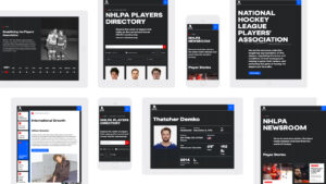
The National Hockey League Players’ Association partnered with Takt to reimagine NHLPA.com as a world-class, player-first digital home—one built to strengthen the connection between fans, players, and the broader hockey community. Rather than producing another league-adjacent website, the vision was to create a platform that celebrates players as people: their stories, their impact, and their voice within the sport.
The redesigned site shifts the lens from the business of hockey to the humans who define it. Immersive visuals, modern storytelling, and a bold design system anchor the experience, turning player journeys, profiles, and personal narratives into the heartbeat of the brand. Legacy content—including Ted Lindsay’s story and historic NHLPA milestones—sits alongside new, interactive features that heighten engagement. These include the CBA Explorer Tool, which transforms dense legal language into a clause-referenced chatbot for fans, players, agents, and media, as well as the Interactive Player Poll, offering real-time insights into player perspectives.
The platform also elevates the NHLPA’s role as a business partner. Expanded case studies and redesigned opportunity pages give sponsors and licensees a clearer path into the ecosystem. Updated player resources, benefits, and services are surfaced with greater clarity, making it easier for members to find what they need, when they need it.
On the technical side, the site is powered by Sanity.io—a flexible, scalable headless CMS that integrates with the NHL’s API for real-time stats and player data. Enhanced editorial tools, a restructured news hub, a curated podcast section, and future-ready e-commerce capabilities round out a resilient digital foundation. The result is fast, accessible, responsive across devices, and built to grow with the PA’s needs.
Launching ahead of the 2025–26 season and the public release of the new CBA, this work sets the stage for a pivotal moment in the sport. It is more than a redesign—it is a player-centric digital ecosystem that blends storytelling, community, and technology while positioning the NHLPA as a leader in how sports organizations champion their athletes.
See the live website here: https://www.nhlpa.com/
See the case study here: https://takt.com/case-study/nhl-players-association/
Client: NHL Players' Association
Industry: Nonprofit
Sector Expertise: Professional & Trade Associations
Location: Toronto, Canada
Services
SEO
UX Design
Video Production
Web Design
Web Development
Technologies: Sanity.io
Completed: Sep 2025

Primasun — A Digital Platform and Campaign Built to Launch a Global Movement for Better Sleep
Primasun — A Digital Platform and Campaign Built to Launch a Global Movement for Better Sleep
Takt

Primasun is a Google-backed precision health company working to reshape how the world understands and manages sleep. In early 2022, with two breakthrough mobile apps nearing launch, the team partnered with Takt to build a digital experience and awareness campaign that could match the scale of their ambition. What began as a website redesign quickly expanded into a broader mandate: spark a new public dialogue about sleep health and position Primasun as a category leader in an emerging field.
Our first task was to elevate Primasun’s visual identity and establish a digital presence capable of educating and engaging two distinct audiences — B2B health partners and everyday consumers. With a new logo in place, we developed a website that captures Primasun’s innovative approach, using clear storytelling, modern design, and intuitive UX to make complex health insights accessible. The effort culminated in a three-time award-winning experience that set a new bar for digital health brands.
Research revealed a gap in the public perception of sleep: most people saw it as a lifestyle preference, not a fundamental pillar of mental and physical health. We built a comprehensive Resource Hub — video content, in-depth articles, and interactive Q&As — to challenge outdated assumptions and reposition sleep as an essential component of holistic wellness.
Technically, the platform is powered by a headless architecture using Contentful and Gatsby, chosen for speed, security, accessibility, and long-term scalability. A modular component library supports ongoing content growth and future product integrations.
As product launch approached, the focus shifted to go-to-market execution. Takt developed an integrated B2C and B2B campaign across Facebook, Instagram, Reddit, and other platforms — designed to dispel sleep myths, build anticipation for Primasun’s “Sleep Movement,” and drive traffic into the Resource Hub. The campaign helped cement Primasun’s role not just as a tech company, but as a leader in a broader cultural movement around sleep health.
The partnership between Primasun and Takt demonstrates how thoughtful strategy, strong creative, and precise digital execution can ignite change. The work didn’t simply launch a website — it helped redefine how people think about the role of sleep in their lives and positioned Primasun to lead a rapidly evolving category.
Client: Primasun
Industry: Healthcare
Sector Expertise: Medical Devices
Location: Los Angeles, USA
Services
B2B Marketing
Branding
Creative
Digital Marketing
Digital Strategy
Email Marketing
Inbound Marketing
Marketing Automation
Online Advertising
PPC
SEO
Social Media Marketing
UX Design
Web Design
Web Development
Technologies: Contentful, Gatsby
Completed: Nov 2023
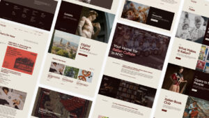
NYU Casa Italiana — A Modern Digital Home for One of America’s Great Cultural Institutions
NYU Casa Italiana — A Modern Digital Home for One of America’s Great Cultural Institutions
Takt

Casa Italiana Zerilli-Marimò has long been the heart of Italian culture at New York University—a hub for events, scholarship, media, and community. But by 2023, its digital presence no longer reflected its influence. Years of accumulated content had created a labyrinth: rich, beloved, but difficult to navigate. The institution needed a digital headquarters worthy of its reputation, capable of inviting a broader audience into the world of Italian culture.
Casa Italiana partnered with Takt to reimagine this experience from the ground up. Our mandate was simple but ambitious: build a modern, intuitive platform that honored the depth of Casa’s cultural archive while making exploration effortless for scholars, students, and enthusiasts alike. We began by restructuring the content ecosystem—creating a clear hierarchy, scalable taxonomy, and flexible architecture able to support the institution’s ongoing growth.
A thorough UX and content research phase set the foundation. Through interviews, workshops, and user testing, we clarified how visitors search, browse, and engage with Casa’s offerings. The result is a restructured experience that surfaces events, media assets, academic resources, and cultural programming with clarity and intention.
Visually, the challenge was twofold: uphold NYU’s iconic brand requirements while giving Casa Italiana a distinct identity rooted in the sophistication of Italian design. Our solution paired NYU’s signature purple with a visual system anchored in Gotham—a typographic choice that nods to the architectural elegance of Italy’s cities while honoring the modernity of NYU. The effect is refined, minimal, and unmistakably connected to its cultural mission.
The site was built on WordPress and optimized for seamless management, accessibility (WCAG compliance), SEO, and performance. The platform supports a growing library of content, faster editorial workflows, and a modern interface that reflects both academic excellence and design craft. The work culminated in major performance gains—including increases across organic traffic, sessions, event engagement, new users, and page views—and earned a 2025 Webby Award for Best Community Website (People’s Voice).
More than a redesign, this project created a digital home that sparks conversation, deepens cultural appreciation, and expands the reach of one of NYU’s most treasured institutions.
View the live website here: https://www.casaitaliananyu.org/
View the case study here: https://takt.com/case-study/nyu-casa-italiana/
Client: New York University
Industry: Education
Sector Expertise: Higher Education
Location: New York, USA
Services
Branding
SEO
UX Design
Video Production
Web Design
Web Development
Technologies: Wordpress
Completed: Sep 2023

CMHA North West Vancouver — A Trauma-Informed Digital Platform Designed for Clarity, Care, and Accessibility
CMHA North West Vancouver — A Trauma-Informed Digital Platform Designed for Clarity, Care, and Accessibility
Takt
CMHA North West Vancouver supports mental health across a vast and varied region: the North Shore, Bowen Island, the Sunshine Coast, and the Sea-to-Sky Corridor. But as their services grew, their website did not. Users struggled with dense navigation, outdated design, and a frustrating mobile experience — a critical issue given that many visitors arrive while in distress, searching for help from their phones. CMHA needed more than a refreshed look; they needed a digital environment built with compassion, calm, and accessibility at its core.
Takt began with a deep research phase, conducting workshops and interviews with staff and community stakeholders to understand the gaps in comprehension, navigation, and emotional experience. We learned that the site’s structure created unnecessary cognitive load: too many navigation choices, too many layers, and no clear pathway to essential care resources. Together, we rebuilt the information architecture from the ground up — simplifying the top-level navigation, surfacing key content within one or two clicks, and guiding users with a sense of steadiness and ease.
The creative direction balanced clarity with empathy. We expanded the organization’s palette into soft gradients and structured colour blocks that bring warmth without overstimulation. Spacious layouts, intuitive visual hierarchy, and trauma-informed interaction patterns ensure that even first-time visitors feel supported — particularly those arriving in a vulnerable state. Every design choice was rooted in inclusion, accessibility, and emotional safety.
The site was built as a fully custom WordPress experience using atomic design principles to ensure scalability and long-term flexibility. Fully compliant with WCAG 2.1 AA, the platform performs seamlessly on mobile — the channel most users depend on. A structured backend with clear templates empowers CMHA staff to update content independently, without technical expertise.
The outcome is more than a functional website. It’s a digital extension of CMHA’s mission: warm, professional, accessible, and deeply human. For the people who turn to CMHA for guidance, the site now offers clarity when they need it most — and for the organization, it provides a strong foundation for growth and future programming. Performance gains reflect the transformation: dramatic increases in organic search, page views, active users, event engagement, and new visitors.
CMHA North West Vancouver now has a digital home that mirrors the care and commitment of the people behind it — a place where those seeking help can find direction, connection, and hope.
Read the full case study here: https://takt.com/case-study/cmha-north-west-vancouver/
Client: Canadian Mental Health Association
Industry: Government
Sector Expertise: Public Health Authorities
Location: Vancouver, Canada
Services
SEO
UX Design
Web Design
Web Development
Technologies: Wordpress
Completed: Mar 2023

Nelson Civic Theatre — A Community-Rooted Rebrand for a Century-Old Cultural Landmark
Nelson Civic Theatre — A Community-Rooted Rebrand for a Century-Old Cultural Landmark
Takt
For more than a century, the Nelson Civic Theatre (NCT) has been one of British Columbia’s most beloved cultural spaces — a gathering place for cinema lovers, local families, artists, and storytellers. It’s where the community comes together not only for film, but for workshops, discussions, and educational programs that spark creativity and connection. After the pandemic, however, NCT faced a critical moment: audience habits had shifted, perceptions had blurred, and the theatre’s brand no longer reflected its role as a cultural anchor. It was time for a renewal grounded in the soul of Nelson itself.
Takt partnered with NCT to lead a full rebrand that honored its legacy while positioning it for the next chapter. We began with immersive discovery — community engagement, stakeholder interviews, environmental studies, and a brand extraction workshop designed to surface the emotional ties that people hold to the theatre. What emerged was a clear picture of NCT’s identity: a catalyst for dialogue, imagination, and shared cultural experience.
A full audit of messaging, content, and visual identity informed a Research Findings Report that became the foundation for the transformation. From this strategic groundwork came a refreshed brand narrative and a new identity system rooted in art-deco influences and the golden age of cinema — an aesthetic that captures both NCT’s heritage and the creative, eclectic spirit of the city.
The redesigned logo, built from overlapping geometric forms and a warm, inclusive palette, symbolizes the convergence of diverse voices and stories. A new messaging framework and the tagline “A home for our imaginations” articulate NCT’s mission to connect people through film and foster a thriving cultural community.
To ensure longevity and consistency, Takt delivered comprehensive Brand and Tone Voice Guides, equipping NCT with the tools to communicate confidently across platforms. The result is a revitalized identity that not only reflects NCT’s renewed vision but reinforces its role as a cultural pillar — a place built by the community, for the community, and sustained by their shared imagination.
Client: Nelson Civic Theatre Society
Industry: Entertainment
Sector Expertise: Museums & Cultural Institutions
Location: Vancouver, Canada
Services
Branding
Completed: Sep 2022

Queen’s Alumni Review — A Digital Reinvention of a Century-Old Publication
Queen’s Alumni Review — A Digital Reinvention of a Century-Old Publication
Takt
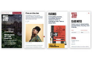
Queen’s University has shaped Canadian and global culture for nearly two centuries, producing world-changing alumni such as Elon Musk, Michael Ondaatje, and countless leaders across disciplines. Its quarterly magazine, the Queen’s Alumni Review, founded in 1927 and read by more than 125,000 people worldwide, is one of the university’s most enduring touchpoints. When Queen’s embarked on a refresh of the print publication, they partnered with Massive to bring the new design to life online — and create a digital experience that matched the institution’s bold, pioneering spirit.
With no advertising to accommodate, our designers were free to prioritize content, elevating the magazine’s voice through clean layouts, rich visuals, and a reading experience that feels premium across devices. Transitioning from print to digital was not a matter of replication, but reinterpretation. The challenge was to preserve the magazine’s editorial integrity while introducing the dynamism that only digital can offer — from immersive imagery to subtle interactivity that gives stories new depth.
A key element of the project was developing a strong technical foundation. The team continued with Drupal on the back end, leveraging its proven strength in managing complex editorial systems. The website’s architecture was built to be modular and future-proof, enabling new sections and content types to be added without sacrificing design consistency. Accessibility, SEO performance, and a frictionless reading experience anchored every decision.
Launched in March 2022, the new Queen’s Alumni Review is far more than a digital adaptation — it’s a redefinition of what university publishing can become. The ezine offers a refined, intuitive platform that honors nearly 100 years of history while embracing the expectations of a global, modern audience. It stands as a testament to Queen’s ongoing commitment to excellence, innovation, and storytelling in the digital age.
Client: Queen's University
Industry: Education
Sector Expertise: Educational Publishers
Location: Toronto, Canada
Services
SEO
UX Design
Web Design
Web Development
Technologies: Drupal
Completed: Mar 2022
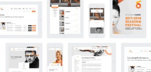
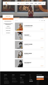
Vancouver Opera Finds Its Voice In A Digital-First World Thanks To Takt
Vancouver Opera Finds Its Voice In A Digital-First World Thanks To Takt
Takt
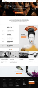

VO has always believed that its love for Opera and, to a stronger extent, the arts community, is the principle around which its entire brand philosophy should pivot. Takt helped VO take place in a digital-first world.
As such, in 2017 VO made the bold move to change its seasonal programming to a four-week Opera Festival, and needed a compelling way to spread the news.
Transformational Stories
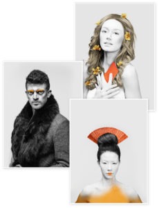
Operas are visceral and emotive; a careful blend of storytelling, melody and explosive vocals that pull you from your world into something entirely new.
Naturally, VO’s 2017/2018 season needed imagery that communicated the power and complexity of these performances. Takt art directed and photographed creative assets for the new season to be used across all digital and physical touch-points.
Each photo hints at the broader story of the opera it represents, enticing the viewer to dive deeper.
Digital-First Design
Through exploration and iteration, Takt established a design system rooted in stories and elegance. Takt’s design was simple, but significant, with bold typography, stunning imagery and plenty of white space, acting as a canvas for the Operas it represents.
Encouraging User Discovery
The intuitive experience Takt crafted is simple, yet comes alive to the tune of an ever-changing, curious Vancouver Opera.
Each season its new, evocative performances take front and centre, enticing opera enthusiasts and inspiring the opera fans of tomorrow.
A custom-built WordPress CMS allows Vancouver Opera to scale and manage content internally without the help of a third party.
Client: Vancouver Opera
Industry: Entertainment
Sector Expertise: Music Venues
Services
Branding
Web Design
Web Development
UX Design

Takt Has A Partnership With ICCLR
Takt Has A Partnership With ICCLR
Takt


ICCLR (International Centre for Criminal Law Reform) co-operated with Takt for redesigning their website. Takt’s services for ICCLR include creative direction, user experience, website design and development.
The International Centre for Criminal Law Reform (ICCLR) is an independent UN-affiliated international research institute based in Vancouver, Canada, that promotes the rule of law, democracy, human rights, and good governance in criminal law and the administration of criminal justice all around the world.
Despite being recognized as a world leader in criminal law reform policy, ICCLR’s online presence failed to capture the power of its collaborative work. Heading into its 2019 AGM, it tasked Takt with the job of re-imagining its web presence and telling its story in a meaningful way.
Clarity & Purpose
The ultimate role of ICCLR is to provide objective research and information that informs policy on criminal law reform and human rights throughout the world.
To communicate this visually, Takt found inspiration in the idea of a jigsaw puzzle; a complete picture that begins to take shape over time. Stunning imagery with tiled gradient overlays communicate this idea of achieving increased clarity.
White space was utilized throughout Takt’s designs to move users through the site’s content, allowing ICCLR’s projects to breathe.
Keeping Policy Makers in the Loop
There are few organizations that can boast the level of experience and expertise ICCLR offers its partners. Its work has been at the forefront of some of the world’s most progressive policies and international initiatives, like the creation of the International Criminal Court.
As such, projects completed even decades ago are still frequently referenced by policymakers across the world, researching solutions to challenges facing their own countries.
To serve them, Takt needed to provide them with a way to quickly and efficiently search through ICCLR’s library of work. The solution is a robust resources library that allows users the ability to search for content in a variety of ways.
The Result
Takt also partnered with Vancouver-based photographer, Chris Nefs, of 9 Yards Photography, to capture new photos of ICCLR Associates, Board and Staff for the new website.
The end result is a stunning digital canvas that clearly and effectively communicates ICCLR’s experience and expertise in a compelling way.
Client: International Centre for Criminal Law Reform
Industry: Law
Sector Expertise: Criminal Law
Services
Web Design
Web Development

Takt Created A 360° Branding Service For Vancouver’s Real Estate Brokerage, Stilhavn
Takt Created A 360° Branding Service For Vancouver’s Real Estate Brokerage, Stilhavn
Takt


Takt launched Vancouver’s newest, most innovative real estate brokerage, Stilhavn.
Takt’s project to Stilhavn included brand naming, visual identity, website design and development, a creative photoshoot, social media engagement, advertising, and a custom-built MLS plugin provides a seamless house-hunting experience.
Stilhavn is a new, exclusive brokerage comprised of the top performing real estate agents in the city. They describe themselves as relationship-driven, results-focused and strategy-led. Stilhavn’s agents are selected based on a strict performance and personality criterion, unlike the most brokerages.
According to these criterions, Takt works on the basis of their codes and created a simple yet powerful brand identity and website design. To follow their strategy, they developed a website that covers the client’s needs and describes them properly in their market. They also offer a blog to get the latest news from Stilhavn and read the newest articles from the real estate market.
One of the other best result-focused thing in the project is their creative photoshoot. With their unique photos and the visual design strenghtens up and we can clearly see the client’s workspace to know more about them. The user experience allows to see more about them with a clear and proper design.
Client: Stilhavn
Industry: Real Estate
Sector Expertise: Brokerages
Services
Branding
Web Design
Web Development

Collaborating with Takt North Vancouver’s Leading Real Estate, Team Clarke Builds On Its Late Founders’ Legacy
Collaborating with Takt North Vancouver’s Leading Real Estate, Team Clarke Builds On Its Late Founders’ Legacy
Takt
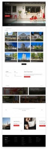

When Team Clarke approached Takt in early 2018, it’s obvious that they need a new branding solution. Despite being North Vancouver’s top selling real estate team year after year, its brand and digital presence were stuck in the past.
It needed a new brand and website overhaul that reflected the evolution of Team Clarke, while building on the reputation and carrying on the legacy its late Founder, Shirley Clarke, had spent her life creating.
The Importance of Legacy
The story behind the project for Team Clarke is, they didn’t have to search very hard to uncover the ‘ethos’ of its Founder, Shirley. Her legacy lives on today through the charity drives, community events and campaigns she facilitated throughout her life.
Beyond her reputation as a stellar REALTOR, she was known as a community builder; a connecter and facilitator; someone who intentionally created events and environments where newcomers and long-standing residents of North Vancouver could connect and form meaningful relationships. For Shirley Clarke, real estate was a chance to help people find a home, but more importantly, a vehicle to foster and create a resilient communities.
This new brand needed to be fresh and versatile, but real success meant capturing Shirley’s heart for community above all and carrying it across every brand touchpoint.
A Picture Says a Thousand Words
North Vancouver attracts home buyers from across the world with its stunning scenery and quality of life. Adding value in creative direction for Team Clarke, capturing the benefits of life in North Vancouver with compelling imagery was non negotiable.
Over a day-long photoshoot, the agency photographed a number of scenes across North Vancouver. Because many of Team Clarke’s customers have families, they kept the photos family-focused, carefully crafting scenes that show meaningful connections occurring against a backdrop of beautiful real estate.
These images were then edited in post, and rolled out across Team Clarke’s new website, social channels and print material.
Prioritizing the User’s Needs
Beauty Meets Utility: The new site features a custom-built map search that integrates with MLS and incorporates convenient features like “search by dragging the map” and toggles between viewing styles. Takt also connected the site to Yelp so users could search nearby restaurants, cafes, parks, and other attractions.
Because Takt knows that people factor a listing’s surroundings into their decision-making process, each listing details page pulls in local attractions. Similarly, on attraction detail pages, listings are displayed below.
Consistency Across Every Touchpoint
The end result looks like a flexible and a comprehensive brand that was implemented across every physical and digital touchpoint in a client’s customer journey. From print collateral like listing brochures, folders and print ads to social media branding and email templates, each interaction with Team Clarke places community at the forefront, with compelling copywriting and community-centric photography.
Testimonial about Takt’s case study, Laura, Rob and Brooke – Team Clarke Real Estate Group all commented,
“Thank you! From start to finish, you guys have been amazing. You have given us a product greater than we had dreamed. We are so proud to stand behind our brand and website.”
“Thank you for being so professional, yet so approachable. We truly enjoyed working with your team every step of the way.”
“We feel so fortunate to have found you. Thank you for all of your hard work – it is truly appreciated.”
Client: Team Clarke
Industry: Real Estate
Sector Expertise: Retail Real Estate
Services
Branding
Web Design
Web Development
MORE