Mastercard Drops Name From The Company’s Iconic Logo
To keep up with the digital world, Mastercard is removing their name from the logo as part of a “reinvention” of the brand.
As a company following the digital updates so well that they even adapt the biometric fingeprint verification, Mastercard evolves their logo once again. The company revealed at the Consumer Electronics Show that it would drop the “Mastercard” name below the red and yellow interlocking circls in “select contexts”, such as at digital and physical retail locations and major sponsorship properties. However, the overlapping circles will add it to a growing list of brands identified by a symbol.
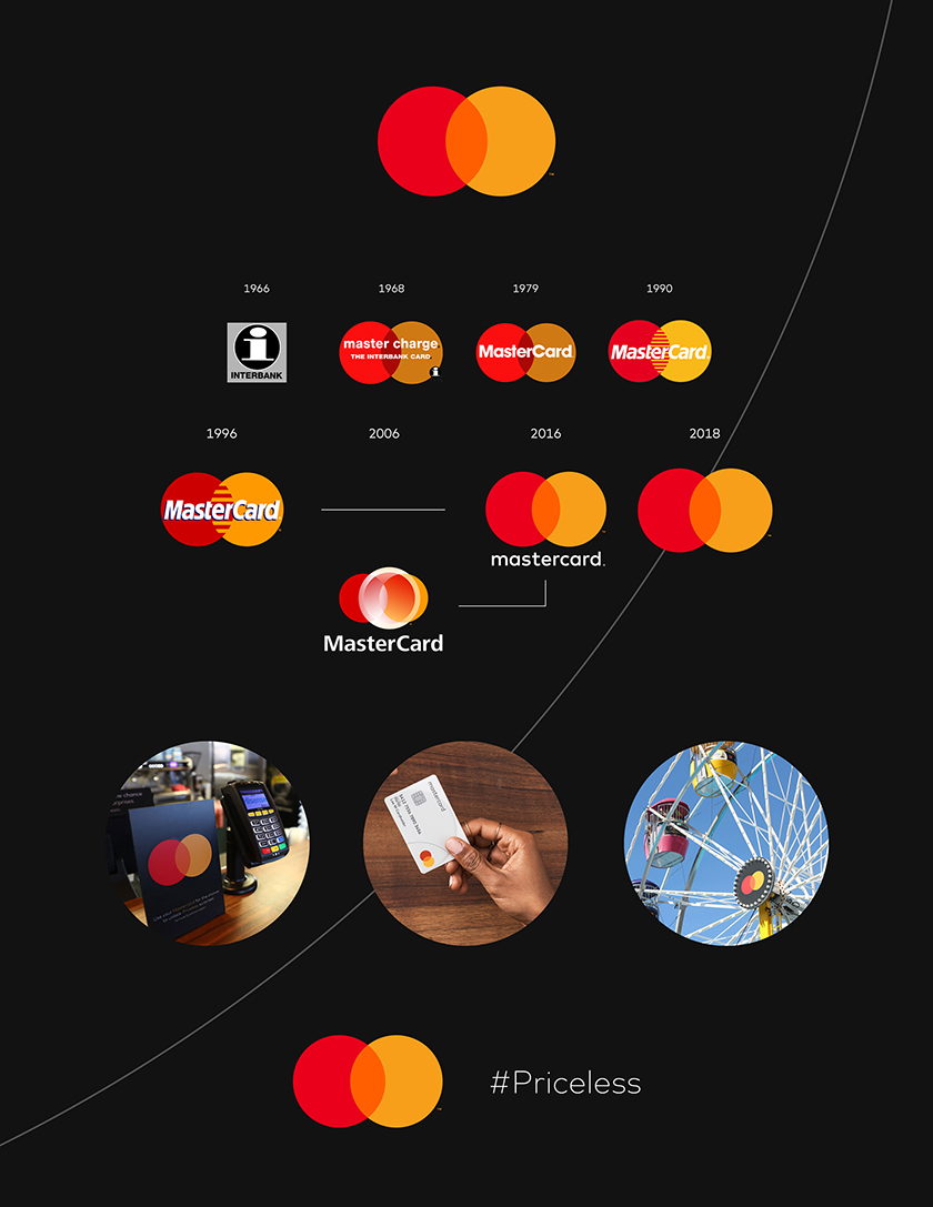
Here’s Mastercard’s complete logo evolution:

Raja Rajamannar, chief marketing and communication officer at Mastercard, said,
With more than 80% of people spontaneously recognising the Mastercard symbol without the word ‘Mastercard’, we felt ready to take this next step in our brand evolution.
Mastercard logo has had 8 iterations since its creation in 1966, with the interlocking circles launching in 1968 and the red and yellow scheme appearing in 1990. The most recent redesigns, including the latest change, have come from design agency Pentagram, starting in 2016.
Partner at Pentagram, Michael Bierut said,
We live in a time where, increasingly, we communicate not through words but through icons and symbols. Mastercard’s two interlocking circles have always represented their commitment to connecting people. Now, that commitment is given greater presence by Mastercard’s status as a symbol brand.
Reinvention, modernization, catching up with the “post-text” era, yields of the digital age… However, don’t you think removing the company’s own name’s a bit too far?


