


How to Use Creative Assets to Convert Users in Apple App Store and Google Play Store
So you’ve got your copy down and you’ve got your app up and running, but what about the visual side of things? Visuals are just as important in acquiring new users, helping lead them to the point of a download.
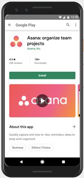
It’s all well and good having your USPs and features in writing, but if users can’t see what they’re looking for in an engaging way then they’re unlikely to be motivated to tap that install button. And nobody wants that. In the app marketing world, screenshots are your best friend.
Everybody knows that screenshots are huge marketing assets. You need to make them compelling, informative, persuasive. Ultimately, make them serve your marketing goals by guiding users in the right direction.
As with most things in the ASO world (that’s App Store Optimization, in case you forgot), you’ve got to break some of the elements down according to the different app stores. That’s because different app stores have different requirements. In this case, we’re going with the two front-runners Google Play and Apple App Store.
1. Screenshots Designs
Layout
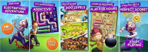
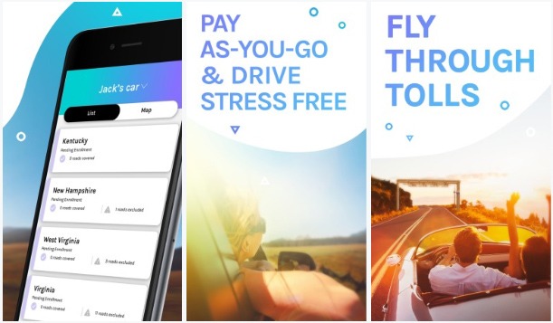
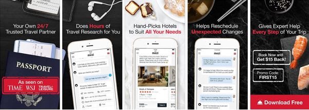
Design your screenshots with exploration in mind. Think fluidity and engagement to avoid abandonment. There are numerous ways to do this, for example cutting the images in the middle so that users have to swipe to see the other half and displaying the device mockups diagonally across screenshots. This encourages users to scroll through whilst offering a unique perspective.
Another creative option we have implemented for our Moburst clients is using landscape orientation, but within this cutting the images to look like portrait designs. This makes it much bolder in the app store. And, what’s more, it looks like fifteen screenshots when it’s really only five with bolder text that appears to be ‘floating’ above the white space. Pretty cool, huh?

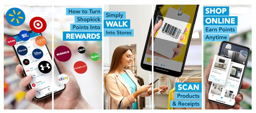
One more element we like to incorporate into our designs is emphasising the UI (User Interface). This gives potential users an insight into what your app looks like and can prove particularly persuasive if they like what they see. It also provides evidence behind the copy. You’ve described the features, but in this way, users can actually see them too.
USPs
Include USPs (Unique Selling Point) in the designs. There should be a different USP in each screenshot to really sell the app’s value. Your unique selling points are how you’re going to both differentiate yourself from your competitors and teach potential users about your product, so it’s essential that you push them wherever you can. Including them in the design is just one more way that your creative assets can lead to conversions.
Also consider ensuring that the most important USPs are frontloaded. On average, only about 30% of users scroll horizontally to explore more screenshots, so you want to highlight the most attractive features in the first 3 screenshots, assuming it’s a portrait design. (For landscape, on both the App Store and Google Play, only the first screenshot will be immediately visible).
By the way, here’s an anecdote: There’s an urban legend that Google does OCR (Optical Character Recognition) for the screenshot text. This is a method of extracting the text from an image. If this is true, it means that the text in your screenshots can act as keywords to help rank your app. You can explore this by checking the indexation of keywords within the images.
CTAs
At the end of the screenshots there should be a Call To Action to encourage users to convert. The CTA should be written clearly using actionable language such as “download”, “install”, “discover”, etc. Call To Actions are powerful tools as they can help to direct your users to take actions. It can directly target your marketing goals. By implementing them at the end of the screenshots you’re letting the users know that if they liked what they saw, that’s the next step they should be taking.
Readability
Make sure fonts are readable. Often, this is the downfall of design (especially in Google Play where the screenshot relative portion on your phone screen is smaller), so make sure to tick this off your checklist.
Readable text contributes to the accessibility of the content. It needs to be easy to process, which is basically impossible if it’s not readable. There has been a shift towards bigger text and less words over the past couple of years as bigger text often lends itself to easier processing.
You should encourage a hierarchy in the screenshots to highlight the most important features of the app. This is where you elevate certain text by making it bigger to draw the viewer’s attention to it. You can also change the color of the text or the text box to achieve the same effect.
The more contrast, the more readable. If you’ve got some yellow text against an orange background (yes, we know, this is an extreme example) then you aren’t going to be seeing the results you’re after – nobody can read that!
You can also use the readability of the text to encourage exploration through the screenshots. By keeping the text consistent and organized you’re guiding users through the screenshots with ease, keeping the fluid feel you should be striving for.
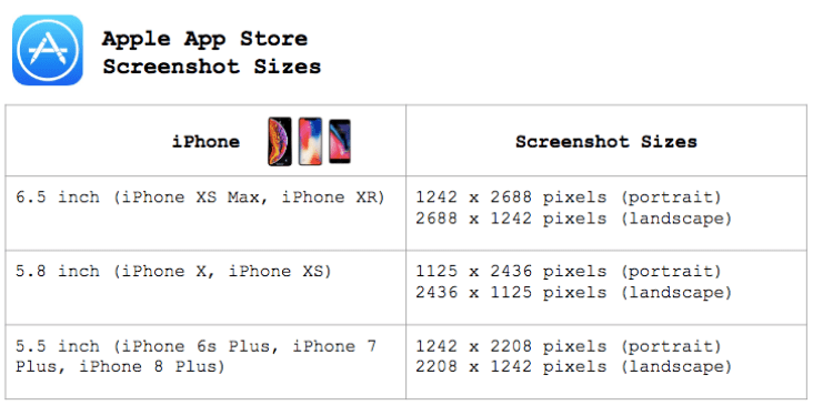
Orientation and Dimensions
We’re going to split this one up between the two app stores, Apple App Store and Google Play, since they differ between the two.
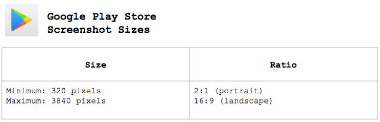
For Google Play, our absolute #1 tip is to play around! The screenshot dimensions and orientation are flexible. They can be portrait, square, landscape, panoramic, etc. The options are BIG and so you can afford to get creative. Ask yourself “what works best for my product?” and test to substantiate it.
For the App Store, the screenshot dimensions are more rigid. There are only two options each for different screen sizes, most commonly the 6.5 or 5.5 inch iPhones. That’s either only portrait or landscape with differing specifications according to the phone size. Of course, they’re bigger for the bigger phone models.
2. Video
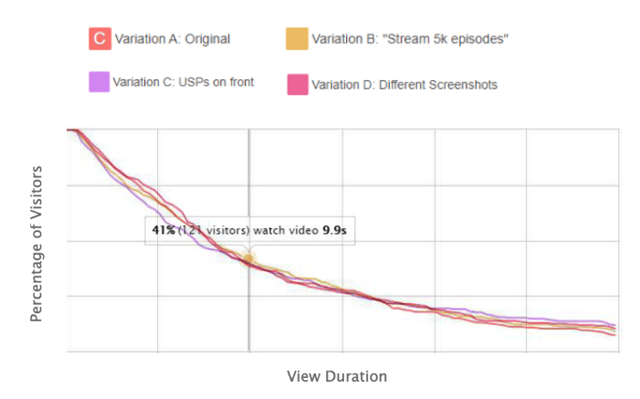
Test the influence (or lack of) of a video to show how many people viewed it, how many people watched the whole thing through, the abandonment rate, etc. If the second half of the video saw more engagement, consider adjusting it to frontload those USPs. After all, most users will drop off a video after the first three seconds.
This means those first three seconds are the most pivotal in leading to conversions. They therefore need to be the most engaging and highlight the most valuable app features/ USPs. Don’t forget to take note of whether the video did or did not add value, not just at what point it saw the most engagement.
Always include a Call To Action at the end of a video to encourage viewers to convert.
3. Test
Again, this part will be split according to the app store since there are different options for each.
The best thing about A/B testing app pages and app store listings (search results) in Google Play is that you can take advantage of their free platform, Google Play Experiments, for your tests. Yes, you read it right – it’s free! Not bad going, if you ask us. Especially when you consider the hefty price of the paid solutions for iOS.
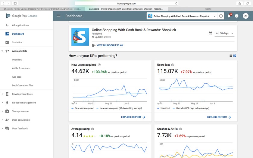
However, being free, Google Play Experiments is a much weaker option with far fewer insights to be offered. This can sometimes prove limiting.
The industry leaders in paid solutions for apps A/B testing are Splitmetrics and Storemaven, the latter being the more expensive of the two. Both provide an enormous array of insights ranging from engagement breakdowns, video view rates, audience segmentation, advanced statistical tools to help converge tests quicker and more. We say it’s worth it, but that really depends on your budget because the cost of setting up a test on one of those platforms is usually negligible compared to the media budget you’ll need to drive traffic to the test.
For both, you test the visual assets (in addition to the textual ones) from the existing (currently active) concept against one or two new concepts that mobile agencies like Moburst can provide. We advise that you only test ONE element at a time, only one change per variant, so that you can more precisely conclude what impacted the results.
4. Strategize
Whether or not you personally think something looks the best is irrelevant. The only thing that matters is actual evidence, and A/B tests provide this evidence. It can then form the core of your creative strategy going forward. You always strategize for future tests based on the results from previous tests.
Your key takeaways should be:
- Portrait screenshots are generally more common than landscape in iOS, but you must test to make sure that this is true for your app.
- In Google Play you can easily test winning screenshot variations, with little to no granular insights.
- To test in iOS, you need to prepare a hefty budget for setting up tests on SplitMetrics or StoreMaven and buying media to drive traffic to the test pages.
- Google Play screenshots are flexible in dimensions. It’s therefore crucial to test what works best for your app. Square or portrait have the advantage of offering more readable text due to the vertical portion that screenshots take on Google Play (which is smaller than iOS).
- Don’t just assume that design concepts that work for iOS will always work for Google Play, and vice versa. If possible, it’s advisable to test separately on each platform.