Digital Agency Website Templates That Convert: 9 Creative Examples & Tips
When it comes to digital agency website design, knowing where your visitors focus and what attracts them in the best possible way makes a difference.
You should strategically place website elements that drive engagement and conversions, as every detail, from layout to visuals, plays a role in shaping the user experience, eventually impacting the ease you’ll have when getting digital marketing clients.
In this blog post, we’ll analyze 9 real-world examples of agency website designs and provide you with the best digital agency website templates.
But before all, we believe that you must know the tips and tricks of web design given by dedicated researchers.
4 Research-Based Keys to Impactful Website Design
- Capture Attention: Users focus on high-impact areas like bold headlines. Websites with large, engaging elements like images capture more attention and drive better engagement (Zurawicki, 2010).
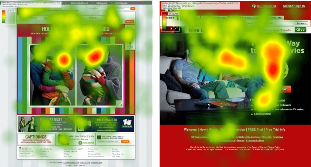
- Responsive and Dynamic Design: Eye-tracking studies confirm that users tend to follow predictable paths on a webpage, focusing on areas like the top-left or top-right corners where navigation menus or key information are typically located (Djamasbi et al., 2008).
For instance, Onet’s heat map revealed significant user attention in the upper right corner, while BBC’s heat map highlighted the top of the page, emphasizing the importance of strategic placement of key elements. (Weichbroth et al., 2024).
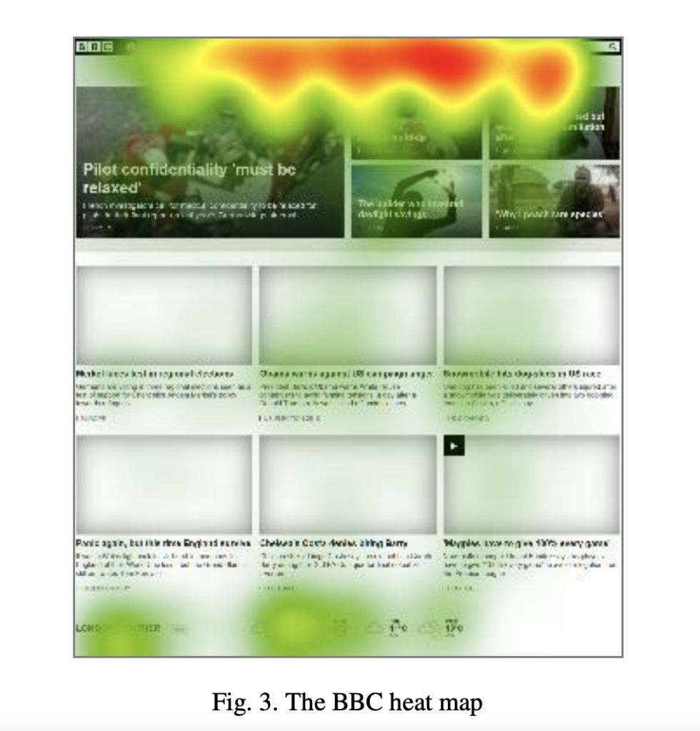
Also, areas with high visual impact, such as the upper right corners of the page or prominent images, often attract more focus. Leveraging these insights, designers should strategically place important information and calls to action in these high-attention zones to enhance user engagement and ensure critical elements are easily accessible (Weichbroth et al., 2024).
- Think About Your Target Audience: Gen Z shows a stronger preference for visuals over text, unlike Gen Y, who tends to engage more with written content. To effectively reach Gen Z, websites should prioritize high-quality images to maintain their attention (Issa & Issaias, 2016).
- Content Layout Affects Engagement: Layouts with diverse content characteristics—such as varying sizes, colors, and shapes—affect how much attention users give to each element.

A well-balanced design that avoids overwhelming the user with too many focal points can significantly enhance the overall user experience (Janiszewski, 1998).
Click & Navigate
- ▶ Marketing Agency Website Template Examples
- ▶ Web Design Agency Template Examples
- ▶ Creative Agency Website Template Examples
- ▶ Sleek Social Media Agency Website Template
Where to Find the Best Digital Agency Website Templates
There are several platforms that offer a variety of templates for your digital marketing agency website to suit different styles and needs.
Let’s analyze four of them with their pros and cons.
Envato
Envato offers a wide selection of customizable digital agency website templates for marketing and web design agencies. You can also find valuable assets like icons and photos, making Envato a convenient all-in-one resource for creating professional websites.
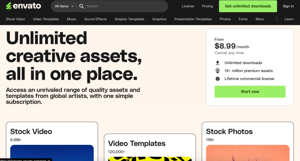
Pros and Cons of Envato
Pros:
- Extensive collection of templates for digital, marketing, and website design agencies
- Fully customizable templates that can suit various industries
- Additional assets like icons and photos to enhance website design
- Access to a wide range of creative resources through the Envato network
- Templates cater to both creative and functional design needs.
Cons:
- Some templates may require advanced customization skills.
- Premium pricing with no free options
- Quality and support can vary depending on the template creator.
- License limitations may apply, especially for multiple uses.
- Additional costs for design assets or advanced features
ThemeForest
ThemeForest, part of the Envato brand, is a well-known platform for purchasing website templates. It offers you a wide variety of options for agencies, from creative to minimalistic designs.
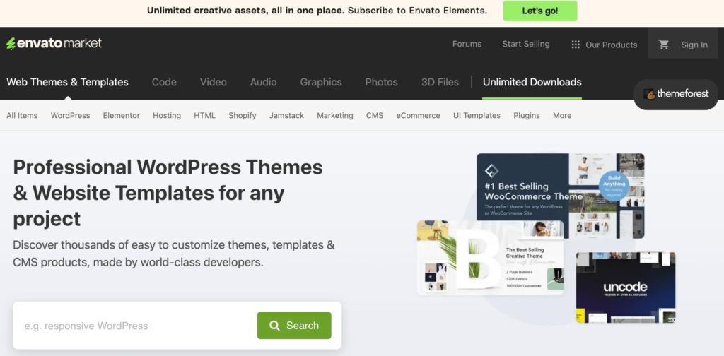
Pros and Cons of ThemeForest
Pros:
- Extensive range of templates, including creative and minimalistic styles
- Templates are available for businesses of all sizes.
- Both premium and affordable options are available.
- High-quality designs with a focus on aesthetics and functionality
- Part of the Envato network, offering access to additional resources
Cons:
- Templates can be complex to customize for users without coding knowledge.
- No free options are available; only premium templates
- Support for customization varies depending on the template author.
- Advanced features may require third-party plugins.
- Quality can vary between template designers, requiring careful selection.
Wix
If you’re looking for a marketing agency website template that’s easy to customize without coding, Wix offers an array of stylish options. You can create professional-looking agency websites with ease.
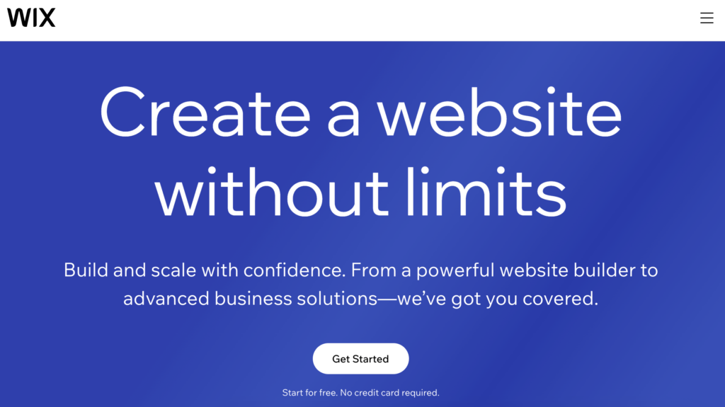
Pros and Cons of Wix
Pros:
- Enables easy website design with a user-friendly drag-and-drop interface
- Enhances site visibility with built-in SEO tools
- Streamlines design and content creation through AI integration
- Supports e-commerce with tools available across most plans
- Offers a wide variety of design templates for diverse aesthetics
Cons:
- The free version is restrictive, encouraging upgrades to paid plans.
- SEO capabilities may be insufficient for advanced optimization needs.
- Challenges in transferring websites to other platforms
- Potential for slow performance with more complex websites
- E-commerce features are basic compared to specialized platforms like Shopify.
TemplateMonster
This platform specializes in offering a broad selection of premium web design templates tailored to different industries, including digital and advertising agencies. With easy filtering options by industry and style, TemplateMonster helps you find a template that aligns with your brand’s vision.
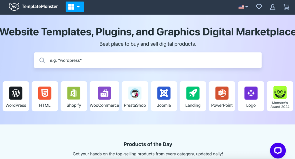
Pros and Cons of TemplateMonster
Pros:
- Large collection of templates for a variety of industries
- Easy search filters to match specific brand needs
- Built-in SEO tools to enhance website performance
- Diverse pricing options for both premium and budget-friendly templates
- Continuous updates and reliable customer support
Cons:
- No free options, only premium templates are available.
- Advanced customization may require coding skills.
- SEO tools can be basic, and lacking advanced functionalities.
- High-end templates can be more expensive compared to competitors.
- Limited assistance for fully custom designs without external help
9 Digital Agency Templates You Should Learn From
From retro-inspired designs to sleek, modern ones, these 9 examples will show you how agencies can show off their creativity while still looking professional.
While analyzing these agency websites, some designs were praised for features like clear call-to-action buttons and responsive layouts, though a few were noted for feeling a bit busy or less intuitive to navigate.
Ready?
Marketing Agency Website Template Examples
1.Lounge Lizard
Founded in 1998, Lounge Lizard is an award-winning digital marketing agency; their website design strikes a perfect balance between retro flair and modern web practices, making it visually captivating on their digital marketing agency website.
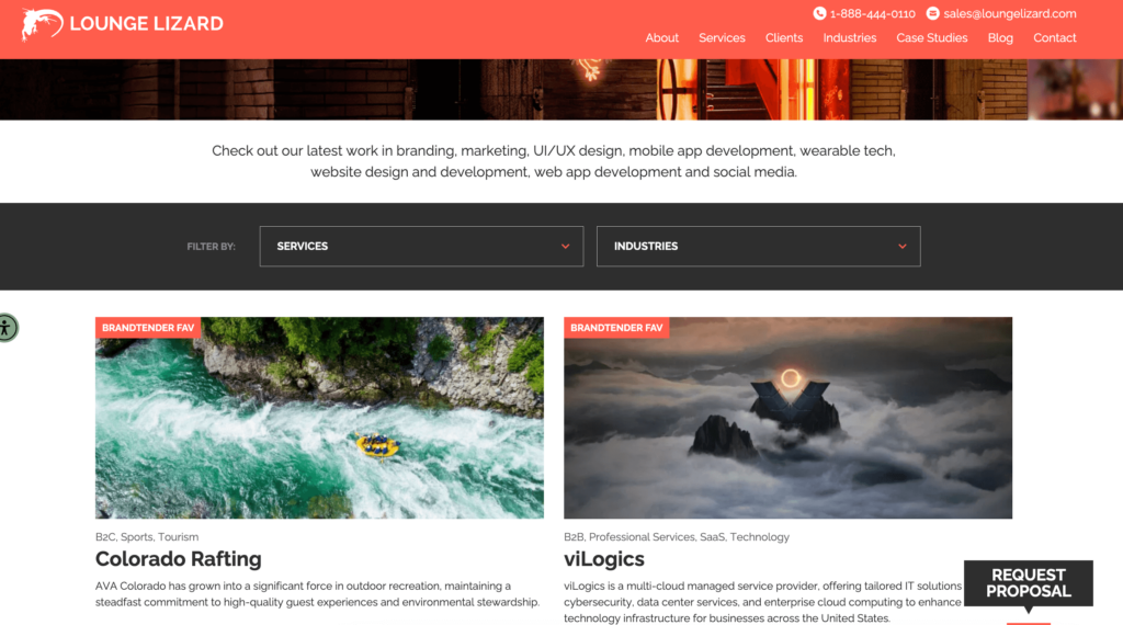
- Layout: The top-right corner contains both contact info and the menu, which can feel overwhelming, adding to the complexity of the design.

- User Experience: While the dynamic effects engage users, the overall design feels visually intense, which may affect usability.
- Branding: Consistent use of red, black, and white throughout the site supports strong brand continuity.
- Functionality: A well-placed testimonial section is helpful, and having the blog in the main menu enhances accessibility and authority
2.Mobikasa
Since 2010, Mobikasa has been distinguishing itself as a globally recognized full-service agency committed to growth, maintenance, and innovation in digital solutions, especially in the eCommerce field.

- Layout: Mobikasa’s website sports a structured and clear layout with distinctive sections for services and solutions, ensuring easy navigation.
- User Experience: The site responds fluidly across all devices, providing swift and easy access to information with minimal wait times.
- Branding: The branding is meticulously consistent and sleek, reflecting their dedication to delivering full-spectrum eCommerce solutions.
- Functionality: Strategic CTAs and a comprehensive display of their portfolio underline their deep expertise in eCommerce, app development, and digital marketing.
3.Aumcore
Based in New York, Aumcore is one of the top marketing companies, and their website design can be seen as a testament to their expertise with its well-thought-out aspects.
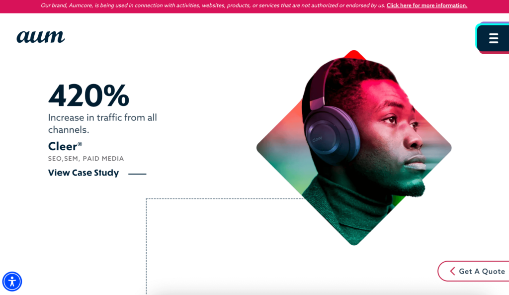
- Layout: The layout is uncluttered and strategically designed to guide visitors through services and information effortlessly.
- User Experience: The site adjusts smoothly across various screen sizes, ensuring that navigation is hassle-free no matter the device used.
- Branding: Aumcore’s professional and modern aesthetic aligns well with its innovative approach, effectively communicating their expertise in digital marketing.
- Functionality: Intuitive call-to-action buttons and well-organized service sections make it easy for visitors to understand the range of services offered and how to engage with them.
Web Design Agency Template Examples
4.Burst Digital
Burst Digital, with offices in London, New York, and San Francisco, showcases its prowess in digital branding and marketing through its vibrant website. Here’s what their website offers:
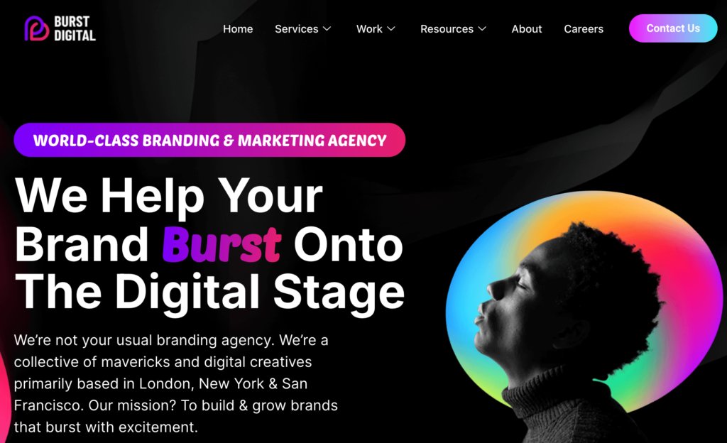
- Layout: The site features a dynamic and modern design that highlights their services and expertise.
- User Experience: It ensures a fluid experience across all devices with efficient navigation and quick load times.
- Branding: Burst Digital’s bold and colorful branding reflects their energetic approach to digital solutions.
- Functionality: The website includes interactive elements and comprehensive details about their services, enhancing user engagement.
Creative Agency Website Template Examples
5.Major Tom
Major Tom knows the trick of the creative scene, and their website perfectly demonstrates their unique blend of creativity and strategy.
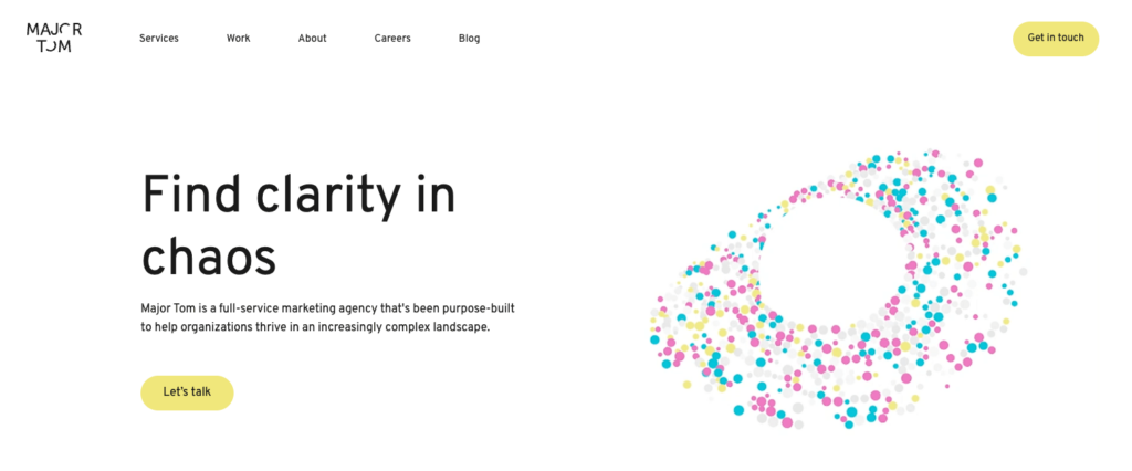
- Layout: The site is clean with a white background, accented by colorful images that draw attention. Clear sections, including “What Makes Major Tom Major Tom,” ensure seamless navigation.
- User Experience: Smooth and responsive across devices, with case studies featured both on the homepage and in a dedicated “Works” section.
- Branding: Bright visuals and a consistent color scheme reinforce their professional yet bold brand identity.
- Functionality: Starting with the phrase “Making client’s brands shine brighter since 2000,” the clickable case studies are easy to navigate, with each image leading to in-depth project insights.
6.Mimosa
Based in Berlin, Mimosa focuses on design. Their website is a showcase of their creative approach. Here’s what makes their site stand out:
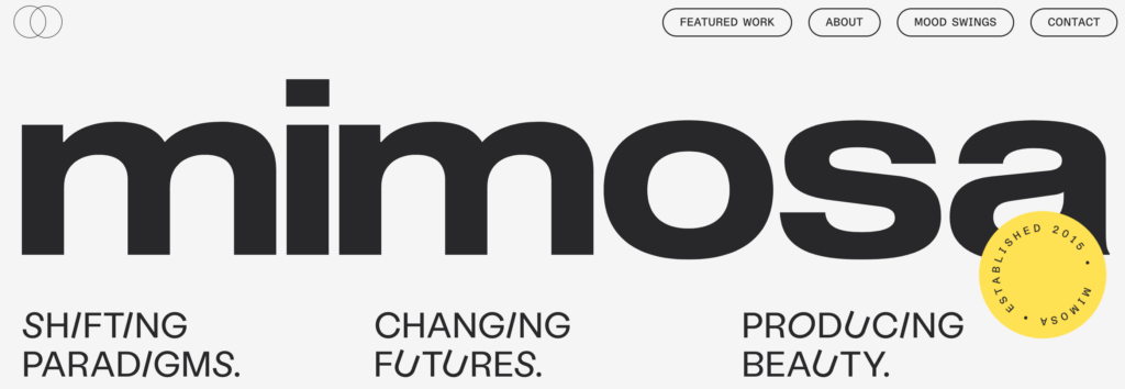
- Layout: The clean and modern layout, accented with black frames and bold colors like gray, yellow, black, and white, enhances navigation. The top-right menu is easy to use, providing a structured, professional feel.
- User Experience: Smooth across devices, but the case studies can be harder to find due to the lack of filters.
- Branding: Eye-catching typography, with some italicized letters, adds a creative flair. The minimalist yet bold design captures the essence of Berlin.
- Functionality: Creative banner strips deliver information in a dynamic way, adding to the site’s originality.
7.Together
Together ensures that from brand design to website development, their all projects resonate with the client’s core identity. Their website offers a nuanced and interactive experience that reflects their expertise in serving B2B tech brands.
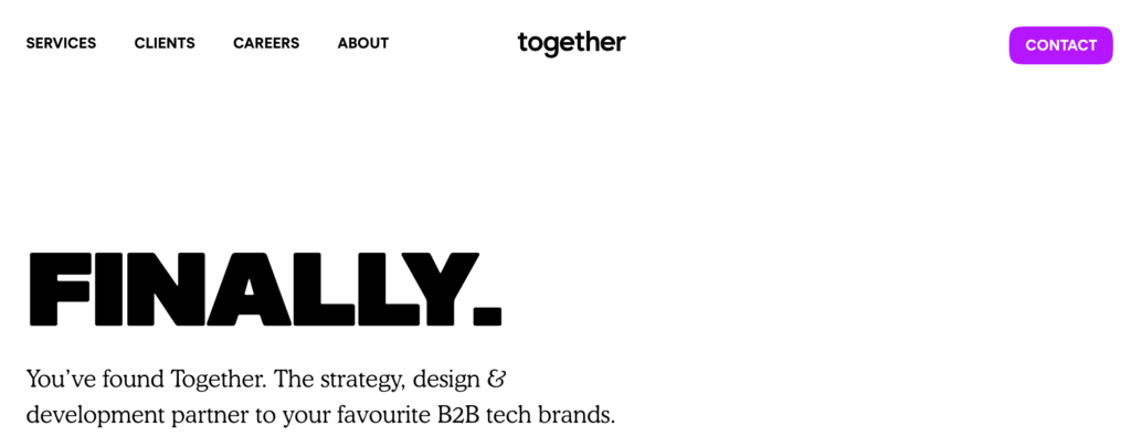
- Layout: The use of large, single-word headings in bold typography instantly captures attention and encourages users to continue exploring the content.
- User Experience: The user journey is enhanced by smooth scrolling and subtle animations that activate as you navigate, providing a fluid and engaging experience.
- Branding: The use of a monochrome palette with pops of color for emphasis aligns well with their professional but modern brand identity.
- Functionality: Interactive elements, like hover effects and video testimonials, are strategically placed to provide insights without overwhelming the visitor.
Social Media Agency Website Template Examples
8.Ceek
Ceek, established in 2016, reflects both professionalism and user-centered design in their website with great use of black and white contrast.
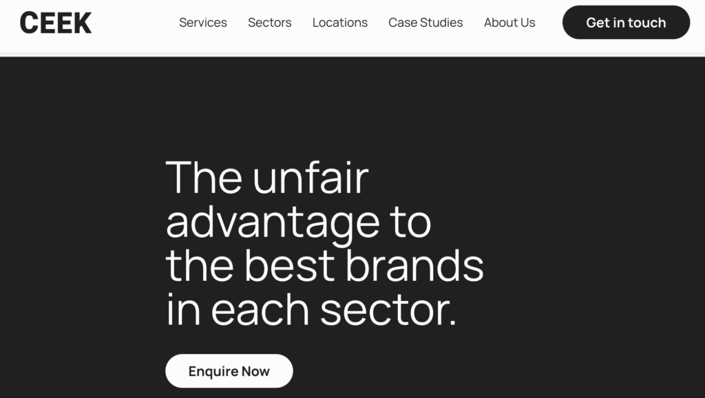
- Layout: The homepage is clean and uncluttered, with a simple, highly visible menu in the top right corner for easy navigation.
- User Experience: The large, readable fonts ensure ease of use, and the clear CTA, located in the top right and can be seen in the image above, is strategically placed. Additionally, the use of black-and-white contrast makes it easier for users to read and perceive the text.
- Branding: Dynamic elements like a scrolling list of past clients add movement and highlight key credentials.
- Functionality: Case studies are featured on both the homepage and a dedicated page with filtering options, enhancing usability. Contact details and office addresses are easy to find.
9.Propeller
Propeller’s website has a more classic feel, with a slideshow-style introduction where example projects scroll from left to right. This design adds movement but can be a bit visually busy at first glance.
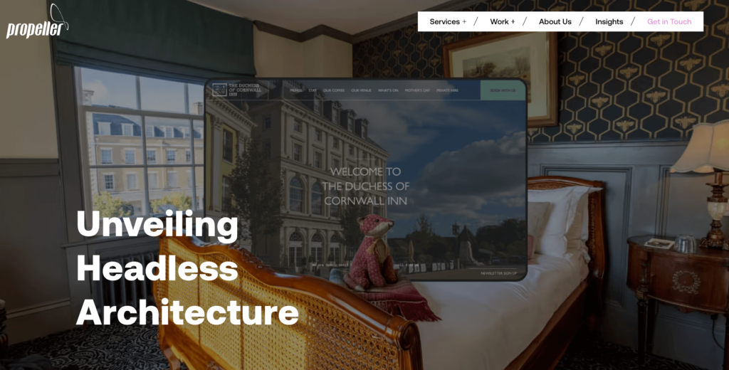
- Layout: The homepage initially feels dynamic but becomes clearer with more white space as you scroll, revealing past work and partnerships.
- User Experience: While the top-right menu is a bit small, the CTA is well-placed and stands out with a purple highlight.
- Branding: Propeller’s branding is subtle yet consistent. The overall look maintains a professional feel that aligns with their experience of over 20 years.
- Functionality: Scrolling brings clarity, balancing the initial busy elements with a more organized, user-friendly experience.
Wrapping Up
So, now you all know what it takes to build a killer digital agency website.
But before saying goodbye, we want to ensure that you don’t miss the must-haves:
- Bold headlines and visuals for maximum impact
- Responsive layouts for a seamless experience
- Key information is placed strategically for easy access
- A clean, balanced design that keeps users engaged
- Tailored content to resonate with your target audience
- Integrate SEO to boost search rankings
With these in place, your website will work hard for you!

