Top Digital Agency Logo Ideas for Designers
Treated as an afterthought but is a priority, you call it logo and we call it “Your Brand’s Identity.” Every day, you come across thousands of logos, but how many do you remember?
If the logos don’t have the wow factor or they are too cluttered, they can’t be remembered by your neurons.
There are three responses to a piece of design – yes, no, and WOW! Wow is the one to aim for.
-Milton Glaser
The purpose of a great logo design is to instill a feeling of immense creativity, imagination, and wit. All these factors come together to provide a sense of brilliance. They are helping companies etch their brand names well into the minds of their users, ultimately making them memorable.
Do you know that brands have witnessed an 80% increase in brand recognition with a colored logo design?
However, coming up with a creative and brilliant logo design is far from simple. There is a lot of research and time that needs to be put in, and hundreds of drafts need to be made. Moreover, it is also important to understand that while a logo carries a lot of weight in terms of attracting the right users, it is also true that in the coming years, both logo design and branding will experience a massive shift in trend.
Why?
Well, that is simple.
Ever since mobile browsing topped desktop searches back in 2016, the world of digital marketing has experienced a 360-degree turn. Today, companies prioritize making things look gorgeous and infinitely creative on smaller screens, instantly captivating users.
Designers are now in a constant pursuit to implement streamlined logo design trends, magnificently aligning everything to fit the current digital landscape. These designers take full advantage of numerous technological innovations in the digital stratosphere, propelling themselves well into the future.
Why Are Agency Logos Critical for Success?
Agency logos are the silent ambassadors of your brand. They are the first touchpoint, the visual hook that can engage potential clients in the bustling digital arena.
Think about a logo as the face of your digital marketing agency: It’s what people remember, share, and relate to. (This is why, having a distinct and memorable logo is crucial.)
Effective digital marketing agency logo ideas should communicate your brand’s innovative spirit and core values at a glance, making a strong case for why you stand out from the crowd. Moreover, a powerful logo is the linchpin in your marketing efforts, seamlessly integrating with all your digital assets and promotions to create a cohesive and compelling brand narrative. This visual consistency across platforms magnifies your brand’s voice and aids in crafting a reliable and recognizable presence in the digital world.
How to Design a Digital Marketing Agency Logo
When it comes to designing a logo for a digital marketing agency, think bold, think unique, but above all, think smart. The process should start with a clear understanding of what your brand stands for and the impression you want to leave in your audience’s mind. It’s about blending simplicity with creativity to create a logo that not only stands out but sticks in the memory.
A great digital marketing agency logo acts as a cornerstone of your brand’s identity, so it’s crucial to use colors, fonts, and symbols that reflect your agency’s personality and ethos. Also, keep in mind that a well-designed logo is a way to speak to the heart of your audience without saying a word—it’s your brand’s silent yet incredibly loud ambassador to the world.
When designing, you should also consider the functionality of your logo across various media. A great logo must be versatile, which means to be equally effective on a website header, a mobile app, or a promotional t-shirt.
Inspiring Digital Agency Logo Ideas for Designers
Now, you know that your logo will make a great difference in how your customers know and remember your brand. So if you need to get inspired before starting to design a logo for your business, and see how effective a good logo design can be, you should take a look at these creative logos of these remarkable digital marketing agencies!
Favoured
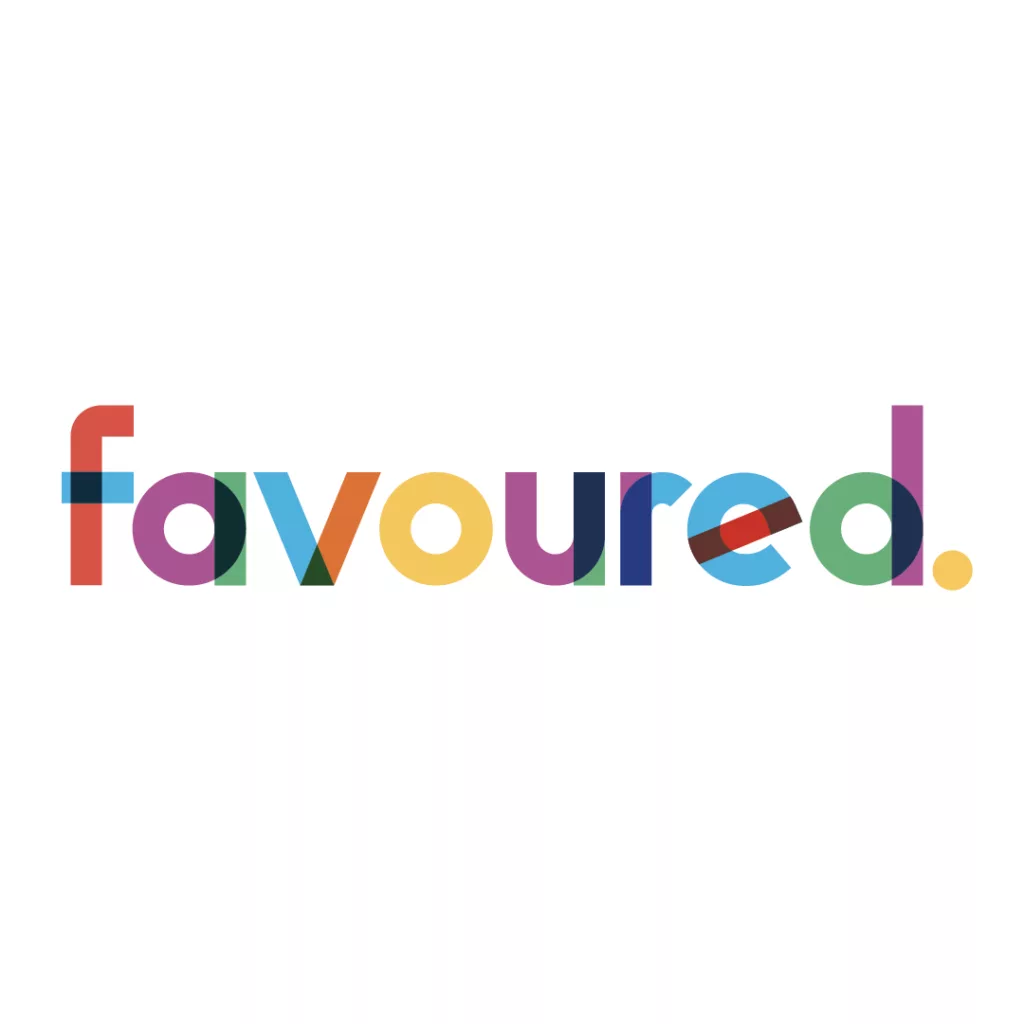
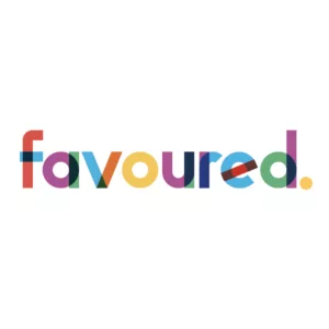
Favoured’s logo immediately catches the eye with its vibrant use of colors, with each letter painted in a different hue. This colorful design helps the logo stand out while reflecting Favoured’s dynamic and creative approach to marketing. The colors within each letter blend where they meet, creating new tones and adding depth, which can be understood as a reflection of Favoured’s ability to work on diverse projects and marketing ideas.
Crowd
Crowd is a creative agency, and it is easy to see why they can truly help businesses create excellent logos. The Crowd logo design is simple and pristine – right to the point. It goes to show that you don’t have to wrack your brain trying to come up with a decent logo – try being simple at first, and it will fall in place.
Major Tom
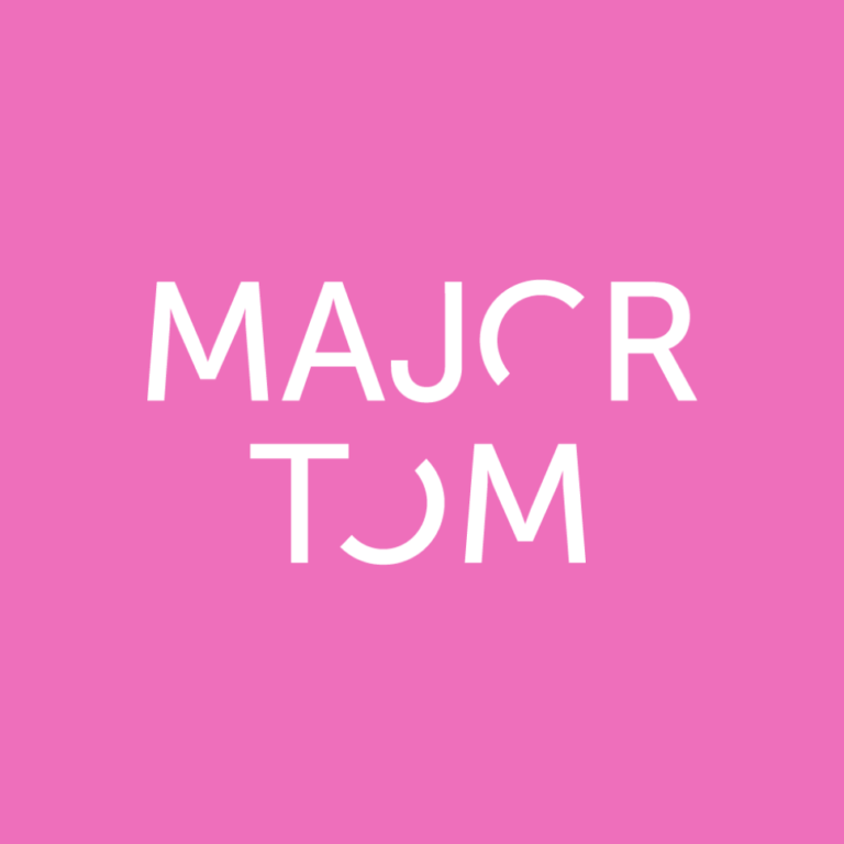
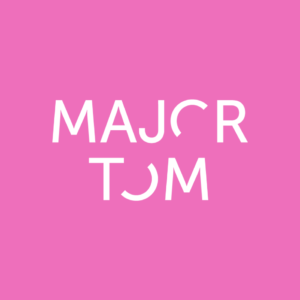
Major Tom’s logo brilliantly encapsulates their motto, “Find clarity in chaos.” This digital agency logo features incomplete “O”s, creating a visual representation of “chaos”. Yet, the overall clarity of the typeface ensures that the logo remains crisp and easy to read, mirroring the agency’s skill in navigating the complex world of digital marketing with precision and simplicity.
Mimosa Agency

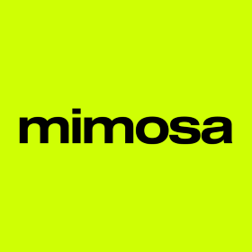
Mimosa calls itself the digital matchmaker. They are the providers of marketing solutions and web design services. Their logo is pretty simple and that’s the real beauty. Using nothing but a creative font to form the name of the company, it is also indicative of the company’s constant effort to provide digital solutions with ease.
Bellman Brand Agency

Bellman’s logo is a truly sophisticated and chic example because of its font and gold color. It is clear that this logo has a romantic state of mind and conveys a strong brand feeling. Bellman is a successful branding agency based in Melbourne, Australia, providing all sorts of branding services for its customers.
Bleech
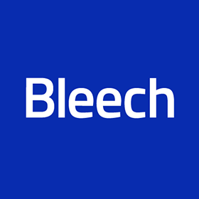
We love the power of blue! Bleech’s logo design is one of our favorites as it has a simple yet characteristic look. We love the way the team presents themselves, combining the colors as well as the font.
Search&Gather

Search and Gather is a digital agency based in Canada. Their logo design is another example of minimalism combined with the creative use of geometry. One look at their logo and you will start imagining how true they are at what they do: adding value to your brand.
The Charles
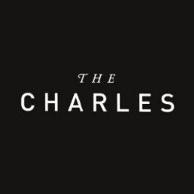
The logo for The Charles uses a clean and elegant typeface that reflects the agency’s sophisticated approach to digital creativity and strategy. Its minimalist design is both modern and versatile, which gives a hint about The Charles’ focus on design, media, and technology. Also, the logo’s simplicity allows it to be easily recognizable and effective across various media.
Baunfire

Baunfire’s logo is characterized by sharp, clean lines and bold, uppercase typography, showing that they value clarity and precision. The logo reflects the agency’s focus on high-end digital solutions and cutting-edge design. The rising effect of the logo design tells potential clients that the agency is always achieving the best results and locating themselves and their clients at the top.
Damteq
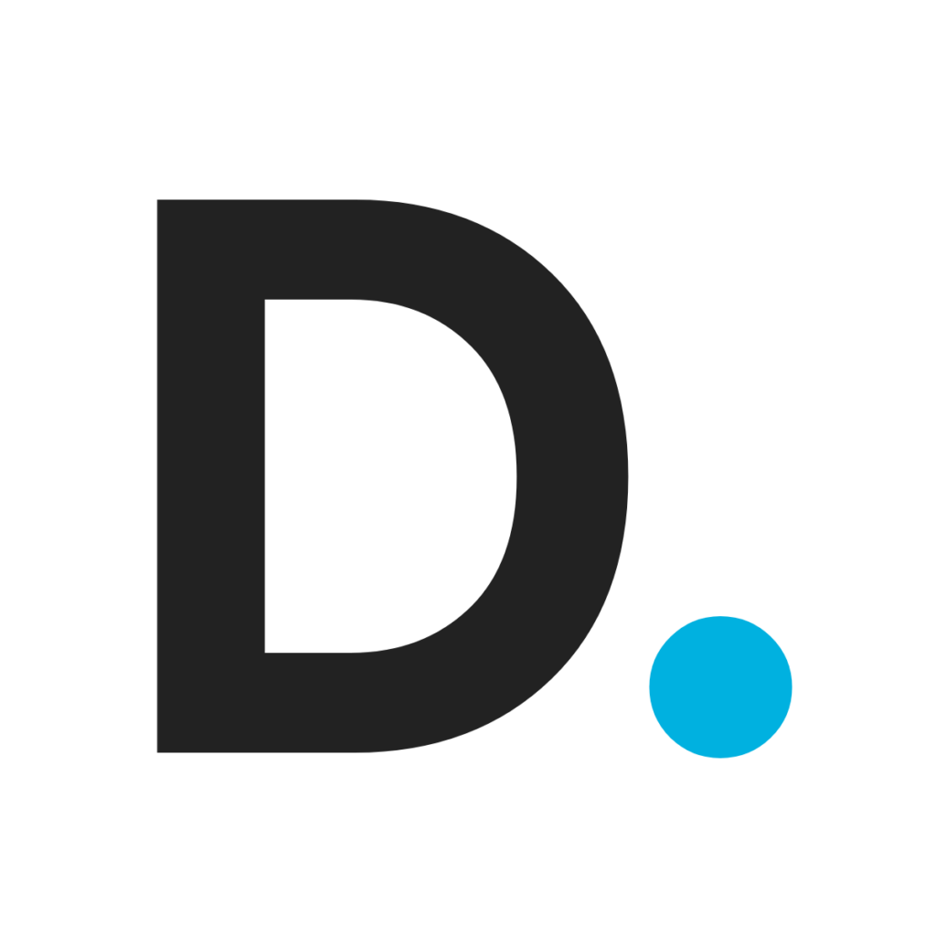
Damteq’s logo features clean, straightforward typography that reflects the agency’s no-nonsense approach to digital marketing. The logo’s sans-serif font is easy to read and professional, making the brand approachable and dependable. Also, the simplicity of the logo ensures that it works well on any platform, helping the brand maintain a consistent identity wherever it appears.
Straight North

Straight North’s logo, with its stylized compass pointing north, captures the essence of their approach: straightforward, focused, and aimed at growth. It’s smart and professional, yet simple enough to be instantly recognizable. This clever use of the compass not only ties back to their name but also symbolizes their commitment to guiding clients towards better digital marketing outcomes. The digital agency logo design is clean and friendly, suggesting that while they’re serious about business, they’re also approachable and ready to help your brand climb higher.
Impression

Impression’s logo is visually striking, composed of a colorful cubic form that reflects the agency’s dynamic and innovative approach to digital marketing. The use of vibrant colors in the cube symbolizes their creativity and energy, portraying a blend of analytical precision and innovative thinking. This geometric design not only signifies their structured, strategic methodologies but also highlights their commitment to bringing fresh, impactful ideas to digital campaigns.
So there you go—some of the best digital marketing companies that you can take inspiration from when developing and designing your logo. We also listed the inspirational digital marketing agency taglines.
Of course, it is a delicate task to design the perfect logo to tell the story of your brand or give the correct vibe, but with these examples, you will quickly see how you can transform the logo ideas and drafts you have generated into real, exceptional logo designs.


