


Optimising Website Performance For Mobile Users
In today’s mobile-first world, it’s no longer a luxury but a necessity for website developers to ensure their creations are optimised for mobile users. With over half of all internet traffic now coming from mobile devices, websites that fail to provide a seamless and engaging mobile experience risk losing a significant portion of their potential audience.
For website developers, optimising for mobile is not just about making sure your website looks good on smaller screens. It’s about understanding the unique needs and behaviours of mobile users and crafting an experience that is tailored to their preferences.
Why Mobile Optimisation Matters
Mobile responsiveness is essential for various reasons:
Improved user experience
A well-optimised mobile website prioritises a seamless and enjoyable user experience for mobile users. This translates into fast loading times, intuitive navigation, and a user-friendly interface designed for touchscreens. A positive mobile experience fosters user engagement, satisfaction, and loyalty, ultimately driving repeat visits and positive brand perception.
Enhanced SEO
Search engines like Google and Bing recognise mobile-friendliness as a critical ranking factor. By optimising your website for mobile devices, you enhance its search engine visibility, increasing the likelihood of appearing in search results when users access the internet from their smartphones or tablets. This boost in visibility leads to more organic traffic, attracting potential customers who are actively seeking information or products related to your website’s offerings.
Boosted conversions
A responsive and user-friendly mobile website paves the way for increased conversion rates. Whether it’s completing an online purchase, signing up for a newsletter, or submitting a lead form, a well-optimised mobile experience facilitates the conversion process. By removing friction and streamlining the user journey, mobile optimisation directly contributes to a website’s ability to achieve its business goals.
Customer retention and brand loyalty
A consistent and positive user experience across all devices, including mobile devices, fosters customer retention and brand loyalty. When users know they can rely on your website to provide a seamless and enjoyable experience, regardless of their device, they are more likely to return and become loyal customers. This translates into long-term business growth and sustainable success.
Key Factors for Mobile Website Optimisation
To ensure your website performs optimally on mobile devices, website developers should focus on the following key factors:
Responsive design: Your website should adapt seamlessly to various screen sizes and devices, from smartphones to tablets.
Page loading speed: Optimise website elements, such as images and code, to minimise loading times and ensure a fast and responsive experience.
User-friendly navigation: Implement simple and intuitive navigation that is easy to use on touchscreens.
Mobile-optimised content: Tailor content presentation and formatting for mobile screens, considering font sizes, readability, and touch-friendly elements.
Accessibility: Implement accessibility features to make your website usable for people with disabilities.
Mobile-specific testing: Employ emulators and testing resources, and conduct real-device testing to guarantee peak performance on a range of mobile devices.
Strategies for Enhancing Mobile Website Performance
In addition to the key factors mentioned above, website developers can employ various strategies to further enhance mobile website performance:
Image optimisation: Reduce image file sizes without compromising quality using image compression techniques.
Code optimisation: Minify code, utilise caching and optimise CSS and JavaScript delivery to improve loading times.
Content Delivery Networks (CDNs): Leverage CDNs to deliver content efficiently across geographical regions, reducing latency and improving page load times.
Progressive Web Apps (PWAs): Implement PWAs to provide app-like experiences on mobile devices, including offline access, push notifications, and home screen installation.
Third-party integration: Incorporate performance monitoring solutions and analytics platforms to monitor metrics specific to mobile devices, pinpoint opportunities for enhancement, and acquire valuable user insights.
Measuring and Analysing Mobile Website Performance
To evaluate the success of mobile responsiveness initiatives, website developers should monitor crucial performance indicators (KPIs) including:
- Page loading speed: Measure the time it takes for a page to fully load on mobile devices.
- Bounce rate: Track the percentage of visitors who leave a page without engaging further.
- Conversion rate: Monitor the percentage of mobile visitors who complete a desired action, such as a purchase or form submission.
Mobile-specific analytics solutions offer valuable insights into the behaviour of mobile users. These solutions enable website developers to gain a deeper understanding of user preferences, pinpoint areas for enhancement, and optimize the mobile experience accordingly.
Case study and example of mobile optimisation success
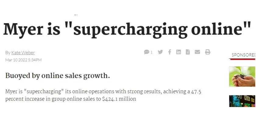
Myer, Australia’s leading department store chain, recognised the growing importance of mobile shopping and sought to enhance its mobile platform to provide a seamless and engaging experience for its customers. To achieve this, Myer implemented a progressive web app (PWA), a type of web application that combines the best features of traditional web apps and native mobile apps.
Myer’s PWA Results
Myer’s implementation of a PWA has resulted in significant improvements in its mobile app engagement and conversion rates. The organisation has observed a:
- 25% increase in mobile app engagement: More customers are using the Myer PWA to browse products, add items to their carts, and make purchases.
- 40% improvement in mobile conversion rates: More customers are completing their purchases through the Myer PWA.
What is a Progressive Web App (PWA)?
A progressive web app (PWA) is a type of web application that utilises modern web technologies to deliver a native-like mobile experience. PWAs offer several advantages over traditional web apps, including:
Fast loading times: PWAs are designed to load quickly, even on slow connections.
Offline access: PWAs can be cached for offline access, allowing users to continue using the app even when they are not connected to the internet.
Push notifications: PWAs can send push notifications to users, providing them with timely updates and reminders.
Myer’s PWA Strategy
Myer opted to integrate a Progressive Web App (PWA) with the goal of delivering a more captivating and user-friendly mobile experience to its customers. The motivation behind this decision was rooted in the anticipation that a PWA would present numerous advantages compared to its current mobile application, such as:
- Improved performance: PWAs typically offer faster loading times and smoother performance than traditional web apps.
- Reduced development costs: PWAs can be developed using web technologies, which are typically less expensive than native app development technologies.
- Wider reach: PWAs can be accessed from any device with a web browser, whereas native apps can only be installed on specific devices.
These results demonstrate the success of Myer’s PWA strategy and the potential of PWAs to deliver superior mobile experiences for businesses.
Conclusion
Optimising website performance for mobile users is not a one-time task but an ongoing process that requires continuous monitoring, adaptation, and refinement. As mobile technology evolves and user expectations change, website developers must stay at the forefront of mobile optimisation techniques to ensure their creations deliver a superior mobile experience that drives engagement, satisfaction, and ultimately, business success.
This ongoing commitment to mobile optimisation ensures that websites remain accessible, engaging, and competitive in the ever-evolving digital landscape.
About Nifty Marketing Australia
Nifty Marketing Australia is a leading online marketing agency, providing web design, SEO, Social media, Google Ads, , digital signage, graphic design and more.