


Isadora Created a Fresh Experience With the Website Design of Kelley Blue Book
Kelley Blue Book approached Isadora Agency for a modern look and feel across various websites.
Numerous web products lacked consistency. This popular car valuation brand Kelley Blue Book also required a focus on conversion. So, their team designed a UX design system for speed and scalability!
Overview
Kelley Blue Book has been a household name since 1918. A full-scale digital transformation was vital to continue attracting its customers and younger audiences requiring a modern experience for accessing auto data.
The goal was to create a fresh new experience that specifically targeted a generation of savvy, online car shoppers while remaining approachable to legacy users. So, Isadora Agency’s team created a UX design system working from the bottom up. They included the most granular of design elements, including typography, icons, illustration, components and full web pages that went through rigorous user experience testing.
Ultimately, they provided KBB with a centralized and adaptable UX design system that facilitates the efficient creation of various new digital web products.
User Experience Manager Chris Choi commented:
The Isadora team brings empathy to human-computer interaction. The heart and soul their team puts in differentiates them from other providers. I’d recommend them to any organization.
Scalability
A UX design system unifies a company’s assets, saves time on development, and increases profits. It serves as a framework for scalability, and a toolkit to help designers and engineers create more efficiently across multiple platforms.
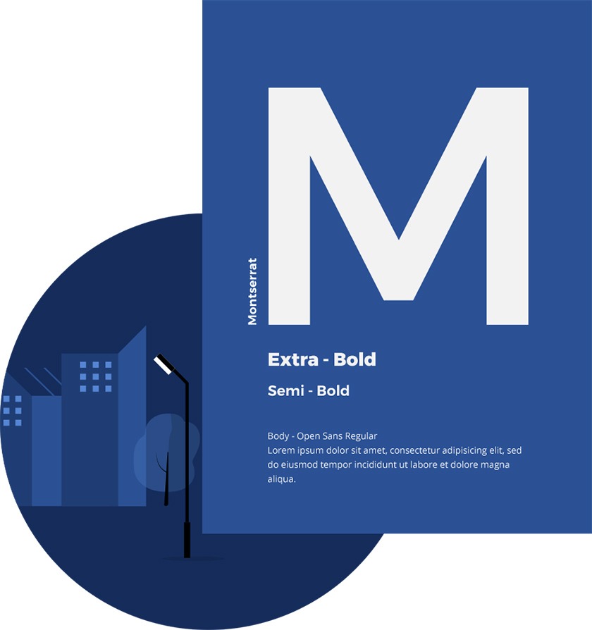
Illustrations & Color
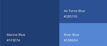
Using a minimal color palette (working mainly with the primary palette) creates a well-branded look for KBB. High contrast content container colors help frame elements for task-oriented users. Shades of blue allow designers to separate information and add visual interest without overwhelming or distracting from the look of the page. A secondary palette of gold and light blue creates clear CTA’s while accent colors allow illustrations and data visualization to stand out.
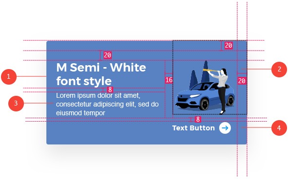

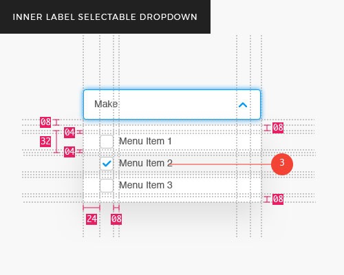
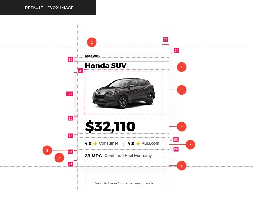
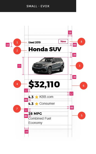
Components
The UI elements were conceived to highlight KBB’s concepts of consistency and efficiency. Simple shapes and minimal customization provide the perfect building blocks for enjoyable and easy-to-use pages. Repeatability of beautiful components is wonderful for bringing designers and developers together for quick collaboration.
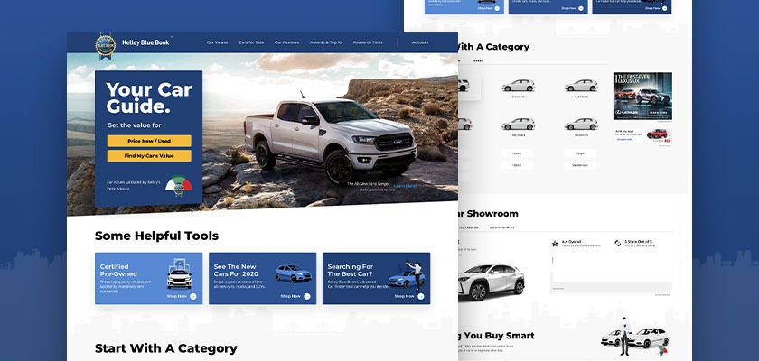
The Website
To incite action from the start, they engineered a helpful, smooth journey, accompanied by attractive visuals and concise copy, to bring users deeper into the site and closer to conversion.
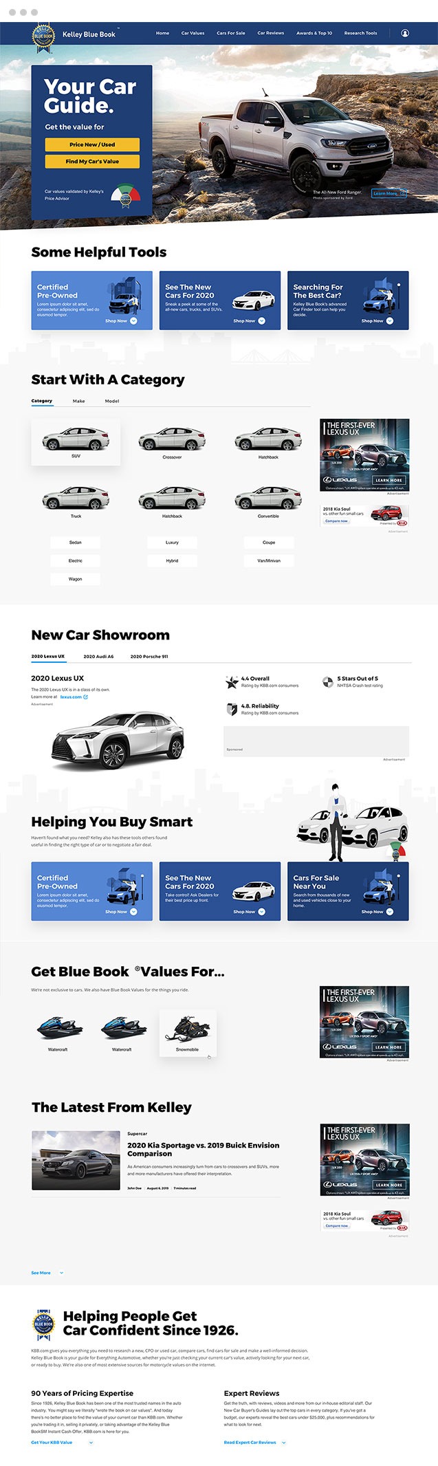
Inner Pages
Kelley Blue Book’s target audience is smart and data-driven, so they made it simple to balance readability with the promotion of sponsored content, news, and updates from throughout the website.
Modular
A modular and typography-focused approach is used to appeal to the younger user base while respecting traditional calls to action and interaction styles for the Kelley Blue Book brand known and loved by a more mature demographic.
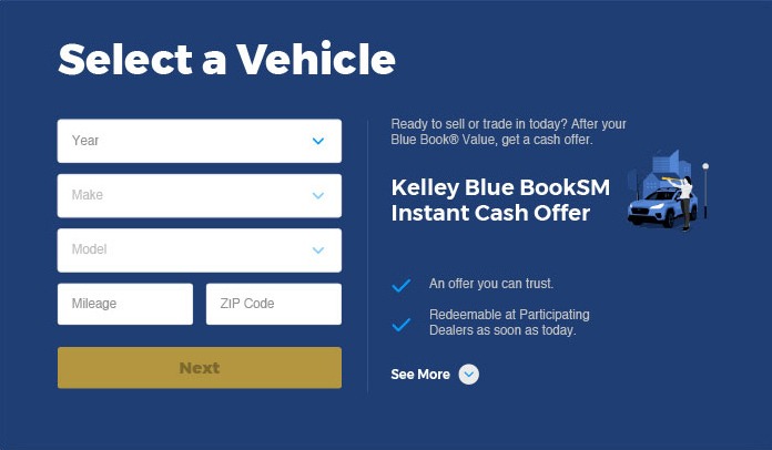
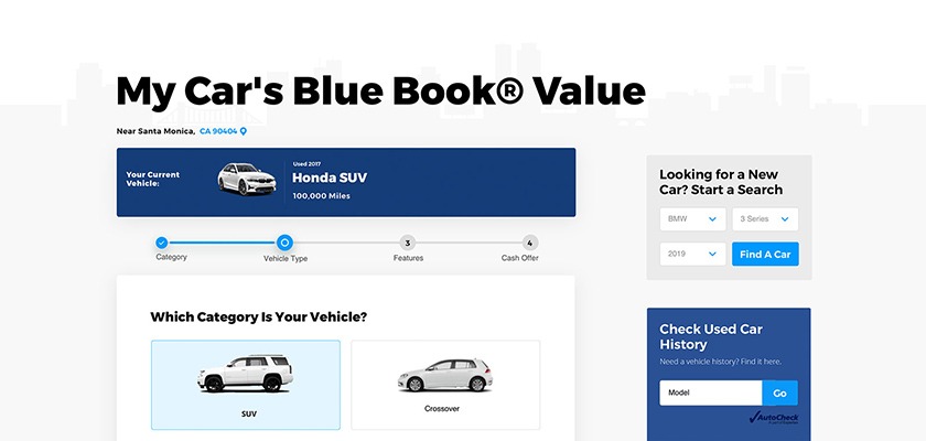
Vehicle Details
For flow and readability, they consolidated details with dropdowns, functional links, and compact photo galleries. Users can now switch between different model years, and access specifications and features without scrolling.
President Isadora Marlow Morgan says:
One of the most enjoyable and sophisticated design partners I have ever worked with. The KBB team is a long-time partner and together we continue to push the boundaries of cutting edge digital infrastructures.
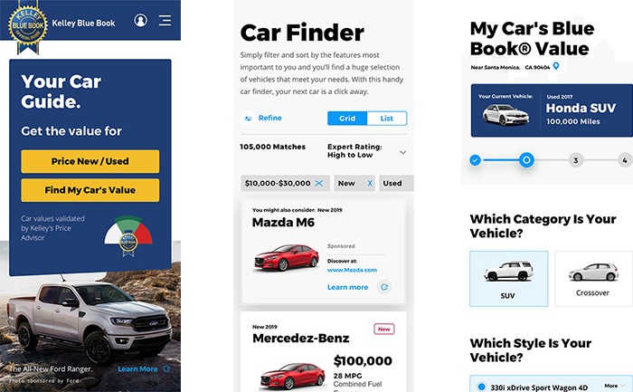
Mobile Experience
They created a mobile grid that uses white space on the edge of the grid to maintain breathing room, while comfortably molding advertising and content into smaller, more digestible components. Emphasis on a mobile experience using strong typography and containers helps quickly distinguish sections of a page, while also clearly separating different components’ stories from each other. Creating the same look and feel for components utilized in mobile is imperative to provide mobile users the same seamless experience they see on desktop.
About Isadora Agency
Isadora Agency is a web design company and leader in transformative visual identity, brand strategy, high-end development, eCommerce and digital marketing.