


10 Best Ecommerce Product Page Design Examples
While impactful product pages largely depend on what the products are, there are crucial elements that can make them stand out.
When visitors reach product pages, they look for crucial information that can lead them to a purchasing decision. As such, your web design should have a layout that makes it easy for customers to find the information they need while highlighting your products’ unique value proposition. Again, there are different approaches to achieving this. Services often use compelling copy, while consumer products can benefit from informative and interactive visual elements.
This article lists ten product and landing page design examples and discusses what makes them effective.
1. Perfect Point
This first example, used by any Houston web design company, is connective and greets visitors with the client’s unique value proposition using the straightforward copy, ‘We remove hard metal fasteners in less than 10 seconds.’ Under the primary text, Perfect Point lists the benefits of the E-Drill, followed by call-to-action (CTA) buttons that lead to more information about the company, the products, and its benefits.
As visitors scroll down, a demo video shows exactly how the product works, followed by more benefits and features. It’s a simple layout that covers all the bases of what prospective customers want to know to make a purchasing decision.
2. Volkswagen
The German vehicle manufacturer takes a more interactive approach with its product pages, allowing visitors to build their ideal car. This is an effective approach, as vehicles have too many elements and moving parts to list. As customers choose different features they’d like, Volkswagen highlights the features of their choice, along with a rotating 3D visual and how it affects the price.
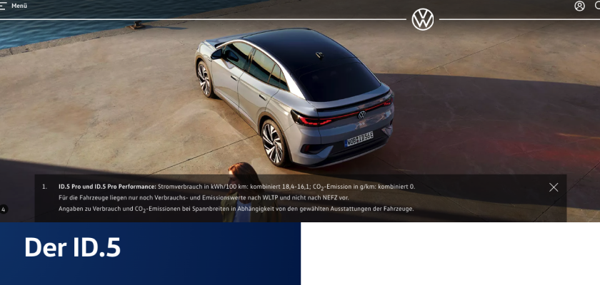
It’s a fun exercise and an excellent way to introduce a product and its various selling points. Once customers finish building their virtual car, there’s a feature helping them find the closest dealer carrying the vehicle with the specs they want.
3. Fitbit
Fitbit has had a history of well-designed product pages that effectively highlight benefits and use cases while engagingly presenting them. This design approach is particularly crucial for tech devices that are chockfull of features. You need to get creative with how you present your value proposition and flood visitors with technical specifications to avoid losing their interest.
Whether it’s for fitness wearables or accessories, Fitbit’s product pages do a great job of showing prospective customers how the products will feature in their day-to-day lives. Additionally, it has unobtrusive product videos that show the products in action, providing all the information a customer could need.
4. Seattle Cider
Seattle Cider exhibits a good understanding of what its products are and what it means to its market. Alcoholic beverages aren’t about features and specifications (for the most part). As such, Seattle Cider uses storytelling to show how each product came to be, intertwined with how it relates to the company’s evolution.
As users scroll down to learn about the different ciders, the fruits and spices used in them, and the story behind each product, there are buttons conveniently located to ‘Find it near me’ and ‘Buy online’. It’s simple yet effective.
5. Bellroy
The company sells streamlined wallets that allow customers to carry more sans the bulk. Bellroy’s landing page greets visitors with the CTA ‘Slim Your Wallet,’ followed by an interactive side-by-side comparison of its wallet and traditional ones. It shows how the wallets fill up, showing customers how much thinner its products are.
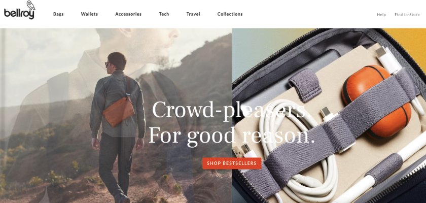
As customers scroll down, Bellroy asks, ‘What do you carry in your wallet,’ leading customers to products depending on whether they carry cards, cards and bills, or both, including coins. It’s a well-designed landing page with all the pertinent information cleanly and creatively laid out.
6. Thinx
The company sells unique female undergarments that absorb periods. Because its value proposition is truly distinct, Thinx’s product pages need to educate customers as they are led to the products perfect for their needs. It achieves this with a clean yet informative layout that classifies products based on absorbency, style, and activity.
In addition, the company’s 3D product images feature models with different body types and skin tones, making it easier for prospective customers to visualize how the products would look on them. As you scroll down Thinx’s product pages, you get more information that helps cement (or add) to a purchasing decision.
7. Rent The Runway
It can be challenging to present relevant information neatly when you have thousands of products in your catalogue. But that’s what Rent The Runway has achieved with its product pages. It complements its designer clothes for rent with all the information customers could need. This includes measurements, stylist notes, size and fit, and reviews with images of customers in the actual clothing.
The stylist notes and actual size and fit sections, in particular, discuss how the clothes fit every part of the body and what body types it suits best. The sections offer other helpful style guides.
8. Sadaka Law
This law firm immediately lets visitors know what it does, as ‘We represent injured people. Period.’ is found on its landing page. This is followed by two CTA buttons to contact the firm and to learn more about its practice areas. As visitors scroll down, they’re guided to information that can help them determine if they have a case.
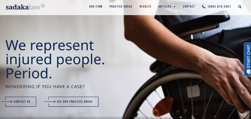
Trust is crucial for clients seeking legal services. Sadaka Law addresses this with client testimonials, a large FAQ section, helpful blog articles, and a live chat feature. These elements work together to ensure visitors have all the information they need without leaving the website.
9. My Tenant Lawyer
My Tenant Lawyer mirrors this practical information layout. What stands out from its landing page is the tiled categories of scenarios and cases that could make tenants eligible for claims. This includes the following:
- Bad living conditions
- Fight evictions and illegal lockouts
- Negligent landlords
- Infestation
- Landlord harassment
- Mold, asbestos, and lead
- Illegal rent collection
- Injuries
This tiled layout lets visitors know if their situation has a case at a glance.
10. Helix Mattresses
The company’s product pages make it extremely easy to find the perfect mattress by providing a quiz that asks visitors to provide relevant information, such as how many people will use the bed and their sleep habits and preferences. Additionally, its product descriptions eliminate confusion by clearly defining what it means by ‘soft, medium, and firm feel’. For example, it describes ‘soft’ as a mattress that ‘lets you sink in link a cloud.’ Conversely, it describes the other spectrum as the ‘Firm top of your mattress with no sink or gives.’
Final Words
As you can see, while there’s no cookie-cutter solution to an effective product page, providing all relevant information in a clean and easy-to-navigate layout is integral. You can use simple design elements like a compelling copy in a larger font or interactive images that engagingly present information.
Whichever suits your business, what’s important is your product pages’ ability to usher customers to a purchasing decision.