


Responsive Elegance: How To Optimise Your Email UX for a Mobile-First Audience
The era of the mobile consumer is upon us in 2024. As we adapt to a new generation of digital interaction, one of the most prominent strategies in need of rejuvenation is email marketing.
Once designed to appear solely on a desktop device, many email campaigns still centre around the widescreen layout and are not optimised for multi-device interaction.
In 2024, a whopping 48% of emails are now opened on a mobile device, while just 11% of email templates are designed with smartphone users in mind.
Moving forward, the smart design will centre around smaller screens. Email marketers in 2024 must consider an omnichannel approach if they are to achieve a successful open rate.
“Short subject lines, mobile-optimized design and pertinent content all shape how a user responds to email,” says Randy Shattuck from The Shattuck Group. “But, at the end of the day, the goal is usually to get them to click over to something. So think through the entire experience to ensure it is optimised for mobile from start to finish.”
Here are five different ways Solvid recommends optimising your own email campaign for mobile UX success.
Introduce Responsive Design for All Devices
Responsive design should be a top priority for email marketers in 2024. Ensuring that users on all devices can engage with your content is the key to boosting your user experience. One of the hardest groups of consumers to please is mobile browsers. With a staggering 80% of mobile users likely to delete your email if they can’t engage with it on a mobile device, it’s essential that you test your designs for a mobile-first audience in 2024.
“Test designing emails that are exclusively for mobile. On mobile devices especially, a user’s first instinct is to scroll. Marketers can leverage “long scroll” emails that completely disregard the fold. This opens up the opportunity for brands to design an immersive experience that easily guides a user through the messaging,” says Matt Doud, CEO at Planit.
The key here is to integrate ‘tapable’ content into your design. Give your mobile users the ability to respond by interacting with clear call-to-action buttons and tapable links to various social apps and web pages.
The more responsive your email design is on a smaller screen, the more interaction you’ll see within the inbox.
Craft Compelling Subject Lines
Mobile users have shorter attention spans and tend to skim through their emails at speed. Therefore, a concise and compelling attitude to email copywriting is essential when optimising the mobile UX of your emails.
“Use perfect email subject lines and snippets to create more mobile-friendly emails. These aspects do the heavy lifting of capturing a reader’s attention and given functionality will dictate what a reader sees on their mobile device,” says Keri Witman, email marketer at Cleriti.
Take this great example from Bloom and Wild:
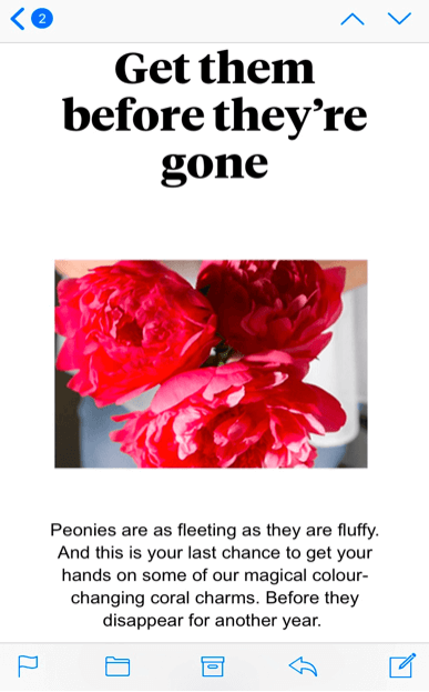
Using a quick and actionable subject line such as ‘Get them before they’re gone’ is a great way to attract consumer attention and create that sense of urgency that all mobile marketing campaigns require.
Optimise Your Content for Omnichannel Viewers
On a mobile device, it is much easier to jump from channel to channel. Many users hop between Instagram, their inbox and Google in just a few seconds, so it’s important that your email facilitates this seamless movement.
One way to do this is to work on your link-building strategy and embed links and buttons to other channels from the email itself.
Airbnb provides a great example of this. Using their social channels to advertise their stays, they offer a window into Instagram, while also showcasing UGC content, a great seller in itself.
“We use email to show what the Airbnb experience looks like and we are really strategic about all our emails. That’s why we focus on the quality so much over quantity. To illustrate the experience, one of the best emails we sent in terms of engagement is when we showed Instagram photos posted by the community,” says Lucas Chevillard, growth manager at Airbnb.
“The Subject line was: We woke up like this. We wanted to find a way to engage with our less-engaged users by showing them compelling content. The hero here is with 3 pictures from the community. A similar idea in engaging users was by using a light question in the subject line (like: Guess where?) and then inserting pictures from the community.”
Prioritise Mobile-Friendly Calls to Action (CTAs)
If you’re an e-commerce business, call-to-action buttons are the key driver of email success. We’ve established that mobile users seamlessly jump from channel to channel, so using your email to direct them straight to the checkout is genius.
Inserting the perfect CTA is difficult. The skill here is to identify the perfect spot for placement. Instead of placing your call-to-action button at the bottom of your email, switch it up and add it at the top. Mobile users have smaller attention spans and are likely to not read the body of the email. If your call-to-action is the first thing they see, you’re much more likely to get them clicking.
Take this example from Wayfair:

By positioning their CTA at the top of the mobile email, consumers are greeted instantly with a link to your products. They may not read the rest of your email, but they’re more likely to end up at the checkout.
Optimise Load Times for UX Success
Last but not least, let’s talk about loading times. Mobile consumers value speed, so your email loading time could be a make or break for your campaign.
Optimising elements such as high-resolution images and heavy graphics are essential if you want to cut your email loading time in half. This process not only reduces UX frustration but also contributes to a much higher open rate for your emails.
Better still, a fast-loading email encourages recipients to promptly engage with your updates and promotional offers, in turn boating your chances for online conversion.
Mobile UX: An Email Strategy Essential
As we enter 2024, your mobile UX strategy should be a top priority if you want to drive success online.
After experts at MailChimp found that launching a mobile-responsive email campaign increases clicks by 15%, more brands are adopting mobile UX tactics.
From optimising your content layout and loading time to crafting speed-read subject lines, renovating your email strategy for multi-device success is a challenge all marketers must face in 2024.
