


How to Create an Impressive Analytics Presentation Without Tearing Your Hair Out
“I want to know how my website is performing as my boss is asking me for our numbers last month urgently.” Can you prepare an analytics presentation for Thursday next week?
Sincerely,
Stressed-out Client
Ever received a request like this on Friday afternoon from your clients when you’re wrapping up for the week?
Before jumping into pulling numbers and creating charts, stop. Take a breath.
It’s worthwhile to systematically break down the request and ask follow-up questions to ensure you’ve created a report fulfilling the request to a T.
You’ll learn how to create an impressive analytics presentation for your clients without tearing your hair out. Read on!
What is an Analytics Presentation?
An analytics presentation compiles data metrics and insights from web analytics tools like Google Analytics, and Adobe Analytics collected in PowerPoint presentation slides or data visualization tools.
Business executives use these presentations’ data analysis and recommendations to review business performance and make strategic decisions.
Your job, therefore, as an analyst, is to find and present relevant data and recommendations that will address the business concerns of the people reviewing the report and help them make decisions.
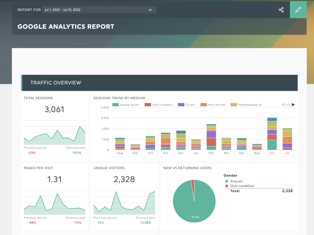
Save time preparing for your next data analytics presentation with DashThis’s Google Analytics report template, gathering all essential web analytics metrics in a beautiful report to ace your next presentation.
5 Steps to Creating the Perfect Analytics Presentation for Your Clients
Step 1: Ask Questions to Gather the Correct Information
Don’t be afraid to probe further if you get a vague-sounding request from a client. Take the time to review their request and understand what they are asking.
First, Sam Priddy from Tableau recommends writing down the request on paper or in your notes to understand the request and identify areas that need clarification. Ensure you and your client are on the same page when understanding requirements and scope.
Once you’re clear, it’s time to dive deeper. Some questions to get you started:
- What is the objective of the meeting? Understand if the session influences any decisions, like pricing decisions, budget allocations or more. For example, a discussion on content marketing strategy for lead generation might need metrics on content marketing’s effectiveness at improving conversion rate and business revenue.
- What’s the reporting period of the data? Are we looking at monthly, quarterly, or yearly data?
- Who will be attending this meeting or reviewing the presentation? Each audience group cares about different things. A VP of sales might care about net new revenue and overall sales pipeline, while a head of content might care about the bounce rate of a sales landing page, the number of qualified leads and partnerships acquired. Put yourself in different people’s shoes and ensure your report contains relevant information.
- What’s the desired outcome of the report? Are they looking for a summary of past performance, a pure presentation of numbers, or an interactive way to explore data in real-time to make optimization decisions?
Tip: Present data effectively by asking yourself what metrics or outcomes each audience group cares about, what their stakeholders want from them and what they expect to see from the report. Research their roles and responsibilities, or ask your client for more information.
With the answers to these questions, you can identify what information you need and what to discard from your report. Now you know how to approach your presentation and structure your report for maximum efficiency.
Step 2: Establish Your Kpis
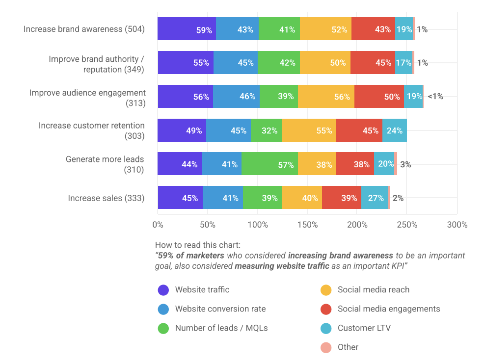
Now that you know the report’s objectives and who will be present at the meeting, ask yourself what KPIs and metrics provide the information your client needs. Good KPIs are always relevant to a stakeholder concern, business goal or marketing goal. A report from Mention and Livestorm details important marketing goals for companies in 2022 and examples of KPIs used to measure them.
How do you go about choosing KPIs from marketing and business goals?
Let’s say your client has a business goal to build positive social proof and establish trust in their target market for their e-commerce store.
Your marketing goal will then be to encourage more online reviews for them in the next 6 months, and you’ll use the number of online reviews from their website, visitors, on Google and on marketplace listings as a KPI to track your progress.
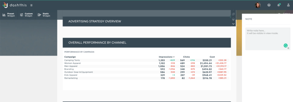
Step 3: Create Your Analytics Dashboard
You could always present your data in a PowerPoint (PPT) slide deck or Excel spreadsheet. But if you’re looking to add that extra spice to your analytics presentation besides a well-formatted PowerPoint template and wow your clients, think about having your data in an interactive dashboard.
An interactive dashboard turns meeting attendees into active participants. They can analyze data for themselves, filter, sort and re-arrange data from nearly any angle. It also helps them follow along in your presentation, making the session more useful.
Here’s how to create an interactive data visualization in minutes with DashThis.
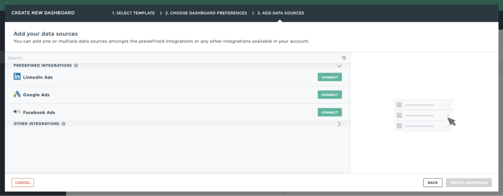
Step 1: Sign up for an account with DashThis. Our free 15-day trial allows you to see if we’re the right fit for you.
Step 2: Choose from one of our pre-set report templates for you to build your report. Our reports include easy visualization functionality like pie charts and bar graphs for presentation design.
Step 3: Choose from over 40+ integrations and connect your digital marketing and social media tools in seconds.
Step 4: Select the metrics to include in your report from DashThis’ preset widgets.
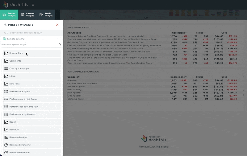
Step 5: Add as many data points as you need to set up your report. Once done, save your completed report as a template so you can reuse the template for future presentations with clients, saving even more time!
Tip: Send your report to your client or people you know will be present at a meeting as a pre-read a few hours before the meeting. This helps you have more productive meetings and makes you and your client look good in front of everyone!
Step 4: Include Action Points
Remember, data is only valid when synthesized and interpreted.
Any data you include should answer the ‘So What’ question – what does this data point mean in the context of business goals, and what to do next?
DashThis allows you to annotate graphs and metrics in your report with notes and comments; useful for summarizing key points, explaining anomalies and including helpful context.
Once you’ve contextualized the data, proceed to develop recommendations, especially if you’re involved in initiatives that influence these metrics.
- Organize multiple recommendations by priority
- Assign owners for whoever is responsible for carrying out these recommendations
- Align on the next time you’ll review the metric.
Step 5: Leave Room for Feedback and Discussion
A presentation is a two-way conversation. You’ll want to leave time for your audience to give feedback and ask questions about the data.
Some tips on handling questions during a presentation like a pro:
- Remember, the people you’re presenting to might be seeing the numbers you’re presenting for the first time. Take breaks while preparing the report to see it with fresh eyes or check in with your team to review for any points you may have missed.
- Anticipate questions by reviewing the people’s roles at the meeting and what they’ll be looking for.
- Use complete sentences in your headers to highlight what’s important in a chart. A chart about social proof can have the heading “The number of customer reviews across all channels increased by 200% in the last 12 months”.
- Use annotations to highlight anomalies in the data, paying attention to spikes or dips in essential metrics.
- Summarize the presentation with one key takeaway that directly answers the business concerns outlined in step 1. Your clients and stakeholders are busy, and doing the work to distill your presentation ensures it delivers more impact.
Ultimately, you want to be so familiar with your data that you know it like the back of your hand.
Deliver Client Analytics Presentations Like a Pro
Following these 5 steps will equip you with all the tools you need to ace your next client presentation,
- Ask questions and clarify what is needed.
- Establish KPIs relevant to business goals and address stakeholder concerns
- Make your data interactive to aid comprehension
- Answer the So-What question in your action steps and recommendations
- Anticipate questions and feedback
And finally, you learn by doing. Every client looks for different things and has various concerns.
The more you work with them and seek feedback to improve, you’ll become known as the presentation master in no time.