11 Creative Homepage Design Ideas to Inspire Your Website
Let me set the stage for you: you’ve just landed on a website, and within seconds, you’re either intrigued enough to explore further or you click away, unimpressed. This crucial first impression is largely shaped by the homepage design, the digital storefront of any brand. In fact, today, a well-designed homepage is more important than ever, where countless websites vie for attention.
Your website’s homepage is the first impression visitors get, setting the tone for their entire experience with your brand. It’s more than just a pretty face but a powerful tool for engaging visitors, conveying brand values, and driving conversions.
For brands, creating a captivating homepage means crafting an engaging narrative that draws visitors in and guides them through your site. This article aims to inspire and guide you through creative homepage design ideas, helping you enhance your website’s first impression and overall user experience.
This article will explore innovative and practical homepage design ideas, providing you with a wealth of inspiration and actionable insights to create a homepage that truly stands out. From highlighting essential design elements to showcasing real-world examples, we’ll cover everything you need to know to craft a homepage that not only looks good but also performs exceptionally well.
Why is Homepage Design Important?
When visitors land on your homepage, it’s often their first interaction with your brand. This makes the layout not just a visual experience but a crucial element of your business strategy. Let’s take a look at why your website’s homepage design is so vital:
SEO Value
Did you know that a thoughtfully designed homepage significantly impacts your website’s SEO? Google prioritizes sites that offer a seamless user experience, and the homepage is often the first point of contact. A clean layout, fast loading times, and mobile responsiveness are crucial for search engine optimization, and search engines analyze your homepage to understand the purpose and relevance of your website.
For instance, a study found that websites on the first page of Google results had an average load time of 1.65 second. Slow-loading websites can lead to high bounce rates, negatively affecting your rankings. You can improve visibility and attract more organic traffic if you optimize your homepage’s structure and content. Adding relevant keywords and meta tags can also boost your visibility on search engines, so we recommend you keep this in mind as well.
User Engagement
The primary goal of a homepage is to engage visitors and encourage them to explore your website further. An aesthetically pleasing homepage design captures attention with compelling visuals and concise, informative content. Clear calls to action, easy navigation, and engaging visuals can help retain visitors and encourage them to take a deeper look into your website.
It’s all too common for visitors to land on a website and quickly lose interest due to a lack of engaging content or clear direction. This disengagement can lead to high bounce rates, where visitors leave without exploring further. This will cost you potential customers and conversions! The pain point here is clear: if visitors aren’t captivated from the get-go, they won’t stick around. The solution lies in creating a homepage that actively engages users from the moment they arrive. So, you must incorporate clear calls to action, captivating visuals, and compelling content that not only grabs attention but also guides visitors through your site seamlessly.
First Impressions
Visitors form an opinion about a website within 0.05 seconds. This makes first impressions crucial, especially online. As the saying goes, you never get a second chance to make a first impression. So if you want to show your visitors what they can expect from your brand, you need to implement your striking homepage design ideas. Whether you’re a digital agency wanting to display your expert team with an agency about us page or a company showcasing its products your homepage can convey professionalism, creativity, and trustworthiness.
Key Elements of an Impactful Homepage Design for Business Success
A successful homepage combines several critical elements that work together to create a cohesive user experience. Here’s a breakdown of what makes a great homepage design:
Clear Branding
Let’s say you’re visiting a website and struggling to understand what the brand stands for or even who they are. This lack of clear branding can leave customers confused and uninterested, ultimately driving them away. The absence of consistent visual and textual elements can create a disconnect, making it difficult for visitors to relate to the brand. This is where clear branding becomes crucial. You need to apply your logo, color scheme, tone, and style across your design, so that you can establish a recognizable identity. Your goal should be to build familiarity and trust and these components will help you with just that.
User-Friendly Navigation
Nothing frustrates website visitors more than getting lost in a maze of confusing links and poorly organized menus. Poor navigation can turn a potential client away within seconds, causing frustration and increasing bounce rates. The problem often lies in cluttered layouts, unclear labels, or hidden essential sections, leaving visitors stranded without the information they need.
The solution is straightforward, though: prioritize user-friendly navigation. A well-structured menu, visible search bar, and clear links to key pages like “Services” make all the difference. Remember: a well-organized homepage design is like a welcoming guide, helping visitors find exactly what they’re looking for without the frustration of a digital scavenger hunt.
Compelling Visuals and Content
Bland and generic visuals paired with uninspiring content can be a major turn-off. These will definitely leave your site’s visitors unimpressed and uninterested, which is the total opposite of what you want to achieve.
When a homepage design fails to captivate through its imagery and narrative, it misses the opportunity to connect with its audience. The antidote is great visuals and excellent content. High-quality images, videos, and infographics can instantly grab attention and convey your brand’s story in a visually engaging way.
11 Website Homepage Examples for Your Inspiration
Let’s dive into some unique and inspiring homepage examples that go beyond the mainstream, offering fresh and creative approaches.
1. Arnold Street
When you first open the homepage of Arnold Street, you are greeted with colorful, dynamic elements. This design immediately captivates the visitor and almost hypnotically compels you to keep watching. These high-quality visuals are actually part of the agency’s case studies, which instantly gives you an idea of the brands and sectors they work with.
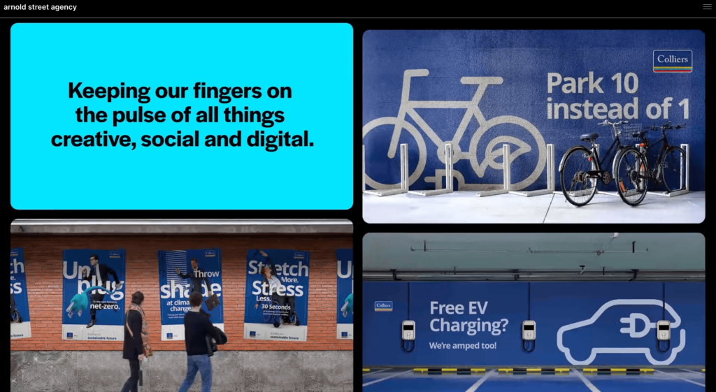
Throughout the site, animated elements are placed on a black background, filled with colorful images. This contrast is not only easy on the eyes but also provides an enjoyable user experience. One of the most important features of this creative homepage design is the easily accessible “Recent Work” section as you scroll down. This area allows potential clients to filter by industry or service, helping them quickly determine if Arnold Street is the right fit for them. This homepage, which is both aesthetically appealing and technically well-designed, is definitely one of our favorites.
2. Baunfire
We mentioned above that it is crucial for visitors to immediately understand what your site or company is and in which field it operates, as this encourages them to stay on the site and explore your brand. Baunfire has executed this perfectly: as soon as the agency’s homepage opens, you are greeted with the text: “A digital agency focused on web.” I don’t think there could be a more explanatory text than this.

Baunfire also includes the most important information for an agency on the homepage: projects and stunning visuals! I should mention that the homepage is divided into sections, with CTAs under each section guiding the user. This detail is very important to ensure the user doesn’t just navigate the homepage but explores the entire site.
The agency’s homepage design effectively summarizes who they are and the fields they serve. Especially in the “Services” section, the geometric shapes used in the design and the fact that only the central image changes as you scroll is a very creative touch that we found impressive. The website homepage of the US-based Baunfire is definitely one of the successful web agencies that deserve to be on this list.
3. Isadora Agency
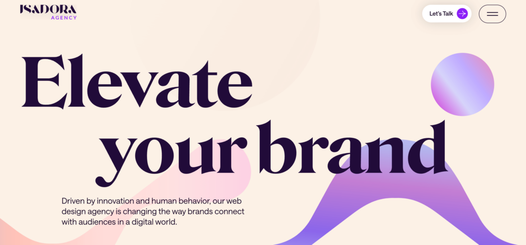
The first things you notice when you enter Isadora’s website are the large fonts, the harmony of purple and pink, and an instantly captivating showreel. The homepage features easy-to-read text that clearly explains the agency, its services, and offerings, making browsing enjoyable and easy. Different shades of purple create contrast, and CTAs in each section are color-coded accordingly. Additionally, this page, where you can find everything you are looking for—areas of expertise, case studies—serves as a fantastic homepage design idea.
4. Major Tom
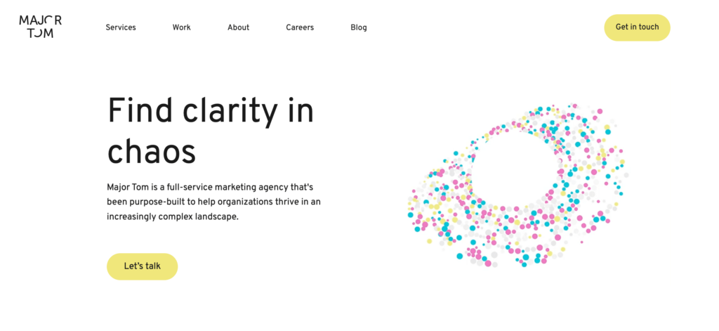
The homepage design of Major Tom features a modern and clean design with a combination of geometric shapes and smooth curves. The layout is structured in a way that guides the user’s eye down the page, creating a smooth flow from one section to the next. Major Tom uses a sophisticated color palette with dominant shades of blue and white and a dash of pink. The use of large, bold fonts for headings and clear, readable text for body content ensures that information is easily digestible. The font choices complement the overall modern aesthetic. Subtle animations are used to enhance user experience, such as smooth transitions between sections and hover effects on buttons and links. The design is also responsive, adapting well to different screen sizes and devices. This ensures a consistent experience across desktops, tablets, and mobile phones.
5. The Miller Group
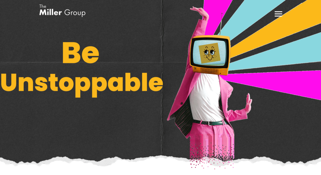
The homepage of The Miller Group grabs your attention right from the start with a striking full-width hero image. The layout is thoughtfully designed, with nicely defined sections that create a seamless and visually pleasing flow. You’ll notice the color scheme uses shades of yellow and gray, striking a balance between fun and trust. The typography stands out too—bold and modern, with large headings and easy-to-read text that keeps you engaged. The navigation bar is fixed at the top right, making it super easy to hop to different sections of the site. It’s intuitive and well-organized, ensuring you can quickly find exactly what you’re looking for.
6. Redonk Marketing
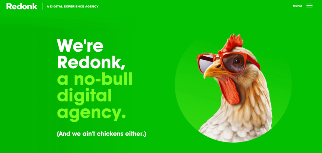
When you first enter Redonk Marketing’s homepage, you are greeted by a whimsical image of a chicken wearing glasses, setting a playful and engaging tone. The background is a striking green, with bold text stating, “We’re Redonk, a no-bull digital agency. (And we ain’t chickens either.)” This immediately captures the visitor’s attention and conveys the agency’s unique personality. The next section prominently features a list of clients the agency has worked with, accompanied by a call-to-action button at the top right corner that says “Let’s work together.” While the homepage is minimalistic in content, its creative and eye-catching design encourages visitors to explore further.
7. Spark Social
Upon entering Spark’s homepage, you’re immediately immersed in a minimalist and serene design featuring pastel blue and green hues on a bone background. The welcoming text, “Spark connection, conversions & community. We’re an award-winning, boutique social media agency, delivering the creativity and agility you’d expect from a small studio with the impact and ROI you’d demand from a big-name agency,” is accompanied by dynamic, high-quality visuals. A small banner section displays the brands they work with, smoothly flowing to the left, reinforcing their expertise in social media. The minimalist text throughout the site clearly communicates their specialization. As you scroll, you encounter uniquely shaped case studies with summary texts and “learn more” CTAs. The homepage’s design is not only visually pleasing but also intuitive and easy to navigate, creating a calm and engaging user experience.

8. SmallGiants
SmallGiants’ homepage captivates visitors with a dark theme featuring a navy blue background. The striking headline “Shaping Tomorrow’s Giants” immediately grabs attention. What sets this page apart are the dynamic lines and geometric shapes that enhance its visual appeal. Instead of traditional images, the design is filled with colorful lines that morph into various shapes like squares and circles, creating a visually engaging experience. A showreel further introduces visitors to the agency, adding a dynamic element to the page.
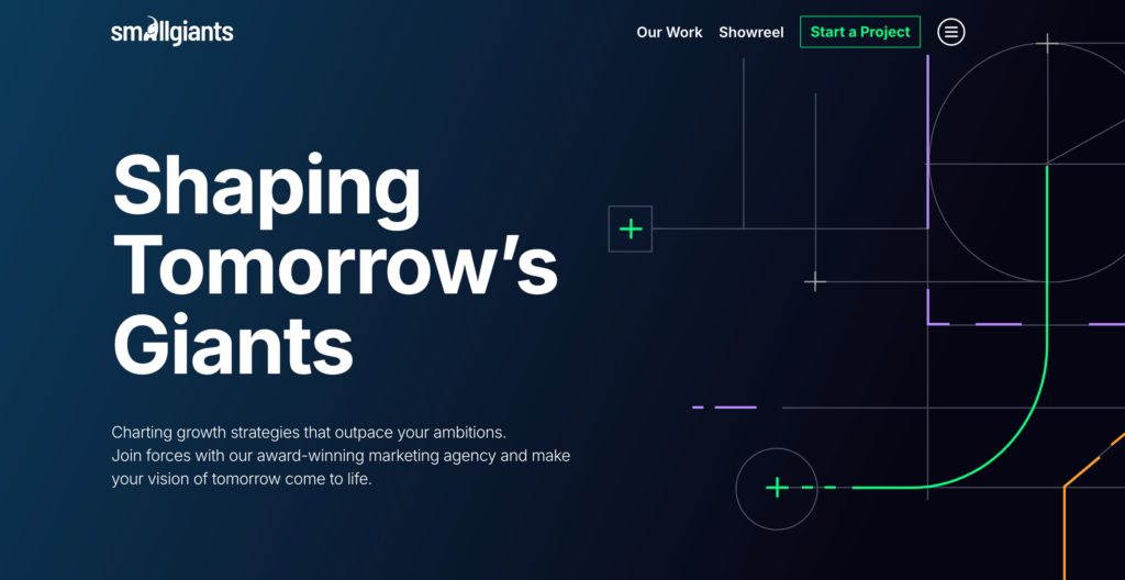
The contrast between blue and navy colors is well-utilized, making key elements stand out. Throughout the page, numerous call-to-action (CTA) buttons ensure easy navigation to the “About Us” page or their services sections. While the design isn’t minimalist, it is highly engaging, easy to understand, and provides a compelling experience for site visitors.
As one of the leading web design agencies, UK-based SmallGiants combines innovative elements with a user-friendly interface, creating a unique and engaging experience for their clients.
9. War Room
War Room Inc.’s homepage is anything but static. It explodes onto your screen with an animated intro designed to grab your attention right away. The homepage design is a vibrant visual experience, predominantly featuring shades of pink. Despite the bold animations, the page maintains a perfect balance with clear and informative content. Unique and quirky illustrations replace the usual stock photos, showcasing War Room Inc.’s distinctive style and setting them apart from typical agency websites. The design incorporates a bright, contrasting contact button in the top right corner, making it easy for visitors to get in touch if they are interested in working with the agency. A standout feature of the homepage is their playful mascot, which is cleverly integrated throughout the site. The mascot appears in different themed boxes, creating a fun “choose your adventure” experience. For example, one box might be styled for travel, featuring luggage and sunglasses, while another represents healthcare with a syringe and stethoscope. This creative approach adds a layer of engagement and makes the homepage design memorable and unique, an excellent of a website homepage design.

10. Alan Menken
Now we shift our focus away from agencies and move in a different direction. One of the important homepage examples that should definitely be included in this list is Alan Menken’s personal website homepage design. The homepage features a sophisticated and artistic theme, reflecting Alan Menken’s illustrious career in music and theater. The design exudes a sense of grandeur and creativity, fitting for a renowned composer.
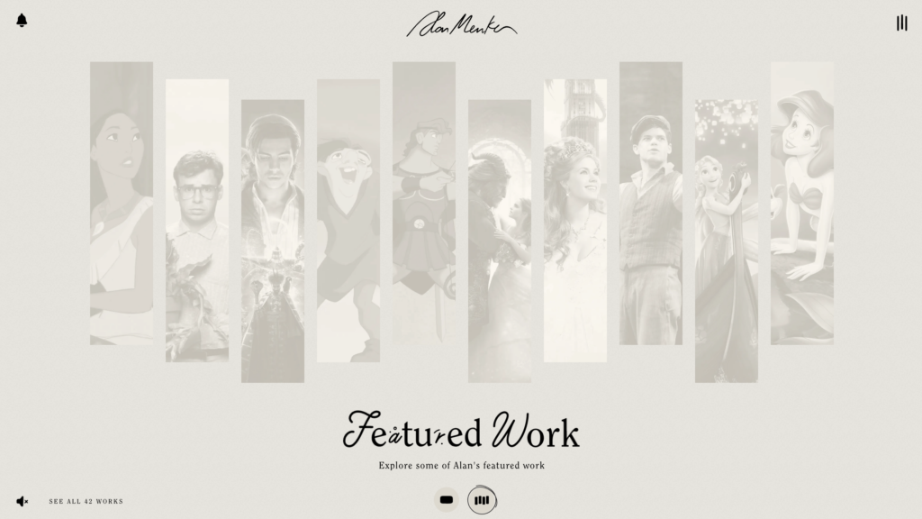
The first thing you see is an entrance page inviting you to “turn on the sound.” Once you step in, the whole experience transforms! Forget those boring, static homepage designs—this one is truly unique. You’re greeted by an introductory video showcasing Alan Menken’s exceptional work for iconic movies, animations, and Broadway shows. Clips from “The Little Mermaid,” “Aladdin,” “Beauty and the Beast,” and many others highlight his incredible contributions.
Then, as you scroll down, you’ll find vertical rectangles in black and white. Hover over each with your mouse, and watch as the black-and-white images burst into color and the movie’s song begins to play. It’s a magical journey through Alan Menken’s world, all encapsulated in one captivating homepage.
11. Basecamp
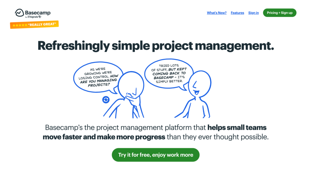
Basecamp’s homepage is designed to engage and inform visitors right from the start. The CTAs are strategically placed, encouraging you to sign up, start a free trial, or explore Basecamp’s features further. Each service is clearly outlined with brief descriptions and visuals, making it easy to understand what Basecamp offers. The color scheme is fresh and inviting, with a clean white background accented by blue and green. This combination creates a focused and clear look. The homepage opens with a bold hero section featuring the headline: “Refreshingly simple project management.” This sets the tone with a direct and compelling message. While informative, Basecamp’s homepage is also an excellent example of thoughtful and engaging homepage design. It’s perfect for those seeking inspiration in project management tools.
Conclusion
Your website homepage design sets the tone, engages visitors, and communicates your brand’s values and offerings. If you focus on the elements we’ve listed above, you can most definitely create a homepage that both looks great and delivers results.
As you explore these creative homepage design ideas, consider how they can be adapted to fit your unique needs and goals. Leveraging an AI website generator can also streamline the process, helping you craft a visually stunning and highly functional homepage with ease. Though, remember, the goal is to create a welcoming and informative experience that speaks with your audience and encourages them to explore further.
So, take these insights and inspirations to heart, experiment with different styles, and let your creativity shine. Your homepage is the gateway to your brand– make it count!

