
Best Fitness & Gym Website Design Examples in 2023
Ready to discover a truth you may have been overlooking? Your gym’s online presence matters just as much as its physical setup.
In an era where first impressions are often made online, having a thoughtfully designed fitness website can be the key to winning over potential gym members. As a savvy gym owner or aspiring fitness entrepreneur, you should know that a website is more than just a virtual billboard – it’s an invitation to experience your brand, facilities, and the transformative journey you offer.
In this article, we’re diving into the realm of fitness website design, exploring the finest examples that 2023 has brought forth. Whether you’re revamping your existing website or starting from scratch, this guide will provide you with a wealth of inspiration and insights to help you create a captivating online home for your fitness venture.
Stay tuned as we explore the essential elements of effective fitness website design, showcase standout examples from the field, and delve into the latest website design trends. Whether you’re a seasoned website designer or a fitness enthusiast stepping into the digital arena for the first time, this article is crafted with you in mind.
So let’s stretch our digital muscles and discover how exceptional website design can elevate your gym’s online presence to new heights!
Key Elements of an Effective Fitness Website Design
In the bustling digital landscape, a gym’s website is often the first point of contact for potential members. Just like a welcoming smile at your gym’s front desk, a well-designed website greets visitors and invites them to explore what you have to offer. To ensure your website leaves a lasting impression, we’ve gathered some key elements you should consider:
Clean and User-Friendly Navigation
Think of your website’s navigation as a well-laid-out workout plan. A clear and intuitive menu structure ensures that visitors can easily find the information they’re seeking. You should make sure that you display essential sections like classes, schedules, trainers, and pricing prominently. However, it’s also important to avoid overwhelming visitors with too many menu items – simplicity is the key.
Responsive Design
In the era of smartphones and tablets, your website must look as good on a small screen as it does on a desktop. Responsive design adapts your website’s layout to different devices and screen sizes, providing a seamless experience for all users. Remember, a frustrated user is unlikely to become a member.
High-Quality Imagery and Videos
Visuals are potent tools for conveying your gym’s atmosphere and offerings. High-resolution images showcasing your well-equipped facilities, energetic trainers, and vibrant classes can stir curiosity and excitement. Incorporating videos that demonstrate workouts or feature member testimonials can provide an authentic glimpse into the gym experience.
Consistent Branding
Your gym’s brand identity should shine throughout your website. Thus, you need to Incorporate your logo, brand colors, and fonts consistently to create a cohesive visual identity. Consistency in branding fosters recognition and trust among visitors, helping your gym stand out in a competitive market.
While these strategies for creating an effective fitness and gym website are undoubtedly impactful, we understand that the prospect of implementing them all can seem daunting for busy gym owners like you. Crafting a website that seamlessly integrates all these elements requires expertise, time, and dedication.
That’s where a trusted web design agency in the UK can be your ultimate ally. We must remind you that collaborating with professionals who specialize in web design for fitness companies can transform your vision into reality.

Design Trends in Fitness & Gym Websites for 2023
Fitness website designs are embracing innovative trends that reflect the dynamic nature of the industry. As we venture deeper into 2023, several design trends have taken center stage, reshaping the way fitness businesses connect with their online audience. Let’s take a look at the future of website design and the upcoming trends:
Dark Mode
Dark mode design has emerged as a powerful trend in 2023. Beyond its sleep appearance dark mode offers practical benefits, such as reducing eye strain during late-night browsing sessions. Many gym and fitness website designs are adopting dark backgrounds with vibrant accents, creating a visually striking and immersive experience that resonates with the energy of intense workouts.
3D Elements
The integration of three-dimensional elements is breathing new life into fitness and gym websites. Interactive 3D models of gym equipment, virtual walkthroughs of training spaces, and animated workout guides are captivating visitors and enhancing engagement. These elements provide a tactile and realistic sense of what the gym experience entails, even in the digital realm.
Micro-Interactions
Micro-interactions are subtle animations and responsive elements that enrich the user experience. When it comes to fitness and gym websites, micro-interactions might include animated progress bars during class registration, interactive icons that respond to hover effects, or playful animations that accompany successful form submissions. These small touches add a layer of interactivity and delight, keeping visitors engaged and entertained.
Personalization and AI Integration
The fusion of personalization and artificial intelligence is revolutionizing fitness and gym websites. Web designers and web design agencies are utilizing AI and AI algorithms to analyze user preferences and behaviors, then tailoring content, class recommendations, and workout plans accordingly. Implementing an effective content strategy for gym branding ensures that this personalized approach aligns with the gym’s brand identity and messaging. Visitors are greeted with dynamic content that caters to their fitness goals and levels, fostering a sense of individualized attention.
Inspiring Fitness & Gym Website Design Examples
Ready to draw inspiration from the creme de la creme of fitness and gym website design? Then let’s take a virtual tour of some exceptional websites that have mastered the art of creating an immersive online fitness experience! However, before we delve any further, and you begin to wonder how these popular gyms achieved their status, we must emphasize a few points.
Effective fitness marketing goes beyond merely having a good website or even advertising. It involves understanding the unique needs, motivations, and preferences of individuals interested in fitness and wellness. Therefore, fitness marketers create and implement various strategies to connect with individuals, inspire them to take action and cultivate lasting relationships. If you believe your gym craves more attention than you anticipate, remember that fitness marketing agencies in the UK specialize in helping fitness companies and professionals expand their customer base, enhance brand visibility, and achieve their marketing goals. Now, let’s embark on our virtual tour of inspiring fitness and gym website design examples!
SoulCycle
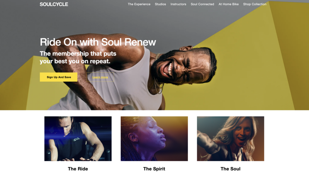
SoulCycle’s website exemplifies the art of simplicity and elegance. With a sleek monochromatic design, the website resonates with the brand’s commitment to high-energy indoor cycling classes. Striking visuals of vibrant classes and empowered riders set an inviting tone.
The website’s straightforward class schedule and seamless booking system make it effortless for visitors to join the SoulCycle movement.
Equinox Luxury Fitness Club
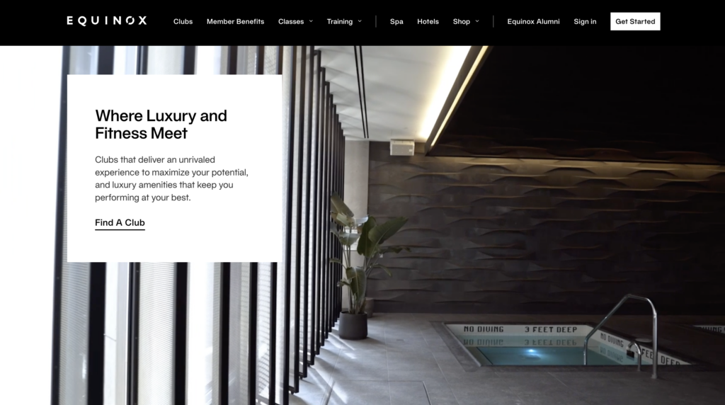
Equinox Luxury Fitness Club’s website exudes sophistication and exclusivity. The website’s immersive design showcases the club’s state-of-the-art facilities and luxurious amenities. From virtual tours of opulent workout spaces to expertly curated content on wellness and nutrition, Equinox’s website creates a complete digital experience for its high-end clientele.
Fiit
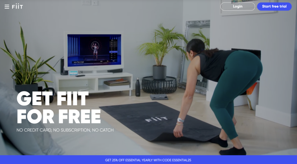
Fiit’s website brings a refreshing twist to the digital fitness realm. With an emphasis on interactive online workouts, the website’s design is clean and modern. The homepage showcases different workout categories, making it easy for users to find sessions that match their interests and goals. The integration of user-generated progress photos adds a sense of community and motivation.
Stacy Lel Fitness
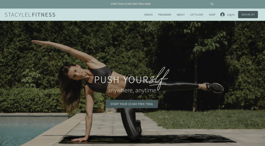
The homepage features a large hero image that showcases the studio’s signature barre-inspired workouts. The website is also well-organized, with easy-to-navigate menus and clear call-to-action buttons. One of the most notable features of the Stacy Lel Fitness website design is its use of a soft color palette. The website uses shades of Edgewater and bluish-gray, which create a calming and relaxing atmosphere. This color palette is also consistent with the studio’s brand identity, which is all about providing a supportive and welcoming environment for its clients. Another notable feature of the Stacy Lel Fitness website design is its use of high-quality images and videos. The website features a variety of photos and videos of the studio’s workouts, as well as testimonials from satisfied customers. These images and videos are visually appealing and informative, and they help to give potential customers a better understanding of what the studio has to offer.
IronEdge Gym Collective
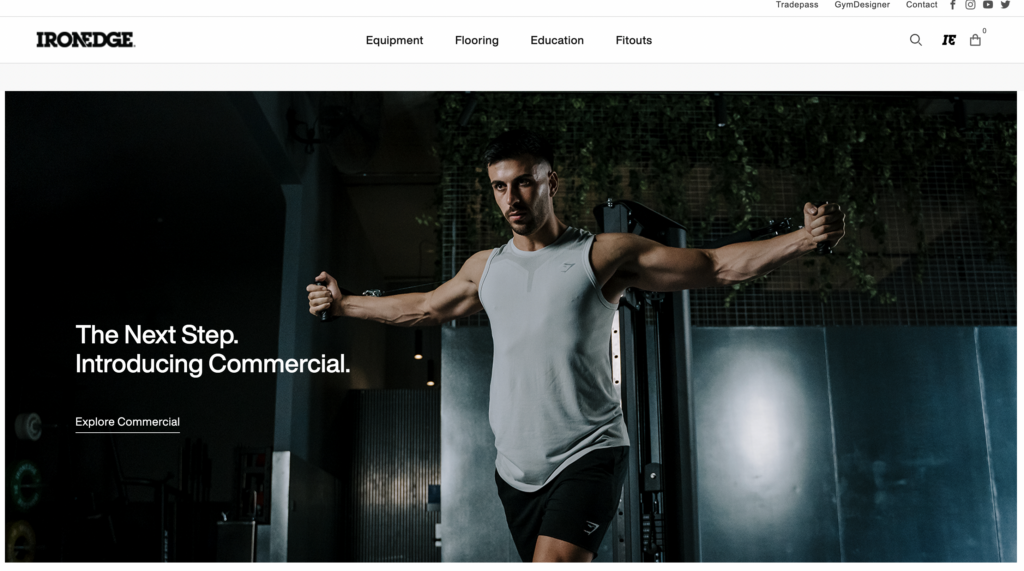
IronEdge’s website stands out with its clean, modern, and urban design. The homepage features a large hero image that showcases the brand’s vibrant community. The website is also well-organized, with easy-to-navigate menus and clear call-to-action buttons. One of the most notable features of the IronEdge website design is its use of video. The website features a number of short videos that showcase the brand’s fitness equipment. These videos are engaging and informative, and they help to give potential customers a better understanding of what IronEdge has to offer.
E-motion Fitness Hub
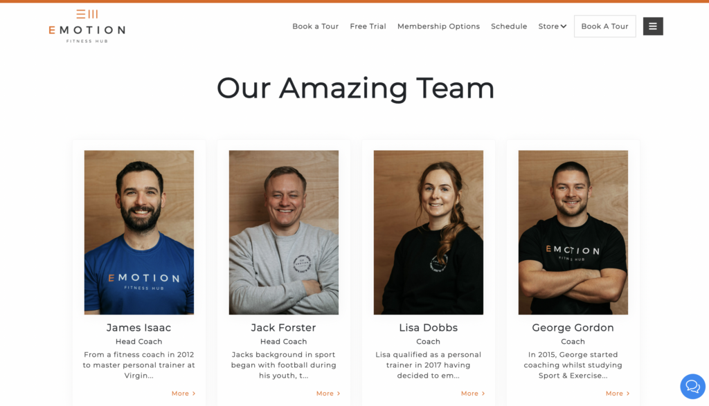
E-motion Fitness Hub takes a fresh approach with its interactive design elements. The homepage features images tour of the gym space, immersing visitors in the environment. What we like most about E-motion Fitness Hub’s website design is its use of a bright and cheerful color palette. The website incorporates shades of orange, yellow, and green, which collectively create a positive and energetic atmosphere. This color palette also aligns seamlessly with the gym’s brand identity, emphasizing its commitment to providing a fun and supportive environment for its members. Another noteworthy feature of their website, which isn’t often found elsewhere, is the ‘Meet the Team’ page. Aptly titled ‘Our Amazing Team’ (very cute!), the brand showcases its invaluable coaches and members with headshots. The page maintains a white background with occasional orange accents, enhancing its visual appeal.
Peloton
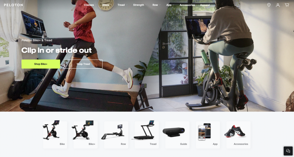
Peloton’s website reflects innovation and community-centric design. The sleek interface showcases the brand’s signature high-tech home fitness equipment and offers a comprehensive range of live and on-demand workout classes. The website’s emphasis on personalization enables users to find the workouts that best suit their preferences and goals.
Final Thoughts
Designing a fitness website is a multifaceted endeavor that demands a balance of aesthetics, functionality, and user-centricity. By integrating the essential elements, drawing inspiration from standout examples, embracing modern design trends, and adhering to best practices, you can create a website that resonates with your target audience and propels your gym’s success in the digital realm.
As you embark on this creative journey, remember that your website is more than a virtual portal – it’s a powerful tool to inspire, motivate, and connect with fitness enthusiasts eager to transform their lives.


