Best Beauty & Cosmetics Website Designs: Eye-Catching Examples
Delivering a seamless experience across devices, prioritizing mobile-friendliness & smooth navigation, and offering a visually captivating website means a lot for beauty and cosmetic brands. Especially when considering that 75% of beauty shoppers say that a website’s design is important in their decision to purchase a product.
Website Design Ideas for Beauty & Cosmetics Brands
In the beauty and cosmetics industry, having a distinctive and user-friendly website design is just as crucial as providing high-quality products. That’s why marketers and business owners focus on top marketing strategies for beauty and cosmetics in recent years.
Basic but true all the time: In the beauty industry, visuals are everything, as a matter of course. And a visually captivating website displaying products with top-notch imagery and high quality videos immediately catches visitors’ attention and draws them in to explore further.
Integrating interactive components like makeup try-on tools and skin type analysis adds a personalized touch, creating a more engaging shopping experience. Not to mention, including user-generated content and integrating social media help brands create an authentic and trustworthy image; as all we know, visitors love real stories and influencers. And that kind of usage of social media is a great way to connect with customers on a more personal level and promote the products.
In the process of crafting a beauty brand’s identity and values, a well-built website is a great player. From brand colors to typography and high-quality visuals, each design element ensures brand recognition and leaves a lasting impression on visitors. So, working with a professional knowing your “brand’s language” is a good call.
Furthermore, a website that highlights special offers and promotions while providing excellent user experience through easy-to-use tools, encourages loyalty and repeat business.
And yes, building a website that includes all of the above mentioned features requires a professional helping hand. Here is your starting point: Best web design agencies in the USA.
Best Beauty & Cosmetics Website Design Examples
Buckle up, beauty adventurers! This journey into the best beauty and cosmetics website design examples promises to be eye-opening, inspiring, and utterly transformative. Prepare to be wowed, empowered, and ready to take your own website to the next level!
MAC Cosmetics: Clean Design Speaks Louder
A clear layout means so much when it comes to website design.
From optimizing the user experience to ensuring easy navigation; from intuitive menus to organized & relevant content, a well-designed website with a clear layout undoubtedly works well. As a great example, Mac’s website features a minimalistic design that allows visitors to make purchases easily while switching through different product categories.
Being minimalist does not refer to limited & no colors; the developers of Mac’s website seem to have played the game well. So much so that the use of high-quality images, well-organized interface, consistent color scheme, and typography that aligns with their brand identity appeal to visitors no doubt.
What’s more, clear design improves mobile responsiveness, guaranteeing that the website functions well across various devices. The website ensures that users can effortlessly access the information they seek, resulting in increased user satisfaction and engagement.
Urban Decay: Make a Strong Visual Statement & Be Unique
Take the Urban Decay website in case you’re seeking an unconventional website design for your cosmetic brand! The website, which unveils the rule of creating a modern website, offers a unique and memorable user experience via a user-friendly interface and an out-of-the-box and colorful scheme. This distinct design technique showcases Urban Decay’s dedication to originality and self-expression, encouraging a strong emotional connection with its buyers.
As a part of the brand’s commitment to challenging traditional beauty standards, the Urban Decay website features models with diverse looks and styles – including Chloe Cherry from Euphoria.
By teaming up with models who do not conform to conventional norms, the brand embraces a message of authenticity and creativity. The great combination of a modern design and eclectic model representation not only enables Urban Decay to stand out in the crowded beauty industry but also remains its position as a trendsetter, attracting an engaged client base.
Nars Cosmetics: Bigger Is Better
We like minimalism so much, however, can not underestimate the power of being bold when it needs to be.
The Nars Cosmetics website’s bold typography and prominent use of giant images, is enticing attention to key messages and product info, ensuring that important details – like price and date of expiry – are not missed at all. That also reinforces the brand’s confidence, matching its reputation as a high-end cosmetics company.
Gigantic, aspirational, and high-quality images plus an uncluttered layout showcase the cosmetic products in detail, helping customers acquire a clear view while giving some hint of how the products would look and feel in real life via online tools.
What’s more, the ample whitespace covering the entire shop section, creates a sense of elegance, providing a seamless browsing experience like easily switching between categories and finding relevant info.
Kylie Cosmetics: Create an Emotional Connection with Fans
The official website of Kylie Cosmetics is a bold mark of the powerful integration of the brand’s identity and Kylie Jenner’s influence.
As the founder and face of the brand, Kylie Jenner’s influence creates a strong emotional connection with her fanbase and followers that seeks to have her style and beauty choices. So much so that we can see that the website works like Jenner’s personal social media platform!
The website, composed of product imagery, Jenner’s tutorials, and testimonials & reviews from customers, aims to persuade visitors to achieve a similar glamorous and trendy look as the celebrity herself via social proof elements. Additionally, high-quality images and well-crafted descriptions make the shopping experience appealing and informative.
Rhode: Blend Nostalgia and Fresh Look
How to attract eco-conscious consumers who seek sustainable beauty and cosmetic products? Ask Rhode!
With its fresh look, nostalgic elements, and emphasis on natural features, Rhode, founded by the well-known Hailey Rhode Bieber, has an excellent website design for a beauty brand. In addition to showcasing the brand’s commitment to environmentally friendly beauty products, the website also creates a sense of sophistication and purity through whitespace and minimalistic elements.
Additionally, the nostalgic images in the website evoke positive emotions and a sense of familiarity among customers. As widely known, nostalgia is a great way to create an emotional connection with a brand, making customers feel more engaged.
As Kylie Jenner’s website does, Rhode also encourages visitors to purchase to be just like Bieber. That’s why the layout is furnished with a great number of photos & quotes of the model.
As a note, there is no strict rule stating that creating one of the best beauty & cosmetic websites necessitates being a fashion model or a pop star. However, seeking professional assistance can make a significant difference in your website’s success. To promote your beauty, body care, or cosmetic products in the finest way available, check the best beauty & cosmetics marketing agencies in the USA out.
Keep reading for more examples.
Fenty Beauty: Dare to Be Unique
No doubt that Fenty Beauty is the most popular brand for its commitment to inclusivity and diversity in the cosmetic sector. And, yes, its website announces its ethos very loudly!
Besides the website’s sleek and modern layout showcasing contemporary and assertive beauty trends, Fenty Beauty does not hesitate to highlight its extensive range of products through high-quality images, videos, and striking elements. The bold use of color, teaming with diverse models with different skin tones, set the brand apart from traditional ones.
The website also provides educational resources, makeup tutorials (by directly well-known singer Rihanna, the founder), and beauty tips, establishing the brand as a leader in the cosmetics industry.
Rare Beauty: Get the Power of Dynamic Tools
Is it possible to create a dynamic and engaging user experience through a well-designed website? The Rare Beauty website says yes!
The website design, creating a sense of energy, excitement, and youthfulness, offers a pleasing experience for visitors via the great blend of high-quality images and videos with bold typography and a clean layout.
By providing active visuals like videos demonstrating makeup application techniques or models showcasing the products in motion, visitors can see the products in detail, making the shopping experience more engaging and interactive.
Chanel Beauty: Remember to Be Elegance
And… It’s time to talk about luxury in the beauty and cosmetic sector.
The Chanel Beauty website design runs true to form and exudes elegance with its pure and minimalistic layout, demonstrating a blend of classic aesthetics and modern elements. Besides the high-quality photographs and videos capturing the spirit of Chanel’s luxurious beauty products, from the typography to the color palette, each and every component seems carefully chosen by experts.
Unlike the other beauty brands, Chanel Beauty’s website focuses on storytelling through engaging content, and creates special experiences for each creation while sharing its heritage, craftsmanship, and dedication to produce premium beauty products.
Advanced Nutrition Programme: Essentials for Healthy and Beautiful Skin
UK-based digital agency Skywire embarked on a collaborative project with the Advanced Nutrition Programme (ANP), a brand known for its premium range of supplements aimed at supporting skin health and wellbeing. The project’s goal was to transition ANP from Magento to BigCommerce, enhancing their e-commerce capabilities and user experience (UX/UI) while preparing for future technical advancements.
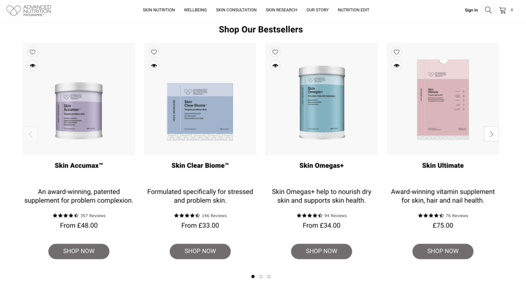
From the moment you land on the website, it’s clear you’ve entered the realm of a beauty and health brand. The immediate display of best-selling products is a thoughtful touch for both loyal users and newcomers alike. What truly sets this website apart, though, is its comprehensive approach to content, catering to a wide array of user needs and concerns without feeling overwhelming. Whether you’re searching for products based on a specific skin issue, key ingredient, or vitamin, the site’s intuitive navigation and helpful guides make finding the perfect product a breeze. Additionally, the brand offers an easily accessible consultancy service right on the website, enhancing the overall user experience. With its straightforward interface and user-friendly design, this website is a pleasure to explore!


