












KOTA is an award-winning Creative Web Design Agency in London. Technically and creatively skilled to translate your brand into its best digital self, they specialise in strategic brand identity, creative web design, smarter web development, and results-driven digital marketing. Their design and development approach creates impactful, engaging brands and immersive digital experiences that bring you a return on creativity. They’re also WordPress content management system experts.
KOTA
Gold MemberKOTA are an international, award-winning, brand-to-build creative agency. They specialise in Brand Strategy, Creative Web Design, Web Development & Digital Marketing.
About
- HQ
- OFFICES
-
HEADQUARTERS
- ADDRESS: 1-5 Clerkenwell Rd, London, EC1M 5PA
- PHONE: 44 2039510562
- E-MAIL: [email protected]
-
OFFICE
- ADDRESS: 477 Madison Ave, Midtown Manhattan, 6th Floor, NY 10022
- E-MAIL: [email protected]
KOTA is a creative web design and branding agency based in London that crafts beautiful work for brands who refuse to blend in. We’re a team of talented creatives who live and breathe great design.
Service Expertise
Reinvent your online store with an expert team who know what it takes to turn clicks into customers and keep them coming back.
Service Expertise
KOTA is a creative web design and branding agency based in London that crafts beautiful work for brands who refuse to blend in. We’re a team of talented creatives who live and breathe great design.
Sector Expertise
- Film Production
- Museums & Cultural Institutions
- Publishing Industry
- Video Gaming
- Music Recording & Publishing
Sector Expertise
- Luxury Retail
- Clothing Brands
- E-commerce Fashion
Sector Expertise
- Asset Management
- Brokerages
- Finance Software
- Wealth Management
- Investment Management
- Financial Advisors
- Banking
Sector Expertise
- Mental Health
- Healthcare Consulting
- Medical Devices
Sector Expertise
- Bars & Pubs
- Event Venues
- Nightclubs
- Hotels & Resorts
- Boutique Hotels
Sector Expertise
- Software Development
- Data Analytics & Big Data
- SaaS
- Hardware & Devices
- Mobile Apps
- IT Services & Consulting
Sector Expertise
- Luxury Yachts & Boating
- Luxury Jewelry & Watches
- Luxury Beauty & Cosmetics
- Private Banking & Wealth Management
Sector Expertise
- Architecture Company
- Development & Construction
- Property Management
KOTA Reviews
Premium design-led digital experience studio
KOTA positions itself as a premium design-led digital experience studio, specializing in high-end website design, branding, and visually distinctive digital products. The agency’s core strength lies in translating brand vision into aesthetically refined, user-centric experiences that drive strong stakeholder satisfaction and elevate brand perception.Strongest differentiators
Its strongest differentiators are:- Exceptional visual design quality and aesthetic precision
- Strong alignment between brand expression and UX execution
- Consistent delivery of premium digital experiences
- High stakeholder satisfaction across creative outputs
- Strong brand and experience-driven value creation
- Limited visible depth in performance marketing, acquisition strategy, and conversion economics
- Less emphasis on technical infrastructure or data-driven growth systems
DAN Perspective
KOTA fits best into the category of “premium design and brand-experience studios”, making it a strong choice for brands prioritizing visual identity, creative differentiation, and high-end digital presence over performance-driven growth execution.Strategic Depth
Client feedback highlights KOTA’s ability to translate brand vision into visually striking digital products supported by effective UX outcomes and positive end-user response. Deliverables consistently meet or exceed expectations.Execution Excellence
Reviews consistently emphasize elegant design execution, refined visual detail, reliable delivery quality, and strong stakeholder satisfaction across branding and website outputs.Speed & Reliability
Clients frequently report punctual delivery, strong organization, efficient milestone management, and responsive communication, with some projects completed ahead of schedule.Collaboration Quality
Feedback highlights flexibility, clear communication, and strong stakeholder satisfaction across branding and website initiatives.Primary Expertise
Client outcomes strongly associate the agency with premium website design, branding, UX excellence, and visually driven digital experience creation.Value Creation Pattern
Reported gains cluster around visual quality, brand perception, UX success, and stakeholder satisfaction. Evidence around measurable acquisition growth, conversion performance, or infrastructure ownership remains limited.Price–Performance Balance
Projects are reported as delivered on time and within budget with strong satisfaction, suggesting positive value perception despite limited explicit pricing transparency.Transparency & Scope Clarity
While delivery reliability and satisfaction are evident, direct client commentary on pricing transparency, contractual flexibility, or measurable ROI governance remains limited.Client Satisfaction
Client sentiment is strongly positive, with consistent praise for creative quality, delivery experience, and overall project success.Referability
Clients demonstrate a high likelihood of recommending KOTA and continuing collaboration, indicating strong trust and satisfaction driven by creative excellence.Case Studies
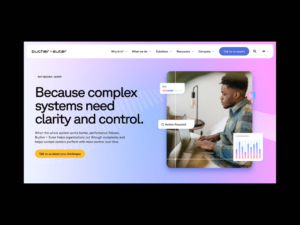
Bucher and Suter brand strategy, identity, and web design.
Client: Bucher Suter
Industry: IT & Technology
- Digital Strategy
- SEO
- UX Design
- Video Production
- Web Design
- Web Development

Bucher and Suter brand strategy, identity, and web design.
Bucher Suter helps enterprise organisations get more from their contact centre platforms. They connect systems, improve performance and help CX teams make technology work harder for people, teams and customers.
The expertise was always there. The challenge was helping people see it faster.
B S works in a category full of technical language, platform noise and plenty of AI chat. Their brand had depth, but the story had become harder to follow. The identity wasn’t always easy to apply consistently, and the website made visitors work a bit too hard to find the good stuff.
Before touching the logo, colours or website, we started with strategy.
The strategy
We built the strategy around one clear idea: Bucher Suter makes the whole contact centre system perform as one, then keeps it performing over time.
That moved the story away from long lists of technical capabilities and towards the problems customers actually recognise: disconnected systems, underused platforms, stretched teams, complex environments and pressure to make AI genuinely useful.
Five strategic pillars became the foundation:
- Connect the whole contact centre system
- Own performance beyond launch
- Proven in complex environments
- Make your platform investment pay off
- Make AI work for people
They gave the team a practical filter for every decision. If something didn’t make the value clearer or speak to the customer’s reality, it didn’t make the cut.
The audience
B S customers are expected to improve service, prove ROI and keep critical platforms performing, all while managing live systems, sensitive data, internal pressure and limited resources. It’s a lot of complexity to deal with, so they need a partner who understands the operational reality behind the technology.
That shaped the brand from the start: calm, direct, technically credible and focused on making complexity feel manageable.
Simplifying the identity
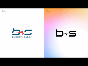
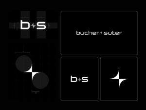
The original logo had recognition, but the abbreviated Bucher Suter styling made the full name harder to read, say and remember. A full rebrand would’ve been overkill, so we refined what was already working.
We brought Bucher Suter to the front and created a separate icon for compact digital spaces, from social profiles to favicons. The result improved recognition while protecting the brand equity they’d already built.
Turning integration into a visual story
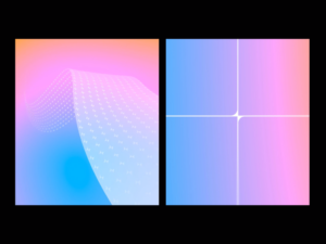
B S connects fragmented tools, platforms and processes into a smoother system. We needed to show that without defaulting to dense diagrams or generic tech visuals. So we created the wave.
Built from contact centre components flowing together, it turned the strategic idea of whole-system performance into something people could understand at a glance. It now flexes across hero sections, CTAs, backgrounds and marketing materials.
Rather than creating loads of disconnected visual assets, B S had one distinctive device that could carry the story across the brand.
Creating a colour system with control
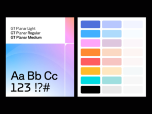
Bucher Suter already had a colourful world, but the existing gradients needed more discipline. So we introduced a cleaner palette with a minimal base, and a refined rainbow gradient drawn from the original brand colours. This gave the team more flexibility without losing consistency.
The result feels sharper and more distinctive, with enough warmth to stand apart from the sea of enterprise-tech blue.
Building the website around customer problems
We rebuilt the site structure around the five strategic pillars, creating clearer routes through the site. That means a CX leader can quickly find the value in improving platform performance, technical stakeholders can still get to the detail they need, and teams exploring AI can understand Bucher Suter’s practical approach without being hit with hype.
Every page had a job. Instead of asking, “What do we need to say about this service?”, we asked, “What problem is this helping the customer solve?” Small shift. Big difference.
Brand-to-build
The website uses a clean digital interface with controlled moments of colour, gradient, shadow and motion. A Spline-built wave animation brings energy to key moments, including the homepage and CTAs, while reinforcing the idea of connected systems.
Every design choice had to earn its place. The site needed to feel on-brand, modern and distinctive, without adding more noise.
A steadier brand voice
Bucher Suter has deep expertise, but it wasn’t always expressed consistently. So we developed a tone of voice that reflects what makes the business valuable: connecting complex systems, taking ownership beyond implementation and bringing a practical, people-focused approach to AI.
The new voice is measured, useful and confident. It explains technical complexity without hiding behind jargon, and leads with outcomes rather than features.
Making consistency easier
A brand only works when people can actually use it, so we created a custom-built online brand platform, giving the Bucher Suter team one place to access guidelines, assets and usage rules. This makes the system easier to apply across sales, marketing, internal comms and future content.
The result
Bucher Suter launched with a clearer strategy, sharper identity and a website built around the problems their customers actually face.
The refreshed logo improves recognition. The colour system brings control and personality. The wave gives the brand a distinctive expression of integration. The website creates clearer journeys and stronger commercial relevance.
Most importantly, Bucher Suter now has a clearer way to explain its value, make decisions and keep the brand moving forward.
Client: Bucher Suter
Industry: IT & Technology
Sector Expertise: SaaS
Location: London, UK
Completed: Jun 2026
Client: UPP
Industry: Entertainment
Cinematic web experience for a Hollywood VFX studio.
Client: UPP
Industry: Entertainment
- UX Design
- Video Production
- Web Design
- Web Development

Cinematic web experience for a Hollywood VFX studio.
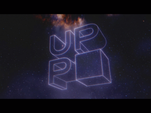
Universal Production Partners (UPP) is the VFX powerhouse behind some of Hollywood’s most visually stunning blockbusters, including Barbie (2023), Blade Runner 2049 (2017), and Conclave (2024).
Their work pushes the boundaries of digital effects, crafting immersive, otherworldly visuals that elevate storytelling to an art form. When it came to their website, they needed something brave and equally ambitious—a digital experience that reflected the high-caliber artistry of their work.
A website worthy of Hollywood’s finest
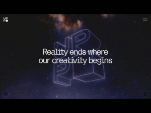
We wanted UPP’s site to reflect the cinematic depth, artistry, and innovation that define their work. It had to be an immersive, seamless, and boundary-pushing website—one that transports visitors into their world from the moment they land.
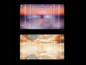
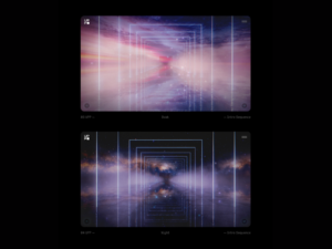
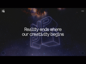
Far from a traditional website, it feels like stepping into an immersive corridor. As you navigate, you walk through a digital space filled with beautiful reflections, expansive skies, and cinematic lighting effects that echo the artistry of UPP’s work.
Cinematic storytelling through WebGL: Pushing the limits of web design
We designed a site that fuses motion, interactivity, and storytelling into a seamless experience.
- We implemented fluid transitions, 3D effects, and motion-driven interactions that mimic the feeling of stepping into a movie universe.
- Dynamic scrolling effects guide users through UPP’s portfolio, bringing their VFX work to life as they navigate.
- The homepage unfolds seamlessly, instantly immersing visitors in UPP’s world of visual effects mastery.
An intuitive, immersive user journey
- We crafted an interface that balances cinematic spectacle with seamless usability, ensuring that the experience is visually stunning without compromising functionality.
- Strategic UX design ensures that visitors—whether film industry professionals or casual fans—can effortlessly explore UPP’s portfolio and expertise.
- Microinteractions, hover effects, and motion cues make the site feel alive and responsive to user input.
A website that adapts to the time of day
- Adding a subtle layer of immersion, the entire website environment changes depending on when you visit—cycling through Dawn, Day, Dusk, and Night themes.
- Each version brings a unique atmospheric tone. A soft echo of the craft, depth and detail they bring to every frame.
- This dynamic environment enhances the feeling that you’re stepping into a living, breathing digital space—not just browsing a website.
- Dawn, Day, Dusk, Night. Four moods. One seamless experience. And a quiet reminder: web design can (and should) do more.
Gaming-inspired interactivity
- Borrowing from game design, the site includes interactive storytelling techniques, guiding users through UPP’s work as if they were moving through a virtual world.
- Parallax effects, interactive video sequences, and reactive elements keep users engaged and immersed in the experience.
A high-performance experience
- We stress-tested and optimised every animation and transition to ensure lightning-fast load times and smooth performance across all devices.
- By leveraging cutting-edge front-end technology, we ensured the site is as technically impressive as it is visually striking.
Custom backend for seamless updates
We built a flexible, user-friendly CMS empowering their team to:
- Update project listings as new films go from “In Production” to release.
- Upload new reels and VFX breakdowns without relying on external support.
- Manage a secure, client-exclusive portal for restricted-access reels (e.g., showcasing vehicle work, environments, or creatures on-demand).
The impact: Setting a new standard for creative industry websites
- Engagement that mirrors a film-like experience—Users feel like they’re walking through the website, with every transition and interaction adding to the immersion.
- A site that elevates UPP’s brand presence— There are no other VFX studios with a website like this, cementing their position as leaders in the industry.
- A benchmark for what’s possible in web design—This project proves that websites don’t have to be static—they can be cinematic, interactive, and transformative.
- Recruiting the next generation of VFX talent—The immersive experience makes an impact on up-and-coming artists looking to work in a cutting-edge studio.
- Operational efficiency for UPP’s team—Their new CMS empowers them to update their portfolio instantly, keeping their work fresh and relevant.
As audiences demand more engaging digital experiences and brands seek new ways to stand out, this project is a testament to how design, technology, and storytelling can merge to create something truly extraordinary.
Results 30 days post-launch:
- 44.8% increase in sessions from Google.
- 101.4% increase in users from referrals.
- 150.6% increase in user stickiness.
The future of web as an experience
This project creatively pushes what a website can be. As the web continues to evolve into a more interactive, experiential space, brands have the opportunity to captivate users in ways that go beyond traditional web design.
For UPP, it was about creating a digital experience worthy of the cinematic masterpieces they help bring to life.
From the very first conversations, James, KOTA’s Creative Director, understood our vision. He didn’t just meet the brief—he transformed it. The concept he delivered was beyond what we had imagined: a bold, elegant experience that positions UPP at the leading edge of both design and digital storytelling. It’s no exaggeration to say the final product redefines what a website can be. We’ve even adopted a new line in talking about it: “It’s not a website, it’s an experience.”
– Shaun Obanion
Social Media and PR Manager of Universal Production Partners
Client: UPP
Industry: Entertainment
Sector Expertise: Film Production
Location: London, UK
Technologies: WebGL
Completed: Mar 2025
Client: Bucher Suter
Industry: IT & Technology
Agency News
KOTA Reveals The KOTAverse: A Decade of Creative Evolution in a Unique Digital Experience

KOTA Reveals The KOTAverse: A Decade of Creative Evolution in a Unique Digital Experience
In an era where digital design continually redefines itself, KOTA announces the launch of The KOTAverse, a celebratory microsite that encapsulates a decade of forward-thinking design and creative exploration. This unveiling aligns perfectly with the 2024 trend of immersive digital experiences, positioning it as a pivotal development in the world of creative and tech design.
The KOTAverse isn’t just a showcase of KOTA’s 10-year journey, but a testament to the power of interactive, storytelling web design, and its potential to captivate audiences.
James Piper, Creative Director at KOTA says:
The KOTAverse is a journey through our creative evolution, showcasing what happens when you combine collaborative talent with state-of-the-art technology. We hope it will inspire and ignite a new perspective on what web design can achieve.
The microsite features an array of groundbreaking elements crucial to modern web design. Its timeline, crafted with Three.js and CSS 3D animations, offers an immersive and interactive experience, reflecting KOTA’s unique approach to storytelling in digital spaces. AI-generated avatars and dynamic interactive components further demonstrate the agency’s commitment to integrating cutting-edge technology in design.
While The KOTAverse is a milestone for KOTA, it also represents the evolving landscape of digital design, highlighting themes of collaboration, creative play, and the journey of adaptation in an ever-changing digital world. For those seeking to stay at the forefront of industry trends in 2024, KOTA is one to watch.
For a deeper dive into the creative process and the technologies used, KOTA’s latest blog post provides extensive insights.
Agency: KOTA
Published: Jan 2024