


11 Inspiring Food Website Designs for Foodies (and Businesses)
Brace yourself for the recipe to success in designing an amazing food website with our top 10 picks!
Long gone are the days when foodies had to make do with PDFs of menus and images of food in bad lighting.
Contemporary food brand websites make use of a great user interface design, beautiful photography, easy interface, brilliant colors, appealing fonts, quality content, and often a magic ingredient – to entice you.
In this article, we’ve listed the best food website designs and important elements that a great food website should contain. Keep on reading – but make sure to not get hungry.
11 Best Food Website Design Examples for Your Inspiration
Below find the best food website ideas that have our stamp of approval:
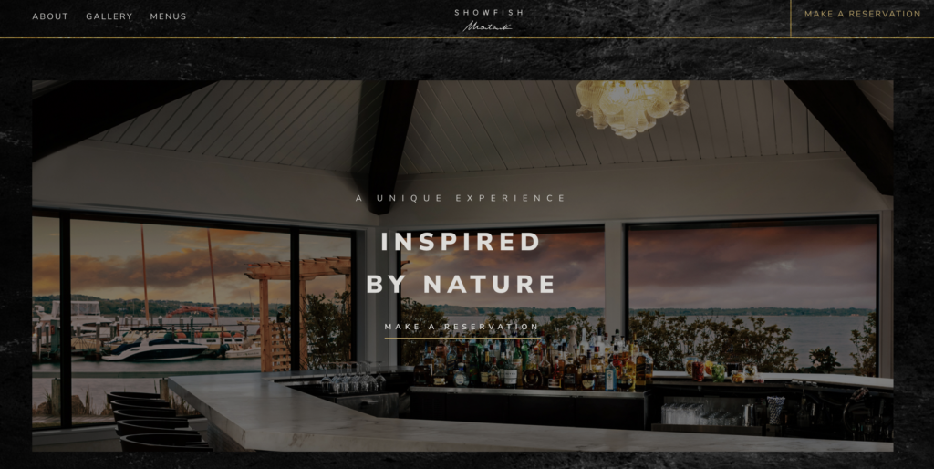
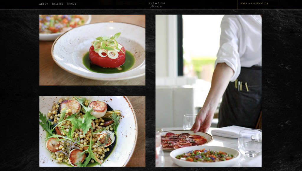
SHOWFISH has an elegant and sophisticated looking website created by the successful digital marketing agency, The Charles. To bring the SHOWFISH concept to life, The Charles merged natural textures and hand-drawn elements with contemporary typography and color accents.
More hand-drawn elements and a monochrome color scheme are used in the website design to further convey the restaurant’s motto, “Inspired by Nature.” One of the best food website designs, we must say.
CreativeWeb brought The Egg Truck’s website to life with a custom WordPress design. They used playful SVG animations and vibrant food photography to capture the brand’s fun essence. Alongside this, on-site SEO improvements boosted visibility, and optimization for quick loading times ensured a smooth user experience. The result is a visually appealing, user-friendly website that drives interest and business effectively.

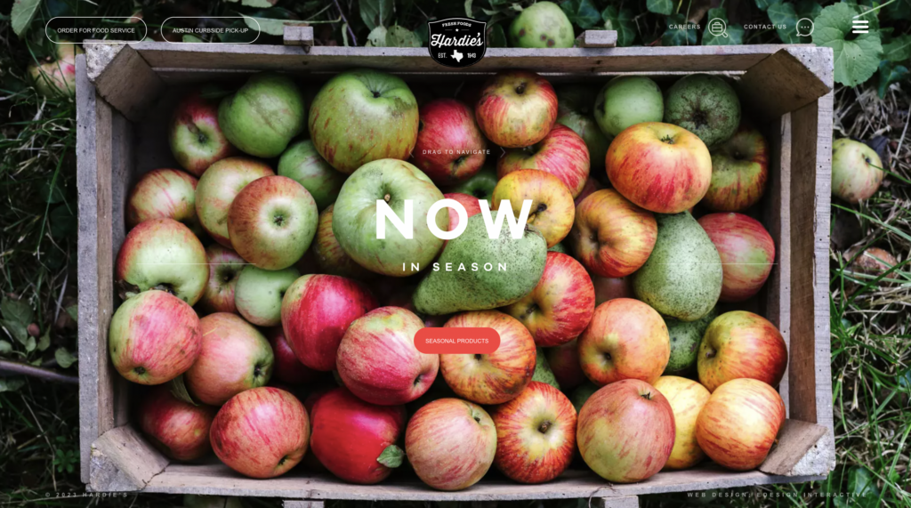
The website for Hardie’s was created by the eDesign Interactive team to perform two key tasks. The business identity, history, beliefs, and work ethics are displayed in one section of the website, while the product catalog and the site’s remarkable selection of in-season produce are featured in the other. The food and beverage marketing agency, eDesign Interactive team, paid close attention to the UX wireframe of the site and provided layout improvements. The website has background images of high-quality, in-season products together with simple but captivating headlines and display copy.
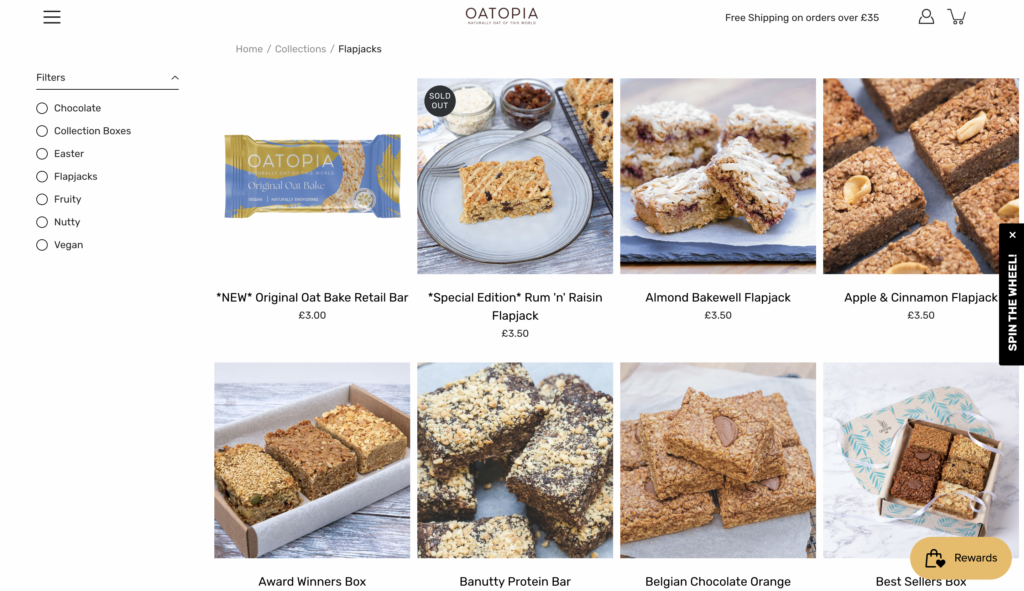
Love healthy snacks that are artisan and utterly delicious? Then, you’re in the right place. The humble oat and flapjack are at the center of Oatopia, which offers a variety of delicious flavors produced using handmade homemade recipes and the best, sustainably sourced ingredients. We adore Oatopia’s website because it uses a color scheme that is indicative of oats and because it features exceptionally excellent imagery of products throughout.
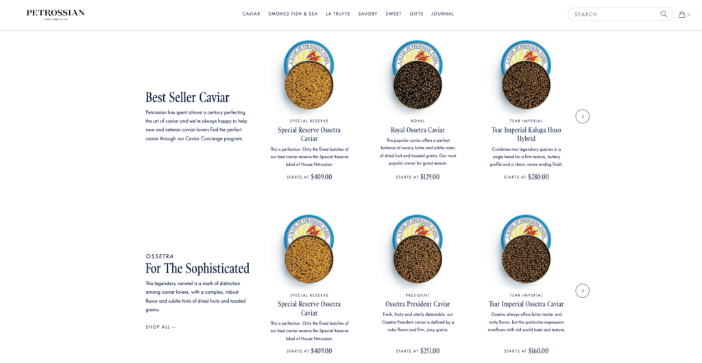
Skywire collaborated with Petrossian, the leading global purveyor of caviar and fine seafoods, and their brand agency to create a new digital home for Petrossian.com. The website has an elegant feel right from the start. It utilizes a clean and fresh aesthetic with a white background that allows the products to take center stage. Easy navigation is ensured by a clear menu at the top of the page. As you explore, a user-friendly drop-down menu lets you delve into details without feeling overwhelmed. This is more than just an eCommerce site; you can purchase delicacies like caviar and seafood, or even find gifts. But the best part? Experience these products firsthand at their various restaurants! Locations are conveniently listed throughout the site, and a full restaurant list is readily accessible from the homepage.
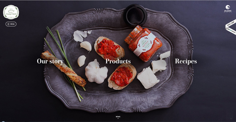
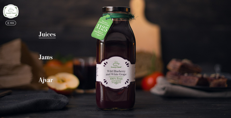
Granny’s Secret has a Didone serif and a script face that invokes the feeling of Granny’s handwritten recipes, not to mentioned brilliant photography that invokes hunger.
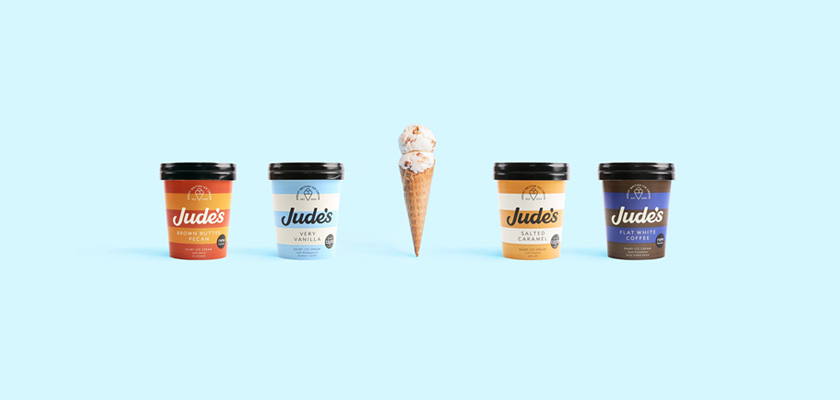
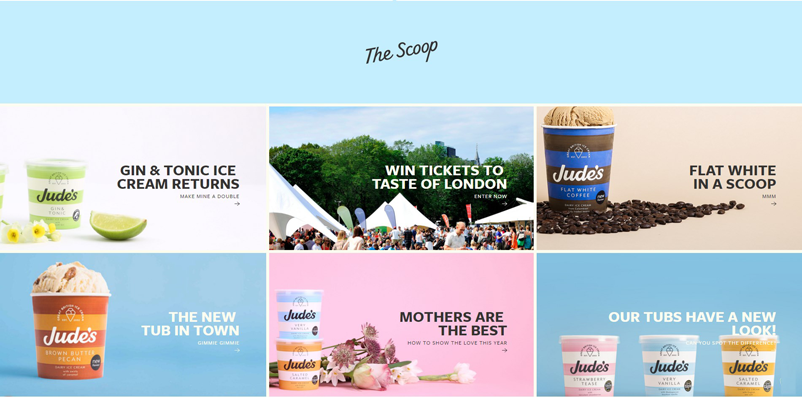
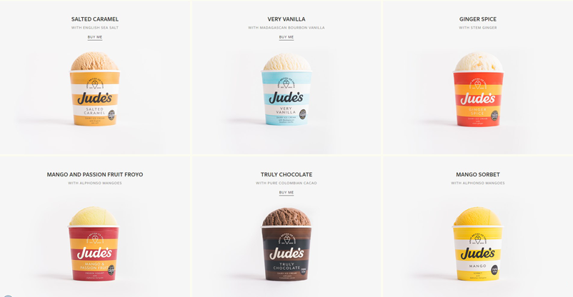
Jude’s Ice Cream is a fun, colorful product to start with, the web developers of Jude made sure to keep the website design just as fun. They use tints from its product packaging to tie all the flavors together.
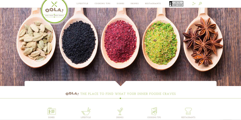
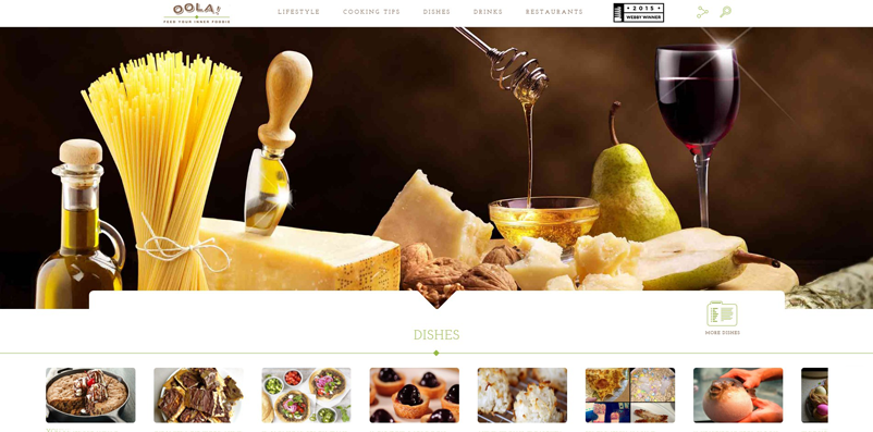
The photographers and photo-editors of Oola are on fleek with these food images designed to tempt!
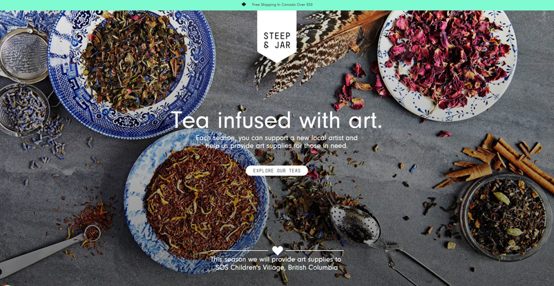
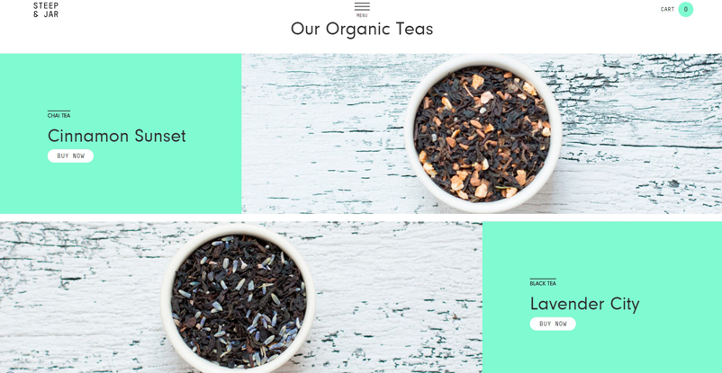
Steep and Jar puts care into consistently framed and edited photos of its teas – the play of colors, neat fonts and great photo-skills make ordinary tea leaves look gorgeous!
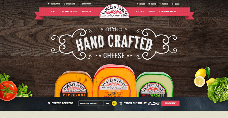
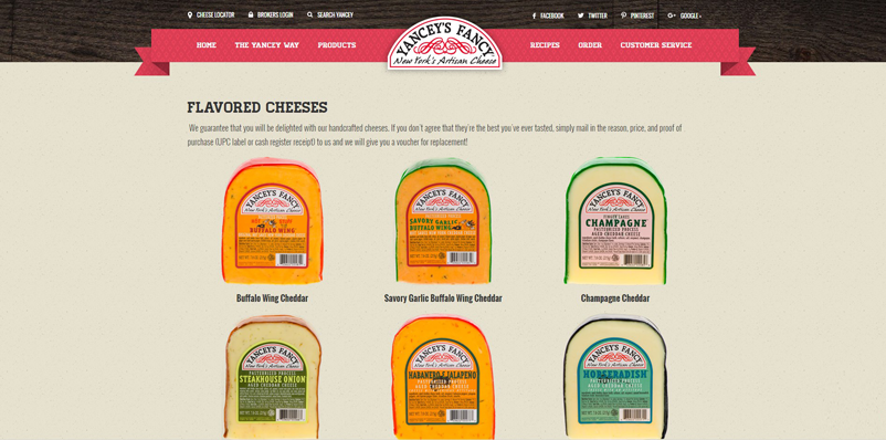
Yancey’s Fancy sells a variety of cheese – and yet somehow makes them look tantalising and different in a beautifully designed website.
5 Vital Ingredients to Create a Delicious Food Website:
A carefully selected color scheme and high-quality photos are crucial components of any food website. If recipes are given, you might need an appealing font and other attractive elements that won’t bore the reader. Beyond these design essentials, effectively engaging your audience with food social media campaigns can also greatly enhance your brand’s visibility and interaction. But don’t you worry! We have listed all the ingredients you need for a delicious-looking food website below:
1. Enticing photography
The eyes lay first on the food – the staple of every food website is a combination of brilliant photography and amazing photo-editing skills.
No matter what your product, it needs to look delectable, fresh, and pretty. Food photography is an art that every food brand needs to master. Keep your plating perfect – your dishes, cutlery and glasses carefully arranged or aesthetically haphazard.
2. Appetizing colors
Colors can play up or down your food, they can make it look tempting or boring. Color play is a big factor in what makes a food website design stand-out.
A good trick of the book when choosing the background color is to sample colors from the food itself, and darken or lighten them – so as to make them all fall in a close palette and make the food look attractive. For the typography, do the reverse (lighter or darker) than the background. You can also sample with a completely new complementary color.
3. Tasty typography
The typography for a food website needs to compliment your food, without overshadowing it. You can draw inspiration from restaurant menus, cookbooks or handwritten recipes.
A contract of type styles between content (subheadings and ingredients) can add a unique flavor to your website design.
4. Yummy Content
The content always matters. Once the readers have had a look and feel of your website, they seek what value you can add to their knowledge or how your content feeds their interests.
Always keep your content light, fun, easy and simple – so as to catch their attention and keep them hooked. You can have some fun with the name of the dishes or the recipes you add to your blogs.
5. Delicious Interface
A good user interface design is the foundation of any website. It allows the user to carry out their purpose easily and browse efficiently without getting distracted.
The best UI work subtly in the background and elevate your user experience. When designing a user interface keep in mind that all the functions are consistent and intuitive, the user has a clear idea on how to perform his desired action, its highly responsive and keeps up with the user’s speed and also well-maintained for it to be ABSOLUTELY DELISH – speaking strictly in food terms.
You can also check 4 Best Website Builder Tools for Food & Beverage Industry article for further reading.