


We are a team of Brand Strategists, Brand Designers and Brand Marketers, helping brands reach their goals. We develop successful brands that connect with the right people. We are one of Australian leading brand building agencies, check out our website for more information.

Viabrand®
Standard MemberAward-winning brand team helping Australian companies plan, design, launch and manage amazing products and services.
About
- HQ
- OFFICES
-
HEADQUARTERS
- ADDRESS: Level 1, Unit F4, 12 Browning Street, South Brisbane QLD 4101
- PHONE: 1300 876 080
- E-MAIL: [email protected]
Services
Branding
Service Expertise
Digital Marketing
Email Marketing
Service Expertise
Inbound Marketing
Online Advertising
Service Expertise
SEO
Service Expertise
Social Media Marketing
Service Expertise
Web Design
Service Expertise
Web Development
Service Expertise
Industry Expertise
Automotive
Sector Expertise
- Automotive Parts & Components
- Automotive Aftermarket
- Commercial Vehicles
- Auto Retail
- Mobility & Transportation
- Electric Vehicles (EV)
Education
Sector Expertise
- Language Schools
- Vocational & Trade Schools
- Educational Consulting
- K-12 Schools
Energy
Sector Expertise
- Energy Equipments
- Energy Storage
Finance
Sector Expertise
- Adventure Travel
IT & Technology
Sector Expertise
- Software Development
- SaaS
- Cloud Computing
- IT Services & Consulting
- Internet of Things (IoT)
- Hardware & Devices
- Cybersecurity
- Artificial Intelligence (AI)
- Machine Learning (ML)
Law
Sector Expertise
- Corporate Law
- Business Law
- Litigation and Dispute Resolution
Real Estate
Sector Expertise
- Residential Real Estate
- Property Management
Startup
Sector Expertise
- Manufacturing & Industrial
- Software & SaaS
- Artificial Intelligence (AI)
Telecommunications
Sector Expertise
- Internet Service Providers (ISP)
- Telecom Infrastructure and Equipment
- 5G & Next-Gen Network Technologies
Awards
- International Visual Identity Awards Winner / Telecommunications 2021
- International Visual Identity Awards Winner / Manufacturing 2020
→
Case Studies

Intelligent Chemical Containment Demands Intelligent Brand Positioning
Intelligent Chemical Containment Demands Intelligent Brand Positioning
Viabrand®
Snosko is the market leader in chemical dual containment systems. Offering Australian industries, a range of both dual contained and single walled storage systems for a wide range of applications.
Snosko utilises first principles engineering, Finite Element Modelling (FEM), and rigorous testing regimes to develop innovative, modular, patented solutions which are corrosion-resistant, economical, and designed for easier operator maintenance.
As the business planned to strengthen their position in the market, they reached out to the Viabrand® team to collaborate on a number of growth marketing projects.
Chemical Systems, Built Tough
Snosko’s mission is to provide clients with safe, fit-for-purpose products that cater to their unique needs and protect the environment. Their unique modular solutions are designed to address chemical containment providing a unique opportunity for Viabrand® to reinvent how they talk about issues such as chemical containment, dangerous spill prevention and leak detection.
The process took a focus on the brand position offering, including consistent and strong messaging that would be rolled out through brand marketing touchpoints and campaigns across Search, Social Media and Website.
Systems that work hard for you
As we moved through the process, we delivered better value definition to customers. The key value was that Snosko delivered ‘chemical systems, built tough’. Viabrand® was able to provide tactical methods to communicate this message across extended business touchpoints including:
- Express Discovery Session
- Full Brand Positioning & Messaging Strategy
- Identity Review & Design Recommendations
- Colour Review & Recommendations
- Google Business Profile Optimisations
- LinkedIn Profile Optmisations
- Social Media Post Templates
- Full Website Design, Copywriting & Development
- Campaign Planning and Implementation
End-to-end Solutions for Snosko
Viabrand® was involved in all aspects of the brand positioning – discovery, research, brand strategy, design, copywriting, website development and now campaign implementation.
The results have engineered positive outcomes in creating stronger brand recognition, brand connection (and reconnection), and easily communicating the USPs of Snosko – rigorously tested, engineered to protect people and the environment, corrosion resistant, designed for optimal operator maintenance and products that are safe, effective and economical.
The business continues to grow in confidence in their new brand position and are inspired, confident ready to hit the global market.
Client: Snosko
Industry: Retail
Sector Expertise: Manufacturing & Industrial
Services
Branding
Web Design
Web Development
Digital Marketing

A Campaign that Reconnects You with What Really Matters
A Campaign that Reconnects You with What Really Matters
Viabrand®
Founded in 1928, Century Batteries has grown to become the undisputed market leader in the Australian/New Zealand automotive battery market. Supplying more than 1.5 million batteries every year the iconic brand produces recognisable and reliable products to Australians and New Zealanders alike across a wide range of applications.
Switch off, Hit Refresh and Reconnect with What Matters
After Covid kept us indoors, locked down, and with borders closed for the better part of two years, Viabrand® was tasked with the challenge of creating a campaign to reinvigorate the idea of getting outside and reconnecting with the things we love to do – exploring the great outdoors, getting out on the water, camping and connecting with family and friends.
The recreational campaign for Century Batteries focused on a full broadcast offering campaign that would be rolled out across a wide range of media throughout Australia and New Zealand.
Supporting an Immersive Campaign
Taking the brief of creating a campaign to inspire a renewed love of getting out and about, Viabrand® created a range of deliverables for the national campaign across Australia and New Zealand, including:
- Creative Direction and Script Writing
- Broadcast Video On Demand Production (Digital TV)
- Radio Ad Campaign
- Print & Digital Collateral
- Social Media Ad Campaign
True Success in Collaboration
Viabrand® carefully managed each aspect of the immersive campaign in collaboration with our trusted and quality production partners providing:
- Consultation throughout every stage of the project.
- Planning and in-depth analysis of project requirements.
- Script writing for 6”, 15”, and 30” clips to suit a range of media including social media and television.
- Talent sourcing and casting.
- Arrangement of lighting, sound and visual props to suit the client’s vision.
- Video production and sound engineering to meet multiple media specifications.
- Art direction across the entirety of the project.
Already successful with the client, the campaign hit the mark in creating brand recognition, brand connection (and reconnection), and feel-good ads we all needed after a difficult few years.
Client: Century Batteries
Industry: Automotive
Sector Expertise: Automotive Aftermarket
Services
Creative
Content Marketing
Social Media Marketing
Video Production
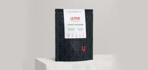
Repositioning a Packaging Company for the Next Stage of Growth
Repositioning a Packaging Company for the Next Stage of Growth
Viabrand®
Ultra Labels is a leading Australian-owned business that provides custom label and flexible packaging solutions using cutting-edge print technologies. Ultra Labels approached Viabrand to help prepare their business for the next stage of growth.
A Quality-inspired Brand Refresh
Viabrand refreshed Ultra Labels brand look to reflect its role as a premium provider of packaging solutions as they expanded into new digital printing and flexible packaging options.
Viabrand analysed the market, competitors and the client’s brand strengths, target markets and buyer personas to develop a brand refresh strategy.
A Logo that Merges Two Unique Talents
The Stockley and Pagano ‘shield’ logo mergers the two initials of the directors and symbolises the protective nature of the service they offer their clients. The logo captures their brand essence by incorporating warm champagne tones to symbolise the warmth and sincerity in their consultative approach to clients.
Viabrand then reinvigorated Ultra Labels’ branding assets to reflect its position as a quality packaging solutions provider whose work, consultation and customer service exceeded industry standards.
Updating brand colours to symbolise energy (red), sophistication (black) and refinement (cool gray), Viabrand encapsulated the underlying quality story that was driving the growth Ultra Labels was experiencing during the next phase of its business.
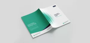
Refreshing All Branding Assets
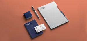
Taking the updated brand look through to Ultra Labels’ marketing assets involved a refresh of its logo and other materials, including:
- Brochures
- Sales templates
- Business cards
- Letterhead
- Advertising templates
- Email signature
- Social media templates
A Refresh Designed for Growth
With a brand refresh to reflect its quality offering, Ultra Labels has positioned itself as an innovator in the packaging market with superior digital printing capability and flexible packaging production.
Client: Ultra Labels
Industry: Retail
Sector Expertise: Consumer Goods (CPG)
Services
Creative
Branding

Launching a Unique SaaS Offering
Launching a Unique SaaS Offering
Viabrand®
Evansa grew out of a desire to transform the transportation industry in Australia. A team with experience across the electric vehicle (EV) charging industry and technology believed that incentivising EV fleets to charge with renewable energy could electrify transport in Australia, reducing greenhouse gas emissions and driving the development and adoption of EVs and renewable energy.
This belief led to the development of Evansa, a SaaS company that helps businesses generate carbon credits to monetise or offset their emissions, incentivising the decarbonisation of the transport industry and combatting climate change.
Creating a brand that transforms
The Evansa team approached Viabrand to create a brand identity that amplified their drive to decarbonise transport and transform how Australian businesses moved around the country.
Creating an electrifying brand identity
Viabrand established the ‘who, why and how’ of Evansa, encapsulating their brand values, purpose and target customer and created branding that captured their brand ethos ‘integrity, intelligence and innovation creating IMPACT’. They then reinvigorated Ultra Labels’ branding assets to reflect its position as a quality packaging solutions provider whose work, consultation and customer service exceeded industry standards.
Updating brand colours to symbolise energy (red), sophistication (black) and refinement (cool gray), Viabrand encapsulated the underlying quality story that was driving the growth Ultra Labels was experiencing during the next phase of its business.
Creating a brand identity
The brand name Evansa combines a major aim of the company — advancing the EV industry — and the forward-thinking, transformative vision of the Evansa team.
Viabrand incorporated the brand promise to decarbonise transport through carbon credits and EV charging into other brand assets, including the brand promise and the logo.
The logo captures how Evansa is providing a unique offering that advances the transport industry and protects the planet by encouraging the adoption of EVs and charging them with renewable energy.
Inspired by crisp, clear blue skies, the mesmerising teal of the unique and precious Southern Lights and the incorporation of a regal purple demonstrates Evansa’s environmental commitment and ensure the logo stands out from the competitive set.
Preparing to launch Evansa
Evansa’s brand launch was at Brisbane’s inaugural ‘Electric Dreams’ summit in July 2022. To bring the brand to life, Viabrand created elements to show summit delegates who Evansa are and what they stand for. Viabrand also built content to educate about carbon credits and how they work, how Evansa helps businesses generate carbon credits and how charging with renewable energy transforms the environment, the EV market and the renewable energy sector.
Tradeshow signage to illuminate
Tradeshow signage with two 4000 x 3000 mm and one 1500 x 4000 wall designs visually brought Evansa’s brand story and promise to life. The signage visually broke down the carbon credit generation process and how fleet managers could integrate Evansa’s service offering into their business. Each wall included QR codes directing delegates to Evansa’s landing page to register their enquiries.
A brand video to drive change
Viabrand created a brand video capturing the urgent need to reduce carbon emissions and protect the planet. Sharing how, with Evansa, businesses can manage their emissions and generate carbon credits — while transforming the EV and renewables industries, the video will inspire trade show delegates to drive change for the planet’s sake. The video will also be used across social media and on Evansa’s landing page.
Eco-friendly business cards
Creating digital re-usable business cards for summit staff that look innovative and unique suits Evansa’s Saas offering and their environmental ethos.
Developing, creating and implementing brand assets that communicated a new SaaS offering to the market has prepared Evansa for an exciting launch and the years beyond. Viabrand capture the transformative nature of their software solution and their passion for decarbonising transport and creating a lasting impact on climate change, the EV industry and the renewables sector.
Client: Evansa
Industry: Automotive
Sector Expertise: Electric Vehicles (EV)
Services
Branding
Content Marketing
Video Production
Brand Refresh for a Law Firm With a Difference
Brand Refresh for a Law Firm With a Difference
Viabrand®

Stockley & Pagano Lawyers engaged Viabrand to create brand elements that reflected their warm, caring, and collaborative relationships with their clients. In addition, Stockley & Pagano see themselves as lawyers who do things differently, with a warmth and approachability not seen at more conservative law firms, and they wanted their updated branding to reflect that difference.
Communicating Confidence and Compassion
After conducting a detailed discovery session to uncover what makes Stockley & Pagano unique, Viabrand created various brand elements, including a new logo, brand colours, typography and brand promise. These elements communicated the values of professionalism, experience and compassion important to Stockley & Pagano.
A Logo that Merges Two Unique Talents
The Stockley and Pagano ‘shield’ logo mergers the two initials of the directors and symbolises the protective nature of the service they offer their clients. The logo captures their brand essence by incorporating warm champagne tones to symbolise the warmth and sincerity in their consultative approach to clients.
Signage that symbolises integrity
After designing a new logo and choosing brand colours, office signage and posters were designed to reflect the brand’s competence, sincerity and security and capture the target audience’s imagination.
Branded collateral to complete the brand refresh
Printed and digital collateral, including business cards, letterhead, notepads, eDM marketing banners and email signature footers, were then designed to incorporate the refreshed brand elements.
Website design with personality
Stockley & Pagano pride themselves on their down-to-earth, approachable style. Viabrand created a website that lets their creativity, integrity and approachability shine through. Stockley & Pagano’s website design lets their talents shine by incorporating brand colours, iconography, and stunning photography.
Refreshing a brand allows businesses to re-examine what their customers want and need, what makes them unique in the marketplace and key messages shared across marketing and sales collateral. The Stockley & Pagano brand refresh shows how well-thought-out branding elements help you outpace your competition and let your unique personality shine through.
Client: Stockley & Pagano
Industry: Law
Sector Expertise: Family Law
Services
Branding
Creative
Web Design
Web Development

Rebranding the Broadband of the Future
Rebranding the Broadband of the Future
Viabrand®
Opticomm is one of the largest independent providers of fibre-based access networks in the country, offering a better way for Australians to connect. Their leading edge technology takes an innovative approach to ensure their solutions work today, tomorrow and for decades to come.
Being serious about building world-class fibre networks and solutions that keeps people connected, Opticomm wanted to grow their public awareness, so clarity in their approach to the market was vital. They joined forces with Viabrand® to get crystal clear on the repositioning of their brand. Since Viabrand® already had a strong previous relationship with Opticomm, they quickly and easily understood the ins-and-outs of their industry.
Refining Their Brand Strategy
Workshops with stakeholders revealed that Opticomm is valued for their future-thinking technology and for their commitment to ensuring Australians have greater control and choice over their connectivity. However, Opticomm needed a purpose that went beyond innovative services and was inspired by the fundamental impact they want to make in the world.
Viabrand® launched a process to refine Opticomm’s brand strategy. Their mission was to build a world class network service that challenges the status quo with their future-focused technologies, solutions and infrastructure.
The rebranding of Opticomm began with a new brand promise: the powerful idea of ‘Built on Better™’. The promise reflects Opticomm’s goals and capability to improve lives for years to come.
Connecting with the Market
The next step was to develop a brand identity that positioned Opticomm to stand out from the crowd. Their team designed a brand mark that incorporates the concepts embedded in their industry: spaces, connectivity and universal reach. The ring-shaped combination of dots is designed to embody a feeling that is both engineered and yet human.
The final result was a clear brand mark that encapsulates Opticomm’s core personality and competitively positions them in a national market.
Networking with Consumers
Their focus was on a long-term strategic shift. As Viabrand® developed the voice for Opticomm, they embodied the future value of their services. The newly introduced communication framework was embedded into all aspects of the organisation. The result reflects their mission to help Australians connect for decades to come.
The approach to their new positioning was further supported through a collection of functional brand assets. The design approach was refined to include audience appropriate visual language, contrasting colour palettes and functional typography that is easy to read.
From stationery tools to marketing materials, they leveraged the value in Opticomm to exhibit their rebrand. With the design and implementation of consistent brand assets, the company was ready to reconnect with consumers.
A Server for Change
Future-proofing the Opticomm brand was transmitted through to their website. A combination of quality copywriting, creative design and seamless web development ensured their core values would not go unnoticed. Their website was designed to educate clients on their services and to encourage consumer interaction through clear call-to-actions.
With a well-defined brand presence, visitors are now able to better connect with the brand through various levels of interaction. These include reading helpful information, connecting with the service, or learning more about their industry experience. The result was a simple, robust and functional website that aligns across all company touch points to enhance the user experience.
The Platform for a Better Future
With an enhanced brand positioning, consumers are able to better connect with Opticomm. By instilling a greater sense of freedom and choice, Viabrand® created a more compelling story and visual branding for consumers to engage with. The results positioned Opticomm as a future-focused tech brand in a progressive industry, helping them to create Australia’s fastest access network and allowing them to help Australians connect better today and tomorrow.
Client: Opticomm
Industry: Telecommunications
Sector Expertise: Telecom Infrastructure and Equipment
Services
Branding
Web Design
Web Development
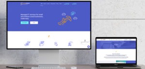
A Fresh Brand for Business It Management Heroes by Viabrand
A Fresh Brand for Business It Management Heroes by Viabrand
Viabrand®

The Viabrand design team were also able to implement the new look across supporting print and digital marketing materials.
StormWarden offers businesses holistic, end to end IT management and reliable protection from online risks.
The flexible team of IT experts works with clients around the globe and is preparing for a growth phase. As such StormWarden wanted to ensure their brand reflected their capabilities now and into the future.
Viabrand’s strategists and creative director met with the client to gain insight into their needs and goals. Language and content were updated to fit the brand’s personality, which is that of a hero coming to save the day for small and medium businesses.
The design team then set to work to turn insights into inspiration. The goal was to modernise the colour palette without moving too far away from the original. Viabrand also gave the client a unique, fresh evolution of the logo while still retaining a superhero style symbol. Keeping with the superhero theme, they jazzed up the team avatars with superhero outfits. In addition, they created a suite of iconography and design elements to support the brand’s growth. They worked with the client through some revisions of the designs, after which the client was ecstatic with the refreshed brand.
StormWarden has simplified their offering with convenient package options for businesses.
Viabrand’s team developed sales collateral to aid the client in promoting their streamlined offerings. They also designed a new look website which aims to simplify the path to purchase while delivering the information people are seeking in layman’s terms.
The Viabrand design team were also able to implement the new look across supporting print and digital marketing materials. Aside from the website and corporate brochure, they delivered an email signature, letterhead, PowerPoint template, and business card design.
Client: StormWarden
Industry: IT & Technology
Sector Expertise: IT Services & Consulting
Services
Creative
Branding
MORE