











We are an award-winning marketing and web design agency with teams in Birmingham and London. We specialise in purpose-driven web design and growth marketing where every aesthetic choice serves a clear goal: make information easy to find and understand, and move visitors to take action. We help ambitious SMEs and startups scale through PPC, SEO, and conversion-focused UX. Republic’s growth-minded team partners with startups and enterprises to solve today’s challenges and build future-proof strategies. Our variable pricing model allows us to offer value to companies of various sizes. We are ready to go the extra mile as our business model is based on establishing long-term win-win relationships.
Republic Marketing
Gold MemberAward-winning web design and marketing in London and Birmingham. We build high-performing websites and run PPC, SEO, and paid social that turn interest into revenue.
Min. Project Budget:
£5,000+
Min. Monthly Budget:
£1,000+
2-10 Employees
9 Case Studies
About
- HQ
- OFFICES
-
HEADQUARTERS
- ADDRESS: 10 Brindley Pl, Spacemade, Birmingham, England, B1 2JB
- PHONE: 0121 5170544
- E-MAIL: [email protected]
-
OFFICE
- ADDRESS: 20 Red Lion St, London WC1R 4PS
- PHONE: 0208 243 4550
- E-MAIL: [email protected]
Services
Creative
eCommerce
Service Expertise
Inbound Marketing
PPC
Leverage the power of targeted campaigns, amplify your brand’s visibility and fuel your growth with PPC campaigns that resonate. Work with an official Google Partner Agency.
SEO
We’re a performance-driven SEO agency for ambitious brands. Grow your business and revenue with high-performing SEO campaigns that deliver results.
Service Expertise
Social Media Marketing
By using our expertise as a Social Media Agency, we’ll deliver eye-catching, results-driven social media campaigns that will increase your brand awareness, reach and sales.
UX Design
From wireframes to UX design – Our talented team is an expert in the web design process. We will create a site with a unique personality that wows your visitors and moves your business forward.
Web Development
We are an award-winning marketing and web design agency with teams in Birmingham and London. We specialise in purpose-driven web design where every aesthetic choice serves a clear goal.
Industry Expertise
Finance
Sector Expertise
- Financial Advisors
- Banking
- Real Estate Investment Trusts (REITs)
- Private Equity
- Finance Software
IT & Technology
Sector Expertise
- E-commerce Platforms
- EdTech
- SaaS
- IT Services & Consulting
- Cloud Computing
- Software Development
Law
Sector Expertise
- Immigration Law
- Business Law
- Family Law
Real Estate
Sector Expertise
- Architecture Company
- PropTech
- Property Management
- Retail Real Estate
- Hospitality & Leisure Real Estate
- Development & Construction
- Industrial Real Estate
Travel & Tourism
Sector Expertise
- Adventure Travel
- Travel Agencies
- Cruise Lines
- Corporate Travel Management
Clients
Kinrise
Rove Legal
Plume Studio
PureBurn
Future Stories
Eunomia
Harmonique
Rossi Studio
NHS
Budgets
Min. project budget
£5,000+
Min. monthly budget
£1,000+
Republic Marketing Reviews
5
Performance-first digital growth partner
Republic Marketing positions itself as a performance-first digital growth partner, combining SEO, PPC, paid social, and web development with strong technical execution to drive measurable outcomes such as traffic, lead generation, and conversions.
The agency’s core strength lies in integrating data-led performance marketing with technical web optimization—ensuring that both acquisition and on-site performance are aligned to maximize ROI.
Strongest differentiators
Its strongest differentiators are:
- Strong expertise across SEO, PPC, and paid social (multi-channel performance)
- Data-driven execution with bespoke tracking and optimization
- Ability to deliver both acquisition (traffic/leads) and on-site performance (UX, conversion readiness)
- Strong capability in technical and B2B environments
However, available signals suggest:
- Strong full-funnel acquisition capability (SEO + paid + conversion-ready web)
- Moderate depth in lifecycle systems, CRM/RevOps, or retention infrastructure
- Positioned closer to performance specialists than creative or brand-led agencies
DAN Perspective
Republic Marketing fits best into the category of “performance-driven acquisition and web optimization partners”, making it a strong choice for businesses seeking measurable growth through search, paid media, and technically optimized digital platforms.Strategic Depth
Client feedback highlights the agency’s ability to design data-driven strategies tailored to industry-specific challenges, particularly in competitive and technical sectors.
Execution Excellence
The agency demonstrates strong execution across SEO, paid media, and web development, delivering both performance improvements and technically robust digital assets.
Speed & Reliability
Clients report highly organized, responsive, and transparent communication throughout engagements.
Collaboration Quality
Feedback highlights a proactive, honest, and partnership-driven approach, with clear expectation setting and strong alignment to client goals.
Primary Expertise
Client outcomes strongly associate the agency with SEO, PPC, paid social campaigns, website design, and technical optimization.
Value Creation Pattern
Reported gains cluster around increased traffic, higher rankings (including competitive keywords), improved lead generation, and stronger conversion performance. Evidence around lifecycle marketing, CRM integration, or retention systems remains limited.
Price–Performance Balance
Strong ROI signals and measurable outcomes indicate positive value perception.
Transparency & Scope Clarity
Client feedback highlights realistic proposals, clear expectations, and transparent communication.
Client Satisfaction
Client sentiment is highly positive, driven by performance results, technical expertise, and communication quality.
Referability
Clients demonstrate strong referral likelihood, supported by long-term partnerships and consistent delivery.
Our team has summarized customer reviews to provide you with a concise overview of what people are saying about the agency on various review sites.
Platform Expertise


Case Studies
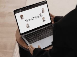
Quiet luxury online: a refined website for Rossi Studio
Quiet luxury online: a refined website for Rossi Studio
Republic Marketing
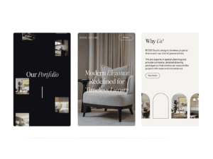

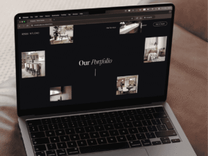

Web design & development for an interior design studio in Solihull
Rossi Studio is an award-winning interior design studio in Solihull, creating refined, personal interiors shaped around the way each client wants to live.
But online, that same level of quality was not coming through.
The old site presented the work, but it did not capture the care, detail and confidence behind it. For a studio that takes clients from first concept to final installation, the website needed to feel much more considered.
We were asked to design and build a new digital home for the brand. One that reflected the studio’s taste, reassured potential clients and turned quiet browsing into genuine enquiries.
A refined digital showroom, not just a portfolio.
Industry
Interior Design
Location
Solihull, UK
The brief
Turning an interior design portfolio into a refined digital showroom
Choosing an interior designer is a personal decision. People are not just buying a service, they are trusting someone with their home, their budget and the way they want to live.
• The site needed to sell the feeling first, giving visitors a clear sense of the design quality before asking them to enquire.
• It also had to build trust quickly, showing that Rossi Studio could guide a detailed, high-end project with care and confidence.
• The process needed to feel clear and reassuring, without overwhelming visitors with too much copy or unnecessary detail.
The goal was to make the studio feel premium, approachable and easy to trust from the very first interaction.
The visual direction
Letting luxury interiors set the tone
Rossi Studio creates interiors that feel refined, personal and highly considered, so the website needed to carry that same sense of taste. It had to feel premium from the first glance, without distracting from the work itself.
• A soft palette of off-white, warm grey and black creates a polished setting that lets the interiors take centre stage.
• Refined serif typography and italic headline moments give the site an editorial feel, adding character without making the brand feel forced.
• Thin lines, soft borders and gentle arches create a distinctive visual thread that runs through the full experience.
The photography leads, the copy supports and the design gives each project the space it deserves. The result feels elegant, confident and quietly premium.
The website experience
A slower, smoother way to explore the studio
A studio this considered needed a website that moved with the same sense of care. Smooth, measured and deliberate, with every transition designed to support the mood.
• A branded preloader opens the site with a percentage counter and an elegant headline reveal, setting the tone before the first page even loads.
• Smooth scrolling and unhurried image reveals create a polished pace that mirrors the studio’s refined approach to interiors.
• Projects appear gradually as users move through the page, making the portfolio feel discovered rather than simply listed.
The motion adds a sense of quality before a visitor has read a single word. It makes the site feel considered from the start.
The details
Subtle interactions that build trust and enquiries
The detail is where the care shows. Each interaction is subtle, tactile and designed to make the journey feel effortless.
• A recurring arch motif appears across imagery, cards and transitions, giving the brand a recognisable visual thread without overpowering the work.
• A full-screen contact panel slides in when a visitor is ready, bringing call, message, WhatsApp and email options together in one simple place.
• A client review sits beside the form, while a consultation prompt stays within reach across the site to keep enquiries easy and natural.
Nothing gets in the way. Every interaction is there to build trust, support the experience and make the next step feel simple.
The outcome
A website that turns quiet browsing into confident interior design enquiries
The new Rossi Studio site feels like the studio itself: refined, premium and carefully crafted from the first second to the last.
It gives the portfolio space to breathe, makes the design process easier to understand and turns booking a consultation into a natural next step. Trust is built throughout the journey, from the founder’s story to SBID and BIID memberships, Best of Houzz recognition and real client reviews, all presented with the same care as the work itself.
The result is a website that does more than display beautiful interiors. It creates the feeling of stepping into the studio, giving potential clients the confidence to imagine what Rossi Studio could create for their own home.
Results
• 200% increase in organic traffic
• 70% increase in enquiries
• 50% increase in average session duration
Client: Rossi Studio
Industry: Real Estate
Location: Birmingham, UK
Services
Branding
Creative
Digital Marketing
Online Advertising
SEO
UX Design
Web Design
Web Development
Technologies: Wordpress, GSAP, JS, PHP
Completed: Aug 2026

Website redesign for the Edgbaston Priory Club
Website redesign for the Edgbaston Priory Club
Republic Marketing

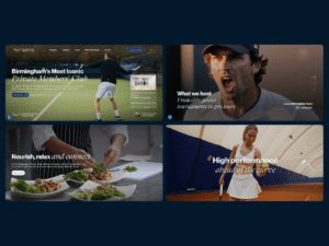

Brand repositioning, web design & development
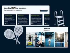
Edgbaston Priory Club has 150 years of history behind it. But online, that history had started to feel heavier than it should.
The club itself is anything but quiet or closed off. It is busy, social and full of energy. A place for tennis, fitness, food, wellbeing and community. The old website did not show the real experience of being there, making the club feel formal, distant and harder to access than it really is.
We repositioned the brand and rebuilt the website so the digital experience finally matched the real one.
A private members’ club with heritage, movement and real community. Not a museum. Not a brochure. A club people want to be part of.
Industry
Private members’ club
Location
Edgbaston, Birmingham, UK
The brief
Repositioning a private members’ club for a new audience
Heritage was the club’s greatest strength. It was also the biggest risk.
• Lean too far into the past and the club feels old-fashioned. Strip it back too much and you lose the authority that comes with 150 years of history.
• The site had to speak to long-standing members who value the club’s legacy, while attracting a younger, more active audience looking for sport, fitness, wellness, food and community.
• Most importantly, the website had to shift perception and show that Edgbaston Priory is far more than a racquets club.
It is a full members’ destination, and the new site needed to make that clear, quickly and confidently.
The visual direction
Balancing heritage with energy
The brief was simple. Make it feel established, but never old.
• We built a visual direction that balances tradition with energy, using deep navy for weight, off-white for warmth and tennis-ball yellow for pace and personality.
• Serif italics bring in a sense of heritage, while strong modern headlines keep the experience fresh and direct.
• Archive photography sits alongside modern action shots, so the past and present work together on the same page.
The result feels premium, but not stiff. Confident, but still human.
The website experience
A guided journey through sport, wellness and community
We did not want the website to feel like a flat brochure. We wanted it to feel like a guided walk through the club.
• As you scroll, the experience opens up, revealing the facilities, membership, history and lifestyle moments with pace and purpose.
• Scroll-led storytelling, pinned sections, parallax details and horizontal transitions create a more immersive journey.
• Hover menus, blurred backgrounds and image previews make navigation feel more visual, more useful and more natural to explore.
The build turns the website into an experience, giving users a real sense of the club before they ever step through the door.
The details
Interactive moments that make membership feel alive
Two moments do the heavy lifting. They add character, create movement and help the site feel more like the club itself.
• The membership call to action is playful and interactive, with tennis balls that respond to the cursor.
• The club’s history becomes a cinematic sideways timeline, letting users move through 150 years rather than simply read about it.
• Conversion is built into the journey, with “Book your tour” and “Become a member” appearing at the right moments without ever feeling pushy.
Every interaction has a purpose. It adds energy, but never gets in the way.
The outcome
A website that makes the club feel open, active and desirable
The new Edgbaston Priory Club site gives the club a digital presence that feels as considered as the experience itself. It captures the energy of the courts, the calm of the wellbeing spaces and the easy social feel that makes the club so much more than a place to play.
It brings 150 years of heritage into a sharper, more contemporary frame, without losing the sense of prestige that makes the club distinctive. The design feels confident and premium, while the journey makes the full membership offer feel clear, desirable and easy to explore.
The result is a site that feels open, polished and full of life. It turns membership from something formal into something people can picture themselves being part of.
Client: Edgbaston Priory Club
Industry: Fitness
Sector Expertise: Gyms & Fitness Centers
Location: Birmingham, UK
Services
Branding
Digital Strategy
SEO
UX Design
Video Production
Web Design
Web Development
Technologies: Wordpress, GSAP, PHP, JS, Matter.js.
Completed: Aug 2026
A new brand and website for a building compliance firm
A new brand and website for a building compliance firm
Republic Marketing


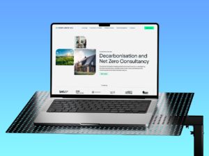
Compliance 100 keeps buildings safe, compliant and properly managed. It is serious, technical, high-stakes work, yet sector websites rarely reflect that, too often feeling dense, grey and forgettable, more like a long PDF than a brand you can trust. Compliance 100 wanted to stand apart, so we rebranded the business and built a new site around the same qualities as the work itself: precision, structure and control.
The identity had to feel as measured as the business. We created a modular logo and visual system that feels engineered rather than decorative, set in a confident palette of dark green and bright compliance green, with grid lines, corner markers and survey-style graphics that nod to inspection and measurement. It reads less like a traditional facilities firm and more like a modern technical consultancy.
The offer is broad, so the site needed to guide people without slowing them down. A structured mega menu groups surveying, consultancy, training and facilities management into clear routes, tabbed content and accordions keep technical detail easy to scan, and sector pathways for housing, public sector, commercial and private rented audiences make it feel relevant from the start. Small precision-frame hover states bring corner markers into place around key actions, echoing a survey frame and quietly reinforcing the brand idea.
The result feels like the business it represents: sharp, structured and quietly confident. A complex technical offer is now far easier to understand, each audience can find what matters to them, and proof is built in through accreditations, case studies and more than 30,000 surveys delivered since 2019. It does the opposite of what the sector expects, making building compliance feel clear, credible and genuinely modern.
Client: Compliance 100
Industry: Real Estate
Services
Creative
Web Design
Web Development
Completed: Aug 2026

Turning characterful workspaces into a richer digital journey
Turning characterful workspaces into a richer digital journey
Republic Marketing


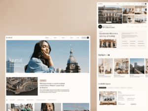
Kinrise takes iconic old buildings and turns them into modern places to work.
Their buildings are the story. The architecture, the history, the natural light, the design and the community all matter. But a standard property website would have reduced that to floorplans, availability and square footage.
Kinrise needed something more considered. A site that could make each building feel distinctive, while still working hard as a commercial tool for tours, enquiries and space comparisons.
We were asked to design and build a website where the buildings lead.
Not a directory. Not a listings page. A digital experience as considered as the spaces themselves.
Industry
Property and workspace
Location
Birmingham, Bristol, Leeds & Manchester, UK
The challenge
Kinrise’s architectural photography is one of its strongest assets. Most property websites use imagery as decoration, but for Kinrise, it needed to drive the whole experience.
• The site had to communicate the full value of a Kinrise building, from heritage and design to amenities, culture and community.
• It needed to feel elegant and editorial, while still making tours, enquiries and space comparisons easy to find.
• Across four cities and several building types, the portfolio had to feel simple to explore, never like a property database.
The goal was to turn practical property information into a more immersive, visual journey.
The design
The buildings carry the emotion, so the design gives them space to do the work.
• Off-white backgrounds, black type and soft neutral panels create a refined setting for large-scale architectural photography.
• Generous spacing, elegant typography and delicate details give the site a gallery-like feel without making it feel too precious.
• A consistent black and white image treatment adds contrast, structure and a strong visual language across the experience.
The result feels less like a property listing and more like a place worth spending time in.
The build
Kinrise needed a site with movement and depth, but never at the cost of speed or usability.
• Scroll-based animations reveal photography as users move through each page, giving the journey a guided, editorial pace.
• A performance-conscious build keeps the site fast and smooth, avoiding the heavy feel of many animated property websites.
• Interactive sections bring buildings, spaces, approach and culture to life, while keeping the core journey clear.
The site moves like a guided tour of the buildings, not a search through them.
The interaction
The interaction language is where the Kinrise experience starts to feel different. Every detail is subtle, tactile and tied to the content.
• A signature hover treatment shifts imagery between black and white and colour, adding depth across menus, cards and content modules.
• An image-led mega menu and interactive map help users explore the portfolio by city, building and space type.
• Tabbed availability, modal galleries and floorplan pop-ups keep practical leasing information close to the story, rather than bolted on at the end.
Every moment earns its place. It adds polish, never noise.
The result
The new Kinrise site feels as considered as the buildings it represents.
Photography leads from the first scroll, giving each space the room, detail and atmosphere it deserves. The journey brings heritage, design, culture and community into one clear experience, while still keeping availability, floorplans, tours and enquiries exactly where users need them.
It gives Kinrise a digital presence that feels premium, useful and genuinely distinctive. Less like an office search, more like an invitation to imagine a business belonging there.
The result is a property website that does not feel like a property website. It feels architectural, editorial and built around the character of the spaces themselves.
Client: Kinrise
Industry: Real Estate
Sector Expertise: Commercial Real Estate
Location: London, UK
Services
Creative
UX Design
Web Design
Web Development
Technologies: Wordpress, GSAP, JS, PHP, BunnyCDN
Completed: Aug 2026
A purpose-led website for a strategic consultancy
A purpose-led website for a strategic consultancy
Republic Marketing

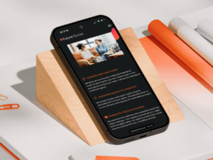
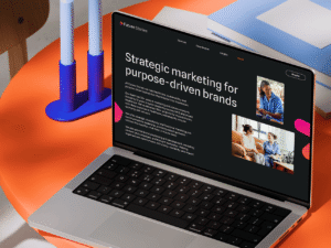
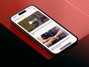
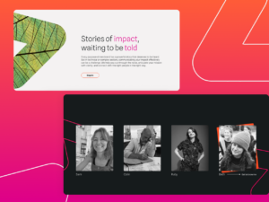
Future Stories is a strategic marketing consultancy for healthcare and sustainability brands, with senior thinking, deep sector knowledge and more than 25 years of experience behind it. The risk online was sounding like every other consultancy: polished, cautious and a little too corporate. They needed a site that showed the depth of their thinking without losing the personal feel of a founder-led business.
So we gave the brand real personality. A bright pink and orange gradient arrow became the signature device, bringing direction, movement and energy to the experience, set against generous white space, editorial layouts and real sector imagery. Pink highlights pull the eye to the ideas that matter most, so the brand feels strategic and creative at once: sharp enough for senior buyers, but never bland.
The offer is layered, so the structure had to make it easy to follow. Clear routes by service and sector let visitors quickly see what Future Stories does and whether it understands their world, with dedicated healthcare and sustainability journeys instead of one generic message. The gradient arrow carries the brand idea through the site, stories moving forward, while testimonials pull together quote, image and client logo so each one reads like a small client story rather than a flat review.
The result is a consultancy that finally sounds like itself: sharp, purposeful and quietly confident. The thinking is easier to understand, each sector has a focused journey, and proof runs through the site with names like Eunomia and Sirona Care & Health and more than 100 impact projects behind them. It feels experienced, human and genuinely worth a conversation.
Client: Future Stories
Industry: Startup
Location: Bristol, UK
Services
Web Design
Web Development
Completed: Jun 2026
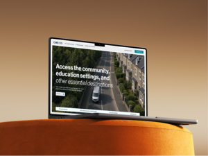
A specialist transport website for Care & Co
A specialist transport website for Care & Co
Republic Marketing

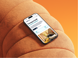

Web design & development
Getting a child from home to school can sound simple. For children and young people with additional needs, it often is not.
Care & Co provides specialist transport for children and young people, including those with autism, ADHD, learning disabilities, sensory needs and behaviours that require a calmer, more considered approach.
The service goes beyond providing a vehicle. Journeys can involve trained staff, consistent routines, safeguarding, behaviour de-escalation and an understanding of the individual before the vehicle even arrives.
The website needed to make that difference immediately clear.
Industry
Specialist transport and support services
Location
UK, with services provided nationwide
The challenge
Care & Co is not a taxi company, but without the right positioning, specialist transport can easily be mistaken for one.
The website needed to explain why the distinction matters.
- Local Authorities, SEN teams, schools, social workers, families and care providers all needed to understand the service quickly.
- The difference between standard transport and specialist support had to be clear, from trained staff and de-escalation to consistent routines and journey planning.
- The brand needed to feel safe and reassuring without becoming clinical, institutional or overly childlike.
- Operational details such as vehicle options, safeguarding and the types of journeys Care & Co supports had to remain easy to find.
The goal was to position Care & Co as a specialist transport partner built around the needs of children and young people, rather than simply a way of getting passengers from one place to another.
The design
Transport websites often fall into one of two camps: corporate fleet operators or local taxi firms.
Care&Co needed its own visual language.
• Deep navy, soft blues and generous white space give the brand a professional, dependable feel without making it cold or institutional.
• Large photography puts children, support staff and real journey situations ahead of vehicles, keeping the focus on people rather than fleet size.
• Premium vehicle imagery gives the fleet a clean, modern presentation and avoids the visual language of taxis, minibuses for hire or medical transport.
• Simple illustrations and icons make subjects such as safeguarding, journey planning, communication and support easier to understand without filling the site with technical language.
The result balances two audiences that rarely want exactly the same thing. It feels credible enough for commissioners and professionals, but calm and approachable enough for families.
The build
The biggest content challenge was turning a broad and potentially complicated service into something people could understand quickly.
We structured the website around the real reasons Care&Co is contacted, rather than expecting visitors to decode industry terminology.
• Education transport covers mainstream, specialist and alternative provision, including arrangements where attendance itself may be a challenge.
• Health and family journeys cover CAMHS, hospital appointments, specialist clinics, family contact and placement transport.
• Planned and urgent transport are separated clearly, giving professionals an immediate route whether they are arranging regular support or responding to a short-notice situation.
The referral process is also made visible. Referral and consultation leads into needs and staff matching, followed by the journey, safe handover and ongoing communication. This shows that transport is planned around the individual rather than simply allocated to the next available driver.
Even the fleet is explained around use cases. 5, 7 and 9 seater vehicle classes are connected to different journey types, group sizes and support requirements instead of being presented as a conventional vehicle catalogue.
The site turns a complex service into a clear journey from referral to destination.
The interaction
For Care&Co, interaction had to make the service feel organised, responsive and active without distracting from a serious safeguarding-led offer.
The website uses movement, visual transitions and changing content to break up information that could otherwise become dense.
• Vehicle sections give each class its own visual presence, helping users understand how different transport arrangements can be matched to different needs.
• The referral journey turns the process into a simple visual sequence rather than a block of procedural text.
• Live journey messaging reinforces the sense that Care&Co is an active transport operation, not simply a care organisation with vehicles.
• Outcome-led case studies introduce measurable proof into the experience, shifting the conversation from journeys completed to what those journeys can make possible.
That last point matters most.
A successful journey is not always measured in miles.
The result
The new Care&Co website gives specialist children’s transport an identity of its own.
It moves the conversation away from cars, drivers and collection times and towards safeguarding, consistency, relationships and outcomes. Care&Co’s trained staff, risk-led planning and person-centred approach are now part of the main story rather than details hidden behind the service.
And there is real proof behind that positioning.
Care&Co reports more than 10,000 trips and over 20 years of expertise, while its case studies include a young person whose school attendance increased from around 20 to 30% to more than 98%, another who achieved 100% attendance on an agreed timetable, and a young person supported in moving from Tier 4 CAMHS into community living.
The result is more than a transport website.
It is a specialist service platform built to reassure families, give professionals confidence and show that when the right support is wrapped around a journey, transport can become the thing that unlocks education, healthcare, relationships and greater independence.
Client: Care&Co
Industry: Automotive
Services
UX Design
Web Design
Web Development
Completed: May 2026
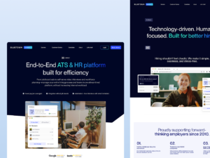
A recruitment website that brings software and service together
A recruitment website that brings software and service together
Republic Marketing
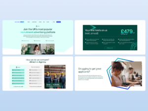
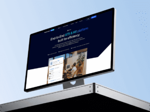


Bluetown helps busy HR teams hire better, with less noise and less admin. They do it through two connected offers: Attract, a fully managed job advertising service, and Connect, their self-serve applicant tracking platform. The challenge was bringing the hands-on service and the smart software together without making the story feel complicated.
The old site needed to work harder to join them up. Attract and Connect had to feel distinct enough to understand, yet clearly part of one Bluetown offer, and the message had to land with everyone from HR directors and enterprise teams to small businesses. So we led with the question every busy HR team is really asking: how will this make hiring easier?
To answer it, we gave Bluetown the look of modern recruitment technology that still feels human. A clean system of soft blue, navy, mint and lavender moves the brand closer to SaaS than to a traditional agency, while dashboard visuals and interface mockups make the product feel real. People-led photography keeps it warm, so it never tips into cold corporate software. Then structure does the rest: separate journeys for Attract and Connect, a clearer mega menu so people self-select fast, and a smarter demo form that lets users choose Attract, Connect or both in a single enquiry.
The result is a recruitment website that finally matches what Bluetown really is: not just software, not just a service, but both working together to make hiring easier. Each offer gets the space it needs, the message is easier to follow, and every audience has a clear path built around how they actually hire.
Client: Bluetown Online
Industry: IT & Technology
Services
Content Marketing
Web Design
Web Development
Completed: Jan 2026
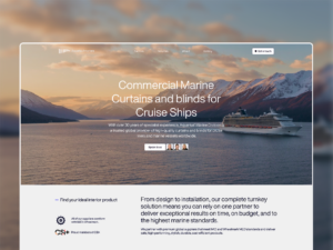
From Coventry to cruise ships: a global B2B website for Aquarius Contract Interiors
From Coventry to cruise ships: a global B2B website for Aquarius Contract Interiors
Republic Marketing
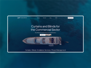
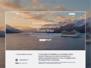
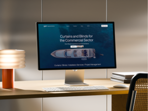
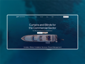
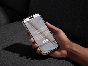
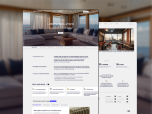
Web design & development
The same family business that fits curtains and blinds in Coventry homes also delivers them for cruise ships, hotels and specialist commercial projects around the world.
Aquarius Contract Interiors is the commercial side of Aquarius. For more than 30 years, they have designed, made and installed curtains and blinds for projects where quality, timing and compliance all matter.
That work needed its own website.
The domestic brand is local, warm and showroom-led. This site had to do something different. It needed to feel international, technical and built for serious commercial buyers, while still carrying the trust of a family-run business.
Local roots. Global reach. Built for large-scale projects.
Industry
Commercial interiors, marine, hospitality and specialist contracts
Location
Coventry, UK, with projects worldwide
The challenge
Commercial buyers do not choose on style alone. They need to know a supplier can deliver on time, on spec and to the right standards.
• The site had to show that a family-run firm could handle large, complex projects across the world.
• It needed to sell operational confidence as much as design, covering delivery, deadlines, compliance, durability and aftercare.
• It also had to feel clearly separate from the domestic Aquarius brand, while keeping the personal service and credibility that made the business trusted in the first place.
The goal was to make Aquarius Contract Interiors feel like a serious international project partner, not just another supplier.
The design
This side of Aquarius needed more authority, so the design takes on a darker, bolder and more commercial feel.
• Deep navy sections create a sense of scale, technical confidence and global reach.
• Large project photography, from cruise cabins to hotel suites, brings the work forward and shows the level of projects Aquarius delivers.
• Refined typography and clear sector icons for Marine, Hospitality and Specialist Contracts help the site feel structured, confident and easy to navigate.
The result feels less like a local interiors supplier and more like an experienced commercial partner trusted on major projects worldwide.
The build
A commercial offer can quickly become dense and technical. We built the site so buyers can find their sector fast, then go deeper when they need the detail.
• Dedicated journeys for Marine, Hospitality and Specialist Contracts give each audience a route built around its own priorities.
• Service pages work like commercial product guides, making compliance, durability, process and project delivery easier to understand.
• A structured mega menu brings customer stories into the journey early, so proof appears before buyers even reach the case studies.
The site gives technical content a clear shape. It feels like a guided journey through capability, not a flat catalogue of services.
The interaction
The hardest thing to prove was global reach, so we made it something buyers could see, not just read.
• An interactive global presence system uses a 2D world map on the homepage and a rotating 3D globe on the About page, turning worldwide delivery into a visual proof point.
• A dynamic testimonials section changes the quote, client and project imagery together, so each review feels like a small client story.
• A dark, scroll-led history timeline turns more than 30 years of marine and cruise projects into a more cinematic brand moment.
Every interaction has a commercial purpose. It builds confidence, supports the proof and gives buyers more reasons to trust Aquarius before they enquire.
The result
The new Aquarius Contract Interiors site gives the business a digital presence that matches the scale of its work.
It feels international, technical and premium, without falling into the stiff catalogue style the sector often relies on. Global delivery is clear from the first scroll, while the Marine, Hospitality and Specialist Contract offers are easy to explore and understand.
The proof now sits at the heart of the experience, from 1,000 completed projects to a project history featuring Cunard’s Queen Mary 2 and Royal Caribbean’s Oasis of the Seas.
The result is more than a supplier website. It is a global capability platform for a family-run firm trusted on some of the world’s biggest commercial interiors projects.
Client: Aquarius Contract Interiors
Industry: Retail
Services
SEO
UX Design
Web Design
Web Development
Completed: Sep 2025
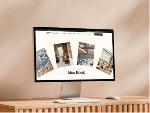
From local specialist to premium interiors brand: a new website for Aquarius Interiors
From local specialist to premium interiors brand: a new website for Aquarius Interiors
Republic Marketing

Web design & development
Aquarius Interiors has spent more than 30 years helping people create beautiful homes with made-to-measure curtains, blinds, shutters and wallpapers.
With two showrooms, thousands of completed projects and a loyal family-run reputation, they had all the proof of a premium interiors brand. The problem was that online, it did not feel that way.
Their work is personal, detailed and beautifully finished. It belongs in well-designed homes, not in a basic product listing. The new site needed to show the quality of the work, while keeping the trust and approachability that make Aquarius feel local in the best possible way.
We were asked to redesign the website so it felt as considered as the rooms Aquarius helps create.
A family business. A premium interiors brand. Both, at once.
Industry
Interiors, curtains and blinds
Location
Coventry & Kenilworth, UK
The challenge
Aquarius needed to look more premium online, without losing the personal feel that makes people trust them in the first place.
• The site had to feel far more elevated than the typical local curtain and blind competitor, while still feeling friendly and easy to approach.
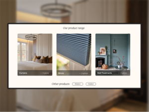
• Curtains, blinds, shutters and wallpapers are visual, tactile products, so the experience needed to be led by photography, texture and inspiration rather than heavy copy.
• The site also had to work for very different visitors, from people browsing ideas to customers comparing showrooms and homeowners ready to book a consultation.
The goal was to turn a trusted local specialist into a brand that felt more polished, more desirable and more in line with the quality of its work.
The design
We treated Aquarius like an interiors studio, not a standard curtains and blinds retailer.
• A soft neutral palette, elegant black type and refined spacing create a showroom feel that gives the work room to shine.
• Modern sans-serif typography, with subtle italic editorial moments, keeps the brand feeling polished without becoming cold or corporate.
• Real photography carries the experience, from finished rooms and fabric details to showroom moments and made-to-measure installations.
The result feels elevated but still personal. It gives Aquarius the presence of a premium interiors brand, while keeping the family-run character that customers already trust.
The build
A visual business needs more than a list of products. The site had to guide people from inspiration to enquiry, without making the journey feel forced.
• Product pages work more like buying guides, helping visitors understand fabric, fit, finish and the difference between each option.
• Showroom pages feel like an invitation, showing what to expect, what can be explored and why a visit is worth making.
• A clear “Book Your Consultation” prompt stays close throughout the journey, so the next step is always easy to take.
The site now works just as well for a quick enquiry as it does for a longer, more considered browse.
The interaction
The details give the site its sense of polish. Each interaction adds movement and depth, without getting in the way of the products.
• An Idea Book gallery uses floating, tilted images and an immersive lightbox to make inspiration-led browsing feel more editorial.
• Case studies open in a soft, blurred modal, giving each project the feeling of a mini interiors feature.
• Gentle scroll reveals and accordion process steps keep the experience easy to follow, while still feeling refined and considered.
Nothing rushes the visitor. Every moment is designed to make made-to-measure feel simple, enjoyable and worth investing in.
The result
The new Aquarius Interiors site gives the business the premium digital presence its work deserves.
It moves the brand beyond the typical local retailer feel, with an experience that is more visual, more polished and far more aligned with the quality of the finished rooms. Products are easier to explore, showrooms feel more desirable to visit, and consultation bookings are built naturally into the journey.
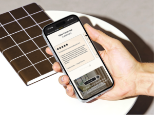
The proof is there too, with more than 30 years of experience, 4,500 completed projects and a wall of five-star reviews from customers who would not go anywhere else.
The result is more than a product catalogue. It is a curated interiors journey that turns quiet browsing into showroom visits, home consultations and confident enquiries.
Client: Aquarius Interiors
Industry: Retail
Services
SEO
UX Design
Web Design
Web Development
Completed: Jun 2025
MORE