


5 Website Design Mistakes Killing Your Conversions (And How to Fix Them)
Even the best-looking sites can fall short if users get confused, lost, or overwhelmed. In this post, we break down five common UX and website design mistakes — from messy homepages to clunky forms — and show you how to fix them for better performance and happier users.
That’s where website design agencies come in. The best ones don’t just make your site look beautiful—they engineer it for usability, accessibility, and conversion. From intuitive navigation and responsive layouts to fast-loading pages and optimized forms, professional web design agencies ensure every pixel serves a purpose. Partnering with one can help you turn design pitfalls into opportunities to engage users, improve performance metrics, and ultimately grow your business online.
Most Common 5 Website Design Mistakes
Even with the right visuals and modern layouts, small usability flaws can quietly hurt your site’s performance. From confusing navigation to poor mobile optimization, these issues often go unnoticed until conversion rates drop or bounce rates climb. To help you avoid them, let’s take a closer look at the most common website design mistakes that can frustrate users and stop your site from reaching its full potential.
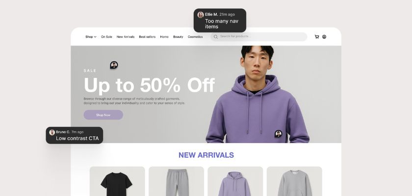
Mistake #1: No Clear Hierarchy on the Homepage

What it looks like:
The homepage feels noisy – every block is fighting for attention. There’s no clear structure, resulting in users not knowing where to focus.
Why it hurts conversions:
If your core message isn’t clear in the first few seconds, visitors bounce. In fact, people form a first impression in as little as 0.05 seconds (50 ms). Worse, 61% of users leave if they don’t find what they want within five seconds (Forbes).
Fix:
Use a clear visual hierarchy by sizing your headline 2-3x larger than body text, limit each section to one key message, and group related elements with consistent padding to naturally lead users from intro to CTA.
Mistake #2: Confusing Navigation

What it looks like:
Some menus have too many items, unclear labels, or they hide important pages in dropdowns or way down the list.
Why it hurts conversions:
People get lost or frustrated and leave before they even find what they’re looking for. The average website conversion rate is only 2.35% (Saleslion), with the top 10% of landing
pages hitting 11% or more, showing how critical clear navigation is.
Fix:
Limit your primary navigation to 5-7 clear items, use familiar terms your audience expects (like “Pricing” or “Contact”), and check your analytics and heatmaps to understand what
users are actually clicking.
Mistake #3: Weak or Missing CTAs

What it looks like:
CTAs like “Learn more” don’t say much. Sometimes they’re positioned too low on the page or missing completely in key places.Why it hurts conversions:
If you don’t tell users what to do next — clearly and confidently — most of them won’t do anything.
Fix:
Use clear, specific copy like “Get your free demo” or “Sign up for 20% off”. Make the CTA stand out visually and test different positions depending on the device or page. In fact, personalised CTAs can increase conversions by 42% (Ecommerce Bonsai). Even design tweaks like adding white space around buttons can boost form conversion by over 200%(Formstory).
Mistake #4: Poor Mobile Experience

What it looks like:
The site looks good on desktop, but it breaks on mobile. Text is too small, images go off-screen, and buttons are hard to tap…
Why it hurts conversions:
Most users are on mobile. If it doesn’t work well, they’ll leave instantly.
Fix:
Design with mobile in mind from the start. Make sure layouts adapt well, buttons are easy to tap, and things load fast. Also, test it on real devices, not just Figma previews.
Mistake #5: Overwhelming Forms
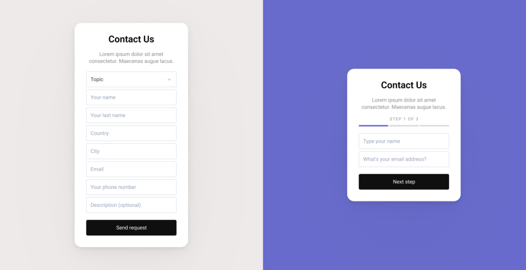
What it looks like:
Some forms ask for way too much info. Everything is in one long list with no help or structure. It feels heavy.
Why it hurts conversions:
Form abandonment is rampant: up to 81% in some industries (Finances Online). People drop off when forms look complicated. Especially on mobile, they just give up before even starting.
Fix:
Start by removing any fields you don’t absolutely need for the first interaction, group related fields visually, and use tools like Typeform or multi-step forms to break longer processes into bite-sized, low-friction steps that feel easier to complete.
At Series Eight, we design identities, build websites, and craft growth strategies that better connect e-commerce brands with customers.
Let us take you further than you’ve ever been.
Schedule a call or get in touch with us.