


When you know where you want to go, but don’t know how to get there – that’s where we come in. Leveraging over 50 years of industry experience, we know what’s important, which means we ask the right questions to help us work out how to deliver results in line with your business goals. We’ve worked on some amazing projects and campaigns with a diverse range of businesses. Some of our clients have worked with us for over 20 years – so, why do they stick around? It’s because we prefer to work with brands that are looking for a partner. We like to work as an extension of your team, understanding the fundamentals of your business, ambitions, hopes, aspirations, strengths, weaknesses and vision – your success is our success.

Harrison Carloss
Gold MemberDon’t bring us the answer, just the problem. We’re a strategy-led creative and digital agency with a passion for problem-solving.
About
- HQ
- OFFICES
-
HEADQUARTERS
- ADDRESS: Harrison Carloss Ltd, Three Counties House, Stoke on Trent, ST1 5PX
- PHONE: (44) (0330) 1331639
- E-MAIL: [email protected]
-
OFFICE
- ADDRESS: Street Address: 3 Hardman Square, Manchester, M3 3EB
- PHONE: (44) (0330) 1331639
- E-MAIL: [email protected]
-
OFFICE
- ADDRESS: Street Address: 235 High Holborn, London
- PHONE: (44) (0330) 1331639
- E-MAIL: [email protected]
Services
Creative
Digital Strategy
Service Expertise
eCommerce
Service Expertise
PPC
Service Expertise
Web Design
Industry Expertise
Automotive
Sector Expertise
- Automotive Aftermarket
Entertainment
Sector Expertise
- Theme Parks & Attractions
Finance
Sector Expertise
- Brokerages
- FinTech
- Financial Advisors
- Finance Software
Food & Beverage
Sector Expertise
- Packaged Food
- Snacks & Confectionery
- Organic & Natural Food
Gaming
Hospitality
Sector Expertise
- Casual Dining Restaurants
- Fine Dining Restaurants
- Bars & Pubs
- Coffee Shops & Cafes
- Catering Companies
Nonprofit
Sector Expertise
- Youth Development
- Charities
- Religion & Faith-Based Organizations
- Community Foundations
- Civil Society Organizations (CSO)
Real Estate
Sector Expertise
- Development & Construction
- Residential Real Estate
- Property Management
Sports
Sector Expertise
- Collegiate Athletics
Clients
Arco
Belvoir Group
Clifton Trade Bathrooms
Cottage Delight
Northwood
Parogon Group
The Residence Collection
West Midlands Safari Park
YMCA England and Wale
Budgets
Min. project budget
£10,000+
Harrison Carloss Reviews
5
Transformative Digital Solutions
Website Design and Lead Generation
Harrison Carloss has been recognized for creating websites that exceed client expectations. Their web designs are noted for significantly increasing lead generation and completion rates, effectively functioning as an additional sales team for their clients.
Social Media Engagement and Content Creation
The agency's social media expertise has been highlighted, with clients praising their ability to create engaging, brand-aligned content across various platforms. Harrison Carloss's agility in adapting to social media trends and algorithms ensures high visibility and relevance of client content.
Exceptional CRM Implementation and Support
HubSpot Expertise and Customization
Harrison Carloss has been praised for their outstanding knowledge of HubSpot and their ability to implement and fine-tune CRM systems. Clients highlight the agency's skill in customizing CRM solutions to meet specific business requirements, resulting in improved efficiency and clearer sales funnel visibility.
Comprehensive Support and Training
The agency's commitment to ongoing support and training has been noted as a key strength. Clients appreciate Harrison Carloss's dedication to continuously improving procedures and providing expert guidance, making them an invaluable partner in CRM implementation and management.
Strategic Business Impact
Sales and Marketing Alignment
Clients have reported substantial business improvements through Harrison Carloss's services, including better alignment of sales and marketing efforts. The implementation of automated systems has led to increased efficiency, allowing clients to convert previously missed opportunities and achieve significant cost savings.
Responsive and Creative Collaboration
Harrison Carloss is consistently described as open, honest, and creative in their approach. Clients appreciate the agency's responsiveness, their ability to meet deadlines, and their skill in delivering solutions that align closely with brand messaging and values while pushing creative boundaries.
Our team has summarized customer reviews to provide you with a concise overview of what people are saying about the agency on various review sites.
Platform Expertise


Case Studies
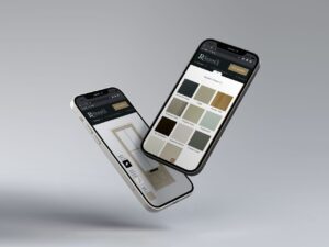
Unlocking User-Friendly Door Design
Unlocking User-Friendly Door Design
Harrison Carloss
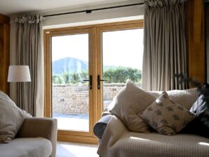

We designed a bespoke door designer web application to give The Residence Collection’s customers a sublime digital experience that streamlines the enquiry process, saves time for all parties, and improves lead quality.
The Key to Your Perfect Door
The Residence Collection features a range of premium window and door systems. We’ve worked with them for a number of years on projects such as their website and digital marketing.
They wanted to create a door designer web application that would allow users to design their own door online and then feed the information via email directly to Residence, the customer and the chosen installer. This automation ensures all parties are in sync throughout the enquiry process and can be followed up with a better understanding of customer preferences.
Step inside the Power of Web Apps
In order to achieve what The Residence Collection were looking for we utilised our experience in developing web apps to create a fully bespoke system and backend using a combination of Laravel and Inertia js.
The single page application (SPA) delivers a smooth and consistent user experience that loads content in and out based on user interaction and is responsive to all devices.
The result is a seamless customer experience that allows for over 2 million combinations, and the ability to control the options available from an easy-to-manage backend.
Leads Through the Door
The new door designer web app will help The Residence Collection and their Installers generate higher quality leads by saving time qualifying them and going through the design journey with the customer.
By integrating the data received from the web app with HubSpot, we were able to use automated email journeys to communicate effectively and get more value from every enquiry.
I love working with Harrison Carloss because I think it’s really important to have a good relationship, and everything I can see in my head, they manage to actually put into digital, which is amazing. They’ve really understood our business and what we need from an agency to work with. And that’s so important in terms of understanding our products, how we work and operate and what markets we want to get into. I would 100% recommend Harrison Carloss.
Sarah Hitchings, Sales & Marketing Director, The Residence Collection.
Client: The Residence Collection
Industry: Retail
Sector Expertise: Home Goods & Furnishings
Location: Other Cities, UK
Services
Marketing Automation
Mobile App Development
Software Development
UX Design
Web Development
Technologies: Laravel, Inertia js., HubSpot, WordPress
Completed: Apr 2025
How Harrison Carloss Tripled Retirement Property Sales for Platinum Skies
How Harrison Carloss Tripled Retirement Property Sales for Platinum Skies
Harrison Carloss

Platinum Skies needed to sell 50+ properties that were sitting vacant. Our strategy-led campaign was built around achieving this goal. In 2024 they had struggled to generate a sufficient volume of interest but more importantly quality leads.
As their external marketing partner, we proposed a new strategy-led campaign to connect emotionally with their target customers.
The impact in the first quarter alone has seen a 40% increase in qualified leads, which has resulted in triple the number of property sales (Q1 2025 vs Q1 2024). The immense improvement in performance has strengthened the partnership with Platinum Skies, and campaigns are set to continue throughout 2025.
A Strategy-First Approach
The foundation of our success was in how we prepared. We completed over 50 hours of research to create a data-driven strategy and a multi-channel campaign plan.
We delved into the Platinum Skies CRM and sales data, conducted market research, customer modelling and reviewed the performance of previous campaigns.
We put Platinum Skies’ vision and goals at the heart of our thinking, allowing us to weave our findings into a strategy and create several innovative campaign concepts.
Managing Director at Harrison Carloss, Adam Mobley said:
“We’re genuinely thrilled to be appointed as Platinum Skies’ strategic marketing partner. The way we’ve approached this partnership and the initial impact we’ve seen makes for a model case study for the importance of strategy and why it’s crucial to invest time into the discovery phase of long-term projects.”
Redefining Retirement
Platinum Skies had been running local campaigns and marketing in the South West for over 7 years, so we knew the campaign would have to take a different approach to activate an audience that was already heavily targeted.
The campaign we moved forward with was typographically-led and designed to unpick common myths around retirement and encourage the local over-55 community to reconsider community living. We crossed out words like ‘rich’ and replaced them with ‘real’, and slashed the ‘un’ from unaffordable.
We implemented a refreshed and bright colour scheme, which was complementary to the typographically-led creative and copy to make more impact and generate more leads.
With technology-savvy over-55s growing by the year, we ensured the campaign also had an online presence through social media, email marketing and digital display ads, to help reinforce our more traditional advertising methods.
The campaign was rolled out in January 2025, utilising direct mail, door drops, digital display, social media, press advertising, PR, events and email marketing.
The Result
The goal of the campaign was to not just improve the volume of appointments generated for discovery days, but to generate high-quality leads.
We increased the number of qualified leads by 40%, and the impact this had was a 3x increase in sales (Q1 2025 vs Q1 2024).
Client: Platinum Skies
Industry: Real Estate
Sector Expertise: Hospitality & Leisure Real Estate
Services
Email Marketing
Social Media Marketing
Digital Marketing
Completed: Apr 2025
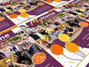
More Engaging Customer Comms for Aspire Housing
More Engaging Customer Comms for Aspire Housing
Harrison Carloss
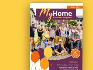
Having partnered with Aspire Housing for over a year and solving a host of problems and challenges, we were appointed to produce their quarterly customer magazine, which includes both a print and digital version, and is circulated to around 9,000 customers every quarter.
The time that goes into the quarterly magazine is a big responsibility, and the project needs strong attention to detail at all stages to avoid delivery errors.
We’ve helped ease the burden for Aspire by taking on the project management from design to delivery. We design the magazine for both print and email, proofread the content and ensure the data is accurate. We then work with our trusted print and fulfilment partner to deliver the magazine to each customer’s doorstep.
Our account management team work to deliver both the postal and digital versions on time and to budget.
What the client says
“Thanks to Harrison Carloss, we’ve seen a 76% increase in engagement in our customer magazine. This engagement rate is taken from QR codes within print, which drive people to campaign URLs. In digital, we’ve seen a very large uplift in engagement, measured through click and open rates.
Go to Harrison Carloss with your challenges and let them come up with a solution. They’re really innovative and look at the bigger picture. They think outside the box and devise a solution to drive your KPIs.” – Scott Turzański, Communications Lead
Sustainability in mind
Every quarter, the Aspire magazine involves printing around 2,000 copies. With the help of Ecologi, we offset the printing of the magazine by planting trees to replenish forests. Every edition we produce means 50 more trees in the ground.
If you’re looking for a housing specialist agency to help produce your customer magazine, then contact us using the button below or by emailing [email protected].
Client: Aspire Housing
Industry: Real Estate
Sector Expertise: Affordable & Workforce Housing
Location: Other Cities, UK
Services
Content Marketing
Creative
Email Marketing
Completed: Mar 2025
Serving up Organic Results for Parogon Group
Serving up Organic Results for Parogon Group
Harrison Carloss

Parogon Group is a restaurant chain offering a premium dining experience to guests across Staffordshire, Cheshire and Shropshire.
The group had often found they relied heavily on people who already knew of Parogon and their venues. From an organic search perspective, this was evident as the vast majority of their keywords were branded, meaning they were not picking up new traffic from relevant generic keywords.
As the group looked to expand into new regions where they were less well known, it became more important that they ranked for generic keywords with a comprehensive SEO strategy.
54% of all traffic to Parogon websites comes from organic search.
Restaurant Near Me
With any restaurant, a thorough local SEO strategy is imperative.
While Parogon’s reputation locally was strong, it was still important to make sure they ranked well for local keywords to fully dominate the scene.
After all, it’s not just people from the local area who are searching for local keywords.
As part of the first few months of the retainer, we reviewed and optimised each venue’s Google Business Profile. This included updating opening times, checking contact details, adding relevant attributes and adding schema markup to the website to pull in additional information such as social media profiles. Additionally, we advised the client to stay on top of replying to reviews and answering questions.
We also wrote and input optimised metadata across all sites.
Finding the Special Ingredient
When it came to creating new content, the first step was to define each venue and its offering.
With a growing number of venues, we needed to highlight each venue’s features and what would be a ‘pull’ factor for a potential guest.
We scraped public data from sites like TripAdvisor to get a true feel of how diners see each venue. We removed common words like “food”, “service”, “good”, “lovely” etc. to help find what distinguishes the venue. Using this data, we presented word clouds to the client to visually pull out the most common themes in guest reviews.
From here, we were able to build out comprehensive keyword research pieces for each venue which would help underpin our content strategy.
À La Carte Content
To create new traffic streams, we created relevant content pieces targeting more generic keywords.
The SEO team worked with our in-house copywriter to create engaging and optimised pieces of content for the sites. In addition to content underpinned by keyword research, we also took onboard direction from the client to align pieces with their own internal focuses.
Depending on the topic, these pages could be a blog piece, a landing page or even a refresh of existing content of their site.
On a monthly basis, we were also keeping focus on addressing technical fixes and optimisations across the site.
After our optimisations Parogon’s websites ranked for 3,026 more keywords. A 151% increase.
Serving Up Organic Results
After just 6 months, we saw significant improvements across each of the websites.
The strategic focus on local SEO yielded particularly impressive results, especially for websites located in more populated areas. It became evident that businesses with a stronger local presence experienced more substantial improvements due to the targeted efforts in optimising their visibility within the local community.
Furthermore, the content pieces created during this period became instrumental in diversifying and expanding the sources of website traffic. These well-crafted pieces not only engaged the audience but also attracted new visitors, contributing significantly to the overall success of the digital strategy. In addition, the pieces helped Parogon to connect with their local communities as they shared news and events from the area.
The first half of the retainer period demonstrated the effectiveness of a comprehensive digital strategy that combined local SEO efforts with compelling content creation.
Harrison Carloss has now produced several stunning websites for the Parogon Group, delivered fantastic SEO results, and designed their intelligent menu system.
Client: Parogon Group
Industry: Hospitality
Sector Expertise: Fine Dining Restaurants
Services
SEO
Content Marketing
Completed: Mar 2025
A Smarter Way into the YMCA
A Smarter Way into the YMCA
Harrison Carloss
YMCA England & Wales was looking for a brand-new website to hero their vibrant brand but also has a seamless UX.
YMCA currently serves over 570,000 people across England and Wales and was looking to improve its digital presence to make it easier for people to find and access their services, and also encourage more participation in events, fundraising, and online donations.
There are over 83 independent YMCAs throughout England and Wales. The vision for this website theme is for it to be able to roll out to the local YMCAs.
A Website That Grows with You
The YMCA England & Wales website is built on a bespoke in-house framework using the latest technology and WordPress platform.
The website is built using flexible content blocks to allow them to not only amend existing pages but also create completely new ones. This gives scope for their website to grow and develop with their business. This is also ideal for the rollout of the theme to local YMCAs who all offer different services and may want to modify templates.
We built in multi-level search functionality so users can easily search the website in one click which is key for service users who come to the website with a specific need.
Designed around New Opportunities
The new website has been completely redesigned utilising the existing YMCA brand and assets but ensuring it’s a modern, impactful, vibrant experience to really reflect the organisation’s values and the services offered by YMCA.
Ultimately YMCA offers opportunities, safety, and hope for the future, by transforming people’s lives, and the website now reflects that purpose. We ensured users could access information quickly including their nearest YMCA, charity shop and clothing bank as well as finding out more about YMCA including an interactive history of the organisation. It also includes multiple donate links throughout the site at relevant places in the user journey to encourage additional donations on-site.
A Seamless Roll-Out
It was important that the new theme had a good reception and uptake from local YMCAs. We built a microsite for YMCA to circulate to the local YMCAs promoting the new YMCA website theme and detailing the different packages on offer.
This was communicated out to the YMCA network on Y-Hub the internal communication platform we developed for YMCA England and Wales.
Harrison Carloss is an extremely talented and committed group of individuals, with a real passion for delivering for their clients. They were dedicated to each step of our project, thinking about how it would be received, and how it could be developed to become even better. They care, and that makes all the difference to an organisation like YMCA.
Jerahl Hall, Senior Communications Manager
Harrison Carloss continues to work with the YMCA to build its digital presence and host their numerous websites. Harrison Carloss also developed the YMCAs internal communication platform, Y-Hub. You can find out more about this project and more on our website.
Client: YMCA England & Wales
Industry: Nonprofit
Sector Expertise: Youth Development
Services
UX Design
Web Design
Web Development
Completed: Mar 2025
Building a Strong Partnership with Aspire Housing
Building a Strong Partnership with Aspire Housing
Harrison Carloss

Aspire Housing is a leading housing association based in the heart of Staffordshire. They provide affordable homes and delivering vital services that improve the lives of their customers. With over 9,000 homes under their management, Aspire Housing plays a crucial role in the local area, offering not just housing but also a range of support services that promote wellbeing and social inclusion.
Beyond Expectations
Aspire Housing initially sought Harrison Carloss’s expertise as a HubSpot partner to improve their website. The partnership has since expanded, with Harrison Carloss now providing valuable guidance across Aspire’s campaigns and creative direction. Aspire was impressed with our unique approach, blending creativity with a deep understanding of their needs, and capable of delivering work with a fast turnaround.
It’s been fantastic working with Harrison Carloss again. Their sector expertise and adaptability to site challenges delivered standout designs that captured attention, sparking high engagement and genuine interest from our local community in the development.
Scott Turzański | Communications Lead
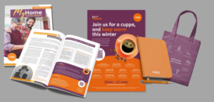
We design a variety of print assets for Aspire Housing, including banners, leaflets, their Good Neighbour Guide, and their quarterly customer magazine which includes both a print and digital version, circulated to around 9,000 customers every quarter.
Expert Account Management
Our success with Aspire’s campaigns comes from our emphasis on strategic account management that underpins the multi-channel campaigns we’re tasked to produce.
From briefing our design team, to managing communication and timelines, proofing work and ensuring consistency across all channels, we’ve been able to supply Aspire Housing with an integrated approach, performing as an extension of their own marketing and communications team.
Aspiring for Better Merch
From designing bespoke tote bag graphics to arranging Aspire branded merchandise for their events, we’ve helped provide Aspire with everything they need to get their brand out in the world.
Working with printers and suppliers on Aspire Housing’s behalf allows us to use our expertise to supply quality artwork and create graphics that are guaranteed to come out looking their best and reduce the risk of print issues that would delay delivery and incur additional costs.
A Landmark Development
We designed the hoardings for Aspire Housing’s Silkworks development site to not only promote the upcoming housing development but also ensure the area looks smart while work is ongoing. The hoardings featured a trackable QR code to allow passers-by to find out more about the new housing development by scanning the code with their smartphone and for us to monitor engagement.
We had to work closely with the printers to ensure artwork that spanned across multiple panels of the hoardings would be aligned when running across uneven ground.
Client: Aspire Housing
Industry: Real Estate
Sector Expertise: Affordable & Workforce Housing
Services
Branding
Completed: Feb 2025

New UCFB Website Hits The Back of the Net
New UCFB Website Hits The Back of the Net
Harrison Carloss

University Campus of Football Business (UCFB) is a higher education institute dedicated to providing undergraduate programmes that prepare students for careers within the football and sports industry.
Off the Woodwork
UCFB had recently gone through a brand refresh but found that applying this to their current website was restrictive and lacked the fun and dynamic impact it intended.
As a relatively young and niche academic establishment, they felt their current website didn’t accurately portray their offering and lacked the immersive and inspiring feel needed to pull in a younger audience.
From a technical perspective, the website required a high level of manual input and created additional work for an already stretched team.
The Comeback Begins
UCFB approached Harrison Carloss looking for a new website that showcased their brand refresh, appealing to a younger audience who are increasingly overwhelmed by options when leaving school.
We kicked off with a meeting to scope out the project, speaking to the team about their experiences with the current website, running through their brand refresh and what they’d love to see in a new website.
Over the following months, we designed and built an exciting new website to better engage prospective students.
The brand refresh was brought to the forefront of the site, enriched by the use of dynamic animations to allow for fluid user navigation through the site. We included tactic illustrations that you might see pre-match as an interesting and on-brand way to highlight key pieces of information.
Behind Closed Doors
As a higher education site, accessibility was essential to the UCFB team and therefore a key consideration throughout the design process. ReciteMe was integrated to help users with additional requirements when visiting websites.
Post types were used to reduce time spent by the team to populate and update content, meaning updates in one place would update in multiple places across the site.
We seamlessly integrated UCFB’s external tools such as Student CRM and Tawk.to, as well as linking to higher education sites like UCAS.
Throughout the migration to the new site, we worked with UCFB’s digital marketing agency to ensure minimal disruption throughout the process and place the new site in the best possible position for growth.
The new website will now make it even easier to engage, excite and educate potential students with the aim of increasing student recruitment and raising UCFB’s brand profile.
But can we do it on a cold, rainy night in Stoke? You tell us.
“The result is outstanding, and it’s clear how much thought, expertise, and dedication went into every detail.”
“The new website is a huge upgrade and hopefully it will continue to improve our growth as a young institution. Looking forward to continuing our partnership and seeing the impact this new website will make.”
Jonny Sutherland, Marketing Manager
“We’re proud to be a leading destination for sports degrees and love to be a positive disruptor within the education sector, and our new website demonstrates our values and our personality perfectly.
I’d argue that it’s one of the best websites I’ve ever seen within the higher education sector. A huge thank you to Harrison Carloss for understanding our vision and executing this to the highest quality.”
Victoria Stears, Head of Global Marketing & Communications
Interested in working with Harrison Carloss on a new website? We’d love to have a chat to see if we’re the right agency for your business. We specialise in fully bespoke designs and builds that are scalable with your business and allow your unique features and brand to shine like no template can.
Client: University Campus of Football Business (UCFB)
Industry: Education
Sector Expertise: Higher Education
Services
UX Design
Web Design
Web Development
Completed: Dec 2024

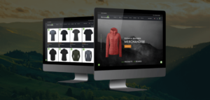
A Smart Ecommerce Website Inspiring Trust and Delivered 47% Increase in Conversions
A Smart Ecommerce Website Inspiring Trust and Delivered 47% Increase in Conversions
Harrison Carloss
When Hausnous were looking to create an ecommerce website that would offer a range of unique, high-quality furnishings, lighting, homewares and home accessories to consumers. In addition, they also offer expert products for home safety such as locks and cylinders to both consumers and the trade.
The website would be selling multiple SKUs and brands across multiple categories and would be looking to cater for broadly, two distinct audiences.
Ecommerce website experts Harrison Carloss took on the project to create a website that would appeal to both audiences and create an enjoyable user experience for two types of customer journeys:
‘The Trade’ – know what they want, are coming to the site for something specific, need to source the item quickly at a reasonable price and potentially need advice or a bespoke solution depending on their current project requirements.
‘The Consumer’ – potentially know what they want or more likely than not they’re coming to the site ‘browsing’ and would like to see the full range. They want the experience to guide them through, suggesting products and would like to reach the checkout quickly and as fuss free as possible.
Hausnous was a relatively new brand with little brand recognition, so Harrison Carloss kept this in mind alongside the brief.
Creating an Aspirational Design
The website design was consistent with the brand but was elevated with the introduction of an additional colour into the palette for key touchpoints on the site and call to actions. The design fairly clean with the use of an illustrative typography to make the brand feel more approachable and contactable should users feel the need to get in touch.
Lifestyle imagery was used to showcase the products with a mixture of B2B/DIY focus and aspirational home interior images. The design was created to hero key products and categories throughout the website guiding users to the ecommerce areas from different touch points.
The ancillary pages such as ‘about’ and ‘blog’ were all placed in the secondary hamburger menu and footer of the site as not to distract users from their purchasing journey.
The ecommerce website incorporated a primary mega menu to enable users to quickly navigate and drill down into their chosen category should they wish, whilst also featuring ‘Shop All’ by category. The mega menu also enabled the B2C consumers to get a breadth of the entire range and browse easily. Hero/Featured products was also built into the mega menu to enable Hausnous to promote any new or hero products, this also incorporated imagery.
Harrison Carloss was delighted to report website conversion increased by 47% on the new ecommerce website.
Beyond the Project?
As with any ecommerce website, once it went live the project didn’t stop. Harrison Carloss provided monthly reports to Hausnous whereby proactive suggestions were made to improve conversion rates on the website.
Post site launch, a delivery countdown timer was incorporated on products to indicate the cut off for next day delivery, this was particularly important as a trigger to purchase for the trade who often needed items quickly and reliably. A stock countdown feature to capitalise on FOMO (fear of missing out) was also included.
Harrison Carloss also integrated Trustpilot reviews into the site. As Hausnous was a relatively new brand with little recognition it was important that the website conveyed trust and credibility. The reviews by product also aided the purchase decision through positive reinforcement increasing conversion rate from Google PPC Ads.
Automated email marketing including abandoned cart, wish lists and waitlists were added. Cross-selling emails were designed to encourage people to come back to the site and purchase again e.g. purchasing a cushion in the range, here are other items in the range that you may be interested in.
Harrison Carloss was able to deliver this ecommerce brand with a strategic boost and increase their sales performance. If you’d like to find out more about how Harrison Carloss can help your business, visit their website now.
Client: Hausnous
Industry: Retail
Sector Expertise: Home Goods & Furnishings
Services
eCommerce
Web Design
Web Development
Completed: Oct 2024
Building Sustainable Growth for the Outdoors Company With 220% Campaign ROI
Building Sustainable Growth for the Outdoors Company With 220% Campaign ROI
Harrison Carloss

The Outdoors Company is a leading trade supplier of workwear and corporate wear for iconic outdoor brands.
Growth Potential
In 2023, The Outdoors Company set a strategic marketing objective: to grow sales within their existing distributor network.
Distinguished as a prominent supplier of premium outdoor apparel in the United Kingdom, The Outdoors Company identified significant growth potential in their sustainable and ethically sourced product line.
With the help of strategic and creative expert, Harrison Carloss, they were able to achieve some fantastic results:
– 220% Campaign ROI
– 59% increase in ECO enquiries
– 19% increase in ECO sales compared YoY
– 8 of the top 10 selling products are now ECO products
Here’s how Harrison Carloss delivered the perfect campaign.
Growing Demand
There was a growing demand for ‘eco’ and ‘green’ products with their distributor network. The Outdoors Company recognised the importance of education in their comprehensive range of eco-conscious and sustainable offerings. The importance of this education process is that the distributors (via the end users) may have different ‘eco’ criteria that they need to meet during their purchasing process. Some may need products made from recycled materials whereas others may only buy from brands which ‘do good’. The campaign’s primary purpose was to establish The Outdoors Company as the top-of-mind choice for distributors when it came to sustainable and eco products.
At its core, this campaign aimed to provide distributors with in-depth knowledge about The Outdoors Company’s eco-friendly and sustainable product portfolio, ultimately resulting in a substantial increase in sales of their ECO range through their existing distributor network.
Green Credentials
The campaign’s initial phase involved a comprehensive review of the entire ECO product range, focusing on categorising them based on their specific ‘ECO’ attributes. Six distinct themes were identified and the products were organised accordingly:
– Products crafted from recycled polyester.
– Products featuring recycled down feathers.
– Products composed of 100% recycled materials.
– Products offering lifetime warranties.
– Products manufactured from recycled plastic bottles.
– Products designed to promote a reduction in the use of single-use plastics.
Hero Brands
Within the Eco range we pulled out Herschel, Rab, and The North Face, each renowned for their extensive sustainability strategies. These brands were poised to take centre stage in the campaign.
These themes formed the cornerstone of our campaign’s messaging, aimed at enlightening distributors about the diverse and extensive ECO product range. To unify the entire campaign, the overarching campaign strapline was developed: “Go ECO with The Outdoors Company,” a consistent message that resonated across all the campaign touch points.
Spreading the GO ECO message
As The Outdoors Company directed their marketing efforts towards their existing group of distributors, it strategically leveraged various key channels for their campaign. These included email marketing, and organic social media on platforms such as LinkedIn, Facebook, Instagram and Twitter/X. Furthermore, they enriched their online presence with a dedicated campaign landing page and blog content.
A sequence of thoughtfully crafted emails and social media posts, each aligning with the distinct messaging areas of the campaign, were developed. These content pieces served to guide users towards a central campaign landing page, acting as a gateway to the extensive ECO product range. Additionally, informative blog posts were curated to deepen the campaign’s messaging, covering topics like ‘Everything you need to know: Recycled Polyester’ and ‘What does PFC-Free mean and why is it important?’ This content provided distributors with valuable resources to empower their interactions with their customers.
The distribution of this content occurred gradually across The Outdoors Company’s proprietary channels. However, the campaign’s message and creative design remained consistently uniform to ensure instant recognition, bolstering awareness and recall. The overarching aim was to keep The Outdoors Company’s ECO range at the forefront of distributors’ minds.
Harrison Carloss were delighted with the results they were able to achieve for their client, delivering a 220% Campaign ROI.
Client: The Outdoors Company
Industry: Fashion & Retail
Sector Expertise: Clothing Brands
Services
Digital Marketing
Content Marketing
Email Marketing
Social Media Marketing
Completed: Oct 2024
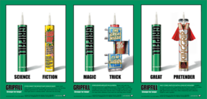
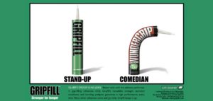
Making Gripfill’s Reputation Stick
Making Gripfill’s Reputation Stick
Harrison Carloss
Gripfill is the brand-leading one-part gap-filling adhesive for professional builders.
A multi-purpose, high-strength adhesive, over the years Gripfill has built a cast-iron reputation as the nation’s Number 1 filler, famed for its incredible strength in almost any application, inside and out. It could also boast the ability to bond most solid building materials: wood, stone, metal, concrete, chipboard, breeze block, ceramics, plastic, etc.
Making Gripfill’s Reputation Stick
With Gripfill notching up sales of over 7 million tubes a year, a clutch of competitor gap-filling adhesives were introduced to this valuable sector of the market, all of them making similar claims to Gripfill.
Naturally, they were envious of Gripfill’s No. 1 market-leading reputation but had neither Gripfill’s quality nor the well-deserved trust it had earned within the building trade.
In the face of this steady stream of attempts to topple Gripfill from its leading position, Harrison Carloss was tasked to come up with an advertising campaign that would both underline Gripfill’s already matchless reputation and at the same time show the new pretender adhesives for the upstarts they were.
Sticking it to the Rivals
After doing research and asking for feedback, the creative agency concluded that a humorous approach would have the most appeal to the hands-on target audience in the building trade. To this end, Harrison Carloss created a series of bold press ads and posters mocking the competitor bonding and gap-filling products as flashy, pretentious and unreliable. The campaign positioned the Gripfill tube next to a jokey depiction of a rival tube, with a series of two-word phrases, describing Gripfill’s quality whilst ridiculing the competitor.
Strong Copy for a Strong Bond
An example of the ad copy is as follows:
Gluer’s droop is no joke. Better stick with the ultimate performer in gap-filling adhesives. Only Gripfill’s incredible strength, technical excellence and bonding pedigree guarantee a high performance every time. Many other adhesives come and go. Only Gripfill keeps it up. Gripfill. Stronger for longer.
A Gripping Reception
The trade loved the campaign. Gripfill’s reputation grew stronger than ever. And the client at Laybond was delighted.
Client: Gripfill
Industry: Retail
Sector Expertise: Specialty Retail
Location: Other Cities, UK
Services
Digital PR
Online Advertising
Completed: Sep 2024

Enhancing The Residence Collection’s Website: Harrison Carloss’s HubSpot Integration Success Story
Enhancing The Residence Collection’s Website: Harrison Carloss’s HubSpot Integration Success Story
Harrison Carloss

Leading Manufacturers of Premium Windows and Doors
The Residence Collection are renowned for their superior flush timber alternatives, firmly establishing itself as a distinguished brand within the industry.
With a strong emphasis on quality, their products exemplify excellence and showcase their deep understanding of the market.
We had been working with the team for over a year before they approached us to design and develop a new consumer facing website. Their old website lacked the prestige of their offering and resembled a competitor’s site. The site had a number of outstanding issues and the code itself was difficult to work with whenever changes were required to improve the user experience.
A Black Hole
Their old site allowed users to download brochures and case studies, contact The Residence Collection and search for their local installer.
They wanted to maintain these capabilities but improve on the overall user experience. Additionally, they wanted to improve the data capture and have a better understanding of marketing ROI.
The Residence Collection have a complex marketing strategy whereby they market to end consumers to drive leads into their own customer network. And so, The Residence Collection’s consumer site acts as a lead generator on behalf of their installer network.
On their old site, they used a huge number of tracked phone numbers for their installers so they could monitor and assess the leads coming through the site from homeowners. It would then be up to the installer to follow up and fulfil the lead. However, the team felt like they had a black hole when it came to following the progress of the lead through to conversion and it was taking a huge amount of man power to contact installers for updates.
Overall, The Residence Collection had very little data to show how many leads were won and therefore a lack of detailed knowledge on marketing ROI.
Enter HubSpot
During the process of designing the site, we saw an opportunity to integrate HubSpot into the new site which would allow for a huge increase in the amount of data The Residence Collection could collect on their users.
Furthermore, it would give a true picture of the user journey – from browsing and consideration to purchase and installation of their windows. HubSpot meant that The Residence Collection could track their leads with little to no input from installers. It meant that they could be there at every step of the journey and fully understand marketing ROI.
Harrison Carloss wrote directly into the HubSpot API to unlock its full potential, enabling the website and HubSpot to communicate pushing leads through the sales pipeline at various trigger points throughout the sales journey.
This allowed The Residence Collection to not only automate communications with end consumers, installers and fabricators which saved time but also enabled closer monitoring of leads, marketing spend, ROI as well as saving the client from having to employ an additional member of staff to manage the lead process.
Clearer picture
We set up pipelines within HubSpot that clearly showed what stage the deal was at.
With every action (or inaction) automated emails were sent to relevant parties to ensure the deal kept moving and Residence Collection was left with a clearer picture of leads.
Additionally, integrating HubSpot allowed The Residence Collection to consolidate a number of other tools including live chat, social media, surveys and marketing emails.
Their new website launched in September 2022. Immediate feedback was overwhelmingly positive and the new site was a true representation of their premium products, allowing the site to become a true showcase of their collections for the end consumer.
The Residence Collection have seen the number of conversions increase as well as time savings from internal resource.
The project was also a finalist for Best Business Initiative of the Year at the G Awards.
Jo Trotman, Marketing Manager, said:
Excellent work, great customer service and always coming up with great new solutions – at the top of their field.
Client: The Residence Collection
Industry: Real Estate
Sector Expertise: Development & Construction
Services
Web Design
Web Development
Technologies: Hubspot
Completed: Aug 2024
Ensuring a Watertight Brand for a National Trade Supplier
Ensuring a Watertight Brand for a National Trade Supplier
Harrison Carloss
Clifton Trade Bathrooms supply bathrooms to trade customers. The brand has grown and expanded over the years, which has resulted in a set of brand guidelines that are over complex and often difficult to follow.
This was making it very difficult for the marketing team to ensure that all collateral from agencies is consistent and on brand.
Clifton Trade Bathrooms is growing aggressively, therefore Harrison Carloss were brought in to audit the current brand and marketing, look at the brand strategy, define their tone of voice and refine their guidelines to ensure that all communications leaving the business are consistent.
Auditing Existing Collateral
To start, we audited the brand guidelines and marketing collateral distributed across all channels to paint a clear picture of where the brand is currently.
We identified that there were nuances between the end consumer and trade customer marketing in how the brand was executed in regards to the logo variant, colour palettes and font usage.
The trade communication was very tongue and cheek and heavily used the red and black of their core palette. In contrast, the end consumer communication looked like it was from a different brand completely and even used a different logo variant. We also found that there was a very large colour palette and font selection which was heightening the issue of branded communications looking inconsistent.
Tone of Voice
We then conducted a workshop to get under the skin of their audiences and to also define the Clifton Trade Bathrooms tone of voice, which was previously missing from their brand guidelines. As they are opening new depots almost monthly, it is vital that the brand not only looks consistent but communicates consistently too.
Refining The Brand
Once we finished auditing the current brand and how it is used we took their existing brand guidelines and refined them.
We reduced the colour palette down from 18 to 6 core and 4 supporting colours, and the number of fonts down from 7 to one core brand font, with specific fonts for traders and traders customers. We also carefully considered how we can unify how the brand works for both traders and traders customers so that all collateral can be clearly identified as being from Clifton Trade Bathrooms, no matter the audience.
We completely overhauled their brand and tone of voice guidelines so that they have a clear and easy to follow document that all of their partner agencies can use.
Brand Guardians
Once the brand work was complete, we were brought on board to act as ‘brand guardians’ for Clifton Trade Bathrooms.
We work alongside Clifton Trade Bathrooms and their partner agencies to check artwork against the guidelines and to push back where necessary to ensure that all branded communications are consistent.
This is vital now, more so than ever as they are growing exponentially. It also helps free up the marketing team’s valuable time!
Claire Wilby, Commercial Manager – Clifton Trade Bathrooms, said:
We’ve been established for nearly 20 years. We needed to update and reset our brand guidelines ready to support our plans for growth. It seemed sensible to do this with a new agency who could tackle the project with fresh eyes.
We worked with a fabulous team that took time to understand our core principles, whilst applying their knowledge and creative thinking to bring our brand identity to life. The result has been spot on and already proving very valuable. We’re looking forward to working with team HC for many more years to come.
Client: Clifton Trade Bathrooms
Industry: Real Estate
Sector Expertise: Development & Construction
Services
Branding
Creative
Digital Strategy
Completed: Jul 2024
Investing in a Clearer Brand Identity for Punter Southall
Investing in a Clearer Brand Identity for Punter Southall
Harrison Carloss
Transforming Financial Futures
Punter Southall has been developing new ways to transform financial futures offering financial planning, employee benefits, pension and legal services since 1988.
The make-up of the Punter Southall Group has changed over the years through organic growth, mergers and joint ventures. The Punter Southall Group now consisted of a number of different companies working in complementary areas yet working in silos. This makes cross pollination across the Group difficult.
The Group came to Harrison Carloss with the challenge of bringing all of the companies under one brand rather than having a number of sub brands under the Punter Southall umbrella. The existing companies will then become service streams allowing them to work more fluidly and to cross sell across different areas of the business.
We worked alongside Punter Southall Group’s chosen research agency who gathered insights from market analysis, competitor audits and reviews of their customer base to analyse in workshops.
During these sessions, the Group’s agility and ability to adapt stood out as a unique selling point – and placed customer need at the centre of all the business activities, shaping the business around customers. From this key insight of being ’Intelligently agile’ was chosen as the organising idea. This helped inform the brand evolution further on in the project.
During the initial part of the branding project, research was also conducted to establish how best to structure the Punter Southall services in a clear and simple way for the end users. The service structure needed to cover the breadth of services without outwardly reflecting the current confused structure of the Punter Southall Group.
The outcome of this was to group services into four core categories: Financial Planning, Employee Benefits, Pensions and Legal.
Creative audit
Harrison Carloss was tasked with evolving the Punter Southall brand identity as they position into one Punter Southall brand. As part of the project, Harrison Carloss conducted an audit to understand how the brand is represented visually across different on and offline collateral.
The outcome was a set of suggestions on how we can use or enhance existing brand elements and where there were gaps to add to the brand guidelines as part of the launch of ‘One Punter Southall’. We considered the use of logo, font, imagery, iconography, graphical elements and colour.
We also created a bold, dynamic and flexible design system which used geometric flat design to unite the Group’s companies, while allowing enough individuality to highlight the wide-ranging offerings.
Creative options
We presented three logo concepts to launch the new Punter Southall One:
- An evolution of the existing brand:
- A revolution of the existing brand:
- Rebrand:
Updating the logomark to remove black and brighten the logo. The inclusion of teal colour provides a friendly, conversational feel. This simple change allows the logo remain distinctly Punter Southall.
The previous story noted ‘customer need at the centre of all the business activities’. We evolved this idea using the new story by moving the dot to the centre of the logo mark creating a stronger connection between the shapes. Rotating the shape to point upwards implies positive connotations, such as pointing toward a positive future with Punter Southall. The introduction of the curve inspired by a positive graph compliments this idea of leading up to a better future.
A single, clean overlap within the logo shapes represents strong relationships internally between services and how Punter Southall work externally with their customers. The arrow (synonymous with Punter Southall) points upwards to demonstrate positive results and looking to the future. The circular shapes form around the arrow demonstrating shaping the business around customers.
Brand launch
Punter Southall decided to do an evolution of their existing brand logo and chose concept one. This was to maintain their current levels of brand awareness and equity as they are well known within the sector. We rolled out the brand to a set of extensive brand guidelines covering off the usage of logo, colours, pattern, icons and photography.
We also created a launch video to launch the new Punter Southall Brand at an event with their employee’s and clients. This video told the story of Punter Southall One and launched the first look of the new visual identity for the brand.
Client: Punter Southall
Industry: Finance
Sector Expertise: Financial Advisors
Services
Branding
Creative
Video Production
Completed: Jul 2024

How Harrison Carloss Dished Up a Solution to Please Everyone
How Harrison Carloss Dished Up a Solution to Please Everyone
Harrison Carloss
Parogon Group is a restaurant chain offering a premium dining experience to guests across Staffordshire, Cheshire and Shropshire.
With 10+ venues now on their books and plans for further growth, the Group needed a better, more efficient and scalable solution to managing the menu content across the individual restaurant websites.
The websites are also used by customers in venues who have allergies, they are provided a QR code to check dish allergens and as such it is crucial that the websites are accurate. Future legislation also requires calories to be displayed against dishes. At present, each venue has its’ own menu and this is being managed and maintained by a member of staff which is taking a significant amount of time, never mind being susceptible to human error. Parogon approached us with the problem and asked us if there was anything that we could do to help.
Serving Up a Solution
As their digital partner, Harrison Carloss had already designed, built and manage their portfolio of websites.
Following some investigative work with Tevalis, Parogon’s external EPOS system provider, we proposed designing and building a completely bespoke system integrating Tevalis and the Parogon Group’s portfolio of websites via the Tevalis API.
The menu could be inputted and linked once into the system which would subsequently update the relevant websites as Tevalis updated each day. The API integration is not something that any of Tevalis’ customers had attempted before so we were breaking new ground for them too.
Following the scoping of the system we then set about wireframing it, followed by design – it was important that the system was on brand but was functional – substance over style on this one! The system was designed and built to work responsively so that the system could be used on a tablet or phone if needed.
Bespoke System & API Integration
The system was built using Laravel and the core functions included the ability to have multiple user logins, add venues, add menu types i.e. ‘Gastro’, add menu items alongside ingredients, prices, calories and most importantly, allergens.
With a live link to Tevalis all information would update automatically in the system and on the websites as the dishes evolved in the venue, ensuring it was accurate at all times. We also included the ability to toggle functions on and off for ease and link multiple websites to the same menu. Finally we also designed a completely custom dashboard for Parogon Group which included key stats around total number of menu types, dishes and total number of dish types i.e. vegan etc so that they could see a snapshot of their current dining offering for their guests.
And for dessert…
Following a thorough testing process, we released a beta version for the client to test from their side before full roll out.
As a result of the new system, it’s prevented the Group from having to employ a member of staff to take on menu management. Tevalis have also been impressed by the use of their own API and have recommended Harrison Carloss to other clients. The system is saving copious amounts of time and they are now confident in scaling. The system has also been entered into industry specific awards for its innovate use of technology.
Ben Allison, Paragon Group, said:
As a customer service provider we look to work with partners who treat us as we look after our guests. Harrison Carloss always seem to go above and beyond our expectations! We are delighted with the link that Harrison Carloss have been able to build with Tevalis. The way that they have made use of the API’s available to us has brought to an end one of our big projects in 2022 – Maximising the Tevalis Stock system, the Nutritional Website link is a key achievement for us.
Client: Parogon Group
Industry: Hospitality
Sector Expertise: Fine Dining Restaurants
Services
Web Design
Web Development
Software Development
Completed: Apr 2024
The Home of Heavenly Hair Extensions
The Home of Heavenly Hair Extensions
Harrison Carloss
Angel Remy is the UK’s leading Indian Remy hair supplier. With over 10 years in the hair extension industry, the company has established itself as the most sought after hair extension brand, offering the best quality hair at very competitive prices to trade and the public. Angel Remy operate in both the B2B and B2C markets under the one brand.
Angel Remy’s old website was dated and the overall the user experience was poor. Only B2B customers could place orders online, yet the process to get a trade account needed to be done over the phone. These processes required a lot of time from the business and was a clunky, disjointed process for the customer. The website also failed to offer trade partners a rewarding customer experience. The previous website did not cater for the B2C market at all and therefore was no longer fit for purpose.
Creating a Seamless User Experience
We were tasked with designing and building a new website for Angel Remy. The new website needed to cater for both the B2B and B2C market within one front end whilst also creating a seamless user experience for both users. The main goal for the website project was to help drive conversions through the website from both B2B and B2C customers as well as streamline the account registration process for both trade and the public.
The website design reflects the premium quality of the Angel Remy products. The design has been designed to hero the products throughout the website guiding users to the ecommerce areas of the website from different touchpoints. The blocks leading to ancillary pages such as ‘about’ and ‘blog’ were intentionally left off the homepage design as not to distract users from their purchasing journey.
After conducting user research, it was identified that customers predominantly shopped by hair colour rather than product types. We added a colour category page predominantly in the menu so users can search products by colour as well as by product type.
54% of turnover recovered via automated email marketing.
One Website. Two Personas.
We used WordPress for the core CMS and the WooCommerce platform to power the ecommerce functionality.
We also integrated AutomateWoo, giving the brand the opportunity to follow up on abandoned carts, birthdays, wishlists and waitlists which has helped them to use their data better to increase conversion on the website. The chosen tech stack allows Angel Remy to easily manage content and product information behind the scenes whilst giving customers a seamless user experience. It was also chosen as it gives them the capacity to easily scale their business operations as they grow.
B2C customers can shop and transact on the website receiving RRP pricing. Through careful prompts throughout the user journey trade users get signposted to login or register for a trade account, once logged in the pricing updates to the reduced trade price. We achieved one website for both their B2B and B2C audiences with no disruption for either persona.
On-Going UX Optimisations
As with any website, once it went live the project didn’t stop.
Harrison Carloss provided monthly reports to Angel Remy whereby proactive suggestions were made to improve performance and user experience. Since launch we improved areas of the website including but not limited to:
- Alternative payment gateways e.g., Klarna
- Optimising homepage user journey to sign post B2B and B2C customers better
- Addition of brand KPI’s to increase conversion rate
- Technical fixes for smoother user experience e.g., image optimisation
- Redesign of call to actions with the addition of hover over to increase click through rate
Debbie Morrison, Angel Remy, said:
All of the staff are friendly and more than happy to help. Extremely punctual with their deadlines. Always solve any issues promptly. Happy to walk you through anything you’re struggling with. Create great social posts and designs for blogs. Incredible design for the website, making it very user friendly for the customers.
Client: Angel Remy
Industry: Beauty & Cosmetics
Sector Expertise: Beauty Devices & Tools
Services
Web Development
Web Design
Marketing Automation
UX Design
Completed: Apr 2024
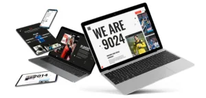
Website Design That Scored an Awwward!
Website Design That Scored an Awwward!
Harrison Carloss

9024 Media is a sports social media agency with offices in Amsterdam and London.
They work with a range of clients across the globe and wanted a dynamic and engaging website that reflected their brand. The website needed to appeal to a number of audiences including players, brands, and agencies, and be image-heavy as it’s so important in their line of work. Their old website was misleading and didn’t effectively convey their expertise.
Bespoke Messaging
To meet the client’s needs, our team designed an image-focused website that highlighted their industry.
Harrison Carloss used lots of animation to reiterate their work in social media, including mimicking the Instagram feed with a like button animation. Tabbed content was used to appeal to all audiences and create bespoke messaging. We also created a map that highlighted their clients to convey their global work.
The main design elements of the website include:
- Dynamic, eye-catching animations to bring the content to life
- Large, full-width images and videos to showcase their work and clients
- A clean, modern layout with a black and white colour scheme that emphasises the content
- A custom-designed map highlighting the global reach of the company
- Tabbed content to make it easy for different audiences to find the information they need
- A responsive design that works well on all devices, including desktops, tablets and mobile phones
Awwward Winning!
The resulting website is visually engaging and interactive, effectively communicating the work of 9024 Media without relying heavily on copy.
The animations and image-heavy design create an immersive experience for the user, while the tabbed content and map make it easy for different audiences to find the information they need. Overall, the website reflects the dynamic and innovative nature of 9024 Media and effectively showcases their expertise in sports social media.
We’re also delighted that this website won an Honourable Mention award with awwwards who recognise and promote the talent and effort of the best developers, designers and web agencies in the world.
Managing Director Christian Miller, said:
Very personal touch to the way HC works, regular check ins in person and online with clear action follow ups. From the outset we felt like it was a project that meant something to HC and that they cared/took pride in delivering our website. Really like the outcome, feedback both internally from the team and externally from clients, contacts and even ex colleagues have been extremely positive.
Client: 9024 Media
Industry: Entertainment
Services
Web Design
Social Media Marketing
Creative
Completed: Apr 2024

Creating Wild Memories for West Midlands Safari Park
Creating Wild Memories for West Midlands Safari Park
Harrison Carloss
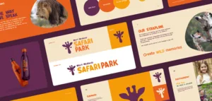
West Midlands Safari Park (WMSP) is an award-winning visitor attraction, located in the heart of England.
It’s home to a variety of all-weather attractions, including four miles of drive-through safari, the largest animatronic dinosaur exhibit in the UK and a theme park. The Park has seen a huge amount of change over the 50 years it has been open and felt that it was the right time to overhaul their brand to reflect the modern-day West Midland Safari Park. As part of this overhaul WMSP even wanted to consider a name change too!
The project included the research, concepts, brand guidelines and application.
Closer to the Excitement
The first stage of this project was immersing ourselves into customer perceptions and where the brand sat in the market. Customer research was conducted and strategy workshops with WMSP staff. It was important to look at where the brand sat from the perspective of both the end consumer and internal teams to identify any trends or discrepancies that needed bridging as part of the rebrand.
Customer research was conducted as well as tone of voice and brand strategy workshops to help identify a strong positioning strategy for the new brand. During the customer research a strong theme was identified across all of the WMSP customer segments, which was that they enjoyed going to WMSP because they could interact with the animals.
Harrison Carloss identified an attractive position in the market for West Midland Safari Park to be a medium to high-cost attraction that families will leave having enjoyed a memorable experience, which was one of the driving factors that came out of the research as to why families would choose an attraction. All of these factors helped to inform the rebrand and to steer the emotive feel the brand deserved.
The Thrill of a Real Safari
During the consumer research WMSP spontaneous consideration was low at 8% meaning they had low unprompted brand awareness however the prompted consideration was 78% which is very strong.
These metrics insinuated that people did know about WMSP but their old brand did not stick in forefront of the target audiences’ minds. With that said if they were to completely change the name their awareness would have dropped significantly in the initial phases of the project. WMSP would have had to work a lot harder and would require more resource to regain their market awareness. With that said we suggested a tweak to the name by correcting ‘West Midland’ to ‘West Midlands’ and to design the logo in a way that is future proofed i.e. could be shortened to drop the ‘West Midlands’ in the future.
Creative Concepts
Following the brand strategy piece, we developed four logo concepts to present to the client.
The concepts were sympathetic to the existing brand name and hero colours to maintain a level of brand awareness. Three concepts used West Midlands Safari Park as the name, however we also presented one concept which looked at a completely new name.
Step into the wild concept: Introduction of a textured tribal typeface lends itself to the feeling of African safari. Accompanied with a strong logo mark which created not only a symbolic representation of safari style tyre tracks, but also a strong ‘W’ and ‘M’ symbol, both of which led to a strong, distinctive logo.
Create Wild Memories concept: The creation of a bespoke, playful font and unique colour palette gave this concept a real sense of adventure and fun. The introduction of a simple, identifiable logomark that can carry through all assets gives this concept a unique feel and helps create a strong brand identity.
Reveal your inner wild concept: A playful font adds fun to the safari brand, accompanied with a textured claw mark to give a sense of the wild. Using textures links well to the strapline ‘reveal your inner wild’ as imagery can be placed within the claw mark to create an impactful reveal.
Safari Adventure concept: This concept adds a modern twist to a traditional African tribal symbol, and uses a bold, contrasting colour palette and typeface to add playful character to the logo and overall brand.
An Unforgettable Animal Experience
WMSP chose to take concept two ‘Create Wild Memories’ forward. We developed full brand guidelines including logo, font and colour usage, tone of voice, photography and brand application.
Careful consideration was taken during this stage of the project when looking at roll out, to ensure that the brand position of being able to be in close proximity to animals was portrayed. This helped position the brand as a memorable experience, helping validate the medium to high price point in the market.
Client: West Midlands Safari Park
Industry: Hospitality
Sector Expertise: Theme Parks
Services
Branding
Digital Strategy
Creative
Completed: Feb 2024
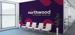
A Fresh Lick of Paint for a National Estate Agent
A Fresh Lick of Paint for a National Estate Agent
Harrison Carloss
Northwood are a well-established national lettings and estate agent with over 90 locally owned franchise offices and have been operating since 1995. While Northwood has a solid reputation for being a trustworthy estate agent that provides a quality service, they recognised the need of updating their brand to remain competitive in a rapidly evolving market including new online challenger brands entering the market. Following a competitive pitch process, Northwood chose to partner with Harrison Carloss to embark on a rebrand process.
Before we began any creative work, we undertook competitor research and also conducted a branding workshop with a group of Northwood franchisees and the Belvoir Group team. We looked to draw out exactly what needed to underpin the new brand and what was important to franchisees and their customers.
A Fresh New Look
We were tasked with giving the brand a fresher, more modern look, whilst also retaining the heritage of the brand including the Northwood ‘burgundy’ that staff and customers had come to know and love. We needed to deliver a new brand image that not only strengthened the estate agent’s national identity but also added significant value in enhancing their market positioning, customer engagement and attracting a wider demographic.
A New Chapter
We have developed the new brand identity for Northwood to modernise its overall look. The updated logo is still distinctly ‘Northwood’, maintaining the lower case ‘n’ for a softer look but adopts a more dynamic look, taking the previous ‘rooftop’ and adding a modern twist. The new Northwood rooftop icon encompasses both the apexes of houses whilst also representing the ‘n’ and ‘w’ from Northwood. The written Northwood logo also has a custom version of Red Hat Display with sharp angles protracting upwardly to represent the apexes of rooftops on relevant letters ‘t’, ‘h’ and the ‘d’.
Smarter Fixtures and Fittings
Harrison Carloss have then supported Belvoir Group with the brand roll out and execution for Northwood across both online and offline elements including shop fit outs, digital design and most importantly, for sale and to let boards.
The boards needed to stand out in a crowded and competitive space, so we threw away tradition and have incorporated a soft edged, die cut board leading with the two primary brand colours; ‘cherry burgundy’ and ‘indigo’.
A Brand New Outlook
Each one of Northwood’s 90 locally owned franchise offices will be updated with the new branding and have an overall refresh.
The typography has been switched for Red Hat Display and Nunito to give a warmer, friendlier feel to the brand whilst the rebrand also sees an overhauled colour palette. We’ve introduced a more vivid, bold shade of the ‘burgundy’ to complement the deep ‘indigo’, whilst elevating the old Northwood yellow with a warmer ‘gold’.
Kiara Simmance, Marketing Director at Belvoir Group, said:
Harrison Carloss designed the refreshed branding for Northwood and we couldn’t be happier with the results. They took the time to understand our business, our franchisees and our customers and came up with a brand that was just what we needed, an evolution not a revolution. The ongoing communication and project management was great, and we felt reassured throughout. The brand is now live and being tried and tested in the ‘real world’ and we’re still just as happy with the outcome. We look forward to working with Harrison Carloss for future Northwood marketing campaigns.
Adam Mobley, Managing Director at Harrison Carloss, comments:
We were thrilled to be chosen by Belvoir Group to rebrand Northwood. It’s a brand that we’re all familiar with and it’s in such a competitive space.
Being chosen to rebrand a national estate agent with such heritage and credibility in their sector was a fantastic creative challenge for the team at Harrison Carloss. We didn’t want to lose the recognition and respect the brand had built up over their almost 30 year heritage but also had to ensure it could compete in a modernising industry. We were all so proud when we saw that first Northwood for sale sign in the new brand!
Client: Northwood
Industry: Real Estate
Sector Expertise: Residential Real Estate
Services
Branding
Creative
Completed: Feb 2024

How the Right SEO Ingredients Boosted Traffic for Cottage Delight
How the Right SEO Ingredients Boosted Traffic for Cottage Delight
Harrison Carloss

Cottage Delight is a British food producer known for its wide range of handmade, high-quality speciality foods. The company was founded in the 1970s in the Staffordshire Moorlands, England.
They started by selling homemade butter fudge and have since expanded their product line to include jams, chutneys, pickles, sauces, marmalades, biscuits, cakes and more.
Taking Ownership of Their SEO
Cottage Delight is renowned for using traditional recipes and high-quality ingredients to create their products.
Their offerings often make use of locally sourced produce, and they have gained a reputation for producing delicious and unique flavour combinations. Much of their business comes from B2B sales with the trade and they have a growing network of over 800 stockists including farm shops and garden centres. Their website was created as a new online channel for sales, focusing on new B2C customers.
They had worked with SEO agencies in the past but felt like they were not getting value for money. As the website was still relatively new, the team was small and much of the leg work had to be undertaken by them, creating additional workload beyond their day to day.
They wanted an agency to take ownership of their SEO activity and alleviate the pressure on the team. As the website and ecommerce offering was still relatively new, Cottage Delight felt that they needed more support at this point to ensure its success and create solid organic foundations for the future.
In addition to traditional SEO work, the internal team also wanted to enlist a web development team to help maintain and support any future work and improvements to the site. The focus would be on UX to help improve the conversion rate on the website as previous development of the site had left some areas with a lot to be desired.
Following the Recipe
Harrison Carloss adopted a holistic approach to Cottage Delight’s SEO strategy, covering all areas of the site:
- Regular, high quality content creation addressing relevant queries from the world of cooking and baking to build a useful knowledge base for their existing customers and drive new users to the site
- Improving and enhancing product listings
- UX improvements across the site including redesigning the blog pages to be more engaging
- Monthly technical updates to address arising issues common on ecommerce sites
Crucial Traffic Driver
Product pages are a crucial traffic driver for Cottage Delight therefore we worked to assess and optimise product pages as required.
As part of a UX project to improve the layout of product pages, we included space for concise product descriptions to help the flow of the page which were optimised across the site.
New products were optimised when going live with targeted meta data and on-page copy.
To cover any missed pages, we set up dynamic meta data through Yoast as a fallback for product, recipe and blog pages to ensure no page was missing any information.
A Baker’s Bible
At the beginning of the year, the team did extensive keyword research for the site, taking particular focus on long-tail keywords as this would form the basis of Cottage Delight’s blog activity.
Working with the internal team, we mapped out relevant content for each month, ensuring to highlight any seasonal occasions and pull focus on new product ranges.
Seasonal pieces were written with the intention of being updated each year, therefore retaining and building on any existing performance. This also made it easier for the team to generate seasonal content easily in the future.
We looked to create a diverse knowledge hub with content that targeted user’s queries yet remained relevant to Cottage Delight’s product base. These blogs looked to drive traffic from those interested in cooking, baking or were just generally curious about food!
Significant Improvements in Just 6 Months
- Harrison Carloss was appointed Cottage Delight’s agency at the beginning of 2023 and in only 6 months we started to see significant improvements in the quality of organic traffic and overall engagement with the site.
- After 12 months, the site had seen a 29.96% increase in organic traffic overall.
- The focus on content yielded significant results and ensured an 845.95% increase in /blog/ sessions compared to the previous year. In numbers, that’s a whopping 24,715 sessions coming directly through the blog over the year.
- We worked to increase and diversify their existing organic keywords which helped to boost their no. of organic keywords by 108%, from 2620 keywords in 2022 to 5465 in 2023.
Client: Cottage Delight
Industry: Food & Beverage
Sector Expertise: Consumer Goods
Services
SEO
Content Marketing
UX Design
Completed: Jan 2024
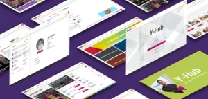
How Harrison Carloss Helped YMCA To Connect
How Harrison Carloss Helped YMCA To Connect
Harrison Carloss

Following a piece of internal research, YMCA England & Wales were looking to improve their internal communication across the entire federation.
The federation is made up of 83 independent YMCA’s throughout England and Wales making communication and resource sharing a challenge. Staff, volunteers and trustees weren’t engaging with the current communication platform, it was lacklustre, unintuitive and cumbersome for users to access.
YMCA were looking for an intuitive internal platform to help bridge this gap, promote a more collaborative working environment and help them to achieve their wider strategy. The objective of the platform was to encourage communication and enable YMCA’s to help one another, sharing resources, knowledge and strategies.
Their objective was to devise a solution with the aim of 1,000 users signed up to the platform within 12 months of launch.
Say Hello to Y-Hub
Harrison Carloss worked with the team at YMCA England and Wales to spec, design and build a brand new digital platform; encompassing a complete directory, live news updates with a ‘breaking news’ ticker, the ability to list and book onto in person and virtual events, a chat function for private and public chats (including emojis and Giphys of course!), resource and brand centres as well as the very competitive daily quiz. Y-Hub enables over 10,000 staff, volunteers and trustees across England and Wales to come together on one platform to communicate, collaborate and share resources.
The platform has been custom designed and built on Laravel and Vue as a progressive web app, allowing them to create a version of Y-Hub accessible through a browser, as a desktop, tablet or mobile app along with native push notifications. Users can search for a colleague in a local YMCA using the directory, start chatting with them, share resources or even create a group chat of colleagues with similar job roles interests to help one another. Y-Hub also allows users to choose when they would like to receive push notifications too, ensuring that people can choose to receive notifications only during working hours if they wish.
Making The System secure
One of the agency’s main focuses for the project was ensuring the system was secure.
Data security best practice has been used throughout the system and was considered in every aspect of its development. From running on a dedicated server to using industry leading security software, Cloudflare – they’ve taken additional steps to ensure that all data on Y-Hub is protected.
Harrison Carloss also conducted penetration testing before launch to ensure the system was secure.
Plus, the whole system is backed up every night just in case so the team can sleep easy!
Y-Hub Showcase
The system was officially launched at the YMCA’s National Conference in the summer of 2023. Harrison Carloss created a launch video for the event which showcased the key features and benefits. They also created welcome packs to hand out to every event attendee at the end of the talk. This included help guides on how to register and download the app with a QR code to the registration page to help ensure a high adoption rate early on.
Since launch, the platform has achieved the initial target of 1,000 users in half the time, exceeding expectations. The platform has been well received and it’s already making a huge impact on YMCA’s throughout the federation with regards to collaboration on projects and enabling better communication at a local level.
Jerahl Hall, Senior Communications Manager, said:
Harrison Carloss are an extremely talented and committed group of individuals, with a real passion for delivering for their client. They were dedicated to each step of their project, thinking about how it would be received, and how it could be developed to become even better. They care, and that makes all the difference to an organisation like YMCA.
Client: YMCA England & Wales
Industry: Nonprofit
Sector Expertise: Civil Society Organizations (CSO)
Services
Digital Product Design
Video Production
Completed: Jan 2024
MORE
Feed

On Sunday, 8th March, the Midlands’ creative scene was alive with celebration and culture as the inaugural We Are Creative Awards took...

Harrison Carloss is delighted to announce their certification as a WooExpert Agency, one of only 11 businesses in the UK and 150 worldwide...

Strategic marketing agency, Harrison Carloss, has released a wild new rebrand for West Midlands Safari Park, an award-winning visitor...
MORE
All Jobs

Account Director
Harrison Carloss is looking for a Senior Account Manager or Account Director to join their team in Stoke-on-Trent.
UK>Manchester
Senior Account Manager/Director
Harrison Carloss is looking for a Senior Account Manager/Director to join their team.
UK>Manchester