


Kooba’s mission is simple. We make beautiful, effective websites that deliver results. We bring every skill to the table. Digital brand development, UX best practices, bespoke UI design, robust development, and continuous website optimisation. Our multi-disciplinary teams create bespoke digital experiences that are tailored to each organisation’s metrics for success. We guarantee that the result won’t only look incredible, but will also deliver lightning-fast performance. And how do we get there? By working with our clients. We involve you in our creative process, listen to your needs and maintain the relationship long after launch. We’re digital partners, here to help find the right solution for your business, and we’re in it for the long-haul.

Kooba
Gold MemberKooba is a team of creative thinkers, problem solvers, and designers. Collectively, we are an award-winning agency dedicated to ensuring your brand succeeds online.
About
- HQ
- OFFICES
-
HEADQUARTERS
- ADDRESS: The Daintree Building 62 Pleasants Place Dublin Ireland
- PHONE: 353 1 444 6677
- E-MAIL: [email protected]
-
OFFICE
- ADDRESS: 62 Elephant Lane, London, SE16 4JD
- PHONE: 44 7340 460006
- E-MAIL: [email protected]
-
OFFICE
- ADDRESS: Hegelpl. 1, 10117 Berlin, Germany
- PHONE: 49 30 2201 2556
- E-MAIL: [email protected]
Service Expertise
Service Expertise
Service Expertise
Service Expertise
Service Expertise
Kooba’s UX and accessibility driven approach is perfect for large universities. Kooba’s work for South East Technical University (SETU) earned the Best in Universal Design award at the 2025 Spiders.
Sector Expertise
- Online Education
- Higher Education
Kooba deliver engaging and motion-driven digital solutions for a range of entertainment clients, including the 3Arena, Aviva Stadium, and MCD.
Sector Expertise
- Music Venues
- Live Music & Concerts
- Culinary Experiences
- Event Management Companies
- Theater & Performing Arts
Kooba deliver exceptional web design and development services to several clients in the world of finance. Kooba’s work for GSR, Rubicon, and Activate Capital highlights this capability.
Sector Expertise
- Finance Software
- Asset Management
- Investment Management
- Financial Advisors
Kooba have produced exceptional, inclusive, and compliant digital platforms for public sector clients. Kooba’s focus on accessibility and usability makes them ideal partners for government agencies.
Sector Expertise
- Educational Institutions
- Environmental Resource Agencies
- Regulatory & Compliance Bodies
- Social Services & Welfare Programs
- Economic Development Agencies
- Federal Government Departments
- Public Affairs
- Public Health Authorities
- Tourism Boards
Kooba provide best-in-class UX and web design for several leading healthcare and pharmaceutical firms, including Bon Secours Health System, St Vincents Private Hospital, Repromed, and GH Research.
Sector Expertise
- Health Research
- Hospitals & Health Systems
- Doctors
- Healthcare Consulting
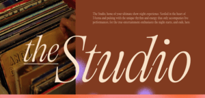
Kooba have recently launched several exceptional solutions for hospitality firms. The Killarney Park Hotel website has been nominated for an IDI award, and the Studio website was launched for 3Arena.
Sector Expertise
- Boutique Hotels
- Event Venues
- Luxury Hotels
- Private Clubs
Kooba understand the complex needs of tech firms, and focus on UX-driven solutions to effectively communicate product ranges, features, and benefits. Our tech clients include Taoglas and Holoplot.
Sector Expertise
- Cloud Computing
- Artificial Intelligence (AI)
- FinTech
- Software Development
- Internet of Things (IoT)
- Cybersecurity
Kooba have partnered with A&L Goodbody, one of Ireland’s leading law firms, to provide an exceptional website solution.
Sector Expertise
- Corporate Law
Kooba Reviews
Design-led digital experience and strategy partner
Kooba positions itself as a design-led digital experience and strategy partner, combining creative thinking, UX design, and strategic execution to deliver high-performing digital platforms and campaigns.
The agency’s core strength lies in balancing creative innovation with business performance—ensuring that design is not only visually compelling but also aligned with measurable outcomes and user behavior.
Strongest differentiators
Its strongest differentiators are:
- Strong integration of design, UX, and strategy
- Ability to connect creative execution with business performance
- Reputation-backed credibility (recognized in local and international markets)
- Collaborative, partnership-driven working model
However, available signals suggest:
- Strong experience and design-driven performance capability
- Moderate depth in deep performance marketing systems or technical infrastructure
- Limited visible emphasis on lifecycle marketing, CRM, or advanced acquisition engineering
DAN Perspective
Kooba fits best into the category of “design-led digital experience and strategy partners”, making it a strong choice for brands seeking high-quality creative execution aligned with strategic growth goals.
Strategic Depth
Client feedback highlights Kooba’s ability to ground creative work in strategic thinking, aligning UX, messaging, and digital experiences with business objectives.
Execution Excellence
The agency demonstrates strong execution across website development, UX design, and digital campaigns, delivering high-quality and performance-aware outputs.
Speed & Reliability
Clients report responsive communication, consistent involvement, and reliable delivery across engagements.
Collaboration Quality
Feedback highlights a highly collaborative, partnership-oriented approach, with strong alignment to client goals and teams.
Primary Expertise
Client outcomes strongly associate the agency with website design, UX/UI, digital experience development, and brand-driven campaigns.
Value Creation Pattern
Reported gains cluster around improved digital presence, stronger user experience, and enhanced brand impact. Evidence around deep acquisition systems, CRM integration, or performance engineering remains limited.
Price–Performance Balance
Strong reputation and consistent delivery indicate positive value perception.
Transparency & Scope Clarity
Client feedback suggests structured collaboration and clear communication, though detailed pricing transparency remains limited.
Client Satisfaction
Client sentiment is highly positive, driven by creativity, professionalism, and consistent results.
Referability
Clients demonstrate strong referral likelihood, supported by reputation and long-term partnerships.
- IDI Award Best New Website Launch - Irish Human Rights and Equality Commission 2025
- Spiders Large Agency of The Year 2025
- Spiders Best in Universal Design - South East Technical University 2025
- Digital Media Awards Best Website / Skillnet Ireland 2024
- Spiders Best Website / Payslip 2024
- Spiders Best Website / National Talent Academies 2023
- Spiders Best Collaboration / Webdoctor.ie 2023
- IDI Awards Website Design / Screen Ireland 2022


Case Studies

Delivering Digital Excellence Across The Bord Bia Website Suite
Delivering Digital Excellence Across The Bord Bia Website Suite

Kooba are engaged in a large-scale and long-term partnership with Bord Bia, the state body responsible for promoting Irish food and drink domestically and abroad. Across this project, Kooba have been tasked with managing the design and development of 13 different websites, each with their own unique audiences and brand identities. This requires a truly flexible and strategic approach, with Kooba’s team perfectly aligned with Bord Bia’s needs at every point.
Digital Partners
Given the size of the Bord Bia project suite, Kooba were keen to work in an efficient, user-focused way across the entire range of websites. This began with extensive user research, using both quantitative and qualitative methods to understand user needs, pain points, and behaviour patterns. The bedrock of actionable knowledge allowed Kooba’s UX design team to make evidence-based recommendations and improvements to each website across the suite.
Kooba also built out a comprehensive design system containing UI features and components which could be used across the entire website suite. This ensured visual consistency, reduced design and development timelines, and empowered Bord Bia’s internal stakeholders with a range of valuable resources.
Strategic Vision
For an organisation as large and complex as Bord Bia, changes in digital strategy can be challenging. Through constant collaboration and communication, Kooba ensured that updates to Bord Bia’s core strategic vision were immediately reflected across their entire digital presence. Likewise, insights from Kooba’s analytics and research informed wider discussions on Bord Bia’s website suite.
One clear example of this strategic adaptation was the careful amalgamation of existing websites based on user needs. This ensured that each of Bord Bia’s diverse audiences could receive a digital experience tailored to their specific requirements, and provided a unitary purpose to each website within the suite.
Flexible Solutions
Whilst operating at scale was crucial to this project, so was attention to detail. As Bord Bia’s marketing team planned new campaigns and targeted new audiences, Kooba were tasked with building flexible and adaptive solutions to support these. These sub-projects drew from existing design and development assets, but also featured original work to provide distinctive brand assets.
One such project was Bord Bia Gather, for which Kooba designed and delivered a one-off event website for a global conference hosted by Bord Bia at PowersCourt. The website perfectly reflected the event itself, with bespoke facecards, itineraries, and pre-event surveys all contributing to an engaging and streamlined experience.
A Living Partnership
For Bord Bia, Kooba have served as a flexible, strategic, and effective digital partner, constantly focused on the specific needs of Bord Bia and their users. Best of all, this partnership is only beginning. As new challenges and opportunities arise, Kooba continue to respond with perfectly tailored digital solutions, helping drive engagement and success across the entire Bord Bia website suite.
Client: Bord Bia
Industry: Food & Beverage
Sector Expertise: Dairy
Location: , Europe
Completed: Dec 2025

Redefining Digital Hospitality for The Killarney Park
Redefining Digital Hospitality for The Killarney Park
The Killarney Park, one of Ireland’s most exclusive five-star hotels, partnered with Kooba to create a digital experience that would reflect its market-leading position in Irish hospitality. The goal was to design and build a website that would not only look visually stunning but would also actively enhance the customer journey, improve booking performance, and extend the hotel’s premium in-person experience into the digital space. This project aimed to combine The Killarney Park’s prestigious heritage with a sleek, modern, visual aesthetic, positioning the hotel for future growth.
The standout feature of the Killarney redesign was the implementation of a dynamic horizontal side-scroll on the homepage, a bold and creative choice that offers a distinctive and unique browsing experience. The resulting user journey is smooth, immersive, and memorable. With the help of bespoke photography, this draws users into the site in an engaging way, encouraging exploration of both the hotel’s luxurious offering and the surrounding destination. This approach helps The Killarney Park stand out in a highly competitive market where many hotel websites rely on static, template-driven formats that do little to differentiate one brand from another.
Kooba placed a strong emphasis on the use of high-quality photography, motion, and thoughtful interaction throughout the site. Full-screen imagery, subtle animations, and carefully designed interactive elements were used to highlight the warmth, comfort, and understated refinement that define The Killarney Park brand. Every visual and functional choice was made with the goal of reinforcing the hotel’s premium positioning while keeping the path to direct bookings front and centre.
To convey the luxurious experience of The Killarney Park across a digital medium, Kooba needed to rebuild the existing visual identity of the website. Kooba’s approach was not to reinvent The Killarney Park’s brand image but to respect, refine, and elevate existing assets. Kooba’s design team enhanced the website’s colour palette, typography, and imagery to create a polished, cohesive look that aligns with the hotel’s reputation for understated elegance. The result is a digital platform that looks and feels premium while strengthening the perception of The Killarney Park as a forward-thinking luxury destination with a strong local heritage.
Kooba’s redesign of The Killarney Park’s digital presence combines a unique and engaging visual experience with a laser-focused conversion pathway. The result is a website that is not only a pleasure to use, but consistently delivers high-quality inbound bookings. This is paired with a slick, highly-functional and accessible development process, ensuring every user receives a seamless and enjoyable experience.
Client: The Killarney Park
Industry: Hospitality
Sector Expertise: Boutique Hotels
Location: Other Cities, Europe
Completed: Jul 2025

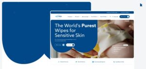
Kooba Announces Exciting New Partnership with WaterWipes
Kooba Announces Exciting New Partnership with WaterWipes
We’re thrilled to announce that Kooba has been selected as the new digital agency for WaterWipes, the world’s purest baby wipes brand. Trusted by parents and healthcare professionals across the globe, WaterWipes represents the very best in care, quality, and purity. This exciting partnership marks a significant milestone for Kooba, and we couldn’t be prouder to work alongside such an influential and purpose-driven global brand.
Our collaboration with WaterWipes is a long-term partnership designed to elevate their digital presence and create meaningful connections with their customers worldwide. Here’s what this collaboration is all about and why it’s such an important step forward for both our teams.
A Partnership Built on Purity and Purpose
WaterWipes, an Irish-based brand, is renowned for its commitment to creating the world’s purest baby wipes. This mission has not only made them a household name for families, but also a trusted partner for hospitals and healthcare providers in over 50 countries. Their emphasis on purity and purpose perfectly aligns with Kooba’s values of creating innovative, user-centric digital experiences that connect meaningfully with audiences.
For Kooba, being entrusted with WaterWipes’ digital strategy across 18 markets and 9 languages is an incredible opportunity. We’re focused on delivering more than just technical upgrades; our work aims to enhance their digital ecosystem, ensuring it reflects the same level of quality and care that the WaterWipes brand represents worldwide.
What This Collaboration Looks Like
At Kooba, we believe in shaping digital strategies that prioritise usability, function, and brand storytelling. With WaterWipes, we’re undertaking a comprehensive approach to reimagine their online presence. Here’s what we’re working on together:
1. A Website Redesign That Puts the User First
We’ve already begun a complete redesign of the WaterWipes website, rethinking everything from information architecture to the content experience. The goal? To create a seamless, intuitive user experience that allows customers to easily find the products and information they need.
From refining the visual design to ensuring every touchpoint reflects the brand’s purity and authenticity, this redesign promises to be a transformational step for users across 18 global markets.
2. Consistent Multi-Market Performance
Managing a digital presence across multiple countries and languages is no small feat. Our team is optimising the platform architecture to ensure top-tier performance, no matter where customers are located. With scalable technology and robust infrastructure, WaterWipes will be able to deliver a seamless experience to every customer, whether in Ireland, Australia, or the United States.
3. Enhanced Digital Storytelling
WaterWipes has a powerful story to tell, and we’re helping them amplify it online. Through smart design, interactive content modules, and data-driven UX enhancements, we’re making sure their message of purity, care, and quality resonates with every visitor.
4. Accessibility for All
A commitment to inclusivity is core to this collaboration. Our redesign includes accessible features to ensure the WaterWipes website is usable and enjoyable for everyone, regardless of ability. Delivering accessibility isn’t just a technical requirement to us; it’s an opportunity to make a meaningful impact for users.
Why This Partnership Matters
The partnership between Kooba and WaterWipes isn’t just about websites and tech. It’s about creating a digital experience that mirrors the essence of what makes WaterWipes extraordinary. For a brand that prioritises the wellbeing of families and babies, it’s essential that their online presence reflects trust, authenticity, and genuine care.
For Kooba, this collaboration also signifies another major achievement in our mission to deliver innovative digital solutions for world-class brands. Fresh from being crowned Best Large Agency of the Year, we’re ready to bring our expertise to this exciting project and continue raising the bar on what digital agencies can achieve. It’s a privilege to work with one of Ireland’s most inspiring global success stories, and we can’t wait to show the world what’s next.
What’s Next for WaterWipes?
We believe this partnership is the beginning of a new digital era for WaterWipes. With a shared vision for growth, innovation, and meaningful connections, our work will continue to evolve alongside the brand. From new content features to ongoing platform optimisation, every step of this journey is about delivering value to WaterWipes’ customers across the globe.
We’re just getting started, and there’s much more to come. Expect to see an enhanced digital experience that celebrates everything WaterWipes stands for, while making it easier than ever for customers to engage with the brand they love.
Excited to Learn More?
Kooba is always looking to collaborate with like-minded partners who are passionate about innovation, user experiences, and delivering value. If you’re curious about working with us or want to stay updated on the latest from our team, reach out today. We’d love to hear from you!
Together, Kooba and WaterWipes are redefining what a strong digital presence looks like for a global brand. Stay tuned for more updates as this exciting partnership unfolds.
Client: WaterWipes
Industry: FMCG
Completed: Jun 2025

Building a Market-Leading Digital Experience for GSR
Building a Market-Leading Digital Experience for GSR


GSR are an elite partner in the digital asset and blockchain space, helping founders and institutions scale from conception to launch. With an experienced and accomplished senior team, GSR occupies a high-status position of thought leadership within a competitive and fast-growing industry. In 2024, GSR reached out to Kooba to optimise their digital presence, with the goal of improving the discoverability of their high-quality content, as well as upgrading their overall visual identity across their website.
Empowering content writers
In order to streamline the workflow of GSR’s exceptional content writers, Kooba addressed several of their existing issues with backend publication. Through the implementation of a user-friendly, adaptive, and marketing-optimised CMS, Kooba’s development team provided GSR’s writers with an immediately useful publishing platform. This translated into operational savings, as well as improved content through flexible and bespoke templates.
Raising discoverability
Crucially, content also needed to be made directly accessible to site visitors. To accomplish this, Kooba refocused the user experience of the website to improve discoverability. Thought-leadership pieces were surfaced early in the user journey, and were clearly tagged and categorised within an “Insights” dropdown. Kooba then designed customised landing pages for each of GSR’s three publication forms, and added user-friendly filter and search functionality.
A visual refresh
Finally, GSR were eager to update their broader visual identity across their website in line with the fast-changing nature of their industry. Kooba implemented subtle interactive elements across the home page, and added motion with a soft animation of GSR’s logo in the site’s background. This was reinforced with responsive features on each page, designed to augment and build upon GSR’s existing brand identity.
Positioned for market leadership
With a streamlined publishing workflow, more flexible content formats, an intuitive UX, and a visually refreshed digital identity, GSR is perfectly poised for future growth. Thanks to Kooba’s redesign GSR’s stakeholders have been empowered to reach their target audience with quality content and resources, raising their status as thought leaders.
Client: GSR
Industry: Finance
Sector Expertise: Financial Advisors
Location: New Jersey, USA
Completed: Jun 2025

A Careers Site That Drives Itself: Kooba & Volkswagen
A Careers Site That Drives Itself: Kooba & Volkswagen
Volkswagen approached Kooba to redesign their existing careers site. Although the site was functional, the strategy was focused on improving the careers site in hopes of attracting stronger talent and increasing hiring engagement.
Attracting The Right People For The Road
Based on Volkswagen’s preferences and the user research conducted by Kooba, we decided on several objectives that would guide the process from start to finish: visuals, content and animation.
Stronger Visuals At Full Speed
Volkswagen wanted stronger visual content across the site; in particular, there was a desire for imagery and video content highlighting people and the Volkswagen community to add a personal ethos to the site. From the start, the strategy revolved around spotlighting company culture and imagery throughout the pages. However, we proceeded with caution, as increased content can often compromise site speed.
To support Volkswagen’s interest in an image oriented and video-heavy careers page, we built in a Vimeo integration for stronger performing videos. By using Vimeo, video chunks are redownloaded on demand rather than reloaded with the rest of the site. As a result, the site is much faster than a site that hosts the amount of video content that Volkswagen wanted.
A Career Booster
Another core part of the digital strategy was positioning the site as an information source. The vision included elements such as application resources, guides, FAQs, and industry insights. We understood that the site needed to evoke a sense of career growth and excellence, something Volkswagen voiced as a priority for attracting the skilled, ambitious people they are looking for.
As a result, the new site content is more creative and rich than before; the modules have been developed to keep the user engaged, and the plethora of information has created a distinction between external careers sites like LinkedIn and Volkswagen’s own site as a resource for prospective employees.
Engaging & Moving
Among the several new innovations on the site, animation contributed heavily to increased functionality and visual engagement. Using animation not only added to the storytelling experience of the site, but also allowed an element of accessibility to the pages. Our developers used GSAP for animations throughout the site, an specific animation library that crafts high-performance animations that function efficiently regardless of the browser or internet speed; more site users can now engage with and eventually apply to Volkswagen.
Two Clicks Away From ‘Apply’
Since the recent launch of the site, Volkswagen has seen several positive outcomes from the development.There are clear goals and consistent call-to-action buttons for the user to navigate throughout the site to add to a more seamless website and career search experience.
The new content is more engaging than before, and the overall performance of the site has improved. The careers process is already daunting as is; the new Volkswagen site takes away the added stressors of slow-loading pages, unclear information, and unmotivating content. What we’re left with is a digital presence that shows a clear road towards career growth with Volkswagen.
Client: Volkswagen
Industry: Automotive
Sector Expertise: Automotive Manufacturers
Kooba and Screen Ireland: A Creative Rework of A Classic Concept
Kooba and Screen Ireland: A Creative Rework of A Classic Concept

Kooba has been a longstanding partner of Screen Ireland, fostering a creative and productive collaboration that dates back to 2015. Their partnership began during a pivotal moment when Screen Ireland underwent a rebranding from its original identity as The Irish Film Board. Kooba played a central role in this transformation, helping to redefine the organization’s public image and digital presence.
Over the years, this relationship has continued to evolve, with Kooba spearheading multiple iterations of Screen Ireland’s online platforms to adapt to shifting audience needs and technological advancements. In their most recent collaboration, Kooba took on the ambitious task of integrating the Screen Skills website and the existing Screen Ireland website, as well as incorporating their shorts player site into a unified and user-friendly digital hub.
A Universal Experience
The overarching goals of the project were carefully defined to address key challenges and ensure optimal functionality for all types of users. One of the primary objectives was to create a platform that could cater to both industry professionals and the general public, offering an intuitive and engaging experience for all. Given the diverse range of users, this meant designing an interface that could easily guide filmmakers, producers, and investors on the one hand, while providing casual viewers, students, and film enthusiasts with a smooth and enriching browsing experience on the other.
Another essential goal was to reinforce and elevate Screen Ireland’s brand identity throughout the entire digital platform, showcasing the organization’s influence and authority within the Irish film sector. Additionally, integrating the Screen Skills website was a high priority, with a focus on achieving seamless navigation between sections. Improving key technical performance metrics, particularly for mobile users, rounded out the project’s key ambitions.
To meet these goals, Kooba crafted a solution that combined thoughtful design, technical innovation, and brand sensitivity. One of the standout features they introduced was a dynamic toggle option designed to meet the needs of Screen Ireland’s diverse user base. With a simple switch between the “industry” and “audience” options, users could immediately access content tailored to their specific interests and requirements. This toggle mechanism created a streamlined user journey, eliminating unnecessary confusion and ensuring that both industry professionals and general audiences could quickly find the information they needed.
Designing for the Big Screen
The redesign also involved a meticulous overhaul of the user interface (UI) to further highlight and enhance Screen Ireland’s branding. Kooba ensured that every design element reflected the agency’s creative vision and credentials, emphasizing its status as a leader in the film and screen sector. Through a sophisticated and cohesive aesthetic, the new UI successfully communicated Screen Ireland’s core mission and reinforced its role as a driving force in promoting Irish cinema on the global stage.
Throughout the project, Kooba conducted an in-depth needs analysis and engaged extensively with key stakeholders to gather input and refine their design approach. This collaborative effort helped shape the website’s functionality and design features, ensuring that the final product met the expectations of all users. By working closely with Screen Ireland’s team, Kooba was able to create a solution that addressed not only the immediate needs of the organization but also anticipated future growth and scalability.
The inclusion of a scalable content management system (CMS) allowed for easy updates and expansion as new content and initiatives emerged, making the platform future-proof and adaptable.
Key technical aspects of the project included fully accessible front-end development, ensuring that the website met modern accessibility standards and could be easily navigated by users with disabilities. The importance of accessibility extended to mobile users as well, with Kooba optimizing the site’s performance on smartphones and tablets. Recognizing the increasing reliance on mobile browsing, Kooba made sure that every element of the site functioned smoothly across all devices, with fast loading times and intuitive navigation.
The Finished Article
The final product demonstrated several notable wins, including an elegantly redeveloped website featuring enhanced UX and UI design. Kooba’s thoughtful design choices elevated the user experience, making it easier for users to engage with content and explore what Screen Ireland had to offer. The industry/audience toggle emerged as one of the most effective solutions, ensuring that users could access relevant content with minimal effort.
The successful integration of the Screen Skills website created a seamless bridge between training and development resources and the wider content available on the main platform.
In addition to the design and development achievements, Kooba provided ongoing post-launch support, helping Screen Ireland address any emerging challenges and maintain the site’s performance over time. This level of commitment underscored the value of the partnership and ensured that Screen Ireland’s digital presence would continue to evolve and improve.
Ultimately, the project’s outcome was a resounding success. Kooba’s redesign helped to solidify and expand Screen Ireland’s brand, offering a single, comprehensive digital hub for its diverse audience. The creative and flexible UX approach enabled users to effortlessly find the content that mattered most, whether they were filmmakers seeking funding opportunities or members of the public interested in discovering Irish cinema. The result was an attractive and functional website that not only enhanced Screen Ireland’s online visibility but also positioned the organization as the definitive authority in the Irish film industry.
By bringing together form and function, Kooba created a platform that perfectly embodied Screen Ireland’s mission and vision, helping to champion Irish storytelling for years to come.
Client: Screen Ireland
Industry: Entertainment
Sector Expertise: Film Production

A Digital Facelift for The Avoca Clinic
A Digital Facelift for The Avoca Clinic

In November 2023, The Avoca Clinic initiated a collaboration with Kooba to redesign their website comprehensively. This decision aimed to enhance user engagement, generate valuable leads, and increase organic web traffic.
By focusing on creating a streamlined and user-friendly experience (UX), The Avoca Clinic also sought to subtly adjust their brand identity, making it more appealing to a broader audience. Kooba’s data-driven approach identified areas for improvement, including boosting conversion rates, implementing a mobile-friendly design strategy, and refining the brand’s visual aspects. As a result, The Avoca Clinic reported significant improvements in engagement rates, web traffic, and qualified leads generated from the website.
Boosting Lead Generation
From the outset, lead generation was one of the primary objectives of the website redesign. The Avoca Clinic aimed to ensure that their site attracted visitors and effectively converted them into leads. To achieve this, Kooba’s UX team implemented strategies to enhance conversion opportunities. A key tactic was the integration of lead-generating call-to-actions (CTAs) strategically placed throughout the navigation bar, homepage, and other key sections. These CTAs were designed to be intuitive, guiding users toward actions such as booking consultations or reaching out for information.
The results were clear. The homepage experienced a 49% increase in views per session, reflecting stronger visitor engagement.
By positioning CTAs where they naturally caught attention, The Avoca Clinic drove higher click-through rates and longer session durations. These improvements directly contributed to an increase in lead generation, enabling the clinic to exceed key performance indicators (KPIs) set at the start of the project. Kooba’s redesign delivered measurable outcomes that supported the clinic’s business goals and created a strong foundation for future digital growth.
Prioritising Mobile-First Design
Another significant focus was the website’s mobile experience. Kooba’s initial UX audit revealed that over 88% of The Avoca Clinic’s website traffic came from mobile devices. Mobile users also demonstrated higher engagement and conversion rates than desktop users. Recognising this, Kooba adopted a mobile-first design approach, ensuring that the website’s functionality and aesthetics were optimised for smaller screens.
This strategy involved reimagining the navigation system to be intuitive for mobile users, enabling quick and efficient information access. Performance optimisations, including reduced loading times, improved user experience and supported better search engine rankings. Additionally, a WhatsApp contact feature was integrated, aligning with modern users’ preference for convenience and immediacy.
The impact was profound. Following the redesign, mobile users accounted for over 90% of traffic, demonstrating the effectiveness of the mobile-first strategy. This shift contributed to higher engagement rates and more inbound leads. By tailoring the website to its predominantly mobile audience, The Avoca Clinic maximised the value of its online presence and achieved meaningful business results. The improvements also enhanced accessibility, ensuring the website functioned seamlessly across various devices and browsers.
Building a Brand
In addition to improving UX and achieving performance-based KPIs, The Avoca Clinic sought to reposition its visual branding to appeal to a more diverse audience. This required designing a user interface (UI) that conveyed inclusivity while maintaining professionalism. Kooba’s design team created a welcoming and accessible online environment to resonate with a broader range of clients.
The visual redesign featured clean layouts, a warm colour palette, and real patient testimonials. These elements created an atmosphere of trust and authenticity, giving visitors insight into the positive experiences they could expect. By focusing on inclusivity and approachability, the updated UI made the website more attractive to prospective clients while reinforcing the clinic’s reputation for excellence.
This shift in branding directly impacted the clinic’s ability to attract and retain website visitors. The enhanced design contributed to an increase in organic traffic and supported long-term growth objectives. By aligning the visual identity with core values and customer expectations, Kooba’s redesign strengthened The Avoca Clinic’s competitive position in the healthcare market. The attention to detail in the visual elements ensured a cohesive and appealing presentation that resonated with all users.
The Results
The results of The Avoca Clinic’s website redesign were transformative. By prioritising a mobile-first design, enhancing lead generation opportunities, and creating a more inclusive and visually appealing UI, the redesigned website achieved success across all objectives.
Engagement time increased by 52%, while visit duration rose by 14%. These metrics indicate visitors spent more time on the site and interacted more deeply with its content.
Most importantly, the improved user experience and targeted strategies translated into tangible business outcomes. The clinic saw a significant increase in valuable leads generated through the website, resulting in higher sales and revenue. This success underscores the value of investing in a thoughtful and data-driven website redesign.
For The Avoca Clinic, the collaboration with Kooba provided an excellent return on investment, positioning the clinic for continued growth and success in the digital landscape. These outcomes demonstrate the potential of strategic design to revolutionize online presence and foster sustained development.
Client: Avoca Clinic
Industry: Beauty & Cosmetics
Sector Expertise: Beauty Salons & Spas
Completely Accessible Education
Completely Accessible Education
In May 2022, Waterford Institute of Technology (Waterford IT) and The Institute of Technology, Carlow (IT Carlow) joined forces to create a unified institution now known as South Eastern Technological University (SETU). This merger marked a significant milestone in the Irish education sector, as it aimed to bring together the strengths of both institutions under a single entity. To ensure this transition was reflected in its digital presence, SETU needed a robust, user-friendly website that would serve as a hub for its students, staff, and other stakeholders.
Kooba, having previously designed a successful website for Waterford IT, was approached to spearhead this project and develop a new website that aligned with SETU’s vision.
Accessibility First
From the very beginning of the project, accessibility was established as a core priority by SETU. As a university catering to a diverse body of students and staff, it was essential that the new website was inclusive and easy to use for everyone. This meant designing the website not only as a repository for administrative and educational content but also as an accessible resource for individuals with varying needs. Kooba took this directive seriously and ensured that accessibility was incorporated into every stage of the design and development process.
Accessibility wasn’t treated as an afterthought or a box to check off; it was an integral part of the foundation. By integrating accessibility principles into the design from the outset, Kooba was able to deliver a website that met rigorous standards efficiently and comprehensively. This was most evident in the user interface (UI), which was designed with high-contrast color palettes, larger font sizes, and a clear font style that enhanced readability.
For users with visual impairments, these visual enhancements were particularly beneficial, ensuring that the content on the website was easy to view and navigate. Additionally, a color-coded content system was implemented, allowing users to quickly identify the type of information they are looking for at a glance. These features not only improved accessibility for those with specific needs but also enhanced the overall user experience by presenting information in a clear, organized manner.
Below the Surface
While the visible aspects of accessibility, such as UI design, played a key role in making the website user-friendly, a significant amount of work was also done “below the surface” to ensure inclusivity. Many of these features were designed specifically for individuals using assistive technologies like screen readers. These behind-the-scenes enhancements are often unnoticed by the average user but can be transformative for those who rely on them.
Kooba ensured that the HTML structure of the website was logical and easy to navigate. This approach enabled users to move through the site using only a limited number of keyboard shortcuts, an essential feature for those who may have physical disabilities or who use screen readers. Additionally, every element on the site was coded with clear and specific associated values, enabling screen readers to describe content accurately and meaningfully to users.
The content templates developed for the website were also designed with accessibility in mind. By creating templates that were both user-friendly and logically organized, the team ensured that site content could be easily consumed by all visitors, regardless of their level of digital literacy or the technology they were using. This thoughtful design extended to the user experience (UX) as well. The website’s layout was intentionally kept simple and intuitive, making it easy for visitors to locate specific pages or resources without the need for extensive searching.
Step by Step
Building a website for SETU presented a unique challenge: the need to reflect the individual identities of the two merging institutions while also establishing a fresh and unified brand for SETU. Waterford IT and IT Carlow had their own distinct branding, UX practices, and site navigation pathways, and these elements needed to be thoughtfully integrated into the new website. Kooba approached this challenge with a strategic two-phase process.
The first phase involved developing an interim website for SETU that could coexist with the existing websites of IT Carlow and Waterford IT. This transitional site allowed SETU to establish a digital presence without the pressure of a tight deadline, while also giving Kooba’s team time to carefully plan and implement the final website. The second phase was the creation of the permanent SETU website, designed to go live after the full amalgamation of the two universities was completed. This step-by-step approach allowed for a more deliberate and considered development process, ensuring that the final website accurately represented the new institution and met the needs of all stakeholders.
A Website for Everyone
The ultimate goal of SETU’s website was inclusivity in every sense of the word. This involved creating a platform that was not only accessible to all users but also representative of the university’s identity and the institutions that had come together to form it. On both counts, the project was a resounding success.
The website underwent an extensive accessibility audit to meet WCAG 2 guidelines. It earned an outstanding AA+ rating, demonstrating full compliance with existing and upcoming accessibility standards. This high level of accessibility meant that all visitors—regardless of ability—could navigate the website with ease and access the resources they needed.
Moreover, the website succeeded in enhancing user engagement. For example, views on the “new courses” page increased by an astonishing 500%, while overall engagement across course pages rose by 278%. These metrics highlighted the effectiveness of the site’s design in capturing and maintaining the attention of its users.
Through its focus on thoughtful UX and UI design, Kooba was able to deliver a website that met the diverse needs of SETU’s stakeholders. The end result was a platform that wasn’t just compliant with accessibility standards but was also inclusive, intuitive, and reflective of SETU’s vision as a forward-thinking institution. By addressing accessibility at every level and carefully navigating the complexities of the merger, Kooba and SETU created a digital space that truly served everyone.
Client: South Eastern Technological University (SETU)
Industry: Education
Sector Expertise: Higher Education

A Fully Inclusive Rebrand for Vially
A Fully Inclusive Rebrand for Vially

In August 2023, Kooba began working on a branding and design project with Vially.io, an innovative company specialising in digital accessibility. As an agency which prides itself on integrating universal design principles to every element of our work, Kooba were especially delighted to collaborate with such a partner.
Vially.io were seeking a complete rebranding, with a focus on building a brighter, more inclusive brand identity. They also wanted a redesigned website, with an improved user experience (UX) and user interface (UI) to help drive customer engagement and leads. Kooba’s work involved building a new brand, complete with a logo, colour palette and social media assets, and a full website design to align with Vially.io’s ambitious growth strategy.
A Fresh Start
To begin with, our design team looked at developing a new logo. Vially.io’s stakeholders wanted their logo to contain a stronger narrative, ideally symbolising the company’s role in the path towards a more accessible future. Following a kick-off meeting to better understand the client’s desired visual identity, several different logos were proposed, each fulfilling the initial brief in different ways. Ultimately, a simple but powerful design was chosen, which evokes the imagery of progress and movement through the incorporation of a step element. The logo was deliberately kept simple and clear, with the aim of creating as inclusive a brand as possible.
A Complete Makeover
Work on the logo was quickly followed by an overall brand development, including the implementation of a bright, clean, and high-contrast colour palette. With this, Vially.io’s content would immediately become more inclusive and aligned with their values as a company. This was combined with the complete UI redesign of the website and its content templates, ensuring a sharp and engaging visual identity across all of Vially.io’s digital platforms.
Kooba also developed a range of social media templates for Vially.io, incorporating their new palette and a textured pattern derived from our logo design. Through developing this range of templates, Kooba allowed Vially.io to better communicate their brand and values, and provided flexibility for future growth and development as a company.
Designing for the Future
With a complete rebrand finalised, Kooba were also engaged to redesign the UI and UX of Vially.io, with the aim of better channelling site traffic into meaningful conversions. Unlike many Kooba projects, this was purely a design task, with Vially.io themselves developing the final website. As such it was a collaborative and cooperative effort, with input from the client at every stage. Our redesigned UI made full use of Vially.io’s fresh brand identity, with a light, distinctive, and colourful design showing off our new colour palette.
During the first stage of our UX redesign, stakeholder surveys revealed concerns regarding the customer journey. Users seemed unsure how to navigate through the site, and even confused as to the nature of the company itself. This was solved through a clearly displayed call-to-action (CTA) above the fold of the home page. This helped both to convert users into leads, and to quickly inform curious visitors about Vially.io’s valuable work. Through this more efficient lead generation pipeline, Vially.io can bring in actionable leads and drive future growth.
The Result
Through a complete rebranding and the design of a new website, Kooba provided Vially.io with the tools needed for adaptable, scalable growth. Throughout this process an emphasis was placed on accessibility and inclusivity, ensuring that the final product aligned seamlessly with Vially.io’s mission as a company. With a fully accessible website, a complete branding portfolio, and a high performing website, Kooba have future-proofed Vially.io’s digital strategy for years to come.
Client: Vially
Industry: IT & Technology
Sector Expertise: IT Services & Consulting

Pushing the Boundaries of Cyber-Security Through Continuous Innovation
Pushing the Boundaries of Cyber-Security Through Continuous Innovation
In 2023, Kooba undertook a new project with TitanHQ, a pioneering cybersecurity platform and existing Kooba client.
Having grown and developed as a company, TitanHQ sought to refresh its digital presence, bring in more leads, and update its visual brand. Between collaborative workshops and data-driven reporting, both Kooba and TitanHQ stakeholders agreed it was time to refresh the user experience (UX) and push the envelope on the site’s look and feel. Since the original site launch in 2016, the business has evolved, and the website needs to communicate this along with its cutting-edge product offerings.
Kooba’s initial audit identified several critical areas for adaptation. The site brought in considerable traffic, and users displayed strong initial engagement rates. However, for an information-heavy site, dwell times and engagement times were lower than desired, and visitors could struggle to easily access the resources available on different pages. The user interface (UI) also showed room for improvement, as a click analysis revealed confusion amongst users over which content was and wasn’t clickable. This was an exciting project, with clear gains to be made if TitanHQ could better convert its existing traffic.
From the beginning, Kooba’s design team centred their attention on three specific issues:
- Visitors were exiting on the pricing page rather than converting. This indicated that users were successfully navigating the page, but struggling to convert at a critical point in their customer journey.
- A traffic analysis found that users showed interest in TitanHQ products. However, fewer users than expected were viewing the products page, suggesting a loss of potential leads.
- Despite the website featuring a large volume of high-quality content, visitors left too early to access the valuable resources available on TitanHQ’s work.
Managing the Pricing Pathway
Solving the issue of the pricing page proved central to driving up TitanHQ’s conversion rate and generating an increase in leads. Visitors were eager to enter this page but frequently left it immediately. Several causes for the page’s underperformance were identified and acted on. An overhauled UX pushed users towards the product page before the pricing page, ensuring that they better understood what they wanted to pay for, and both the pricing and product pages were presented clearly on the homepage.
The result was dramatic, with the proportion of users from the SafeTitan product page clicking on the pricing page increasing by 109%. Likewise, improved CTAs drove more traffic to the product and pricing pages, with a further click analysis finding that 20% of clicks on the homepage were directed to these buttons. This improved UX ensured a smooth and efficient customer journey, and a decrease in lost leads.
Perfecting the Product Page
Given the high volume of paid search traffic on the TitanHQ site, the specific strengths of their products needed to be displayed and communicated. A reworked product section accomplished precisely this by providing each product with its page, complete with a host of informative content. This worked as planned, with the redeveloped product page seeing a 10% increase in sessions, which lasted on average 15% longer.
More importantly, this increased viewing time translated to a 204% increase in the page’s engagement rate, meaning users were more likely to scroll through and learn more about the products on show. The product page was also futureproofed by developing customizable content templates, allowing TitanHQ to update its website effortlessly in response to product improvements.
Controlling the Content Experience
From the beginning of the project, TitanHQ stakeholders had identified MSPs and IT professionals as key target markets for their marketing efforts. Many of these potential leads were seeking to engage in extensive research before committing to a purchase. Given the knowledgeable background of these visitors, it was crucial to include informative content in their user experience. By providing a more immersive product page, transforming the overall UI, and making blogs and other content more accessible, Kooba raised engagement time per user by 20%, helping to retain potential customers and connect them with valuable content.
A UX Revolution
Through a thorough UX audit, careful analysis of pain points, and intensive discussions with TitanHQ, Kooba was able to identify several promising upgrades to their existing site. Kooba’s design team rebuilt the UX to facilitate smoother user journeys and better access to the content needed to drive conversions. Simultaneously, the UI was redesigned to be more dynamic, clear, and modern. The result was a significant improvement across several key metrics, including increased user traffic, improved engagement rates, and more visits to the most valuable pages.
Client: TitanHQ
Industry: IT & Technology
Sector Expertise: Cybersecurity

Revolutionising the IoT Landscape: How the Kooba-Taoglas Partnership Delivered a High-Performance, Market-Leading Website
Revolutionising the IoT Landscape: How the Kooba-Taoglas Partnership Delivered a High-Performance, Market-Leading Website


Taoglas is an Irish B2B company specialising in Internet of Things (IoT) technology. As an industry leader in antenna and cable technology, Taoglas frequently sells to large engineering firms and sees its technology integrated into complex and unique projects.
Taoglas sought a comprehensive rebuild of their existing website, with several key objectives identified.
Firstly, the value of Taoglas’s technology needed to be accurately communicated to their audience, and explained in a clear and compelling way.
Secondly, the entire range of Taoglas products needed to be easily accessible, including a variety of detailed information on each individual piece of equipment.
Finally, Taoglas needed to be positioned as innovative market leaders in their field. All of these objectives focused on Taoglas’s technology itself, which was understood as the main USP of the company.
Clear Illustration of Product Value
In order to effectively display the variety and quality of Taoglas’s technology, Kooba made use of a range of creative techniques and tools. Video content was embedded onto the homepage, immediately showing users stylised footage of a Taoglas antenna at work. This was paired with a collection of other visuals, again focusing on Taoglas’s technology, their use cases, and their value.
Across the homepage, written content was kept minimal and direct. Again, the focus was placed on the technical features and benefits of Taoglas’s product range, and their expertise in IoT technology. Taoglas sell to well-informed and knowledgeable businesses, and it was crucial to use the language expected in the tech and engineering spaces.
Product Presentation
Taoglas not only develops innovative technology, but also produces a wide range of products, including custom made orders for engineering clients. It was therefore crucial to clearly display the full variety of products available across their website. Kooba accomplished this through a data-driven and creative user experience (UX) design approach.
Following a thorough UX audit, Kooba implemented a website layout based on the needs and behaviour of Taoglas’s target audience. This was intended to produce a more efficient customer journey and generate more leads and sales from the website. The header of the site included “product” and “engineering” pages, both of which included vital information for customers procuring equipment from Taoglas. An “applications” page was also designed, serving to show Taoglas’s relevance across a range of use cases and contexts, and assuring buyers across a variety of industries and sectors.
As Kooba’s UX audit discovered, many users visited Taoglas’s website seeking a specific product, and it was crucial to convert these users in as efficient a process as possible. To this end, Kooba developed two unique features for finding and requesting custom antennas and cables. These allowed users to quickly filter available models based on their functionality, and request a custom product if one did not exist. This creative use of UX design made an otherwise broad and overwhelming product library intuitive and accessible, and enabled more users to convert and buy from Taoglas.
Innovative Positioning and Branding
As a company built on cutting edge technology and engineering expertise, Taoglas needed a website that clearly communicated their status as industry leaders. Kooba sought to project the exceptional performance of Taoglas’s products through the final website design. This was accomplished through excellent performance metrics, accomplished through a logical and efficient frontend development process. By building a fast and dynamic website, Kooba conveyed Taoglas’s quality accurately, and simultaneously improved SEO rankings and the overall user experience.
Kooba also embraced the technical nature of Taoglas’s products. Rather than trying to hide the breadth and depth of Taoglas’s product range, Kooba showed it off. Given the B2B nature of Taoglas’s sales, the use of technical imagery and language served to assure their buyers, and convince them of their credibility and expertise. It was important that the website itself reassembled a piece of engineering equipment, and as such Kooba refrained from complicating the user interface (UI) of the site.
Conclusion
Kooba built a website centred around the specific requirements of Taoglas’s position in the tech and engineering space. By placing a priority on the technology and products of Taoglas, and by embracing Taoglas’s expertise in their sector, Kooba delivered a website that could streamline the buying process, attract new leads, and develop Taoglas’s brand as innovative market leaders.
Client: Taoglas
Industry: IT & Technology
Sector Expertise: Internet of Things (IoT)
Feed