7 Inspiring Fashion eCommerce Web Design Examples
Is your fashion eCommerce web design catching eyes for all the right reasons? It should be doing so. As in the fashion game, where style is everything, your site’s design is super crucial for your brand’s fame and fortune.
Think of your website as your brand’s digital “hello” to the world, kind of like those eye-catching displays you see in flagship store windows. Good web design in fashion eCommerce? It’s massive—it’s your virtual vibe that can either skyrocket or crash your brand’s impact.
In this wild, ever-changing digital world, with so many design vibes—from sleek minimalism to the loud and proud avant-garde – the savviest brands get that their site mirrors their style and values. But it’s not all about looking pretty; a killer website also needs to be super user-friendly, making shopping smooth and fun for the trendsetters out there.
1.Unique Branding
Unique branding is the essence of the fashion eCommerce industry, not just a component of it. It’s like creating a vibe that sticks with your audience from the get-go. Making an impact that is felt as well as seen is key.
This concept goes beyond mere aesthetics as it delves into creating an identity that resonates deeply with customers, forging a connection that turns first-time buyers into loyal followers.
Take Telfar’s game-changing shopping bag. It is a statement, a nod to being approachable and fearlessly unique, not just another bag. The design’s simplicity mixed with its bold message turned it into a style icon, perfectly capturing Telfar’s fashion mantra.
And their homepage is a window into their world, with videos and images that do more than just show off the bag—they tell Telfar’s story. This strategic blend of visual storytelling and product presentation encapsulates their brand ethos, engaging customers in a narrative that celebrates inclusivity and innovation in fashion.
2.Effective Navigation
Good navigation takes more than just throwing menus together. It takes your users on a smooth, stylish search experience that makes it easy for them to find what they are looking for. This means creating an intuitive interface that caters to both the seasoned shopper and the fashion novice, ensuring everyone can navigate the array with ease.
Look at Albion Fit. They’re nailing this.
Their site’s got clear menus that make browsing a breeze without ditching the chic. Their design makes finding that perfect style piece as much fun as wearing it. Beyond just aesthetic appeal, their layout prioritizes the user experience, offering smart filters and search functions that help customers quickly zero in on what they’re looking for.
3.Aesthetic Balance
Getting that aesthetic balance spot-on for a fashion eCommerce site is like curating the ultimate wardrobe. To do so, you need the perfect mix of harmony, detail, and proportion.
It is a fine line that, when crossed, transforms your site into a visual feast that is also easy to use. This delicate equilibrium involves selecting the right colors, fonts, and imagery that reflect the brand’s identity while ensuring the user interface remains intuitive and user-friendly.
Check out Thesus (once Alice + Whittles). Their site is a masterclass in clean design, where top-notch product snaps are the stars.
The layout? Stylish, yet not too busy, creating an inviting space that makes you want to explore and admire.
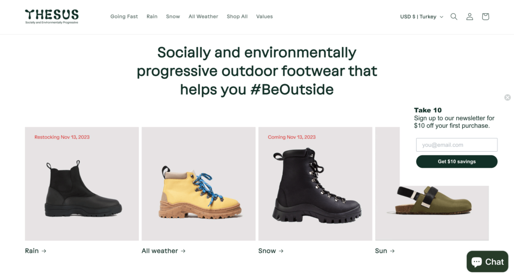
Every element is thoughtfully placed, making the site not just a shopping spot, but a showcase of their commitment to style and quality. This meticulous attention to detail extends to every aspect of the site, from the navigation to the product descriptions, ensuring a cohesive and enjoyable shopping experience that aligns with their brand ethos.
Another great example is Cordings’ website. Since 2011, Skywire has been instrumental in continuously redesigning, upgrading, developing, and optimizing Cordings’ eCommerce platform. The agency’s approach includes strategic advice and a suite of digital marketing services. Skywire also provides complete creative and art direction, alongside production for digital assets, underscoring their role in enhancing Cordings’ brand visibility and online sales.
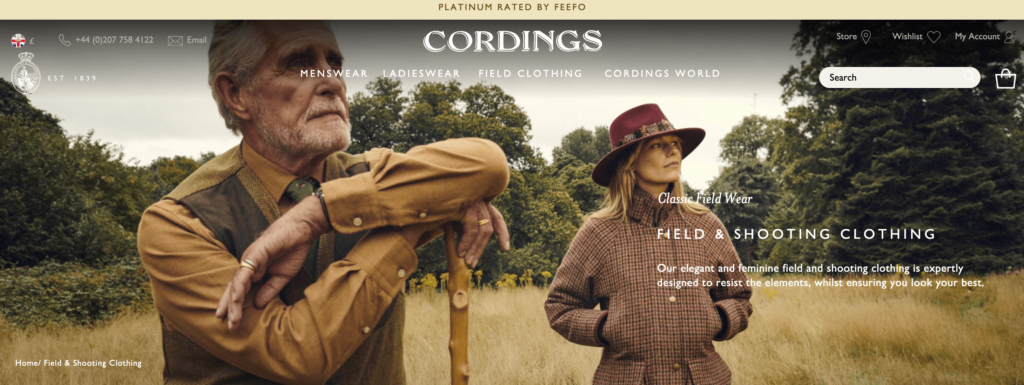
Cordings’ website, with its delightful and inspiring visuals, makes you want to explore more products on the site. In addition to the easy navigation and high-quality visuals of the products, the colors used on the site reflect the English country style wonderfully. You can find shots taken in nature all over the site, but be careful, this might make you buy a few pieces!
Transform your fashion eCommerce venture with our curated selection of top-notch eCommerce marketing agencies! These experts craft websites that are not merely online stores but vibrant showcases of your brand’s ethos, style, and message.
4.Engaging Product Display
Showing off your products means bringing them to life, telling their stories, and connecting with your customers. It’s an art where products don’t just sit there. They speak and resonate.
This approach transforms ordinary shopping into an immersive experience, where every item has a tale to tell, enchanting the customer and making each purchase more than just a transaction.
Nike’s “What if you were a shoe?” campaign is one of the prime examples of engaging product display. The brand turned a regular product showcase into a whole narrative.
Selling a story, an identity, and an unforgettable experience is more important than just selling shoes. By personifying their products, they invite customers to see themselves in shoes, literally and figuratively. This kind of innovative digital marketing for fashion not only showcases the product but also builds a personal connection with the audience, making the buying experience memorable and unique.
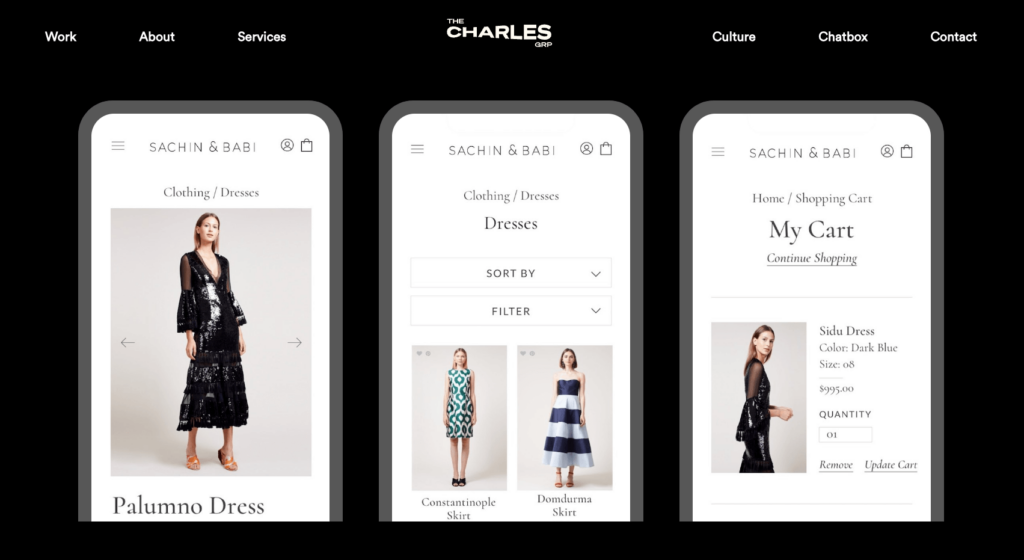
The Charles also knows how to create an engaging product display. The Charles’ work for Sachin & Babi displays the agency’s expertise in fashion eCommerce web design, blending elegance with functionality. Their approach centered on crafting a user-friendly website that highlights the brand’s luxurious products through seamless navigation supported by engaging visuals. With this strategy, the Charles was able to effectively communicate Sachin & Babi’s story and aesthetic. They also enhanced the online shopping experience and were able to engage with customers.
5. Eco-Conscious Design
Going green isn’t just trendy; it’s a commitment that weaves into every part of a brand. This shift towards eco-consciousness reflects a deeper understanding of fashion’s impact on the environment and a dedication to making positive changes.
Using sustainable materials is not enough. A comprehensive strategy that addresses every facet of the company, from packaging to production, is required.
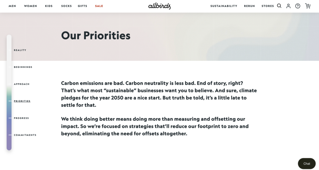
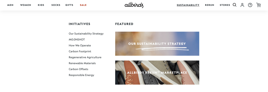
A notable example of trustful eco-consciousness is crystal clear on Allbird’s website. Sustainability is their brand’s heartbeat and they use their website as a stand for their eco-mission, with every bit, from the color scheme to the layout, echoing their planet-first promise.
Their approach to sustainability is comprehensive, encompassing not only the products they sell but also how they engage with customers and communities. The transparency in their processes and the educational content they provide demonstrate their commitment to not just selling products but to promoting a sustainable lifestyle.
6. Customer Trust
Building trust in fashion eCommerce means creating a space where shoppers feel safe, valued, and clued in. This involves not just showcasing products but also establishing a brand identity that resonates with the audience. It requires creating an online environment that mirrors the reliability and customer service of a physical store, reassuring customers of their choices.
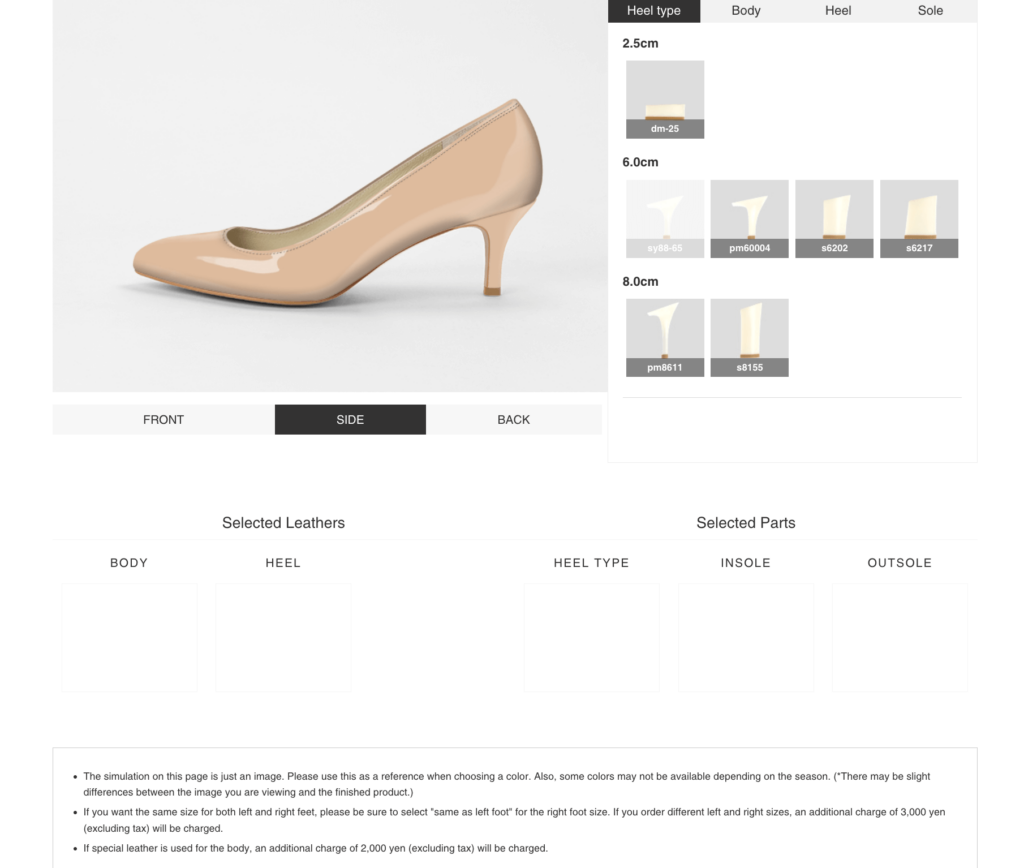
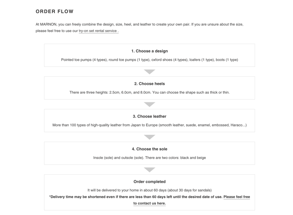
Marnon, rocking it in Japan, has this down. Paired with a menu that’s got everything you need right at your fingertips, they’re turning first-timers into loyal fans. Marnon gets it—in the online shopping world, trust is as crucial as the product. Their detailed product descriptions and customer reviews further bolster this trust, ensuring shoppers have all the information they need to make informed decisions.
7. Responsive Design
Mobile comes first today so responsive design in fashion eCommerce is indispensable. It’s making sure your brand looks just as good on a phone as it does on a desktop. This means ensuring that all elements of the eCommerce websites, from navigation to product displays, are optimized for smaller screens without losing functionality or aesthetic appeal.
ASOS is acing this. Their site’s as user-friendly on a mobile device as it is on a bigger screen, letting shoppers dive into their fashion wonderland anytime, anywhere. This level of responsiveness caters to the modern consumer’s lifestyle, where convenience and accessibility are paramount.
So, ASOS understands that a seamless mobile experience is key to customer satisfaction, ensuring that their vast array of fashion choices is easily navigable and enjoyable on any device. By doing so, they not only retain existing customers but also appeal to a broader, tech-savvy audience.
Conclusion
Rocking a design that’s as user-friendly as it is innovative is your ticket to the big leagues. Getting inspired by the big names can seriously up your game. This means observing and learning from their successful strategies, from intuitive navigation to cutting-edge design elements, and adapting these features to suit your brand’s unique personality and audience.
Teaming up with eCommerce and fashion marketing agencies can fine-tune your site, making sure it doesn’t just meet but beats the expectations of today’s fashion-savvy crowd. These experts can provide insights into the latest digital trends, ensuring your site not only looks great but also functions flawlessly across various platforms and devices. By taking cues from these trendsetters, you can create an online experience that’s as unique and memorable as your fashion line, weaving a digital story that’s all you!

