


Clear Digital is a B2B digital agency that combines 20 years of Silicon Valley success with senior hands-on expertise to deliver websites and brand experiences that deliver real-world impact. The brand experiences we build are impactful and meaningful. More than just data-informed strategy, great-looking design, user-driven content, and world-class engineering, our methodology is purpose-built to deliver results. It’s a unified approach that brings clarity in a constantly changing B2B landscape. With collaboration at the heart and results at the forefront, we confidently take our clients to the next level—whether that’s growing their customer base, securing that next round of funding, or finding their way into a new quadrant.

Clear Digital, Inc.
Gold MemberClear Digital transforms B2B brands with results-driven websites and digital brand experiences with over 20 years of Silicon Valley success.
About
- HQ
- OFFICES
-
HEADQUARTERS
- ADDRESS: 1570 The Alameda, Suite 330, San Jose, California 95126
- PHONE: (1) (408) 2460000
- E-MAIL: [email protected]
-
OFFICE
- ADDRESS: 540 Howard St, San Francisco, CA 94105
-
OFFICE
- ADDRESS: 609 Main St, Houston, TX 77002
-
OFFICE
- ADDRESS: 4753 N Broadway, Chicago, IL 60640, USA
Services
Branding
We craft bold, data-driven B2B brands—building strategy, messaging, and identity systems that drive differentiation, consistency, and growth across complex markets and channels.
Creative
We craft bold, engaging creative—driving brand impact through concept development, art direction, video, motion graphics, and storytelling that captivates and connects.
Digital Marketing
Digital Strategy
We craft digital strategies that drive growth, optimize customer journeys, and transform brands—powered by data, UX insights, and innovative thinking for measurable business impact.
Software Development
We build custom, scalable software solutions—cloud, SaaS, AI, and secure applications—that power business growth, modernize systems, and support seamless digital experiences.
UX Design
We design seamless, intuitive UX across web, mobile, and SaaS—driven by strategy, research, analytics, and content design that optimize journeys and deliver measurable user engagement.
Web Design
We design high-impact, B2B websites that elevate brands, optimize UX, and drive conversions—blending strategy, SEO, and custom design to deliver results-focused digital experiences.
Web Development
We deliver custom, enterprise-grade web development—CMS, front-end, full-stack, and secure web applications—that power seamless, scalable, and high-performance digital experiences.
Industry Expertise
Finance
We partner with financial leaders to craft digital experiences that drive growth, elevate brands, and simplify complex services across FinTech, insurance, investments, and venture capital.
Sector Expertise
- Insurance
- Investment Management
- Venture Capital
- Private Equity
- Finance Software
- Asset Management
- Payment Processing
Healthcare
We create digital experiences that empower healthcare leaders, advance medical innovation, and support patient-centered solutions across technology, research, and care systems.
Sector Expertise
- Medical Devices
- Medical Technology
- Healthcare IT
- Hospitals & Health Systems
- Healthcare Consulting
- Biotechnology
- Pharmaceuticals
IT & Technology
We empower tech leaders to scale with digital experiences that drive growth, elevate brands, and simplify complexity across AI, cloud, cybersecurity, SaaS, and software innovation.
Sector Expertise
- Cloud Computing
- Data Analytics & Big Data
- IT Services & Consulting
- Machine Learning (ML)
- SaaS
- Software Development
Nonprofit
We help nonprofits amplify their mission, enhance advocacy, and build meaningful digital experiences that deepen engagement and drive measurable, real-world impact.
Sector Expertise
- Education
- Advocacy & Public Policy
- Community Foundations
- Grantmaking Foundations
- Health & Medical Research
- Human Rights
- International Development & Aid
- Civil Society Organizations (CSO)
Clients
Cisco
Surescripts
Aviatrix
Habu
SailPoint
Cohesity
Budgets
Min. project budget
$5,000+
Min. monthly budget
$1,000+
Platform Expertise


Case Studies
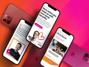
Splunk Engages Clear Digital to Lead Website Re-Architecture and Enhance the Digital Experience
Splunk Engages Clear Digital to Lead Website Re-Architecture and Enhance the Digital Experience
Clear Digital, Inc.
A leader in security and observability, Splunk has crafted a distinctive brand with a strong voice and visual style. With shifts in their digital team, Splunk found themselves needing UX, design, and writing support for a website refresh that completely re-architected their site and navigation. The Clear Digital team stepped in to lend expertise and ongoing collaboration that has spanned a wide range of projects and aspects of the Splunk digital experience.
Challenge
Re-categorization calls for a complete redesign
One of the core motivations for the website refresh was a major shift in how Splunk categorized its products and solutions. With well over 100 pages on their existing site, this meant they needed a new product architecture and site navigation to help visitors find the solutions they’re looking for. Splunk also wanted a fresh way of talking about their products that would address the needs of all users, including new personas, while showcasing advances across the entire platform. They turned to our team for digital expertise in an ongoing partnership.
Approach
Simplified architecture and clear narratives
Clear Digital worked closely with Splunk’s team to fully understand the new product architecture. First, we mapped out the site navigation then created wireframes to craft new narratives for each page. Following our initial work on the home, platform, and product pages, we tackled various other site sections in sprints. With each effort, we defined the UX and page narratives first then provided design and copy, taking care to infuse Splunk’s unique voice into every page. We also developed new components to add to their design system and UI kit.
Shortly after partnering with Clear Digital for a successful website redesign, Splunk announced its acquisition by Cisco, a move that will revolutionize the way companies harness data to connect and protect their organizations and make Cisco one of the largest global software companies.
Expanding a robust visual library
With the web redesign, we were able to leverage the distinctive Splunk visual style and help them establish fresh design treatments with motion graphics. Data plays an important role in Splunk’s digital communications, so we helped them build out infographic styling, while keeping it human with their people-centric photography. And the fun palette always keeps things fresh.
Bringing the product marketecture to life
The Splunk platform’s complexity and depth of products made telling their technology story an exciting design challenge. Our team collaborated with their lead storyteller to define key information and build a visual model that conveys what’s most important. We worked diligently to hone the story, using hovers to communicate additional information. The end result is a web-friendly graphic that simplifies the Splunk story without diluting its sophistication.
Building engagement with user journey mapping
Our UX team used Splunk’s existing persona work as a starting point to define anticipated site visitors and each of their specific needs. We mapped their personas to decision-maker, influencer, and end user paths based on questions each user might have during different stages of the buying journey. Core pages were identified to answer their questions, which set the framework for our information architecture.
Making the site sound Splunky
The Splunk voice is friendly, fun, and a little sassy at times. With strong corporate style and a well-established voice and tone guideline, we wrote fresh copy for a wide range of pages incorporating the new way of talking about their products based on the updated marketecture. From gathering information directly from stakeholders to editing copy written by product owners, our writing team made sure every element had a distinct Splunk feel.
Results
Time on site increased 64%
Form conversions increased 98%
Downloads increased 78%
Client: Splunk
Industry: IT & Technology
Sector Expertise: Cybersecurity
Services
Creative
UX Design
Web Design
Completed: Apr 2024
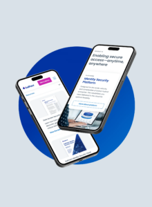
Clear Digital Helps Sailpoint Redefine Its Online Presence
Clear Digital Helps Sailpoint Redefine Its Online Presence
Clear Digital, Inc.

As a leader in identity security services for the modern cloud enterprise, SailPoint is growing fast—but their website wasn’t doing a good job of telling users what they do. The company had a strong brand team that had begun a brand refresh when they realized they needed help executing their vision for the website. They turned to Clear Digital for a complete redesign to bring their new brand to life.
Challenge
User confusion = poor performance
SailPoint provides unified identity security solutions that create serious value by helping businesses mitigate risk. But with a website that was outdated in both design and UX, users struggled to grasp what their products actually do. Lack of visual coherence or a clear information journey made the site difficult to navigate and understand, leading to poor engagement and performance. SailPoint needed a site that would educate existing customers while also generating new leads, with cohesive design elements and easily scannable content.
Approach
Visual consistency meets content clarity
Clear Digital redesigned the SailPoint website to make it clean and simple, with a clear narrative plus optimal UX on any screen. Prioritizing education and lead generation, we created new user flows using consistent layout and thoughtful information architecture to guide them through the funnel. We put together clear specs and guidelines for all design elements to ensure visual consistency, making the site easier to navigate while also making life easier for their creative teams. And fresh new copy that’s clear and concise ensures users can understand what SailPoint does, and find what they need quickly and easily.
Spreading brand awareness
SailPoint needed a video that would highlight their new brand—and they needed it fast. We worked closely with their design team to bring the brand story to life, from concept and rapid-fire storyboarding to expert voiceover and animation. The 60-second video boldly announces SailPoint’s new identity.
Clear, consistent, and impactful graphics
The SailPoint brand team knew which direction they wanted to go visually. Working collaboratively, the Clear Digital team developed a comprehensive sitewide design system, including icons and graphics. We also designed a new product mock-up style that highlights key pieces of information, making it easier for users to understand what products do. Plus, implementing consistent visual style helps to reinforce the new brand and boost overall visibility—a key goal.
Putting site performance under the microscope
To help SailPoint understand how well the site is performing, we mapped out a new analytics approach and implemented full scale tracking to measure engagement across all CTAs, assets, navigation clicks, promo blades, and forms. Using an interactive dashboard, the SailPoint team can easily access a wide range of KPI reports and tools to slice and dice deep analytics data by region, event, or content. The result? A data-driven experience that continually improves performance.
Results
Time on site increased 59%
Form conversions increased 113%
Downloads increased 84%
Client: Sailpoint
Industry: IT & Technology
Services
Creative
UX Design
Web Design
Completed: Mar 2023
Elevating Digital Impact: Clear Digital’s Transformative Rebranding of Viral Nation
Elevating Digital Impact: Clear Digital’s Transformative Rebranding of Viral Nation
Clear Digital, Inc.
When Viral Nation wanted to build an online presence that better reflected the breadth and expanded B2B focus of its offerings, they turned to Clear Digital as their guide to what was next. The company’s new Chief Marketing Officer saw an important opportunity to extend the company’s brand from being primarily an influencer agency to becoming a leader in influencer marketing SaaS solutions. With a growing portfolio of products, Viral Nation asked the Clear team to create a nomenclature strategy that built consistency and brand power for the company, as well as refresh its digital presence. The result is a site that showcases Viral Nation’s full portfolio and presents a brand more aligned with a market shaper.
Our Approach
Danny Halvorson, Creative Director, said:
As we delved deeper into Viral Nation’s world, we were captivated by their unparalleled creative services, talent representation, and cutting-edge technology. We realized that their brand needed to reflect the promise they deliver to their clients—a promise of unrivaled excellence, innovation, and market leadership.
Recognized for Excellence
Viral Nation Branding Transformation Gold Addy Award + Judge’s Choice: Logo Design
A Full Visual Refresh
While the original project scope did not include a logo refresh, early in the process the Clear team identified visual challenges presented by the traditional Viral Nation look and feel. From the fashion orientation and size limitations of the logotype to a dated palette, we recommended a full refresh, including logo, palette, typography, and iconography. The result was a brighter, more contemporary visual style, including a logo bug that could be used independently of the name.
A Centralized, Digitized Brand Style Guide
With a number of different divisions and a variety of creative resources supporting Viral Nation marketers, it was important to create an easily accessible, online style guide for improved usability. This made it easy for different divisions to access their specific photographic colorization and collage-style imagery, including doodles, color swaths, and all related rules.
Added flavor. More Engagement.
The Clear Digital team leaned into animation to add flavor and interactivity to Viral Nation’s graphics and illustrations. These sometimes quirky touches bring more fun to the brand and help it stand apart. The social count on the homepage lends tangibility to what the company does, while the slider interactivity showcases their technical advantages, including the platform, suites, AI, and customer-centric approach. The data pointed to more traffic on large screen devices, so the team focused responsive efforts there first to meet audience trends.
Creating the Right Connections
From influencers and agencies to enterprise brands, the Viral Nation site connects with a variety of audiences. The team created a sub-nav under the hero banner where each target can see the sections and offerings specific to their needs. This includes influencer roster pages for easier talent recruiting to solution pages that speak more to the needs of corporations. By creating clear pathways, the UX helps visitors find what they need efficiently.
Dedicated Content Delivery
By clearly defining the audience pathways on the home page, the UX team was able to tailor the content on each sub-page to the needs of that core audience. This enabled more robust storytelling that specifically addressed what each target was looking for. The effort includes building out additional pages to highlight all of the offerings and audience use cases.
Delivering Real-World Results
The refresh of the Viral Nation website had a direct impact on visitor engagement with the brand. Results show longer time on site, increased conversions, and a significantly lower bounce rate.
Results:
- +26 % Engaged sessions
- -23 % Bounce rate
- +104 % Conversions
Technologies used:
- Bootstrap:
Specially designed to deliver rich web content without the need for additional plugins.
- Sass:
The latest standard for CSS and completely backwards-compatible with all earlier versions.
- Javascript:
The powerful JavaScript Library jQuery greatly optimizes JavaScript programming.
- WordPress:
An open source content management system, built and supported by an active global community.
- Hubspot:
Cloud eCommerce platform with an open source ecosystem that extends beyond the shopping cart.
Client: Viral Nation
Industry: IT & Technology
Sector Expertise: SaaS
Services
Creative
Branding
UX Design
Web Design
Web Development

Clear Digital Empowers Surescripts to Connect Healthcare with a Streamlined Digital Experience
Clear Digital Empowers Surescripts to Connect Healthcare with a Streamlined Digital Experience
Clear Digital, Inc.

As a company dedicated to making healthcare better for all, Surescripts plays an essential role in a vital market.
Surescripts solutions help healthcare professionals across a wide range of organization types enhance prescribing, better inform care decisions, and advance healthcare as a whole. However, Surescripts.com did not reflect the company’s leadership position in the market or enable the type of engagement needed for optimized lead generation. From design and copywriting to technology recommendations and ongoing enhancements, the company turned to Clear Digital for an end-to-end overhaul. The result is an award-winning site that plays a powerful role in Surescripts’ marketing efforts.
Sharon Howard, Vice President, Strategic Marketing, Surescripts, said:
Clear Digital understood us. We like to work hard but also have fun along the way, and they were right there with us. It never felt like we were just working a “vendor.” It was more like were all part of the same team. No question was too small, no concern too trivial. Their commitment to our success really shone through.
Creating More Impact With Color
In the past, the Surescripts website used limited colors, with a white background and copy-heavy content. The refresh gave us the opportunity to bring in more of their brand color palette. From color gradient overlays on photography to heavier hits of color in the background, color played an important part in the new look.
Building Engagement with Animations & Videos
Adding more video components to the site was a key part of expanding how Surescripts delivers content to its audiences. This included illustrative videos that Surescripts designed and the Clear Digital team animated, as well as videos using traditional footage. We helped make these a more branded component by using color swipes that showcased the brand palette. Ensuring the videos were short and optimized for load time was a critical consideration. In fact, even with the addition of more video components, the load time compared to the old site has improved.
Expanding the Iconography
The Surescripts site had used icons in the past, but to create more visual interest, we brought in more options. We expanded their icon library by almost 4X and integrated color into the icons for added variation.
A UI Kit to Set Surescripts Up for Success
Building better micro interactions across the site was a key strategy for improving engagement. We wanted to reinforce user input and add in more hover states and other options that the Surescripts team can continue to leverage from their own UI toolkit.
Using Personas to Tailor the Journey
The Surescripts marketing team had a robust set of personas they used for messaging and sales actions. Our UX team worked closely with the client to focus the web personas on those most likely to engage with the site. We then grouped related motivations, challenges, and knowledge gaps to identify themes and categories, and develop custom information flows.
Gathering Firsthand Site Perspective
At the outset of the project, we ran a two-week pop-up survey of visitors to the Surescripts site to gather real-world perspective. Our goal was to understand engagement patterns, including the types of content they were looking for and their perception of the current site. The data confirmed the need for an update and easier access to information.
Optimizing the Front- and Back-End Experience
From a technology standpoint, our team was wholly focused on ensuring an outstanding experience. Surescripts wanted to move to a new content management system to improve the site’s back-end performance and make it easier to stand up landing pages. The Clear team helped them assess their options and select the best fit for their needs—Drupal. We also worked on ensuring site responsiveness across desktop, mobile and wide screen.
Elevating the Experience With a New Sitemap
Surescripts had two goals for the new site: demonstrate the breadth of their solution offerings and reinforce the company’s leadership position. Building upon the survey and persona refinement process, we developed a new sitemap that accomplished these core objectives. The company also took the opportunity of a new site to rearchitect its solution portfolio, which launched with the new site.
Visual and Verbal Storytelling
To bring the new site to life, the Clear team wireframed and wrote copy for every page. We defined new structures for each page to more clearly highlight the story and connect with all stakeholders. With a richer narrative and segmentation integrated throughout the pages, we created more opportunities for engagement.
While the new pages ended up having more content, we made the information more accessible by breaking up the copy and integrating more visuals. The pages are now easily scannable and digestible.
Delivering Real-World Results
With a more vibrant visual style and digestible content, the new Surescripts.com has elevated visitor engagement and delivered on the company’s goals. Site performance has shown significant improvement.
- +81% Page Views
- +37% Average Session Duration
- -10% Bounce Rate
Client: Surescripts Solutions
Industry: Healthcare
Sector Expertise: Hospitals & Health Systems
Services
UX Design
Web Design
Web Development
Video Production

Clear Digital Drives Data Clean Room Advantage for Habu with Scalable Web Design
Clear Digital Drives Data Clean Room Advantage for Habu with Scalable Web Design
Clear Digital, Inc.
When Habu was ready to reach a bigger, broader audience, the company approached Clear Digital to develop a modern, scalable website. Habu was looking for a digital partner that could leverage its updated visual brand and messaging to magnify its online presence. To align with industry events, they wanted to take a phased approach to launch a more attention-grabbing site. The result was a bold, scalable design that brought Habu’s message to a wider audience and made it stand out as a mature and trusted leader in data clean rooms.
Juan Novella, Head of Marketing, said:
At Habu we sought to transform our online presence and bring our new brand to life with a modern and engaging website. Clear Digital has the proven expertise that we looked for in a partner and their support has been key to deliver on our vision.
Establishing a New Visual Vocabulary
Habu’s new website expanded the brand’s visual vocabulary within a very strict and strategic color palette. A new photography style with gray-scaled photos enhanced the pops of yellow. Diagrams also used yellow highlights to focus the viewer’s eye and curate a targeted storytelling path. With clear, clean icons and refined patterns, the experience was optimized for readability and quick loading.
Framing the Best User Journey
To maximize development efficiencies and enhance ongoing scalability, the Clear Digital team developed a library of reusable blades. Building this kind of flexibility into the wireframing process enabled the initial pages to go live quickly while also enabling the addition of more sections over time. We created a fixed number of templates to keep the design lean and efficient, while the modularity gives a strong foundation for deepening the site as Habu’s business and offerings expand.
Crafting Content for Impact
Ensuring that every visitor to their site understood the power and potential of data clean rooms was a core objective for Habu. The web content had to explain the technology in a concise way, incorporating standard best practices for web content, and outline tangible benefits in a compelling way. Clear Digital used data-driven outcomes and real-world usage examples to showcase the benefits of Habu technology. Introducing a platform and solutions section allowed Habu to demonstrate the applicability of its software across industries and use cases. This approach also gave them the flexibility to deploy content in phases aligned with core campaigns.
Results of a Revamp
By bringing the new Habu brand to life and leveraging digital best practices, the new Habu site has driven greater audience engagement. The educational efforts on the site directly support sales motions and have helped improve lead conversions.
Client: Habu
Industry: IT & Technology
Sector Expertise: SaaS
Services
UX Design
Web Design
Web Development
MORE
Feed

US-based B2B digital agency Clear Digital revealed 2023 B2B Tech Fortune 500 companies with the best homepages.

Competition drives B2B website leaders to constantly improve because slim differences can have a deep impact on their bottom lines....

WebEnertia, a digital agency that empowers B2B brands with impactful web and brand experiences to drive change, was ranked on the 2021 Inc....
MORE