


From strategy to execution, we meticulously plan and create the most important parts of your brand to drive growth and differentiate you. And with a keen understanding of how to get through to people, we build brands that win hearts and engage minds. Centred around a creative approach focused on clarity, simplicity, purpose, and integrity, we get people to care about, and listen to, the brands we build. With Fook, you’ll be closely collaborating with a team dedicated to understanding you, your business, and your vision. We’ll work out what you need together, then help you get there.
Fook Communications
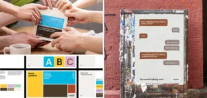
Gold MemberWe’re a creative team that delivers tangible results by developing the most important parts of your brand: strategy, branding, websites, and campaigns.
About
- HQ
- OFFICES
-
HEADQUARTERS
- ADDRESS: 215 Spadina Ave. 4th Floor Suite 400, Toronto, ON M5T 2C7
- PHONE: 1 (289) 998-4787
- E-MAIL: [email protected]
Services
B2B Marketing
Branding
Content Marketing
Service Expertise
Industry Expertise
Fashion & Retail
We’re seasoned pros at positioning and marketing a great product in the world of fashion and retail. Make sure your brand is the one people remember with world-class communication.
Sector Expertise
- Fashion Accessories
- Luxury Retail
- Clothing Brands
- Luxury Fashion
- Home Goods & Furnishings
- Sportswear
- Athleisure
Finance
Sector Expertise
- Financial Advisors
- Private Equity
- Venture Capital
- Wealth Management
Food & Beverage
Sector Expertise
- Beverages
- Consumer Goods
Government
Sector Expertise
- Public Affairs
- Municipalities
- Educational Institutions
Healthcare
Sector Expertise
- Wellness & Integrative Health
- Home Healthcare
- Health Research
Luxury
Sector Expertise
- Luxury Fashion
Clients
Ontario HIV Treatment Network
Mister Safety Shoes
Perseus Group
Enya Mond
Karena Evans
Habit Tea
Budgets
Min. project budget
$25,000+
Min. monthly budget
$10,000+
Fook Communications Reviews
5
Deep brand discovery and storytelling partner
Fook Communications positions itself as a deep brand discovery and storytelling partner, combining strategic branding, personal identity alignment, and high-quality content production to create authentic and emotionally resonant brands. The agency’s core strength lies in going beyond surface-level branding—helping clients uncover purpose, clarify positioning, and translate that into cohesive messaging, visual identity, and storytelling assets.Strongest differentiators
Its strongest differentiators are:- Deep brand discovery process connecting business and personal identity
- Strong storytelling capability across messaging and visual production
- Integrated approach from strategy to execution (brand → content → visuals)
- High-quality video and photography aligned with brand narrative
- Strong brand clarity, storytelling, and perception-building capability
- Limited visible depth in performance marketing, acquisition, or conversion systems
- Less emphasis on data-driven growth frameworks or technical infrastructure
DAN Perspective
Fook Communications fits best into the category of “deep brand strategy and storytelling partners”, making it a strong choice for businesses seeking authentic brand positioning, emotional resonance, and high-quality narrative-driven content.Strategic Depth
Client feedback highlights Fook’s ability to guide businesses through a transformative brand discovery process, aligning purpose, positioning, and identity into a cohesive strategic foundation.Execution Excellence
The agency demonstrates strong execution across branding, messaging, and visual production (video, photography), delivering polished and strategically aligned creative assets.Speed & Reliability
Clients report responsive communication, flexibility, and consistent delivery—even under tight timelines or evolving project requirements.Collaboration Quality
Feedback highlights a warm, people-first, and highly collaborative approach, with strong engagement and adaptability throughout the project lifecycle.Primary Expertise
Client outcomes strongly associate the agency with brand strategy, messaging, storytelling, visual identity, video production, and photography.Value Creation Pattern
Reported gains cluster around improved brand clarity, stronger emotional connection, enhanced brand perception, and cohesive storytelling. Evidence around acquisition performance, conversion systems, or lifecycle marketing remains limited.Price–Performance Balance
High perceived value is driven by depth of strategy, quality of creative production, and transformational brand outcomes.Transparency & Scope Clarity
Client feedback highlights clear communication and structured processes, though detailed pricing transparency remains limited.Client Satisfaction
Client sentiment is highly positive, driven by transformative brand experiences, strong collaboration, and high-quality outputs.Referability
Clients demonstrate strong repeat engagement and referral likelihood, supported by emotional impact and consistent delivery.Our team has summarized customer reviews to provide you with a concise overview of what people are saying about the agency on various review sites.
Case Studies
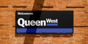
Our new branding for Toronto’s most iconic street celebrates its creative heart.
Our new branding for Toronto’s most iconic street celebrates its creative heart.
Fook Communications


As the creative hub of Canada’s capital city, our brand strategy and brand identity is built around the neighbourhood’s artistic soul.
Brand identity, Brand strategy, Branding, Copywriting, Graphic design, Marketing strategy
Background and challenge
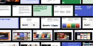
Through a successful RFP process, we worked with the Queen Street West Business Improvement Area (BIA) to create a new brand strategy, visual identity, and website for the Queen West neighbourhood.
The brief here was to develop a brand strategy and identity to help preserve and grow Toronto’s most iconic neighbourhood.
This work needed to align to the BIA’s 5-year strategic plan, respect the history and cultural significance of the neighbourhood, reflect the diversity of people and places, and look to the future.
Queen Street West has been the creative heart of Toronto for generations. Originally laid out in 1793, the street has long been home to independent businesses, artists, musicians, and communities who built their lives in its low-rise heritage buildings and storefronts.
It houses more live music venues than any other single corridor in the city, and Graffiti Alley is one of Toronto’s most recognised landmarks.
As one of the busiest and most iconic streets in the city, it was hugely important that our work reflected the diversity and character of the Queen West community – a place that means so much to so many.
The Queen Street West BIA exists to protect and promote this character, and ensure that what makes the street irreplaceable doesn’t quietly disappear.
By 2025, that work had become urgent. We heard of fears that Queen West’s reputation was eroding, with a real risk of Queen West losing its “effortlessly cool” character.
So, our brief was comprehensive: a full brand strategy and rebrand, a new website, and a suite of marketing assets with our work becoming an integral part of nurturing the soul of Queen West for generations to come.
Process and solution
Strategy
We began our work with in-depth research across a broad range of stakeholders to get a clear picture of what Queen West means to people. We surveyed the public, designing and distributing a survey to get the views of people who live in, work in, and move through the area.
We also interviewed business owners, City of Toronto employees, and BIA board members to hear first hand experiences of Queen West, but also the challenges being faced.
Simultaneously, we conducted extensive audits of other BIAs around the world to find best practices, and case studies that might inspire our direction.
We then presented our findings and preliminary conclusions to the Board, to get early buy-in on where our research was leading us in terms of strategy. This work was incredibly well received, and we were immediately aligned around a direction that put art and creativity at the centre.
With this early alignment, we then used these insights to develop the first draft of the brand strategy. The surveys, interviews, audits, and existing research already undertaken by the BIA gave us a thorough insights-based foundation for our brand strategy.
We shaped the mission, vision, promise, purpose, personality, key messaging pillars, and plans for how to grow the Queen West identity both internally and externally. Our positioning for Queen West was about using art as the anchor for every decision we make.
“Our street as a canvas” became the organising idea – a simple and clear concept, that would be the anchor point for both our work, but also the future work of the BIA.
After consultation and feedback, we were aligned on the brand strategy and so had our foundations for beginning the visual identity work. By building the visual identity from the strategy, we ensured that the end result would be a cohesive path forward for the BIA.
Creative
We created 2 visual identity concepts. One which was a development of their existing identity system, and another which we built from the ground up to be completely aligned with our brand strategy.
Our recommended approach was the 2nd concept. With the positioning that art is our anchor, we needed a brand identity that would let the community’s creativity come to the fore. We decided it was not the job of the identity to carry the creativity of Queen West – the job of the identity was simply to frame it.
An identity that tried to capture every facet of Queen West’s eclectic character would lack clarity and direction.
We didn’t want the identity to be the art, nor to compete with the neighbourhood’s vibrancy. Art, vibrancy, and music in Queen West has always, and will always, come from the community.
And so this was our guiding principle. Create a platform and canvas for the community to add colour and life, rather than trying to impose what Queen West is. Allow the neighbourhood to take centre stage, supported with a strong, clear, and consistent visual foundation.
To do this, we set the logo in American Grotesk Heavy. Inspired by the design of traditional street signage, “West” was subscripted and underlined, with the shorthand logo following the same simple idea.
This blue bar – featuring the blue that the BIA has used in its identity for over a decade – is then an ownable and adaptable visual tool for Queen West. That bar can carry different colours or patterns for events, partnerships, or celebrations, giving a consistent visual structure while allowing it to reflect the diversity and change that define the street.
The logo can also form a translucent frame when we are featuring artists or art, literally allowing the community to be front and centre while the branding takes a back seat.
The main colour blue is supported by the other primary colours – green, red, and yellow – chosen because they are the main tools of a visual artist in creating their work.
Ultimately, this second visual identity concept was the one we moved forward with. And this direction was a significant change for the BIA. It took time and diligent work to bring people around to our way of thinking, and build confidence that a substantial change was the only way forward.
But with the brand strategy and brand identity approved, we rolled out this new direction for the website, streetscape assets, photography, and other print and digital marketing assets.
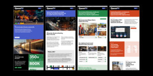
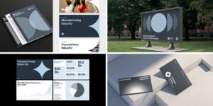
The website includes a business directory, events calendar, community news feed, and an interactive economic dashboard. Alongside it are street pole wraps, banners, signage, posters, and social assets — all drawn from the same visual system, all designed to work together.
Result
Since completing our work, the brand strategy and identity have been presented to the public, the membership, and key City of Toronto members including the Deputy Mayor, with the brand launch at the start of 2026. At each turn, it has been received with enthusiasm and excitement, both in how it looks but also in the clear focus it provides for the efforts of the BIA and the future of the neighbourhood.
And throughout the project, we were meticulous in listening to feedback and ensuring that our key stakeholders were completely confident in our direction. In our presentations to the public and others, we always told a compelling story of the process behind the work, keeping everyone excited for the brand we were creating together.
The brand strategy, organised around the idea of “our street as a canvas”, has refocused the BIA on driving a creative culture that can keep Queen West vibrant and bustling. Our work mapped out external efforts to be made to reinvigorate a creative reputation that drives people to the neighbourhood – benefitting businesses and people alike.
We also mapped out recommendations on internal efforts for the BIA to support membership businesses by playing a visible and active role.
The result of our work is a holistic rebranding, with an internal and external brand strategy, brand identity, website, and full suite of digital and print marketing assets to launch Queen West into this new direction.
We built a visual system that is simple, focused, memorable, and ownable. It adapts as Queen West evolves and changes over time with an identity that will remain relevant, timeless, flexible, and inclusive. It brings balance to the visual landscape, with the grit and unvarnished character of the street being balanced with something cleaner and clearer.
It acts as a platform and canvas for the community to add colour and creativity, rather than trying to impose what Queen West is and compete with its vibrancy. Yet it still carries the strength to give a clear and consistent visual foundation.
All while, importantly, giving the BIA (as an organisation) a distinctive, professional, and appropriate look and feel.
This identity is now showing up in new streetscape assets – from street pole wraps, to banners, to construction hoardings.
In terms of strategy, “our street as a canvas” is being used by the BIA both internally and externally. It’s a line repeated in interviews, it’s an idea that is defining new relationships between the BIA and local institutions, and it’s a strategy that is giving focus to where the BIA diverts its efforts and resources. It also that positions the organisation as the confident, visible presence its members have always needed
It is a clear idea that gives focus to the work the BIA will do in the future. From partnerships, to events, to use of vacant retail spaces, this artistic anchor will drive decision-making and reinvigorate what Queen West has always been known and loved for.
Our work has given Queen West a clear, simple, and ownable brand direction, and a platform that allows for the community to continue to define what Queen West is. Rather than try to impose something new, our brand strategy and identity simply reveal what the neighbourhood has always been, and create the space for it to express itself.
Client: Queen Street West
Industry: Government
Location: Toronto, Canada
Services
Branding
Creative
SEO
Web Design
Web Development
Completed: Jul 2026
New visual identity and website for global M&A firm delivers the image their reputation demands.
New visual identity and website for global M&A firm delivers the image their reputation demands.
Fook Communications
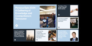

Our work with CSI Perseus means they now communicate with authority and consistency, with a website nurturing long-term leads.
Graphic design, Visual identity, Web development
Background and challenge
CSI Perseus came to us with a very clear problem that needed to be solved. Their core positioning was strong, but their brand identity and website were not carrying this positioning effectively.
They needed a rebrand and a new website that would clearly communicate what makes them different, and enable them to nurture leads over a long B2B cycle.
Their brand promise is a bold one: acquiring software businesses and never selling them (in an industry built around exits). Perseus has made that promise their defining position, but their brand and website weren’t backing it up.
A previous attempt to rebuild the site had never launched. The visual identity lacked consistency and didn’t clearly distinguish Perseus from competitors or other divisions in the wider CSI organisation.
And the deeper challenge was structural. Perseus operates on acquisition cycles that can stretch six years or longer, which means the website needed to work less like a brochure and more like a long-game lead nurturing tool, steadily building founder conviction over time.
Perseus needed a brand and digital foundation built to match their positioning. And they needed a process that ensured genuine buy-in from a large, politically complex stakeholder group.
Process and solution
We started with brand discovery, bringing together stakeholders from across Perseus to understand their vision, their purpose, and the gaps in the current identity, with the aim to then align on the way forward. The brief was clear: evolve what existed rather than replace it.
We developed moodboards to establish a creative direction, then designed two distinct visual identity concepts. Each addressed logo refinement, updated typography, and a strengthened colour palette, building toward a system that could carry Perseus’s brand consistently across every touchpoint.
A structured feedback process with the stakeholder group brought the organisation into the journey, and we refined toward a final direction with real buy-in behind it.
We codified the identity in a visual identity guide, with a logo system, colour palette, typeface usage, and rules for consistent application. We delivered the full brand package alongside it, including logo files in all formats, typography files, and updated social media profile assets.
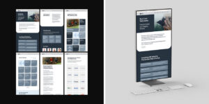
With the visual identity established, we moved into website design and development. We built an eight-page custom WordPress site, and trained the Perseus team on the content management system so they would have full control over the website after handoff.
We structured the site to serve two distinct audiences: founders and business owners weighing an exit, and brokers facilitating M&A transactions.
Result
Perseus now has a brand identity and a digital presence that truly carries their brand promise, and effectively communicates what makes them different.
The updated identity gives their positioning the authority it needs, and a consistency it never had before. The website now fulfils the role that Perseus always needed, with clear navigation, an optimised user experience, Google Analytics integration, and a fully editable content backend that gives them the infrastructure to engage and nurture business relationships over time.
We delivered a purposeful, long-game lead nurturing tool, allowing Perseus to meet founders where they are in an acquisition cycle that rarely moves quickly. The team now has the perfect tools to turn their brand positioning into business results.
Client: CSI Perseus
Industry: Finance
Sector Expertise: Private Equity
Location: Toronto, Canada
Services
Branding
Creative
Inbound Marketing
SEO
UX Design
Web Design
Web Development
Completed: Jul 2026

Video campaign for large footwear retailer turns customer stories into engaging, resonant digital ads.
Video campaign for large footwear retailer turns customer stories into engaging, resonant digital ads.
Fook Communications


Fook’s creative direction and video production delivered 28 digital ads that out-performed Mister Safety Shoes’ existing campaigns.
Animation, Copywriting, Video production
Background and challenge
Getting an audience to stop scrolling takes more than showing a product. It requires creative that feels authentic, compelling, and trustworthy to the target audience.
Mister Safety Shoes sells safety footwear through about 36 retail stores across Ontario and Alberta. Their real advantage isn’t the products they sell, but the experience they offer. They have built their shopping journey around the things that matter most to their trades customers: finding a perfect fit to provide comfort at work, and getting in and out of the store quickly after a long day.
Where some competing, larger Canadian retailers might offer a greater quantity of stores, Mister Safety Shoes offer a higher quality of experience inside theirs.
They were already running a customer-story video format on social media, but the production felt inauthentic and lacked a bit of quality. The brief to us was to bring a higher level of production, with better casting to find authentic actors, better performance direction, more deliberate camera work, clearer and more condensed scripts, and a production plan to generate numerous videos to work across numerous placements (capturing multiple scripts with multiple actors in our shooting schedule).
This was both a brand- and awareness-building assignment. The goal wasn’t a hard call to action, but instead to build trust and relevance by engaging a younger trades audience by showing, in seconds, what makes Mister Safety Shoes worth walking into. Authenticity and production quality were key aims.
Process and solution
We developed two customer stories built around a contractor and a landscaper, anchored in natural, to-camera storytelling and supported by B-roll that makes the guided buying experience visible rather than described.
We collaborated on script-writing with Mister Safety Shoes, taking their scripts and refining them to ensure key USPs were communicated, and that authenticity was maintained. Our messages were clear, succinct, and designed to build awareness around what makes their brand different.
We then storyboarded each video, drawing the key frames and determining a shot list driven by the script content.
Casting and performance were also central to credibility. We cast actors styled as tradespeople and shaped the dialogue around how people naturally speak, leaving room for improvisation so the delivery felt relaxed and real.
Because the campaign needed to run across multiple placements, we planned the shoot to work across three aspect ratios from the start: 16:9, 9:16, and 1:1. That required more intentional coverage and framing decisions upfront, so the story and the key proof moments held up cleanly through every reframe and cutdown.
We shot in an open, active store in Ontario and built the day around real customer traffic while still capturing polished, controlled footage.
Deliberate lensing, shaped lighting, and considered angles gave the work the elevation the format needed. It’s premium enough to earn attention, and grounded enough to feel like it belonged in a working retail environment.
In post-production, we refined the pacing, colour, and finishing. We animated the tagline and logo with more intention, designing the end treatment to feel consistent and considered. The campaign message stayed simple and repeatable: Better work days start here.
Result
The final campaign comprised 28 video versions: two hero spots in 30-second, 15-second, and 6-second cuts across all three aspect ratios, plus five alternate cuts and five organic social cutdowns.
This has given Mister Safety Shoes a full suite of video assets across multiple platforms, where they can rotate, test, and optimise ad performance into the future, always refining the videos and formats that are having the biggest impact on their digital marketing efforts.
The amount of completed views of the video ads was the key metric here, as it indicates engagement and resonance versus simple impressions. And because we delivered authentic, clear, succinct, and impactful videos, our creative significantly out-performed their previous ads across Facebook and Instagram in just over 3 months.
Our careful and quality video production process has given Mister Safety Shoes campaign assets that will allow them to continue to effectively build awareness and brand recognition among a younger audience of customers.
Client: Mister Safety Shoes
Industry: Fashion & Retail
Sector Expertise: Footwear
Location: Toronto, Canada
Services
Creative
Online Advertising
Social Media Marketing
Video Production
Completed: Jul 2026
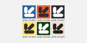
Brand evolution brings interior design studio into a new chapter of growth and scale.
Brand evolution brings interior design studio into a new chapter of growth and scale.
Fook Communications
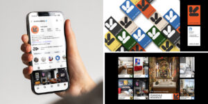
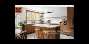
After a decade in business, we created a new Level Studio identity that reflects who they are now, and equips them for their future ambitions.
Graphic design, Visual identity
Background and challenge
Level Studio is an interior design firm founded by a couple whose working dynamic is defined by balance. One brings a constant flow of creative ideas and design energy, while the other grounds the work in clarity, movement, and execution. Together, they offer something uncommon in their field: both design and construction, unified through a single studio experience.
Their original brand was created while the founders were still in university. It served its purpose in the early years, but it was ultimately something formed out of necessity rather than long-term vision. Over the next decade, the studio grew steadily, taking on larger and more ambitious projects. As the work evolved, the brand no longer reflected the maturity, cohesion, or intention behind what they had built.
Reaching a new milestone in the scale and scope of their projects created a natural moment to pause and re-evaluate. The goal of the rebrand wasn’t simply visual change. It was about creating something purposeful, with a unified system that could carry the studio forward into its next chapter with confidence and clarity.
Process and solution
At the heart of the new identity is the idea of duality. This concept reflects both the founders’ relationship and the studio’s unique service model, where design vision and construction execution operate together rather than apart. Instead of treating these qualities as opposites, the brand frames them as complementary forces that create balance.
This thinking takes shape most clearly in the logo with the two overlapping squares. Conceptually similar to a Venn diagram, the form represents two distinct parts coming together to create something shared. Beyond the mark itself, this geometry informs how imagery is framed, subtly extending the idea of duality into the wider visual language while keeping the overall system minimal and restrained.
The tone of the identity was designed to feel warm, free-form, and friendly, while remaining minimally expressive. Rather than relying on decoration, the system focuses on cohesion – ensuring typography, colour, layout, and imagery work together as a single voice instead of separate elements added over time.
The result is a brand that feels calm, intentional, and unified, allowing the studio’s work and personality to lead.
Result
More than anything, the rebrand created internal alignment. It gave the founders a renewed sense of confidence in the future of the company and a clear foundation for how they present themselves across every touchpoint, from presentations to social channels.
What had once been an inconsistent collection of visual decisions over time became a cohesive identity capable of supporting the studio’s continued growth, and conveying a brand with scale, capability, and expertise.
The new brand doesn’t just represent what Level Studio has grown to become. It reflects the vision for the future, and equips them with the platform to get there.
Client: Level Studio
Industry: Luxury
Sector Expertise: Luxury Home Goods & Furnishings
Location: Toronto, Canada
Services
Branding
Creative
Completed: Jul 2026
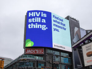
Our bold rethinking of public health messaging raises awareness of HIV across Ontario.
Our bold rethinking of public health messaging raises awareness of HIV across Ontario.
Fook Communications
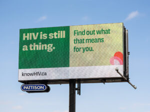
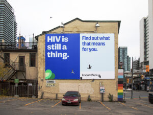
A campaign that generated over 178m impressions, KnowHIV restarted a public conversation around HIV with billboards and marketing across Ontario.
Background and challenge
KnowHIV is among the proudest and most meaningful work we’ve had the privilege of working on. Having the opportunity to use our creativity to positively impact something so important was hugely significant for us.
This was a responsibility we took seriously, so we gave this project everything we had to create a world-class campaign.
Our client, the Ontario HIV Treatment Network (OHTN), came to us with a clear set of challenges and goals.
Today in Canada, HIV is no longer front page news. Many people think it’s solved, may not understand transmission, or underestimate their own risk.
But in fact, new diagnoses in Ontario (and across Canada) are on the rise, and people are living with HIV who are unaware of their status.
There is a need to re-engage the public around HIV, and to help populations most affected by it to seek testing and treatment.
And so, our brief was to create phase 1 of a multi-year awareness campaign that would be handed off to the OHTN. This was the first step in a long-term plan that would provide the foundations for a brand that can grow into the future, and a campaign platform that can develop towards the overall goal of reaching and helping priority populations.
In this first phase, launching on World AIDS Day 2024 and running until March 2025, we wanted to create an accessible conversation about HIV that grows awareness, and simply brings HIV back to people’s attention – both in the general population, and specifically to groups that are typically most at-risk.
This work would then form the foundations of a trusted brand that can reach priority communities for years to come, and of a series of campaigns that would help populations most affected by HIV access responsive health services.
To do this, we had to plan, create, and execute every component of this campaign. This meant creating a brand identity, a name, campaign messaging, brand strategy, all campaign creative assets, and marketing, PR, and media buying strategies.
From inception to amplification, this was a huge undertaking. And because of tight deadlines meaning we had to launch for World AIDS Day, we had just 2 months to create a brand from scratch, and broadcast it across Ontario.
Navigating a complex organisational structure, with stakeholders across numerous levels of provincial healthcare, we overcame a range of challenges to deliver clear, bold, and resonant campaign creative with wide and effective reach across Ontario.
Process and solution
Strategy
Our approach began by clearly defining a strategy for both the campaign and our message.
We consulted at length with stakeholders across AIDS organisations, within provincial healthcare, and within the OHTN, to balance a range of considerations and priorities from the sector.
Our campaign strategy was simple and focused: bring HIV back to the awareness of the general population with large-scale out-of-home (OOH) advertising, and amplify that OOH message through media and influencers to reach specific communities.
By boldly discussing HIV in public, we wanted to create a story worthy of discussion, and bring HIV back into the collective conscience. And by talking so publicly about such a stigmatised subject, we aimed to empower people individually, and help destigmatise the virus.
Community-leading influencers would then amplify the message among our target demographics, sharing the billboards on social media, and tailoring our message to the specific needs of their community.
The global momentum of World AIDS Day would then help drive media coverage, and our strategy of delivering a public message that is clear, culturally equitable, and necessary would be newsworthy.
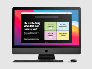
Finally, paid digital and social ads would reinforce the OOH message, reach an even broader audience, and ensure repeated exposure to our message to drive people to visit the KnowHIV website resource.
This website, the final destination for the campaign, would be our resource for furthering understanding and conversation, providing clear and accessible information on the most important questions.
Creative
On the creative side, our goal for this campaign was to normalise the conversation around HIV, and focus on building trust. We wanted a clear, approachable, and simple message, and a brand identity that was sensitive to the seriousness of the subject matter, but felt warm, contemporary, and accessible.
Many campaigns in this sector can feel clinical and lack emotional connection, so we wanted a message that felt human. This was important to avoid fear-mongering and alarm, and also to destigmatise the virus.
From the outset, we knew a fresh approach was needed. We researched the existing communication landscape, and determined there were 4 pillars that our work would be built on. The campaign needed to be emotionally intelligent, artful, community-driven, and sustainable.
With these pillars, we undertook creative workshops to work out the core positioning of the campaign and directions for messaging. Moodboarding multiple visual, messaging, and naming approaches helped us refine our creative direction, and build towards finalising our campaign creative.
We developed a message that is simply how people speak. It avoids clinical language, and instead engages people by using day-to-day language. It’s simple and focused, and the “HIV is still a thing” tagline is an easily adapted umbrella for a range of CTAs (e.g. ‘Find out what that means for you’, or ‘Get tested here’, or ‘Ask us about treatment options’).
This flexibility means a campaign that can be localised and deliver a range of specific messages under a single recognisable campaign.
Normalising the conversation by using language like this was also a big goal for us. We destigmatise when we normalise, and resonate with people by giving them a message that is clear and easy to remember.
The brand identity was simultaneously developed to be inviting, warm, reassuring, and confident, and to give a flexible visual system that allows others to join the campaign. It is easily adapted across cultures and demographics by allowing for the colours of flags, geographies, or partner organisations to be incorporated into the logo, giving an identity that is inclusive at its core.
The lack of faces was also intentional, as we wanted to avoid associating any particular demographics with HIV, but instead to allow those amplifying our campaign (influencers and the people starting conversations) to be the faces of our campaign.
The name is clear, simple, and direct, and encourages a specific action (and draws on an empowering theme of ‘knowledge is power’). Spoken out loud, it also sounds like “No HIV”, which echoes the goal of preventing HIV transmission.
A careful balance of voice, message, and visuals gave a tone for the campaign that captured kindness, approachability, trust, empathy, and confidence. It delivered a clear message, and a campaign that exceeded expectations.
Result
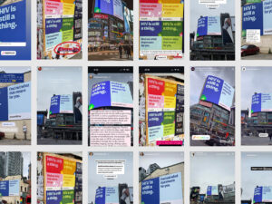
From iconic billboards, to cutting edge podcasts, to legacy media radio, our campaign reached across the province and generated 178,939,671 impressions.
We achieved millions of bonus impressions across OOH, paid social, and paid digital, delivering $436,000 in added value, and hitting over 220% of planned impressions.
This was a campaign that stretched from billboards in Thunder Bay, to lecture halls in Toronto universities. We grew awareness in the general population, while ensuring the message reached specific demographics.
Our billboards covered 15 regions in Ontario, and went as far south as Windsor, as north and west as Thunder Bay, and as east as Ottawa.
We also secured the biggest and most iconic Toronto billboard in Sankofa Square (formerly Yonge and Dundas Square), right in the heart of downtown.
As well as wide-ranging billboard coverage, we had digital restobar posters in restaurants, bars, and on university campuses, wild postings across the Toronto downtown core, animations on Toronto’s public transit, and digital posters on Ottawa bus stops. Our OOH had breadth, but was also tailored to reach specific areas and communities.
With the OOH generating buzz, our carefully curated list of passionate influencers then began amplifying our message, and micro and macro influencers shared our campaign to our priority populations and started the conversation in those communities.
The key here was to make this conversation feel authentic. Our influencers added their own flavours and styles to our message to make it resonate specifically with their followers, in ways that made it meaningful.
Beyond posting on Instagram, our influencer collaborations also secured a segment on Flow 98.7, a 30-minute Extra Gravy podcast episode, and partnerships for live events with the University of Toronto and International Women’s Day. The relationships we fostered with our influencer network also opened a range of future opportunities – from Carabana activations, to sports and streetwear collabs.
In the media, we had 18 media hits, including with CBC Metro Morning, CBC Radio Ottawa, Yahoo, and Media in Canada, and meaningful conversations with global news outlets have garnered interest in covering KnowHIV as it evolves in the future.
All of this work was supported with paid social and digital ads, across Meta and YouTube, which ensured an even wider reach for awareness. Here, we achieved 164% higher video completions than planned, with a cost-per-completed-view 33% lower, and 319% more impressions at a CPM 76% lower than planned.
Through the multiple layers of our 360 degree campaign, we created the feeling of an active conversation in Ontario, reinforcing our message by reaching people multiple times and in multiple ways.
Our strategy and tactics covered a wide range of touchpoints, across traditional and non-traditional advertising, long-form and short-form content, delivering a consistent message across OOH, digital, social, radio, and live events.
From real-world billboards in people’s neighborhoods, to posts in people’s social networks, and far beyond, our campaign boldly communicated a necessary HIV message at a critical time, and used community and culture to amplify.
With the primary goal of this phase 1 campaign to simply bring HIV back to people’s attention, and restart the conversation in the province, our work was an incredible success, exceeding expectations and delivering significant added value to our client.
As well as success in this first phase, we delivered a beautiful, adaptive, and sustainable brand, approachable, fresh, and flexible messaging, and incredible foundations for KnowHIV to grow into the future and become a trusted brand in Ontario’s sexual health landscape.
KnowHIV now exists to continue raising awareness, and to foster an on-going, accessible conversation around HIV, and empower populations most affected by it.
Client: Ontario HIV Treatment Network
Industry: Healthcare
Location: Toronto, Canada
Services
Branding
Creative
Digital Marketing
Influencer Marketing
Online Advertising
PPC
Social Media Marketing
Web Design
Web Development
Technologies: Brand strategy, Branding, Campaign strategy, Copywriting, Graphic design, Marketing strategy, Media buying, PR
Completed: Mar 2025
Award-Winning Director Karena Evans Breaks New Ground With Powerful Brand Vision
Award-Winning Director Karena Evans Breaks New Ground With Powerful Brand Vision
Fook Communications
Crafting a visual identity for one of the most sought-after talents in entertainment.
Background and Challenge
Karena Evans is one of the most exciting directing and acting talents in entertainment. Having directed for the likes of HBO, Fox, Drake, Coldplay, and Adidas, and now working in film, TV, and fashion, Karena needed a brand identity that could grow with her ever-expanding influence and reputation.
And from the outset, she emphasised the importance of her new branding reflecting her humble character, but also her artistic vision. It needed to be an authentic portrayal of who she is, and the stories she tells.
Through her work, she subverts narratives, and challenges the ethical issues of our time, doing so with trademark emotion, and energy. With empowerment and representation being consistent themes in her creations, she truly wants her work to take centre stage, and so her visual identity had to reflect all of these characteristics.
Process and Solution
Creating a brand identity that matched Karena’s global reputation, that was capable of matching an even bigger reputation years down the line, and that authentically captured Karena the artist and person was the type of challenge we love to take on.
With so many big boxes to tick, it was important to deeply understand her in order to create an identity that felt true to her. We meticulously studied Karena’s work, noting the consistent moods, tones, and colours she uses. As Fook Communications, we learned about her story, her motivations, and the artistic thread that ties together everything she does.
From this understanding then came the logo, which precisely combines 2 typefaces to be approachable and humble, allowing her work to take centre stage, while also positioning Karena as a visionary in her industry with unique contributions to a rich history of storytelling.
This included using a typeface that modernizes traditional ‘blacklettering’ (the lettering originally used for text settings from the 11th to the 17th century). This then conveys both a historical and a contemporary mood, tying Karena’s work to the history of telling stories, but bringing that artistry into modernity.
The colours were also carefully curated for the Karena Evans brand, chosen mainly for their sense of empowerment and tactility. The red used not only encapsulates the vibrancy of Karena and the energy behind her creations, but also references a consistent use of that colour in her work. The ‘paper’ colour is then used to soften the red, while referencing the very beginnings of written storytelling by mimicking the colour of parchment paper.
Result
This thoughtful combination of colour and typography carves out a distinct identity for Karena, paying homage to her distinguished style and character, while maintaining the humility required for her work to do most of the talking. It is a brand identity that mirrors the care, quality, and timelessness of her art, and one that can grow with her as her career evolves and expands.
It also laid the perfect foundations for us to design and develop her beautiful new website, which puts bold presentations of her work front and centre while clearly stamping her brand identity onto it.
We then consistently applied this identity onto her pitch decks, invoices, letterheads, and other internal materials to give her a cohesive and meaningful brand, that very few of her peers possess.
Client: Karena Evans
Industry: Entertainment
Sector Expertise: Film Production
Services
Creative
Branding
Web Design
Web Development

Anti-racism Non-profit Positioned to Inspire Lasting Change and Impact the Conversation Around Equality
Anti-racism Non-profit Positioned to Inspire Lasting Change and Impact the Conversation Around Equality
Fook Communications
Background and Challenge
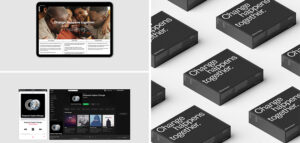
Make Ripples is an anti-racism not-for-profit founded on the idea that change happens when we each take practical and conscious action in our daily lives, communities, and workplaces – when we “make ripples where we are”. It exists to make change sustainable by addressing inequality through education and knowledge sharing.
As Fook Communications, we helped to start this organisation, alongside an incredible founding team, by creating all of the branding and marketing materials – from the brand identity, to the website, to internal pitch materials.
From the outset, the team made clear to us that the goal for this non-profit was to feel accessible and valuable. It needed to make measured, thoughtful contributions to important conversations, and empower, inspire, and motivate people to continue taking action in whichever ways they can to make change lasting.
Process and solution
We spent a lot of time with the founding team in the early stages, getting a deep understanding of their experiences and their aspirations for this organisation.
Through hours of learning and conversation, we shaped a vision, value proposition, voice, and core message centred around the idea that “change happens together” – a powerful and succinct distillation of the Make Ripples mission.
The visual identity was then created to support and amplify the organisation’s purpose. Starting with the logo, we designed a simple representation of this central idea of making changes that reach farther than their initial impact. By avoiding visual complexity, we ensured approachability and clarity in the logo. The use of complete circles also implies the idea of the momentum for change being continuous.
The primary colours, black and white, are intentionally stark and simple. Wanting to help spread valuable and empowering messages, it is the words that come from Make Ripples that take precedence over colour and decoration.
The brand typefaces continue these themes, and also help to carry our intended brand voice. Founders Grotesk, the primary typeface, was first conceived with the goal of portraying information in a serious yet daring tone. This helps Make Ripples speak directly and with authority on matters of race and equality, while also keeping the communication accessible.
The secondary typeface is Times New Roman. Created at the beginning of the modern era of printing, it was made to portray a sense of trust, which is exactly why we used it here. It helps to build a human relationship with the Make Ripples audience, adding approachability and trustworthiness.
Result
By carefully researching and understanding the nuances, needs, and sensitivities around this area, we were able to craft a meaningful identity and message that resonated with its audience, and invited people into its conversation.
The brand speaks to its core purpose, reflecting the ethos of “making ripples”, and also invites people in. With the idea that change happens together, we equipped Make Ripples with a non-confrontational, non-judgemental, human, and accessible brand identity that is equally capable of having the power to speak directly when necessary. Both visually and in the language we use, this is a brand that doesn’t shout or antagonise, but speaks calmly and plainly about the need for action.
Through this thoughtful and holistic approach to branding an organisation that operates in such a critical part of life, we have created a contemporary brand identity and brand voice for a modern form of advocacy. Enabled by the meticulous work done at the brand level, Make Ripples has since engaged with thought-leaders, incredible organisations, and global brands to spread the Make Ripples message.
Client: Make Ripples
Industry: Nonprofit
Sector Expertise: Human Rights
Services
Creative
Branding
Web Design
Web Development
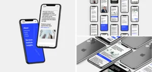
New Website Elevates Brand Image of Leading Strategic Consultant Firm
New Website Elevates Brand Image of Leading Strategic Consultant Firm
Fook Communications
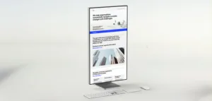
Through our meticulous design process, StrategyCorp’s new website is clear and intuitive, and boosts brand perception.
Background and Challenge
A strategic advisory and management consulting firm with clients around the world, from government bodies to 7-Eleven, StrategyCorp came to us to improve their online presence.
With an existing website that was dated, difficult to use, and didn’t accurately convey who they were or the quality of their service, our job was to develop a site that properly represented them and their reputation.
So, Fook Communications set about creating an intuitive website that elevated them above their competition, and presented information with clarity and purpose.
And beyond the typical creative challenges in a project like this, another key challenge here would be navigating a corporate environment with many senior leaders and multiple opinions, to deliver a website that everyone would buy in to.
Process and Solution
Before beginning any design work, we first ran workshops with StrategyCorp to gain an in-depth understanding of what they do and the goals they were trying to achieve. In order for us to authentically communicate on their behalf and build a website that truly contributes to their objectives as a company, these initial explorations were vital.
With many stakeholders having skin in the game, this background was also necessary to ensure buy-in across the board by grounding every decision we took in strategy. Getting an entire corporate team behind our work meant having clear justifications behind our decisions that were anchored in a total understanding of what they were trying to achieve.
So, having worked with them to shape a clear picture of who they are, it was then onto the more creative side of things. The next step was to audit and update their existing visual identity. With all of the insights we’d gained around their brand and their vision, we had to make sure we had the right foundational tools to build a website that properly reflected all of this.
To make their brand feel more contemporary, we explored secondary typefaces and additional colours, and added a couple of options that stayed true to their existing brand while giving us the flexibility to modernise it.
We also wanted to develop a high-quality and unique approach to imagery, but we knew that budgets were limited. Good visual content is a huge part of any website, so we wanted to avoid using generic stock images and instead find a way to generate a unique style that really added to the website experience, without breaking the bank.
So, we used Dalle 2 to generate a series of AI illustrations, thoughtfully using the tool to create a consistent art style that could be an ownable aesthetic for StrategyCorp.
Then began the website work itself. We first created a design concept just for the homepage, and moved through multiple stages of delivery and approval to hone in on a full website design we all loved. With final design approval, we sent the work to the development team who perfectly translated the design into the live website.
Result
From every angle – design, messaging, positioning, and technical quality – this new website has hugely improved StrategyCorp’s digital presence.
Our design and writing process was precise and measured, refining towards an approach that balanced feeling fresh and modern with seriousness and professionalism. Backed up with thorough background work, we ensured the final website delivered on exactly what StrategyCorp needed.
By investing this time in understanding them, and walking their team through our process clearly and thoroughly, not only did we create a website that nailed our brief, but we did it with total buy-in from their team.
The outcome is a website that elevates the perception of their brand and truly reflects their organisation. They now have a site that makes it simple to explore and understand the company, and succinctly articulates who they are. And the cherry on top, it’s fast, responsive, and secure.
Client: StrategyCorp
Industry: Finance
Sector Expertise: Financial Advisors
Services
Creative
Web Design
Web Development
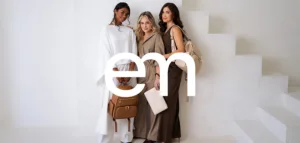
Fook’s Rebrand Delicately Blends Elegance and Empathy for Luxury Parenting Accessory Company
Fook’s Rebrand Delicately Blends Elegance and Empathy for Luxury Parenting Accessory Company
Fook Communications

With products created to support mothers and parents, Enya Mond’s branding puts this mission at its heart.
Background and Challenge
Enya Mond is a high-end parenting accessories company which started life selling diaper bags that addressed a huge gap in the market. Seeing a product category inundated with bags that were either not functional or didn’t look good, the founder created an alternative that was stylish, high quality, and functional.
But this product wasn’t born simply from spotting a business opportunity. Instead, it came from the founder’s deep desire to support mothers in their journey of becoming a parent. From her own experience of having a child, and being surrounded by other mothers, she realised one of the biggest challenges is for mothers to keep their own identity.
This type of experience profoundly impacted Enya Mond’s founder, and so this company was born out of a mission to address this.
Their team came to us with a beautiful line-up of bags that were already very well received – products designed specifically to make parents feel good while offering all of the practicality they need. They were now ready to invest into branding and marketing.
Our job, then, was to help build a sophisticated brand capable of selling high-end products, and also one that authentically embodied the founders’ vision of creating a company to support mothers and parents, born out of her experience as a mother.
So, what was needed from us was to establish a brand that balanced the elegance of high quality fashion, with the empathy of deeply understanding the needs of the target audience. This empathy could not be displaced by an over-emphasis on appearance. The integrity of what Enya Mond stands for was central to the branding Fook Communications created.
This was so much more than creating a fashion brand that sells parenting products. This was creating a brand that could be a community for parents, where they felt seen and understood.
Process and Solution
For us to find a meaningful position and brand identity for Enya Mond, our work here started by defining a clear vision and strategy. Everything we did (and continue to do) from a creative perspective had to be inspired by the mission driving Enya Mind.
With insights their team had already gathered, plus work from our side to deepen our own understanding of this industry and the experiences of motherhood, we started to shape a value proposition to give direction to the brand. We articulated the vision – a brand built around an authentic understanding of the experience of mothers – and used that as our anchor.
Fulfilling this vision (in the context of fashion) meant finding the perfect look and feel that balanced elegance with empathy.
Visually, we needed to be fashion-forward and elegant. Simple and honest. Approachable and inviting.
In our voice and tone, we focused on authenticity and warmth. Trustworthiness and empathy. Care and inclusivity. And quiet confidence and maturity.
We pitched 2 concepts to the client that hit these marks, but the winning concept is the one you see on this page. We channelled the vision into a tagline and position that perfectly captures everything we wanted Enya Mond to be: “You’re a mother, but you’re still you.”
Packed with meaning, this simple line was then supported with a visual identity that effortlessly carried that sentiment while portraying a sophisticated fashion brand.
Our logo, connecting the “E” and “M” from Enya Mond, is a simple representation of the connection between parent and child. The logo is set in the GT Walsheim typeface, which is used in a multitude of weights throughout the visual identity.
This typeface, along with the colour palette, was carefully selected to balance sophistication with clarity, warmth, and approachability. It helps the brand feel effortlessly honest, while also showing the quiet confidence and maturity expected from a high-end fashion label.
Result
With clear, simple, and thoughtful branding and positioning now supporting the company, we have since been working with Enya Mond to bring it to life in a range of areas. This work has played a vital role in the successful rebrand and launch of new products for the company.
We captured stunning product and lifestyle imagery through a full-fledged production, featuring stylists, make-up artists, and media strategists. These incredible photos and videos were driven by the same vision and positioning we’d defined earlier, and they allow Enya Mond to show its products in the best possible light on its website, in press publications and print materials, and on social media.
We’ve since created print ads and trade show materials that are cohesive manifestations of our work to date, and we’re now helping with social media and paid campaigns to grow sales for the business.
From strategy and positioning, to branding, copywriting, imagery, website development, and print advertisements, we took the vision for Enya Mond and gave it life. A truly holistic and comprehensive creative process has established a brand that is clear, consistent at every turn, and that stands for something.
It is a brand with elegance and warmth. One that supports premium product pricing, while supporting a community of mothers and parents that feel seen by what Enya Mond is doing.
Client: Enya Mond
Industry: Fashion & Retail
Sector Expertise: Fashion Accessories
Services
Creative
Branding
Digital Strategy
Social Media Marketing
PPC

New Brand, Old Industry: Habit is a Fresh and Disruptive Voice in Tea
New Brand, Old Industry: Habit is a Fresh and Disruptive Voice in Tea
Fook Communications
The team at Habit came to Fook Communications with a clear goal: creating a tea company to bring people together. Inspired by the ability of tea to enable conversation, our challenge was to build a truly authentic and meaningful brand that was about much more than a drink.
And as a company with founders who have an online community of nearly 2m followers, the stakes were high. This tea brand had to be ready to be launched to a wide global audience.
Through our initial research and strategising, we found a great opportunity to forge a path no other tea brand had followed. This is an industry that often has very similar messaging and talking points. It’s always about the quality of the tea and where the tea came from.
Of course, these are important things, but we couldn’t find a brand centred around something more than just the tea itself. So, we’d create one.
Habit, from the very start, was about fostering connection and proper conversation. It was about the power of tea, beyond its benefits as a drink. It was about building a brand that stood for something and could have a community around it.
Process and Solution
The important first step was for us to listen and learn. Fook Communications deep-dived into the target audience, understanding their demographics, scouring the social media spaces they frequented, and creating a clear picture of who they are.
Understanding the audience, as always, meant we understood what matters to them (and therefore, how to talk to them). And so with this picture we constructed a clear value proposition. We defined our core claims, USP, messaging hierarchy, brand values, and brand voice.
From these foundations, we then created 2 thoughtful branding concepts before deciding on the one you see now (and which actually moved our client to tears!).
“Tea worth talking over” is our tagline, with a contemporary and original visual identity for a new generation of tea lovers. Everything in this identity, from the colours to the brand voice, was authentically built around connection and bringing people together.
We designed a logo that is immediately recognisable, and a simple distillation of the idea of conversation, combined with a typeface that is accessible and informal.
Our colour palette, inspired by the ingredients found in each Habit tea blend, was carefully curated. It complements the Habit voice, bringing energy and playfulness when needed, and a brightness that invites people in.
Result
Our work here delivered a brand that is fresh and differentiated, and perfectly targets the audience by speaking to their values and what they care about. It has warmth and empathy, and uses humour and just the right amount of confidence to give the brand character.
The incredibly successful launch of Habit, both in terms of sales and social media following, are proof that we really resonated with our target audience.
With a clearly defined (and well-researched) vision and value proposition at the heart of the brand, it feels authentic, meaningful, and consistent at every turn. And from this brand identity, we designed all of the Habit packaging and built the website, brought to life by beautiful imagery.
This photography, using the simple but impactful creative concept of hands expressing a range of emotions in conversation, gives Habit a unique and ownable art direction, and a powerful brand visual.
We’re very proud of our work with Habit. Careful research, learning, and positioning has resulted in a truly unique brand, and we couldn’t be happier with the result.
Client: Habit
Industry: Food & Beverage
Sector Expertise: Beverages
Services
Creative
Branding
MORE