


DigiSalad is an award-winning digital agency in Hong Kong, Singapore and Taiwan. We professionally specialize in User Experience (UX), User Interface (UI) design and Digital Transformation for different digital platforms such as responsive web, mobile app and kiosk. We aim to create amazing user experience and journey for our client projects. We believe Digital Media is like a mixed salad with lots of different ingredients. For example, UX and UI Design, Front-end Web Development, Mobile App Development, Motion Graphic, CRM, Customer Loyalty and different kinds of Digital strategies. We believe that there will be more unknown “ingredients” and new possibilities for us to explore in the coming future.
DigiSalad
Gold MemberDigiSalad specialises in UX Strategy, UI Design & Digital Transformation. They are an innovative & professional digital agency in Hong Kong.
Min. Project Budget:
$5,000+
Min. Monthly Budget:
$1,000+
11-50 Employees
20 Awards
12 Case Studies
About
- HQ
- OFFICES
-
HEADQUARTERS
- ADDRESS: 25/F, Prowell Asia Centre, 926 Cheung Sha Wan Road, Cheung Sha Wan, Kowloon, Hong Kong
- PHONE: 852 3103 2588
- E-MAIL: [email protected]
-
OFFICE
- ADDRESS: 15F, No. 525, Section 4, Zhongxiao E Rd, Xinyi District, Taipei City, Taiwan
- PHONE: 886 978 502 608
- E-MAIL: [email protected]
-
OFFICE
- ADDRESS: Street Address: 7/F, CT HUB, 2 Kallang Avenue, Singapore
- PHONE: 852 31032588
- E-MAIL: [email protected]
Services
Creative
Service Expertise
Digital Marketing
Mobile App Development
SEO
Service Expertise
UX Design
Industry Expertise
Fashion & Retail
Sector Expertise
- Department Stores
- Footwear
- Men's Clothing
- Fashion Accessories
- Clothing Brands
- E-commerce Fashion
Finance
Sector Expertise
- Banking
- Investment Management
- Asset Management
- FinTech
- Financial Advisors
- Credit Cards
- Insurance
- Real Estate Investment Trusts (REITs)
Hospitality
Sector Expertise
- Hotels & Resorts
- Luxury Hotels
- Theme Parks
- Private Clubs
- Casual Dining Restaurants
- Fine Dining Restaurants
- Bars & Pubs
- Event Venues
- Coffee Shops & Cafes
- Spas & Wellness Retreats
Insurance
Sector Expertise
- Health Insurance
- Business Insurance
IT & Technology
Sector Expertise
- Mobile Apps
Clients
tvN
3HK
Centaline Property
Hopewell
SmarTone
Wynn Macau
Savills
Adobe
Invesco
See All (2)
Budgets
Min. project budget
$5,000+
Min. monthly budget
$1,000+
Awards
- Marketing-Interactive's Agency of the Year Awards B2B Agency of the Year | Best Client-Agency Partnership | Industry Specialist Agency of the Year | Rising Star | MarTech Agency of the Year | Production Agency of the Year | Best Agency Culture | CRM & Loyalty Agency of the Year | Data Analytics Agency of the Year | Experiential Marketing Agency of the Year | Innovative Agency of the Year 2025
- The Loyalty & Engagement Awards Best Loyalty Strategy – Finance & Insurance| Best Loyalty Strategy – Lifestyle & Entertainment | Best Use of Gamification | Best Use of Rewards & Incentives | Best Customer Acquisition Strategy | Best Mobile Marketing Strategy | Best Membership Programme | Best Customer Retention Strategy | Best Loyalty Strategy – Lifestyle & Entertainment 2025
- Marketing Excellence Awards Excellence in Interactive Marketing | Excellence in Loyalty Marketing 2024
- The Loyalty & Engagement Awards Best Loyalty Programme (Lifestyle & Entertainment) | Best AI-Powered Engagement Campaign | Best Use of Mobile | Best CX/UX Strategy | Best Acquisition Strategy | Best CRM Strategy 2024
- Digiz Awards Best of the Show (Brand) | Best Digital Targeted Audience Campaign | Best Use of Real-Time Marketing | Best UI/UX Design | Best Use of Personalization Strategies | Best Digital Launch/Rebranding Campaign | Best Conversion Optimization Strategies | Best Digital Launch/Rebranding Campaign 2024
- Marketing-Interactive's Agency of the Year Awards Local Hero Agency of the Year | Agency Team of the Year | CRM Agency of the Year | Brand & Design Consultancy of the Year | Digital Agency of the Year | Production Agency of the Year | CRO Agency of the Year | B2C Agency of the Year | Industry Specialist Agency of the Year | Independent Agency of the Year | Best Client Acquisition Agency of the Year 2024
- Marketing-Interactive Mob Ex Awards Best Use of Personalization | Most Innovative Use of Mobile | Best Mobile AI and Chatbot Integration | Best Campaign - B2C | Best Campaign - Health & Wellness | Best Campaign - Lifestyle & Entertainment 2024
- Asia Smart Innovation Awards 2025 Asia Smart App Awards | Lifestyle and Entertainment | Special Mention Award of UX / UI Design 2024
- IAB HK Digital Awards Best Digital Campaign of the Year | Best Use of Technology | Best Advocate of Social & Environmental Impact | Best Use of Omnichannel Strategy 2024
- The Loyalty & Engagement Awards Best Loyalty Campaign (Launch/Rebranding)| Best Use of Mobile |Best CRM Strategy |Best CX/UX Strategy |Best Loyalty Programme (Retail) 2023
- Marketing-Interactive MARKies Awards Hong Kong 2026 Best Use of CRM 2023
- Marketing Excellence Awards Excellence in Loyalty Marketing | Excellence in Health & Beauty Marketing 2023
- Digiz Awards Best UX & UI Design | Best Conversational Marketing Solution | Best Digital Performance Campaign 2023
- Marketing-Interactive's Agency of the Year Awards Agency Leader of the Year | Innovative Agency of the Year | Market Research Agency of the Year | Brand & Design Consultancy of the Year | Best Agency Culture 2023
- Marketing-Interactive Mob Ex Awards Best Mobile Growth Strategy | Best User Experience | Best Use of Mobile - Customer Engagement | Best Use of Personalization | Best Direct-to-Consumer Campaign 2023
- Marketing-Interactive's Agency of the Year Awards CRM & Loyalty Agency of the Year 2022
- The Loyalty & Engagement Awards Best membership Program | Best Use of Rewards & Incentives | Best Loyalty Campaign 2022
- Digiz Awards Best App Design | Best Digital CRM Campaign | Best Mobile Campaign | Best Customer Journey | Best UX/UI Design 2022
- Marketing Excellence Awards Excellence in Experiential Marketing | Excellence in Mobile Marketing | Excellence in Use of Technology 2022
- Most Innovative Solution Award Best Digital Agency of the Year 2021
→
Platform Expertise


Case Studies
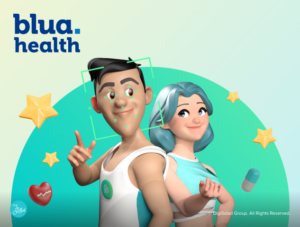
Blua Health Mobile App UX & UI Design & Development
Blua Health Mobile App UX & UI Design & Development
DigiSalad
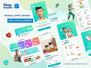
Bupa, an international healthcare and insurance company, understands the struggles that busy Hong Kong residents face in taking care of their health and well-being. Amid their fast-paced lifestyles, many Hong Kongers struggle to prioritize their health and frequently seek rapid solutions. To tackle these challenges, Bupa has invited with DigiSalad to design & develop the Blua Health App, a comprehensive lifestyle and CRM application designed to promote health and wellness among Hong Kongers.
A Membership System for Everyone
The Blua Health App features a versatile membership program open to both Bupa customers and the general public. Existing Bupa clients can simply enter their phone number or email address to link their profile with the app. Meanwhile, new users can register with basic information. After completing the verification process, users have the option to fill out a survey detailing their interests, hobbies, and preferences. The app then employs this data to deliver personalized content and notifications tailored to the user’s interests.
Engaging Missions and Rewarding Incentives
It includes an innovative mission and rewards system that fosters user engagement and encourages daily logins. Users can accomplish daily missions, such as logging their water and vegetable consumption, setting focus time, and meeting walking steps target. By completing these missions, users accumulate points that can be exchanged for alluring rewards.
AI-Powered Health Assessments
Blua Health uses advanced AI technology for health assessments via face scanning. Users can take a selfie, and the AI analyzes the image to estimate a health score. This innovative feature provides users with a unique, personalized health report.
Interactive Workouts with AI Motion Detection
The app features AI-driven exercise videos for workouts like push-ups and squats. The AI technology assesses the user’s posture and exercise intensity in real time, providing feedback to ensure each workout is effective and safe.
Find the Right Doctor with Ease
The doctor finder feature empowers users to search for medical professionals across various specialties, such as cardiology, dermatology, and Chinese medicine. Users can filter their search based on their needs and save their preferred doctors for future reference. The app supplies comprehensive information about each doctor, including their qualifications, areas of expertise, and contact details.
With a steadfast commitment to promoting health and wellness among Hong Kongers, the Blua Health App will continue to expand, offering new features and resources to meet the diverse needs of its users. Stay tuned for exciting updates and enhancements.
Client: Bupa Hong Kong
Industry: Finance
Services
Mobile App Development
UX Design
Completed: Dec 2026
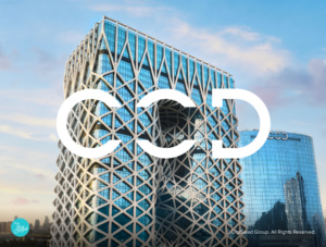
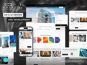
City of Dreams Macau - Step Into Luxury with a Sleek New UX & UI Experience
City of Dreams Macau - Step Into Luxury with a Sleek New UX & UI Experience
DigiSalad
CHALLENGES
As one of the top integrated resort destinations in the world, City of Dreams (‘COD’) Macau attracts high-end tourists to its immersive luxury experiences. However, its existing website was too plain to be in line with its brand perception. COD was in need of a more modern website that would display its world-class offerings in a more intuitive way, making it easy for clients to navigate and book their desired experiences.
The existing website was a typical text-based layout that cataloged hotel, dining, and entertainment options in a lengthy list style. Incongruent color shades and design patterns across different pages, in addition to poor transitions, not only compromised brand consistency but also resulted in a poor user experience.
Additionally, COD’s overly simplistic and inefficient content management system (CMS) made it difficult to manage and update content efficiently. The lack of flexibility in the CMS not only slowed down maintenance but also created challenges in implementing an effective SEO strategy. With a non-user-friendly interface, handling technical SEO elements became cumbersome, limiting the website’s search visibility and overall performance.
PROJECT OVERVIEW
Diverse Illustrations to Enhance Brand Identity
Melco Resorts engaged DigiSalad to revamp three of its websites, including COD, to overcome existing challenges and enhance the user experience. As was done when COD launched and dazzled the market, we set our sights to craft one that would dazzle users in terms of engagement and innovation.
Our design experts leveraged seamless transition effects and dynamic graphics to ensure smooth transitioning of content between segments to enable principal content to be more highlighted. The website was also transformed to a new, cool-hued colour scheme that added vibrancy without sacrificing elegance or a perception of luxury.
Stepping onto the COD website is now like embarking on a high-end digital ride, where each move is smooth, immersive, and personalized to provide a high-end feel. This is in line with our vision — to deliver a visually compelling and highly intuitive surfing experience coupled with a boost in brand presence via the new interface.
WEBSITE FEATURES
An Enhanced More Intuitive & Engaging User Journey
On going through the structure of the website and hierarchy of pages, we minimized the process of booking and navigation. Previously, the booking button was placed deep in detail pages, making it hard to spot in poor contrasting coloration.
Today, users can book straight from home or listing pages in one-click, and most of the details required, including check in / check out date and number of guests, also get highlighted in primary pages to cut short unnecessary redirects and provide a smooth and efficient process.
Quick Navigation Among Melco Resorts’ Properties
Users can navigate City of Dreams Macau, Altira, and Studio City easily in one smooth integrated process. The brand icon at the top, and the bottom icons in footer provide instant entry to sister properties, making it easy for visitors to view all resort and entertainment options under Melco Resorts.
The experience is optimized for different devices:
- Desktop and tablet users – Instant access to call and booking options in the top menu.
- Mobile users – Quick access to hotels, dining, entertainment, and bookings through buttons in the fixed bottom menu, adopting a design approach inspired by mobile app navigation. This ensures an intuitive experience for users familiar with app-based interactions.
Improved Search Experience
With so many entertainment, dining, and retail options available, a strong search function is a given. Where there was no option to search for specific venues or experiences on the old site, the new one has a search function at the top of each page, making it a flash to find what you need to find. Furthermore, individual filter searches in key areas such as restaurants, events, and shopping allowed quick browsing of related information.
The list structure was also overhauled to limit default results per page to allow for more convenient perusal. Furthermore, users can easily filter and order listings to quicken the process of discovery.
SOLUTIONS IMPLEMENTED BY DIGISALAD
Balancing Brand and User Experience
The official website is the key medium of brand portrayal, the new COD website balances brand elements — Visual, Typography, Patterns, and Colors — in design. The elements get organically integrated in design, presenting unique brand elements without sacrificing on the user’s experience. All of it blends coherently without intrusiveness. For example, the top-level menu is shown when needed and disappears when scrolled, making it easy for users to dive into the vibrant universe of COD and enjoy a more sophisticated browsing process.
Enhanced Interaction & Booking Experience
Asides the layout, the process of booking was also overhauled to allow more interaction. For example, the booking buttons were strategically repositioned — rather than being placed deep within detail pages, they are now easily accessible across all relevant sections, making it a hassle-free process of booking. Furthermore, key details such as the number of guests, room preferences, and date are auto-populated, eliminating manual entry and making the process hassle-free.
Furthermore, visual enhancements such as dynamic banners and smooth scroll effects deliver a more immersive, friendly, and easy to navigate yet aesthetically pleasing view experience.
Refined Visual Identity
The new design delivers brand consistency and a premium feel, reinforcing that COD is a high-end destination. Better typography, optimized spacing, and enhanced readability make the content easier to digest.
By strategic use of interactive elements and motion effects, the site delivers a refined yet immersive experience, keeping users engaged while reflecting the brand’s luxurious appeal.
CONCLUSION
The new COD website successfully transforms the digital experience, making it sleek, intuitive, and highly engaging. By simplifying navigation, enhancing search functionality, and adding interactive elements, the new website is now easy to explore, discover, and book.
Not just is this redesign a more powerful digital presence for COD, it also serves business goals straight up in terms of engagement and conversion.
Client: Melco Resorts
Industry: Hospitality
Sector Expertise: Hotels & Resorts
Services
UX Design
Web Design
Web Development
Completed: Jul 2026
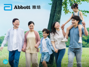
Abbott Nutrition VIP Club - Creating Seamless Member Journeys with Cross-Device UX & UI
Abbott Nutrition VIP Club - Creating Seamless Member Journeys with Cross-Device UX & UI
DigiSalad

Project Overview
Abbott Nutrition VIP Club is Abbott’s newly upgraded membership program designed for both adult and pediatric users. It offers a broader range of information and services, while the 「營‧獎賞」 program allows members to accumulate points by scanning QR codes and uploading receipts after purchasing designated products. These points can be redeemed for Abbott items or other rewards.
DigiSalad was honored to be entrusted by Abbott to design a brand-new website for the Abbott Nutrition VIP Club that balances aesthetic appeal with practical functionality. Starting from user research and needs analysis, we adopted a user-centered design approach to build a clear information architecture. Throughout the process, we aligned with Abbott’s brand positioning to deliver a professional yet approachable visual identity that enhances the overall user experience.
Website Features
Member Registration and Points Accumulation
To boost member engagement and loyalty while attracting new users, DigiSalad streamlined the registration and rewards redemption process as part of an integrated CRM experience. For example, once users scan the QR code on a product can, the system automatically imports the relevant product details. They can then earn points simply by uploading their purchase receipt — just two easy steps. This data is seamlessly stored within the CRM system to support future engagement and personalization, and the interface clearly displays a list of eligible retailers and qualifying products, helping users easily identify authentic purchases.
Points Management and Rewards Redemption
Members can redeem their preferred rewards once they have accumulated enough points. DigiSalad enhanced the rewards page with a “Show Redeemable Only” filter and implemented a color-coded labeling and tab system to distinguish between the statuses of “Available,” “In Progress,” and “Redeemed,” improving clarity and streamlining the user experience. All redemption history, including approval status and point adjustments, is stored in the member’s CRM profile, ensuring a transparent, trackable, and data-driven loyalty process.
Account and Profile Management
The Abbott Nutrition VIP Club website includes comprehensive account management features that allow members to update their personal information with ease. Users can conveniently edit account details such as their password, contact information, and date of birth, all of which sync with the centralized CRM system. More importantly, they can now manage family profiles, including adding, editing, or removing family members as needed, since the former “Abbott Mama Club” has been integrated into this new loyalty program. This enhancement further improves the flexibility of profile management and enriches Abbott’s CRM database for more personalized engagement.
Solution Implemented By DigiSalad
User-centric UI Design
DigiSalad applied a clean and intuitive design throughout the interface, embedding thoughtful, user-centric details into each step of the user journey. The goal was to create a seamless and pleasant interactive experience for all members. For instance, when a user successfully redeems a reward or completes membership registration, the system displays a pop-up message providing instant feedback and guidance for the next step. Similarly, first-time members are greeted with a welcome prompt encouraging them to explore the platform’s key features.
During any interaction, if the system detects incomplete fields or incorrect formats, the related action buttons are automatically disabled and grayed out, accompanied by clear error messages to help users identify the issue.
All point balances, redemption progress, and expiry dates are neatly organized in a fixed sidebar, allowing members to easily track their account status at any time. Through these carefully designed micro-interactions and visual feedback mechanisms, DigiSalad has helped Abbott strengthen both its brand image and customer loyalty.
Adaptive Design for Mobile
To accommodate the needs of users across different devices and usage scenarios, DigiSalad has optimized the interface for smartphone and tablet usage.
Based on an adaptive design framework, the mobile version incorporates design patterns commonly found in native apps, including fixed bottom navigation for quick access to core features. The layout emphasizes thumb-friendly usability, with key functions such as scan results, receipt uploads, eligible product listings, and FAQs clearly highlighted and easy to reach. Performance tuning and prioritized content loading further ensure a smooth user experience, even under mobile network conditions.
For the desktop layout, the focus is on account management and reward redemption. The interface adopts a multi-column structure that clearly separates key modules such as “Points & Rewards,” “Reward History,” “My Rewards,” and “My Account.” Each module features user-friendly icons and filtering options, enabling users to navigate, view, and manage their profiles and redemption records with ease.
Mastering Conversion Tracking & Reporting in GA4
Conversion rate is a key performance indicator in evaluating the effectiveness of a loyalty program. DigiSalad’s tech team worked closely with Abbott to implement Google Analytics 4 (GA4) tracking on the website. This setup precisely records user actions at key conversion points such as scanning QR codes, uploading receipts, and registering as a member, and automatically triggers corresponding events. Event parameters such as product ID, merchant name, and accumulated points are sent to the backend database for further analysis.
In addition to core conversion metrics, DigiSalad also captures a range of anonymized behavioral data, including page views, scroll depth, button clicks, and session duration. These insights help Abbott better understand user browsing behaviors and preferences, providing a data-driven foundation for ongoing user experience optimization. Furthermore, DigiSalad delivers customized website performance reports on a regular basis, covering funnel analysis, device and traffic source distributions, user retention and engagement metrics, along with actionable recommendations to continuously refine the member experience and improve marketing strategies.
Conclusion
From user research to visual design, DigiSalad placed user needs at the core of every decision, crafting a membership website for Abbott that not only aligns with the brand identity but also delivers a high level of usability. Whether users are scanning QR codes to accumulate points on mobile devices or managing their accounts and redeeming rewards on desktop, the website offers an intuitive and seamless experience across platforms.
With fully integrated GA4 conversion tracking and customized data reporting, Abbott can monitor member behavior and preferences in real time, continuously optimizing both marketing strategies and user experience. The new Abbott Nutrition VIP Club website not only boosts engagement and member retention but also embodies a user-centric, data-driven approach to digital operation, laying the foundation for long-term, high-value member relationships.
Client: Abbott Laboratories Ltd
Industry: Healthcare
Services
UX Design
Web Design
Web Development
Completed: Jul 2026
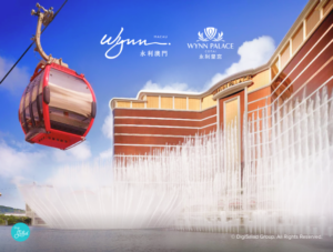
Wynn Resorts Macau Website Revamp Project
Wynn Resorts Macau Website Revamp Project
DigiSalad
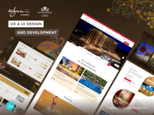
Wynn Resorts operates two luxury hotel and casino resorts in Macau: Wynn Macau and Wynn Palace. Both properties offer high-end accommodations, gaming facilities, and dining options. They operated three distinct websites: Wynn Macau, Wynn Palace, and Wynn Insider. In this project, DigiSalad has revamped the Wynn Resorts websites to increase their conversion rate and provide a better user experience.
Visually Driven Design for an Informative Website Experience
DigiSalad has crafted a visually appealing and user-friendly UI design for the new Wynn Resorts website, incorporating the latest branding elements of them. The new Wynn Resorts website provides a wealth of information on hotel accommodations, dining options, entertainment venues, and membership benefits, presented in an engaging and visually driven manner. High-quality images, immersive videos, and interactive elements showcase the luxurious and unique offerings of Wynn Macau and Wynn Palace, enticing visitors to explore further and ultimately make bookings. The visually driven design not only captivates users but also effectively communicates the Wynn Resorts brand identity and its commitment to world-class luxury experiences.
Efficient Content Management with Advanced CMS
DigiSalad has implemented a state-of-the-art Content Management System (CMS) for the revamped Wynn Resorts website, which allows users to efficiently manage all content, such as shop opening hours, event schedules, and promotional information. The CMS is designed with a widget-based approach, enabling editors to easily control and organize content in one centralized location.
One of the main features of the CMS is its ability to support the creation of content using pre-defined UI components. This allows for a consistent and cohesive presentation of information across the website while ensuring that content remains visually engaging and adheres to the Wynn Resorts branding guidelines. The use of these UI components streamlines the content creation process, making it easy for editors to update the website with new information and promotions.
The widget-based approach enables users to quickly and easily modify, add, or remove content as needed, all from a single interface. This approach not only simplifies the content management process but also reduces the risk of inconsistencies or errors, as updates made in one place are automatically reflected across all relevant sections of the website.
Single Domain Consolidation for Streamlined User Experience
To simplify the user experience and streamline content management, DigiSalad has consolidated the Wynn Macau, Wynn Palace, and Wynn Insider websites into a single domain. This approach allows users to seamlessly switch between the different properties and membership program within the same website.
Driving Traffic and Sales Conversion through Improved SEO
By consolidating the three websites into a single domain, Wynn Resorts can better track and analyze user behavior, helping them optimize their website for improved SEO and attracting more visitors to their properties. Furthermore, the new website design encourages visitors to explore the various offerings and make reservations, ultimately driving sales conversion.
China Mainland Focus for Targeted Audience Engagement
Understanding the importance of the China mainland market, DigiSalad has tailored the new website to cater to this audience. The website is available in both Simplified Chinese and English, ensuring that visitors from the mainland can effortlessly access information and make reservations. Additionally, the revamped website highlights promotions and events that are particularly relevant to the China mainland audience, further enhancing its appeal to this key market segment.
In conclusion, DigiSalad’s revamp of the Wynn Resorts websites has successfully unified the user experience, provided a visually driven and informative platform, and catered to the China mainland market. This comprehensive approach is designed to drive traffic, increase sales conversion, and solidify Wynn Resorts’ position as a leading luxury hospitality provider in Macau.
Client: Wynn Resorts Macau
Industry: Hospitality
Services
UX Design
Web Design
Web Development
Completed: Jul 2026
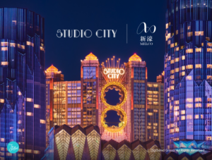
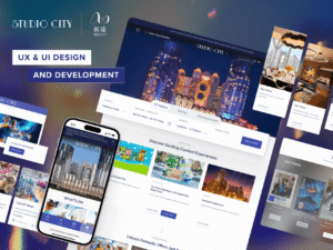
Studio City Reimagined: A Bold New UI & UX Journey Through Entertainment, Hospitality, and Lifestyle
Studio City Reimagined: A Bold New UI & UX Journey Through Entertainment, Hospitality, and Lifestyle
DigiSalad
CHALLENGES
As one of Macau’s most iconic integrated resorts, Studio City stands out with its wide range of attractions, from luxury accommodations and diverse dining options to the thrills of the Water Park, immersive cinematic experiences, and world-class entertainment. However, its previous website did not reflect the energy, scale, or interactivity of the property. It lacked the visual appeal and functionality needed to meet the expectations of modern digital audiences.
The outdated site relied on a static, text-heavy layout that segmented experiences into siloed pages with limited visual storytelling or interconnection. Disjointed color palettes, inconsistent visual styles, and clunky page transitions led to a fragmented user journey that made it difficult for visitors to explore Studio City’s full range of offerings in an engaging way.
Moreover, the underlying content management system (CMS) lacked flexibility and efficiency. Updating event highlights, seasonal campaigns, or cross-promoting shows across pages was a tedious and manual task. This not only slowed down content maintenance but also created friction in executing timely promotions and optimizing the site for SEO performance. Without an intuitive backend, making even basic changes required technical intervention, limiting the site’s agility in a fast-moving, experience-led industry. Additionally, images were displayed without accompanying text, limiting search engine visibility and making it harder for users to find relevant content. The new updates embed keywords under images and provide an intuitive backend, significantly enhancing SEO performance and enabling audiences to discover content more easily.
To meet the evolving expectations of digital-first users, including tourists, families, and entertainment seekers, Studio City needed a complete digital overhaul. The new solution had to be immersive, scalable, and user-centric, bringing together every facet of the resort under a seamless, unified, and visually dynamic online experience.
PROJECT OVERVIEW
Melco Resorts engaged DigiSalad to revamp two of its websites, including Studio City and City Of Dreams, to overcome existing challenges and elevate the digital experience. As with the City of Dreams transformation, our objective was to create a platform that not only reflects the vibrant spirit of Studio City but also enhances user engagement and accessibility across all offerings.
To reinforce a cohesive brand presence, both the Studio City and City of Dreams websites were designed with a consistent structure and visual style, allowing users to easily recognize and relate to their shared identity under the Melco Resorts umbrella. This unified approach enhances brand recall while ensuring a seamless user experience across properties.
Our design team introduced smooth transitions, engaging visuals, and an elevated UI that brought different entertainment zones, from the Water Park and Cinema to hotel, dining, and entertainment, under one cohesive digital umbrella. The site now features a sleek, entertainment-forward visual language with lively tones that maintain a premium, family-friendly appeal.
Exploring the Studio City website now feels like stepping into the resort itself, immersive, interactive, and personalized. This is fully aligned with our vision to create a visually compelling and intuitive user journey that strengthens brand presence and drives discovery across Studio City’s multi-faceted experiences.
WEBSITE FEATURES
Everything at Your Fingertips- From Stays to Entertainment
The redesigned Studio City website was restructured to put hotel, dining, and event bookings at the forefront, enabling users to seamlessly reserve a stay, secure a table, or purchase tickets with just a few clicks. Beyond bookings, the site also makes it easy to discover activities, special offers, and signature attractions like the Water Park and Cinema. Previously, essential details such as showtimes, promotions, and ticketing information were buried deep within the site and lacked visibility due to inconsistent styling. Now, users can effortlessly scroll through the homepage to explore featured content or navigate via a simplified menu, guided by clear call-to-action buttons and intuitive booking modules. Whether planning a stay, dining experience, or entertainment outing, the user journey is now streamlined, engaging, and visually guided.
For the Cinema page, we integrated with the cinema’s official site through an Application Programming Interface (API), allowing real-time updates of movie listings. This means visitors can view current and upcoming movies, read movie descriptions, and purchase tickets directly on the website without needing to visit the cinema’s external site, providing a more cohesive and convenient user experience.
As for the Water Park page, it is designed as a dedicated section showcasing all water-related activities, such as pools, surfing attractions, water slides, and other entertainment options. Users can browse detailed descriptions, view the latest news about the Water Park, and check ticket prices conveniently presented in a pricing table format. When users enter the page, the call-to-action (CTA) buttons are placed in prominent areas, enabling visitors to quickly purchase tickets, streamlining the booking process and encouraging higher engagement.
These features ensure that visitors can easily find all the information they need and make reservations with minimal effort.
Unified Navigation Across Melco Destinations
Visitors can seamlessly navigate between Studio City, City of Dreams Macau and Altira Macau through an integrated, cross-property experience. A consistent brand icon and intuitive links in the footer provide easy access to sister destinations within the Melco group of properties, while the header navigation also allows users to switch effortlessly between properties. This dual navigation approach ensures a cohesive and uninterrupted browsing journey, enabling users to explore the full breadth of offerings across Melco Resorts with ease.
Adaptive Design for Smarter Interactions
The new site adapts seamlessly across all screen sizes, providing desktop and tablet users with a clean top navigation for quick access to hotel booking, events, and contact information, while mobile users enjoy an app-like experience with a fixed bottom menu for easy access to key sections such as Attractions, Offers, and Tickets. This device-first design ensures a seamless and frictionless experience for users across all contexts.
Structured Navigation for Smooth Browsing
With a diverse range of experiences at Studio City, including upcoming events, attractions, hotel bookings, cinema showtimes, and exclusive offers, the revamped website was thoughtfully designed to guide users seamlessly through their journey using a clear structure and intuitive navigation, eliminating the need for a search function altogether.
Instead, we prioritized a well-organized content structure with a clear visual hierarchy and intuitive navigation flow. Key sections are strategically arranged to encourage exploration, while prominently placed call-to-action buttons ensure users can easily access what they’re looking for, whether it’s booking a hotel or exploring upcoming events. Additionally, a dedicated section in the navigation allows promotional packages to be highlighted more prominently, making them easily accessible to users during active campaigns.
This deliberate design approach creates a smooth and effortless browsing experience, allowing users to naturally scroll through curated content and engage with relevant information at the right moments, enhancing discoverability while maintaining a visually engaging interface.
SOLUTIONS IMPLEMENTED BY DIGISALAD
Design-Driven Solutions to Elevate User Engagement
As the central digital touchpoint, the new Studio City website strikes a careful balance between brand expression and usability. Key brand elements, including visual style, typography, graphic patterns, and color palette, are seamlessly woven into the design to reflect Studio City’s dynamic and entertainment-driven personality. These elements are thoughtfully integrated to enrich the brand experience without disrupting the user journey.
For instance, the top navigation menu appears only when clicked and elegantly retracts as users scroll, allowing them to fully immerse themselves in the vibrant, high-energy world of Studio City while enjoying a more refined and intuitive browsing experience.
Widget-Based Solutions to Streamline Content Access
By utilizing a widget-based CMS, DigiSalad provided Studio City with a powerful platform for efficient, precise, and user-driven content management. This flexible system enables Studio City’s team to easily create, update, and rearrange content across the site without the need for complex coding, allowing key information to be presented through modular, interactive widgets.
On the Cinema pages, the layout is organized into distinct columns with multiple widgets for easy navigation. A top widget displays the current movie listings, while another highlights upcoming movies. Additional widgets provide detailed information about the cinema itself, including an introduction to the venue, descriptions of different movie houses, and special features such as Dolby Cinema and VIP House. This widget-based structure allows users to explore movie options, check show details, and navigate directly to ticketing pages in a clear and intuitive manner.
The Water Park section similarly uses a widget-based layout, with separate modules highlighting new attractions and activities. Each widget is paired with intuitive icons that indicate the type of experience or important notices, allowing users to quickly grasp essential information at a glance.
This CMS-driven architecture ensures content can be dynamically updated, personalized, and deployed across different sections of the site, keeping the Studio City website fresh, engaging, and responsive to user behavior. The result is a smoother, more immersive digital journey, where content is not only visually organized but also intuitively accessible based on user needs.
Unified Backend for Consistent and Scalable Operations
The revamped Studio City website is powered by a centralized content management system that supports efficient, consistent, and scalable operations across all digital touchpoints.
Integrated into Melco Resorts’ broader digital framework, this unified backend allows for real-time updates across hotel, dining, entertainment, cinema, water park, and promotional content, all managed through a single, streamlined platform. This approach not only simplifies maintenance but also ensures a cohesive and timely experience for users, no matter which part of Studio City they’re exploring.
Enhanced Interaction & Booking Experience
Beyond layout improvements, the user journey at Studio City was reimagined to deliver a more interactive and seamless experience. Booking and ticketing buttons, once buried deep within detail pages, are now strategically repositioned across all relevant sections, allowing users to take action quickly and effortlessly. Whether booking a hotel stay, purchasing cinema tickets, or exploring Water Park events, the process is now more intuitive and accessible.
Key details such as number of guests, preferred dates, or ticket options are clearly displayed and, where applicable, auto-filled, reducing the need for manual input and making the experience smoother and more user-friendly. These parameters are also carried over seamlessly to the booking system, eliminating the need for users to re-enter information and streamlining the entire journey. Additionally, visual enhancements such as dynamic banners and smooth scroll effects contribute to a more immersive, aesthetically pleasing interface that is both easy to navigate and engaging for users.
Cohesive Branding Through Engaging UI and Interaction
The new Studio City website presents a cohesive and contemporary brand image that reflects its dynamic, entertainment-rich positioning. Enhanced typography, refined spacing, and improved readability ensure that content is easy to navigate and digest across all sections, from attractions and dining to shows and offers.
Interactive elements and subtle motion effects are strategically applied to create an engaging yet polished experience, capturing the energetic spirit of Studio City while maintaining a sense of sophistication and design finesse.
CONCLUSION
The new Studio City website redefines its digital presence with a sleek, immersive, and user-centric experience. Through streamlined navigation, clear content pathways, and engaging interactive elements, the site now makes it easier than ever for users to explore attractions, discover events, and access key offerings with just a few clicks.
More than just a visual refresh, the redesign strengthens Melco resort‘s position as a world-class integrated resort while directly supporting business goals, driving deeper engagement, increasing conversions, and elevating the overall brand experience online.
Client: Melco Resorts
Industry: Hospitality
Sector Expertise: Hotels & Resorts
Services
UX Design
Web Design
Web Development
Completed: Mar 2026
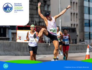
Hong Kong Association of Athletics Affiliates | Standard Chartered Hong Kong Marathon Website UX&UI Design & App Development
Hong Kong Association of Athletics Affiliates | Standard Chartered Hong Kong Marathon Website UX&UI Design & App Development
DigiSalad
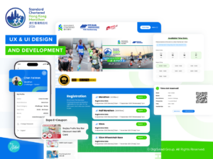
Project Overview
The Standard Chartered Hong Kong Marathon (SCHKM) is one of Hong Kong’s most iconic and largest annual sporting events, attracting tens of thousands of runners and members of the public each year. Beyond race day, the event involves extensive pre- and post-race operations, including runner registration, information dissemination, participant support, runner’s pack distribution, and post-event engagement. These critical processes rely heavily on a stable, efficient, and easily managed digital platform across multiple user touchpoints.
DigiSalad was commissioned to deliver a comprehensive digital upgrade for SCHKM, including a full revamp of the official website, alongside the design and development of a dedicated mobile application to support the race participation. Together, the website and mobile app provide runners with timely event information, registration support, and post-event engagement, while enabling organisers to manage large volumes of content and participant data efficiently.
By integrating the website and mobile app into a unified digital ecosystem, the solution ensures consistent information delivery, seamless user journeys, and operational flexibility throughout different stages of the event, supporting the scale and complexity of one of Hong Kong’s largest annual sporting events.
Challenges
The original official website of the Standard Chartered Hong Kong Marathon was no longer aligned with modern digital behaviours or user experience expectations. The homepage was text-heavy, lacked clear visual hierarchy and navigational guidance, and featured small typography with low-visibility call-to-action elements, making it difficult for users to identify key information or begin their journey.
Visually, the interface was constrained by rigid grid-based layouts and fixed image sizes, resulting in a dated and inflexible presentation. Key pages such as the Runner’s Guide and important announcements relied on minimal interaction cues with insufficient contrast and scale. The event photo gallery, although categorised by year, required multiple layers of navigation and displayed images in small thumbnails, reducing browsing efficiency and intuitiveness.
Beyond front-end experience issues, the platform lacked a comprehensive content management system (CMS). Content updates were handled manually, causing event information, announcements, and user-related content to be fragmented across the site and limiting scalability, data integration, and experience optimization.
At the same time, the SCHKM relied solely on its website as the primary digital touchpoint, without a dedicated mobile application. As smartphones became the dominant access point for users, this desktop-first setup restricted real-time access, convenience, and engagement across key moments of the event journey.
Starting in 2021, the project initiated a mobile-first digital transformation. We designed and developed a dedicated mobile application for the SCHKM, enabling real-time participation, live tracking, and instant access to race updates and official announcements—establishing a scalable foundation for subsequent experience design and execution.
Website Features
UX & UI Design Enhancement |Content Structure Optimisation
The revamped website is built around clarity, readability, and efficient browsing, achieved through the seamless integration of UX and UI design, navigation structure, and content presentation. The interface is structured to help users quickly understand content priorities and locate key information such as race information, runner-related content, important notices, and event highlights, even when navigating information-rich pages.
A strong visual and informational hierarchy is established through refined typography, balanced white space, and modular layout design. Content is organised into clearly defined sections and structured layouts, allowing different types of information to be presented in the most appropriate format. On content-heavy pages such as “Race Information” and “Course Map”, key details—including schedules, locations, important notes, and arrangements—are systematically organised, enabling users to scan, compare, and absorb information efficiently without the fatigue of long-form text.
Navigation is supported by a consolidated menu positioned within the header, allowing users to access all major content categories through a single interaction. Clear visual indicators are used for expandable sections, helping users understand content depth and navigate through multi-layered information with confidence.
From a UI and visual design perspective, the website incorporates subtle motion graphics and controlled animation to enhance interaction flow. Smooth transitions between sections create a natural browsing rhythm, while flowing banners positioned within the mid and lower areas of the page are used to showcase event slogans and key messages without interrupting content readability. Geometric layout principles and consistent visual language are applied across pages, reinforcing a modern and cohesive design system.
A centrally positioned countdown timer on the homepage serves as a key visual anchor, clearly highlighting the upcoming marathon date. Its scale, placement, and visual weight are carefully balanced within the layout to draw attention without overpowering other primary content.
Overall, the website combines structured content organisation, intuitive navigation, and contemporary UI design to accommodate large volumes of information while maintaining high readability and ease of use. The result is a confident, user-friendly browsing experience suitable for users of different age groups and digital habits.
Mobile App Features 2026
End-to-End Mobile Experience Upgrade
The mobile application serves as a key digital extension of the SCHKM, designed to support both runner experience and event operations. DigiSalad carefully considered how runners interact with information at different stages of the event and how mobile technology could streamline processes and improve operational efficiency.
The application allows runners to manage personal profiles, access race information, and remain connected before, during, and after the event. A core feature is the Runner’s pack collection arrangement, which enables runners to select their preferred collection date and time slot directly within the app. This helps runners plan ahead while assisting organisers in managing crowd flow and optimising on-site distribution.
To enhance engagement, the app supports race result sharing, allowing runners to easily share achievements with friends and family. A merchant reward programme is also integrated, enabling runners to redeem e-coupons through the app and extend the event experience beyond race day.
On the interactive side, the Cheering Banner feature allows supporters to create personalized encouragement messages that scroll across the screen when the phone is held horizontally, transforming mobile devices into digital cheering boards and adding vibrancy to the race-day atmosphere.
Overall, the mobile application balances practical functionality with interactive design, reflecting DigiSalad’s ability to align user experience with real-world operational needs.
Mobile App Features 2023 – 2026
Run Anytime, Anywhere
Both international and local runners are able to register and participate in the virtual run. Runners can choose their own path to satisfy the required distance. Each runner can take on a maximum of five attempts, each of them can be finished within 24 hours. More importantly, users may pause the run to take a break any time after the start time. They can also capture all the special moments in the run on the mobile phone camera and share them on social media.
Leaderboard
There is a real-time leaderboard to show the current top 10 participants, including their time and distance, and other users will be encouraged to challenge them and break the record with the remaining attempts.
E-certificate
After the completion, the runners can submit their best record to the system and or it will select the best record from the valid attempts and issue an e-certificate to the runners. They can view their e-certificate in the mobile app and receive it from email attachment.
Physical Marathon
After the pandemic, the physical Marathon came back. The app is enhanced and integrated with the membership system, which means all qualified participants can login the app through their simple verification flow.
They can collect the runner’s pack by showing their own QR code. Before the competition, runners can even upload their RAT test results and vaccination record in the app so as to speed up the pre-registration process. What’s more, they can redeem their exclusive rewards by using the in-app coupons on the event day, and simplify the whole process.
DigiSalad’s Solution
Widget-based Centralized Content Management System
To address limitations in the legacy backend system, DigiSalad developed a widget-based, centralized Content Management System (CMS) tailored to the operational needs of the SCHKM. This centralized CMS allows administrators to manage both website and mobile app content within a single platform, ensuring consistency across digital touchpoints. The system enables administrators to control content—including text, images, page structures, and functional components—through an intuitive interface, without reliance on technical support for daily updates.
Administrators can freely add, remove, or rearrange content modules and adjust displayed content according to different event stages. For example, runner-related information can be prominently displayed during registration and pre-race periods, then hidden or modified after the event concludes. This level of flexibility ensures content remains aligned with the event timeline and operational requirements across both the website and app.
The modular, centralized CMS significantly improves backend efficiency, reduces maintenance costs, and provides a stable foundation for future scalability, supporting the long-term development of a large-scale annual event.
Social Platform Integration and QR Code Linking
As part of the overall digital solution, DigiSalad integrated official social platform content into the revamped website. A dedicated section on the homepage displays synchronised updates from the event’s official Facebook page, allowing users to view real-time announcements and key highlights while browsing the website, or seamlessly access the official social platform for further engagement.
This integration streamlines content management for organisers by allowing information published on Facebook to be reflected directly on the website, ensuring consistency across channels while reducing duplicated update efforts.
In addition, DigiSalad introduced a QR code-based mobile application download feature, which was not available on the previous platform. When users browse the website on a desktop or tablet, they can simply scan the on-screen QR code with their mobile devices to access the app download page instantly. This design caters to modern mobile-first usage habits, eliminating the need to switch devices or manually search for the application, and significantly improving download convenience and adoption.
Data Integration and Migration
Given the scale of participant data and operational complexity, DigiSalad implemented comprehensive data management and reporting capabilities within the content management system, while also handling the secure migration of legacy website data to the new platform.
Data collected from both the official website and mobile application—including identification details, Runner’s pack collection time slots, T-shirt sizes, and other registration information—can be consolidated into structured reports for centralised review by event administrators. This integrated reporting mechanism is especially critical for Runner’s pack distribution, enabling accurate planning, reducing manual processing, and minimising operational risks.
The data migration process was carefully planned to ensure historical data was fully preserved and transferred without disrupting user experience. This stable foundation supports ongoing data analysis, informed decision-making, and long-term event management efficiency.
Conclusion
Through the integration of a website revamp, mobile application development, a flexible content management system, and comprehensive data management solutions, DigiSalad delivered a cohesive and forward-looking digital ecosystem for the SCHKM.
The solution not only enhanced information accessibility and engagement for runners and general users through the official website and mobile app, but also effectively supported the organiser’s operational needs across large-scale event planning and execution.
This project demonstrates DigiSalad’s expertise in CMS platform management and UX & UI design, system architecture planning, and digital solutions for major events. By establishing a stable, scalable, and future-ready platform, DigiSalad provided a solid digital foundation to support the long-term growth and continued evolution of the SCHKM.
Client: HKAAA | Standard Chartered Hong Kong
Industry: Sports
Location: Hong Kong, Asia
Services
Digital Strategy
Mobile App Development
UX Design
Web Design
Web Development
Completed: Jan 2026
Altira Macau Website Revamped: Seamless, Elegant & Luxurious Experience
Altira Macau Website Revamped: Seamless, Elegant & Luxurious Experience
DigiSalad
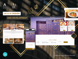
CHALLENGES
As the flagship luxury brand under Melco Resorts & Entertainment (‘Melco’), Altira Macau is renowned for its refined ambiance, panoramic skyline views, and internationally acclaimed Forbes Five-Star hospitality. However, the previous website was unable to fully communicate the hotel’s understated elegance or the personalized nature of its guest experience.
The older site relied on a static layout with limited visual storytelling, making signature offerings less discoverable. Key information such as room details, wellness services, and dining highlights required multiple clicks to access, resulting in a browsing journey that lacked clarity and emotional resonance. Additionally, the backend system offered limited flexibility, slowing down content updates and making it challenging to launch seasonal campaigns or promotions efficiently.
With Studio City and City of Dreams having already undergone their digital transformations, it became essential for Altira to adopt a renewed online presence that could both reflect its distinctive luxury and align with the refined and cohesive digital direction of the Melco Resorts brand as a whole.
PROJECT OVERVIEW
Melco entrusted DigiSalad to elevate Altira Macau’s digital presence, completing the final chapter of the group’s cross-property website modernization. Our goal was to reinterpret Altira’s quiet luxury in a digital environment, ensuring that every interaction conveys the same depth, calm, and sophistication experienced within the property itself.
While the website follows the group’s unified design system to maintain consistency with Studio City and City of Dreams, Altira’s digital identity is further expressed through selective visual cues, graceful pacing, and tactile interaction details. Smooth visual transitions, spacious layout rhythm, and a refined color palette together create an atmosphere of serene elegance.
The result is an immersive yet composed digital journey that reflects Altira’s essence, while still offering the same cross-property navigation convenience and coherent user experience shared across the Melco portfolio.
WEBSITE FEATURES
Cohesive Design with a Distinctive Sense of Luxury
To maintain consistency with other Melco properties, the Altira website revamp follows the same design philosophy while introducing a refined sense of elegance unique to the brand. DigiSalad incorporated subtle motion effects, generous white space, and a well-balanced layout to create a calm yet engaging digital experience that reflects Altira’s understated luxury and remains aligned with Melco’s cohesive brand identity.
Unified Navigation for Effortless Cross-Property Exploration
DigiSalad implemented a unified header that enables users to switch seamlessly between Altira, Studio City, and City of Dreams, creating a cohesive cross-property browsing experience. By providing clear branding and visual cues, DigiSalad ensures visitors always know which property they are viewing, while intuitive, quick-access links in the footer give effortless entry to other Melco destinations, enhancing overall navigation and user experience.
A Streamlined and Gracefully Structured User Journey
The revamped website adopts a clear and well-balanced menu bar that organizes core experiences including Hotels, Dining, Spa and Wellness, Meetings and Weddings, and Offers. Users can browse key facilities and services directly, with minimal steps and intuitive flow. The menu bar smartly collapses as users scroll, keeping the view clear while allowing effortless exploration of content throughout the site.
Featured highlights such as seasonal dining menus, wellness treatments, and exclusive stay packages are presented through subtle animations and refined visual cues that draw attention in a gentle and unobtrusive way. Action buttons including Book Now and Make an Inquiry are strategically placed across relevant sections, supporting natural decision-making without disrupting the browsing experience. As users continue to scroll, room types, dining venues, spa journeys, and event spaces reveal themselves with visual consistency and calm pacing, creating a browsing rhythm that feels smooth, engaging, and reflective of Altira’s understated luxury.
SOLUTIONS IMPLEMENTED BY DIGISALAD
Quick Access and Easy Navigation on Mobile
DigiSalad understands that today’s users browse primarily on mobile and expect fast, effortless access to services. The mobile site addresses this with a fixed bottom navigation bar that stays visible while scrolling, enabling users to navigate quickly and complete bookings or explore promotions without interruption. This design ensures a smooth, convenient, and efficient mobile experience.
Mobile page layouts are optimized for intuitive browsing. On the Dining page, users can swipe through restaurants, banquet halls, and themed dining options, with clear images and descriptions. They can quickly understand each venue’s style and atmosphere and tap “Learn More” or “Book Now” to take immediate action. This solution-oriented design ensures users engage efficiently, make informed choices, and complete bookings effortlessly, enhancing Altira’s digital convenience and service effectiveness.
Widget-Based CMS for Agility and Consistency
As a sub-website within Melco Resorts, Altira adopted a similar website revamp strategy guided by DigiSalad to ensure consistency with other Melco properties. The revamped site is built on the group’s shared widget-based CMS platform, allowing Altira’s team to efficiently update promotions, seasonal campaigns, images, and content details without technical assistance. While the CMS solution is unified across Melco’s property websites, each property’s data is managed independently to ensure operational clarity and information security. This flexible and scalable framework keeps the website fresh and responsive to ongoing content needs, while maintaining a cohesive brand presentation and supporting long-term digital growth.
Driving Engagement Through Immersive Storytelling
Altira’s Meeting & Wedding facilities are among its most distinguished offerings, providing luxurious, visually stunning venues paired with Forbes Five-Star service, perfect for festive celebrations and high-end events. Understanding this, DigiSalad designed the Meeting & Wedding page to highlight these signature experiences through immersive visual storytelling. A central full-width photo gallery showcases the grandeur and elegance of each venue, while a carefully curated video at the bottom brings the spaces to life, giving visitors a dynamic sense of the service, atmosphere, and Altira’s philosophy. This approach not only captures attention and deepens engagement but also guides potential clients seamlessly toward inquiries and bookings, turning inspiration into action.
CONCLUSION
DigiSalad brought Altira Macau’s online presence to life, transforming its website into a dynamic, elegant, and fully integrated digital experience. With a cohesive design aligned with Melco’s other properties, seamless navigation, a flexible widget-based CMS and immersive storytelling for signature experiences, every element works to captivate and engage visitors. The revamp not only showcases Altira’s refined luxury and world-class service but also creates an intuitive, inspiring and memorable journey for every guest, turning browsing into discovery and engagement into action.
Client: Melco Resorts
Industry: Hospitality
Sector Expertise: Hotels & Resorts
Services
UX Design
Web Design
Web Development
Completed: Jan 2026
NEW LP CLUB MOBILE APP & LANGHAM PLACE WEBSITE UX & UI DESIGN AND DEVELOPMENT
NEW LP CLUB MOBILE APP & LANGHAM PLACE WEBSITE UX & UI DESIGN AND DEVELOPMENT
DigiSalad
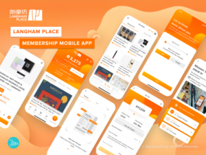
Project Overview
Langham Place Shopping Mall is one of the most famous buildings of Great Eagle Group. Standing in the heart of Mongkok, it holds an important role to the citizens of Kowloon district. For anyone who craves for an enjoyable shopping or dining experience, it is the best place to visit. To bring more surprises to their fans, Great Eagle Group engaged DigiSalad Team for Digital Transformation and enhanced the LP CLUB Membership Programme which has rolled out recently along with a brand new Mobile App & Website for customers to engage more.
Personalized Privileges
Everyone can enjoy the privileges from Langham Place by registering in LP CLUB Mobile App. The flow is effortless for any first-time visitor to complete the process within a few steps. Not only is the registration experience user-friendly, but extra points could be earned by filling out a simple questionnaire, which would lead to personalized offers in the future. These points are basically rewards from Langham Place to their loyal members with wide selections from merchants or products to be instantly redeemed via QR code displayed on this mobile App.
Smart Receipt Scanning by A.I and Machine Learning Technologies
Thanks to our A.I and Machine Learning System, all receipts can be scanned and uploaded within this App to build up a database of each member. With the customer matrix of purchase behavior and consumer preferences, the algorithm is on work to promote the best-fit offers to these segmented members. For example, if a customer is interested in F&B, after uploading the receipt from a restaurant in Langham Place with user-friendly approval system, the customer will earn points immediately and fall into the Foodie segment so they will receive the latest promotional offer for Langham Place’s restaurants.
Simplified Workflow and Fluent User Experience
One of the aims of this revamp is to reduce the workload for our client and bring fluent experience to the end customers. DigiSalad’s UX Team has improved the user flow for Shop and Dine Directory in both Mobile App and Website. Now customers can sort out shops or restaurants by category or alphabetically with just one click. Moreover, we also ensure our client will have a convenient interface to manage all content in Mobile App and Website. Thanks to DigiSalad Technical Team, a highly flexible and stable Content Management System (CMS) is developed for Langham Place Admin to access and edit all images and text. For any seasonal or popup event, they have full control on the scheduled promotion with easy steps.
We would like to express our thankfulness for the trust from our client, and we are glad to take part in this great project to create amazing UX with our client. It is truly a vivid example of how DigiSalad Team brings out the best of our expertise!
Client: Great Eagle Holdings Limited
Industry: Real Estate
Sector Expertise: Hospitality & Leisure Real Estate
Services
Mobile App Development
UX Design
Web Design
Web Development
Completed: Nov 2025
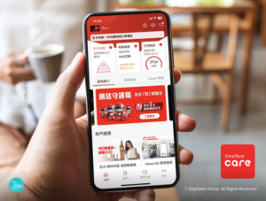
The New SmarTone Care App: A New Era of Member-centric Telecom Services
The New SmarTone Care App: A New Era of Member-centric Telecom Services
DigiSalad
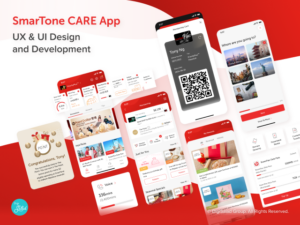
Project Overview
Introducing the remarkable transformation of the SmarTone Care mobile application, our showcased offering reveals a multitude of new and enhanced features, accompanied by a meticulously enhanced UX & UI design. With this comprehensive overhaul, the app is poised to revolutionize the way users engage with their telecom services. The revamped SmarTone app offers a comprehensive suite of services tailored to meet the ever-evolving needs of today’s digitally-savvy customers. Let’s explore the cutting-edge capabilities and unparalleled user experience delivered by the revamped SmarTone app.
Unlocking a Seamless Experience
The login system in the revamped SmarTone app has undergone a significant transformation, simplifying the access for users while ensuring robust security measures. With the implementation of a phone number-based login system, users can effortlessly enter their phone number and receive a One-Time Password (OTP) for swift and hassle-free authentication. Furthermore, in a bid to enhance convenience and security, users now have the option to log in using Face ID, providing a seamless and intuitive login experience. These innovative approaches not only alleviate the inconvenience of password retrieval but also bolster the overall security of user accounts.
UX Strategy – Widget-Based Homepage Design
We’ve ushered in a more intuitive and personalized user experience with our widget-based design strategy for the homepage. The first fold showcases a set of card views that highlight vital user information like billing info, remaining data, roaming plans, membership tiers, accumulated points, and Valued Added Services (VAS). The beauty of this design is its adaptability. Users can prioritize and arrange the widgets to their convenience, ensuring that the most relevant information is front and center every time they open the app. This novel approach to UX design makes for a seamless and personalized user journey right from the get-go.
Unleashing the Power of Membership
The revamped SmarTone app brings forth an exceptional membership module that aims to enhance the customer experience and reward loyalty. Within the app, customers can effortlessly monitor their monthly data usage and access detailed billing information, providing them with transparency and control over their telecom services. What’s more, each time a member pays their monthly bill, they earn valuable points that can be redeemed for a wide range of rewards.
The membership module introduces four distinct membership tiers, allowing members to progress through the levels by accumulating points. As members ascend the tiers, they unlock a host of exclusive benefits and privileges tailored to their loyalty status. To further personalize the membership experience, users can access their own digital membership card and dynamic QR code within the app, which serves as a versatile tool for offline points collection and identification.
To amplify the rewards potential, the membership module seamlessly integrates with “The Points” program, operated by Sun Hung Kai Properties. By aligning these two membership systems, every spending within the SmarTone ecosystem earns members a valuable point in “The Points” program. This synergistic partnership enhances the value proposition for our members, providing them with even greater opportunities to earn and redeem points across a broader range of services and offerings.
Engaging Users with Dynamic SVG Animations
Adding a layer of vibrancy to the UI is our creatively designed SVG animations. Our design team has worked tirelessly to create a range of animations that bring the app to life, creating an interactive and engaging user interface. These animations activate on special occasions – like the user’s birthday month or when they upgrade their membership tier – adding a delightful and personalized touch to the user’s interaction with the app. This dynamic and creative use of SVG Animation makes the SmarTone app not just a tool, but an experience.
Seamless O2O Integration
The revamped app goes beyond the realm of digital services, offering an array of innovative O2O (Online-to-Offline) functionalities. Experience the convenience of power bank rentals at fingertips. Users can effortlessly check the availability of power banks at each offline SmarTone store and reserve them directly within the app. Say goodbye to the hassle of waiting in line!
Additionally, the app introduces a remote queuing feature, empowering users to optimize their time. Simply select the preferred SmarTone branch and generate a queue ticket within the app. Users can conveniently monitor the current queue number and plan their visit accordingly, ensuring that they arrive at the store when their own queue number is about to be called. Bid farewell to long wait times and make the most of their day.
Unified Account Management
To simplify the user experience and reduce friction, we have integrated a feature that allows users to combine all their mobile plans or services under a single account. This eliminates the need for multiple logins and accounts, streamlining the user’s interaction with the app. Whether the user has multiple mobile plans or different services, they can switch between them effortlessly within the app. What’s more, all accumulated spending from different services will consolidate into one membership account. This not only simplifies account management but also allows users to accumulate and utilize rewards more effectively.
Embracing the limitless possibilities of mobile technology, the revitalized SmarTone app empowers users with seamless access to an array of innovative features, while unlocking a world of rewards and providing a sense of tranquility. Step into a new era of digital convenience and connectivity with the revamped SmarTone app.
Client: SmarTone Mobile Communications Limited
Industry: Telecommunications
Services
Mobile App Development
UX Design
Completed: Sep 2025
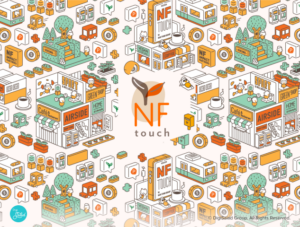
NF Touch Website - Empowering ESG Actions with a Revolutionary Membership Program
NF Touch Website - Empowering ESG Actions with a Revolutionary Membership Program
DigiSalad
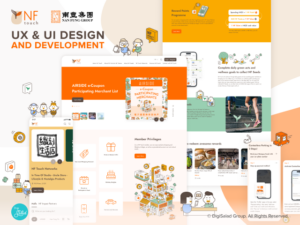
NF Touch, a cutting-edge customer loyalty (CRM) program under Nan Fung Group, aims to revolutionize the way customers interact with various shopping malls under the Nan Fung Group umbrella. At its core, NF Touch is designed to provide an exceptional user experience, enabling customers to collect points through their shopping activities and green acts. These points can then be redeemed for a wide range of exciting rewards, or even be converted into donations to support local communities.
As part of this exciting project, DigiSalad has played a key role in designing and developing the NF Touch website. The website serves as a gateway for customers to explore and understand the customer loyalty program. By logging in or signing up, users can conveniently check their accumulated points and track their progress. To fully unlock the program’s benefits, such as redemption of rewards, users are encouraged to download the NF Touch app through this website.
Elevating User Experience (UX) with Intuitive Design Strategies
DigiSalad has implemented several strategies aimed at optimizing user interactions. One of these strategies is the incorporation of automatic horizontal scrolling in sections such as the merchant list. By reducing the need for manual clicks, users can effortlessly explore a wide range of options, enhancing their browsing experience.
Diverse Illustrations to Enhance Brand Identity
DigiSalad has infused the NF Touch website with a range of custom illustrations, each designed to enhance the brand’s identity and appeal across diverse demographics. These illustrations not only make the interface more engaging but also communicate the brand’s commitment to sustainability and community, reinforcing the program’s values visually and effectively.
Page Transition Animation
DigiSalad has enhanced the NF Touch website with smooth and seamless page transitions, maintaining consistency with the brand’s visual identity. These carefully designed transition effects create a cohesive and visually appealing journey for users, effectively reducing the perceived loading time and ensuring an engaging browsing experience.
Advanced Search Function
To improve site usability, DigiSalad implemented an advanced search function that enhances user experience significantly. This feature allows for an efficient and convenient search process, incorporating popular search keywords and search history. Even users who are not logged in can benefit from personalized and relevant search results, making the platform more accessible and user-friendly.
Interactive Rewards Catalog
Our team has implemented an interactive rewards catalog that dynamically updates and allows members to easily browse and redeem their points. DigiSalad focused on creating an intuitive user interface with filters and categories that streamline the search process, thereby enhancing user engagement and simplifying the redemption experience.
Mobile-First Design
Reflecting modern browsing habits, DigiSalad adopted a mobile-first design strategy for the NF Touch website to ensure optimal performance and accessibility across all devices. This approach not only improves user accessibility but also ensures that the website delivers a seamless experience whether accessed via desktop or mobile.
NF Points / Tokens
At the heart of NF Touch is the NF Points system, where members earn points for every dollar spent at participating locations. These points can be converted into NF Tokens, which serve as cash at various merchants, integrating simplicity with utility in the loyalty program.
Green Explorer
The Green Explorer initiative within NF Touch encourages members to engage in environmental conservation through a gamified mobile experience. Members earn NF Seeds by completing eco-friendly actions, which can be used to unlock achievements or support environmental NGOs, effectively turning virtual activities into real-world impact.
Multilingual Support
Understanding the diverse user base of NF Touch, DigiSalad has equipped the website with full multilingual support. This development ensures that all members, regardless of their preferred language, can navigate the site easily and understand the program benefits fully, thus widening the program’s reach and usability.
Widget-Based CMS Approach
DigiSalad has integrated a widget-based Content Management System (CMS) into the NF Touch website, significantly enhancing the administrative ease and flexibility of content updates. This CMS allows site administrators to efficiently manage and update content without needing extensive technical knowledge. Widgets can be easily added, removed, or rearranged, providing a highly customizable and user-friendly interface. This feature is particularly beneficial for keeping the site dynamic and fresh, enabling quick adjustments to promotions, events, and rewards that directly cater to user interests and market trends.
Through strategic UX & UI design and innovative digital solutions, DigiSalad has successfully delivered a comprehensive website that not only enhances user engagement but also supports Nan Fung Group’s goals of sustainability and customer loyalty. The NF Touch project showcases DigiSalad’s expertise in creating digital platforms that are not only visually appealing but also functionally superior, fostering community engagement and enhancing corporate social responsibility.
Client: Nan Fung Group
Industry: Real Estate
Services
UX Design
Web Design
Web Development
Completed: Apr 2025

HKT Enterprise Website - Transforming User Experience with Innovative UX & UI Design
HKT Enterprise Website - Transforming User Experience with Innovative UX & UI Design
DigiSalad
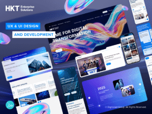
CHALLENGES
HKT Enterprise Solutions offers a comprehensive range of B2B solutions across industries such as retail and finance, including cloud services, cybersecurity, and data solutions. However, their previous website struggled under the weight of its own complexity. With a vast array of solutions tailored to specific industries, the structure of the site became disorganized and difficult for users to navigate.
Key sections such as case studies, industry trends, events & news, and blogs were hard to locate, and the weak search functionality only exacerbated the problem. Users often found it challenging to discover relevant information or services, resulting in a poor user experience and missed opportunities for conversion.
HKT Enterprise Solutions needed a website overhaul that would streamline their content, improve usability, and emphasize their position as a cutting-edge telecommunications leader.
PROJECT OVERVIEW
To address these challenges, DigiSalad partnered with HKT Enterprise Solutions to revamp their website into a user-friendly, visually engaging, and tech-forward platform. Our primary objective was to simplify the website structure while leveraging advanced UX and UI design principles to create a seamless and aesthetically pleasing user journey.
The revamped website was designed to reflect HKT’s leadership in the telecommunications and technology space, incorporating modern aesthetics, dynamic interactions, and intuitive functionality to create a seamless user experience.
WEBSITE FEATURES
Modern UX/UI Design with a Tech-Inspired Feel
To showcase HKT’s position as a leader in telecommunications, the homepage features a dynamic broadband optical fiber animation as its key visual, immediately establishing a sense of innovation and technological expertise. The design prioritizes clean layouts, bold typography, and strategic use of space and taglines, effectively highlighting HKT’s capabilities in delivering cutting-edge, high-tech solutions. This visually striking approach captures users’ attention and sets the tone for an engaging and professional user experience from the very first interaction.
Service Carousels with Progress Indicators
On the homepage, DigiSalad introduced interactive carousels and card views to display HKT’s services and the industries they cover. The carousel auto-scrolls horizontally, keeping users engaged by presenting content in a dynamic format. A progress bar under the carousel visually informs users when the next slide will appear, ensuring the interaction feels intuitive. For those who want more information, a “Learn More” button allows users to dive deeper into the details of specific services.
Intuitive Contact Journey
Recognizing that most web traffic concentrates on the homepage, we have added prominent Contact Us buttons directly on this page, along with an enquiry form at the bottom. To encourage users to submit enquiries, we have also simplified the contact process by incorporating clickable CTA elements such as phone and email links in both footer and the redesigned enquiry forms, significantly enhancing their visibility and increasing conversion opportunities.
Content Categorization with Tagging System
To improve content discoverability, the News and Blog sections now feature a tagging system. Users can filter content by relevant tags, making it easier to find articles, news, or updates that align with their interests. This enhancement ensures that users can quickly access valuable insights without unnecessary searching.
Efficient Search Functionality
The new search functionality enables users to quickly locate relevant information through keywords and further refine results using the tagging system, which features distinct tag colours to help users swiftly skim content, significantly enhancing usability. While the search feature is conveniently accessible via the icon at the top-right corner, dedicated search features have also been incorporated within the ‘News & Events’ and ‘Resource Centre sections’. Additionally, content-rich pages now feature intuitive sorting and categorization functions, ensuring information remains organized and easy to find.
SOLUTIONS IMPLEMENTED BY DIGISALAD
Interactive Design Elements
DigiSalad incorporated interactive scrolling effects, dynamic visuals, and carousels to keep users engaged. These features not only enrich the user experience but also make the website visually captivating, encouraging users to explore further.
Improved Conversion with Highlighted CTAs
Previously, users had to scroll to the bottom of product pages to find the Contact Us form, leading to missed opportunities for conversions. DigiSalad resolved this by introducing a prominently placed Contact Us CTA button that is easy to spot across all relevant pages. Within the form, users can now select specific products or services they’re interested in, simplifying the inquiry process and boosting engagement.
Widget-Based CMS
DigiSalad equipped HKT with our self-developed widget-based content management system (CMS) that significantly streamlines content management. This intuitive system gives HKT the flexibility to easily create, rearrange, and customize website widgets, enabling rapid adjustments to marketing initiatives, industry trends, or evolving business requirements. By simplifying complex content workflows, DigiSalad’s Widget-Based CMS helps HKT deliver a consistently fresh and smooth browsing experience to its users.
User-driven SEO Optimization
We developed a user-friendly backend environment for HKT, empowering them to easily control SEO settings without technical know-how. Additionally, the restructured pages enhance topical coherence and strengthen HKT’s topical authority, significantly boosting search visibility. Furthermore, our team improved the mobile experience and responsiveness, ensuring the website performs consistently well across all devices and delivers an optimal user experience.
CONCLUSION
The redesigned HKT Enterprise’s website addressed the challenges of the previous site by simplifying navigation, improving content discoverability, and incorporating interactive features that captivate users. The new website not only strengthens HKT’s digital presence but also supports their business goals by improving user engagement and driving conversions.
Client: HKT Limited
Industry: Telecommunications
Services
UX Design
Web Design
Web Development
Completed: Jan 2025

Digisalad Revamp the Life Solutions Corporate Website of Panasonic
Digisalad Revamp the Life Solutions Corporate Website of Panasonic
DigiSalad
Panasonic Life Solutions Company Limited is a Japanese multinational electronics corporation headquartered in Japan.
It is one of the largest Japanese electronics producers and it has been working on eco-solutions to ensure sustainability for the industry and the global ultimately. On this website, visitors can discover a variety range of eco-friendly electronic products which promote green living with less-polluting electronic products.
“A Better Life, A Better World” is the value that is believed in and shared by Panasonic Life Solutions Company.
Web Accessibility
Web Accessibility WACG 2.0 is applied throughout the design and development stages in this project. In design-wise strategies, such as high-contrast background colors with clear and consistent design are used.
In development-wise strategies, such as text-alternatives are provided to both visual and audio content which cater to the needs of people with blindness.
PQ Curve
This is a website that requires different physics formulas for the product comparison section. This PQ Curve development requires the flexibility of the admin portal interface (Panasonic side) and product filtering function (user side). Users can filter products by entering several parameters.
The parameters can calculate a coordinate with x, y values which would be the search criteria of PQ curve with existing products. Users can receive the result instantly which lists out the nearest products with a graph presentation of PQ curve.
Web Animation
Web Animation plays an essential role to represent trendy, eye-catching, and energetic impressions to users. It is a powerful way to provide an intuitive and interactive experience to visitors.
DigiSalad helps design and develop the web animation for “Home Ventilation” throughout the website to demonstrate the benefits of using Panasonic eco-products. Some interactive elements are applied in the animation to encourage visitors to watch and to assist visitors to understand the complex mechanism behind the product’s operation.
Client: Panasonic
Industry: IT & Technology
Sector Expertise: Consumer Electronics
Services
Web Design
Web Development
MORE