












Shikatani Lacroix Design (SLD) is a Toronto-based strategic design agency with over 35 years of experience helping retail, CPG, and financial brands earn a place in consumers’ hearts. At the core of SLD’s work is a simple belief: purchase decisions are emotional. The agency’s proprietary Think Blink process uncovers the specific emotional triggers that drive a customer to choose one brand over another, while its Blink Factor framework turns that insight into design that has instant and lasting impact.
That thinking runs through everything SLD’s multi-disciplinary team creates at in-house studios in Toronto and Shanghai: strategy, packaging, retail environments, and digital experience. It’s an approach global and regional brands have trusted to build real connection with their customers, including PepsiCo, US Bank, and Canadian Tire.
Shikatani Lacroix SLD
Gold MemberSLD (Shikatani Lacroix Design) is a strategic design and branding agency.
About
- HQ
- OFFICES
-
HEADQUARTERS
- ADDRESS: 227 Front Street East
- PHONE: 1 4164146830
- E-MAIL: [email protected]
-
OFFICE
- ADDRESS: Shanghai
- PHONE: 86 15618129532
- E-MAIL: [email protected]
Shikatani Lacroix SLD Reviews
Retail & Branch Experience Design Partner
Shikatani Lacroix SLD positions itself as a brand and physical experience design partner that helps retailers and financial institutions redesign the spaces customers actually walk into. Client feedback consistently highlights new store formats, elevated branch experiences, and standardized design across multiple sites, with one retail prototype reported to outperform existing stores by over 30%. The agency appears particularly focused on designing how a space sells rather than only how it looks.Strongest Differentiators
Its strongest differentiators are: Store format design that measurably outperforms existing locations Sales choreography and in-store storytelling treated as design disciplines End-to-end interior delivery from site assessment through construction documents and signage Design standards rolled out consistently across multi-site relocation programmes Brand, graphic, and environmental design handled by one team Available signals suggest the agency prioritizes commercial performance of physical space rather than aesthetic refresh alone.DAN Perspective
Shikatani Lacroix SLD fits best into the category of retail and branch experience design partners. The agency appears particularly effective for retailers and financial institutions rolling out a new format across many locations, where design decisions must be documented, standardized, and repeatable. Its strengths are most visible where brand identity, interior design, and customer journey need to be resolved together.Retail Format & Customer Experience Design
Client feedback consistently highlights Shikatani Lacroix SLD’s work on physical retail. One apparel retailer describes a new store format in which the team also changed the sales choreography and brought storytelling into the store, with the resulting prototype outperforming existing stores by over 30%. The agency appears particularly capable of linking design decisions to sales performance.Interior Design & Multi-Site Standards
Beyond individual formats, the agency demonstrates strength in rollout. A financial institution references site assessments, construction documents, furniture selection, and signage design, alongside standardized and improved design elements across multiple branch relocation sites. This suggests Shikatani Lacroix SLD can take a concept through to documented, repeatable execution.Collaborative & Attentive Working Style
One of the strongest recurring themes across reviews is how the team works with clients. Feedback describes an excellent communicator that listened and collaborated throughout, delivering a product that exceeded expectations. Clients also describe the team as tenacious and visionary in how it pursues the brief.Reliable Delivery & Ongoing Guidance
Clients reference all timelines being met and a team that supports them across a wide range of services. Reviews also describe guidance provided while the client implements updates, such as revised signage standards. This suggests the relationship continues through implementation rather than ending at design handover.Primary Expertise
Client outcomes most strongly associate the agency with retail store format design, branch and interior design, branding and corporate identity, graphic design and signage, environmental design, furnishing and fabrication, renovation support, and web design. Commercially driven physical experience design emerges as the clearest specialization across available feedback. The agency also demonstrates particular value in multi-site rollout programmes requiring consistent standards.Value Creation Pattern
Reported value creation centers on spaces that perform better commercially. One client reports a new store prototype outperforming existing stores by over 30%, while another describes an elevated branch experience and image standardized across relocation sites. Feedback indicates the agency’s impact is measured in trading performance and brand consistency rather than design output alone.Price–Performance Balance
Available feedback suggests strong perceived value through design work with directly measurable commercial effect, including a store prototype outperforming its comparators by over 30%. Reviews pair this with breadth of service delivered by a single team across brand, interior, and signage. This indicates a value proposition centered on trading improvement rather than design fees alone.Transparency & Delivery Confidence
Clients consistently praise Shikatani Lacroix SLD for meeting all timelines, communicating well, and delivering work that exceeded expectations. Feedback describes a highly capable team supporting clients across a wide service range and guiding them through implementation. These signals contribute to strong confidence in both the agency’s process and its finished output.Client Satisfaction
Overall client sentiment is highly positive, driven by measurable retail performance, design quality, and dependable delivery. Clients describe talent, experience, honesty, and professionalism as impressive, and characterise the team as tenacious and visionary. Satisfaction appears particularly strong among organizations rolling out a new format across multiple locations.Referability
The consistency of positive feedback around results, communication, timelines, and professionalism suggests strong referral potential. Clients particularly value the combination of strong functional expertise with design thinking that changes how a space trades. Referral potential appears to be driven by commercial outcomes delivered alongside dependable, documented execution.Case Studies
WSS (Warehouse Shoe Store)

WSS (Warehouse Shoe Store)
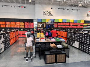
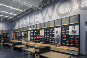
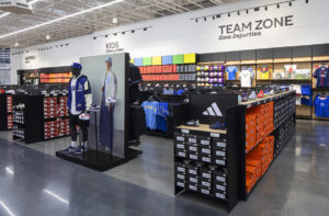
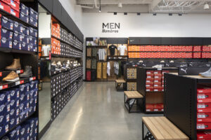
WSS (Warehouse Shoe Store) has been serving SoCal communities for decades, building authentic connections within neighborhoods that were often overlooked by competitors. Looking to expand beyond their home territory, WSS wanted a new store experience to help them grow. With an unbeatably broad offering, the existing store could be hard to navigate, especially for new shoppers. Although that offering included the latest styles, consumers were more likely to give them credit for being great on value. And competitors were beginning to encroach on WSS territory, attempting to mimic their community-based approach and appealing to younger consumers. The new store needed to amplify the experience without sacrificing the authentic community connection WSS spent over half a century creating.
SLD’s approach was to create an experience that makes the broad selection of products at WSS the hero. By simplifying the store, the shop becomes easier and inspirational. And at WSS, community is the heartbeat of the brand, and this needed to come through. By celebrating the local area through signage, featured products, and a custom art piece at the checkout, we reinforce WSS’s impressive community commitments.
At the exterior, a bold red architectural entryway acts as a beacon. A large lit logo sign with the brand tagline “Your neighborhood shoe store” reinforces the brand’s unique value and community focus. Popular brand logos flank the doors, building excitement. Upon entering, a full-family display features a “something for everyone” lifestyle vignette. From there, zones are clearly visible with strong signage against a clean backdrop around the perimeter. Strong pops of color and pattern in key locations create a vibrant energy without overwhelming the space. Community is reinforced throughout the store, a large community message in the brand shop, and a giant map of the local area featured behind the cash desk.
Client: WSS (Warehouse Shoe Store)
Industry: Fashion
Sector Expertise: Department Stores
Location: Los Angeles, USA
Completed: Jul 2025
COBS Bread

COBS Bread
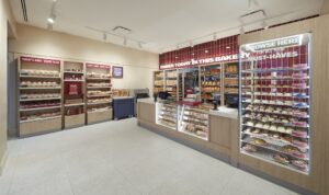
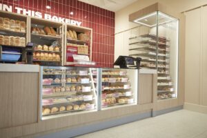
COBS has a winning recipe for success: every day, each location bakes its own goods from scratch on site.
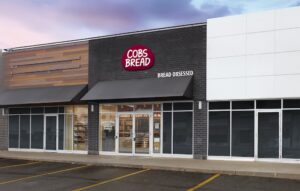
You just can’t get bread, scones, and pastries this fresh from a centralized bakery. Every location has a large back-of-house, leaving a small storefront where staff deliver a full-service experience that’s also unbeatable. With a high volume of product to sell every day, our first challenge was to maximize space effectiveness. The second was to amplify the promise of freshly baked goods, every day, on site.
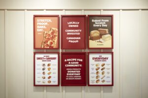
We enhanced the back wall behind the counter, allowing a view of the bakers in action through shelves of freshly baked bread. In the old design, queueing customers blocked the view of under-the-counter display cases. Using height to our advantage, a glass tower elevates the baked goods, making them visible from anywhere, even the street. A mobile prep table allows staff to complete tasks, such as icing scones, while still being visible and available to customers. And a rich burgundy tile backdrop is tagged with a simple message: BAKED TODAY IN THIS BAKERY.
Some COBS customers want to browse, while others quickly make their purchase. We shifted the front counter to one side, creating clearer separation for full-service. The grab-and-go area, now larger, was enhanced with custom fixtures to show off popular items. A menu board with thoughtful graphics supports product storytelling for best sellers and seasonal items, and a dedicated online order area with clear signage streamlines pickups.
The result: a bakery experience that celebrates the COBS commitment to freshness, service, and community.
Every aspect of the design was carefully chosen to elevate what makes COBS unique. From framing the toasted hues of bread in the burgundy tile, to signage and storytelling graphics throughout the store, to human-centred service design, the new bakery packs a lot of impact into a small footprint.
Client: COBS Bread
Industry: Hospitality
Sector Expertise: Fast Food Chains
Location: Toronto, Canada
Completed: Jul 2025
CareMakers Website

CareMakers Website
Communicating Kindness
The power of stories builds awareness for the Petro-Canada CareMaker’s Foundation.
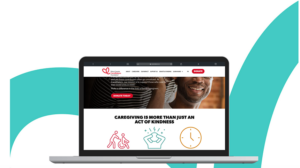
As a relatively new organization, the PetroCanada CareMakers Foundation wanted to build awareness of their purpose: supporting Canadian family caregivers. The cause is one that Canadians broadly believe needs more attention, but many more established charities compete for their donations. To build awareness, CareMakers needed to let Canadians know who they are, what they do, and why caregiving deserves their support. Seeking an optimistic and active voice, SLD was asked to provide a visual identity, website, and content strategy to amplify their presence across the country.
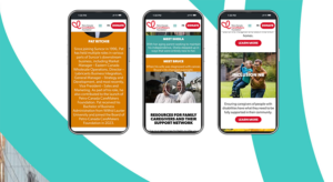
A dynamic visual identity system, including a maple key-inspired logo, was developed for the CareMakers’ brand using bold colours and a clean but approachable font. The website features full colour photography and impactful storytelling, leveraging data from the CareMakers’ own POV papers and grant success stories. Strong calls-to-action are highly visible throughout the site, encouraging users to get involved and donate. Unique content, including blogs, a foundation story video, and other graphic elements, supports the organization’s expertise and presence in the caregiving space.
https://www.sld.com/case-studies/caremakers/
Client: CareMakers Canada
Industry: Nonprofit
Sector Expertise: Grantmaking Foundations
Location: Canada
Completed: Jan 2024
Flow Digital Retail Experience

Flow Digital Retail Experience
Transformation That Flows
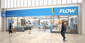
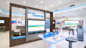
Uniting a cable and a wireless brand into a transformational experience store featuring an adaptive digital content system.
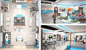
With the amalgamation of two brands into one, Flow was redesigned with an adaptive digital content system for a more consistent customer experience. As a telco/cable provider in 13 different countries, developing a standardized system that could still cater to regional preferences was critical. The newly redesigned stores needed to focus on providing their customers with a consistent experience.
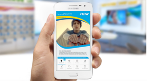
To improve the customer experience, an entire redesign centered on an integrated digital solution was implemented. Aside from a refresh of traditional store elements, the new system included a cueing system, a new tablet sales tool that transitioned to a more customer-centric sales choreography, and an enhanced content system tailored to national and regional consumers. Customers could interact with the products, including personalized digital messaging and digital experience zones throughout the store.
The new digital solution system dramatically improved customer wait times, in-store promotional message retention by 30%, less reliance on staff during peak periods, and allowed for centralized control of local and regional content to be deployed across all markets.
https://www.sld.com/case-studies/flow/
Client: Flow Wireless
Industry: Telecommunications
Sector Expertise: Mobile Network Operators (MNO)
Location: USA
Technologies: LG digital LCDs, Omnivex Media Players
Completed: Jan 2021
NuSkin Immersive Experience

NuSkin Immersive Experience
The Fountain of You
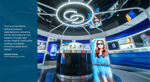
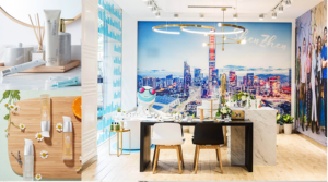
More than just a place to buy products, Nu Xtore blurs the line between gallery, science center, community hub, and event space.
The Nu Xtore had to achieve a variety of goals: to promote Nu Skin’s innovation and research, to nurture their community, to creatively tell their brand story, to provide detailed product information in an engaging way, and to host events. While serving all of these different purposes, the store had to exemplify the brand’s mission to help customers “Discover the best you.”
SLD conducted management and employee interviews, on-site research, audits of competitors, and numerous brainstorming sessions to arrive at a design that tells the Nu Skin story through graphics, digital, wayfinding and environmental design.
Youth, wellness and energy. These elements, expressed in Nu Skin’s fountain-shaped logo, became both a visual metaphor and a primary interaction piece for the store design – we called this idea the “Fountain of You.” True to the Nu Skin philosophy of community and philanthropy, the design conveys the ripple effect made by a drop of water. As visitors journey through the space, circular shapes, radiant color and shimmering light-play inspire with a sense of the collective effect of many droplets falling through light and rippling outward.
The Nu Xtore experience we created for Nu Skin is personalized and interactive, using the latest in technology and design trends to create a welcoming yet futuristic and aspirational space. A guided journey through the zones of the store, with contemporary furniture and materials, digital integration, graphics and wayfinding, allow visitors to fully experience the brand, its products and its values in a way that is refreshing and intriguing.
https://www.sld.com/case-studies/nu-skin/
Client: NuSkin
Industry: Beauty & Cosmetics
Sector Expertise: Beauty Salons & Spas
Location: Shanghai, Asia
Technologies: LG digital LCDs, Omnivex Media Players, Digital curtains, Projection mapping
Completed: Jan 2019