Reimagining Slack: How Clay Enhanced User Experience with a Data-Driven Redesign
Nowadays, when chatting with friends across different social media apps has become paramount, Slack remains one of the top apps many companies use. It’s evident that as the platform has advanced and matured, its user experience (UX) must also be at the same pace from now.
To remain competitive, Slack had to bring in design agency Clay to redesign the product’s interface and improve usability for millions of users.
It was clear what the problem was and what video Slack needed in this context: a complete UI redesign that changed how people use the product without losing the brand’s essence. This paper analyses how Clay worked on Slack’s redesign, what key elements were important, and what results the team reached.

Understanding the Scope: Slack’s Design Needs
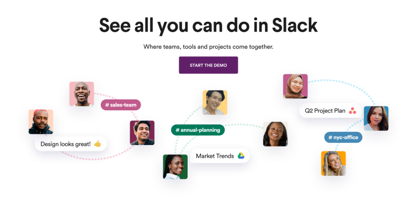
Slack is more than a chat; it is an extensive collaboration and interaction tool that is close to dozens of integrated apps and an online workspace for numerous companies. However, as Slack kept piling up features and tools, the complexity of the user experience kept increasing, leading to a need for a streamlined approach that would allow users to navigate the platform easily.
When Clay instigated the project, they had more than some considerations to think about:
- Scalability: Considering Slack’s user base was already expanding into the millions, it was important that the new design retained its effectiveness in the future.
- Cross-Platform Consistency: Since Slack is compatible with many devices, it is important that the look and feel are the same regardless of the device.
- User Feedback: Any restructuring had to be based on the real needs of the users to ensure that the platform’s usability did not aggravate the old users of the old systems.
The Approach: Data-Driven Design with a Focus on Usability
Data analysis and user-centered design were at the core of Clay’s process. Their team kicked off with a detailed assessment of the existing Slack interface and dealt with its weaknesses based on users’ complaints and behavioral patterns. In doing so, they made it possible to untangle the core concerns, which consisted of the following components that required a redesign:
- Navigation Issues: Slack’s old interface was more complex and cumbersome. It further added functionality, driving it down into layers that may have sometimes been reached by multiple clicks. Clay revamped the entire navigation structure of the system to ensure greater emphasis is placed on the essential features and that users reach these features more quickly.
- Visual Hierarchy: One of the biggest difficulties was arranging the many features of Slack so that users would not be intimidated. Clay used appropriate visual hierarchy, which permits users to arrange the information based on the context given in a less complex manner.
- Cross-Platform Consistency: Another important aspect of the redesign was keeping the look and feel of all Slack`s versions—desktop, web, and mobile—the same. According to Clay, each platform had a unified design language, which was crucial to ensuring a consistent user experience regardless of platform usage.
Elevating the User Experience: Key Design Improvements
As a result of the collaborative process, Clay continued with various design modifications in Slack, which greatly enhanced user experience. Those were among some better design solutions which, more importantly, include the following:
- Simplified Sidebar: The new interface and design of the sidebar improved navigation in the workspaces and channels, switching them and understanding which conversations were on and which channels needed attention. Thus, the users were able to concentrate on the necessary and essential information rather than sifting through a lot of irrelevant information.
- Customized Themes: Clay allowed users to customize their Slack interface differently. Allowing custom themes not only enabled users to tailor their workspaces but also enhanced reading compatibility to their likings.
- Improved Messaging Experience: The messaging interface has been redesigned to enhance usability and readability. Given the many points of interaction that Clay typically incorporates, he made typography and conversation thread spacing more appropriate for long and difficult conversations. They also made it easier to insert files or hyperlinks and add links to reactions to messages to make interaction even better.
- Enhanced Search Functionality: Since Slack stores a large volume of conversation history, many users were having a hard time locating relevant information. Clay redesigned the search function, and now it is much faster and smarter, with better filters that allow users to find messages, files, or any content quickly and easily.
The Results: A More Intuitive and Scalable Slack
The newly designed version of Slack was well received by the users, who reported favorably about the ease with which they were able to navigate through the platform.
With the redesigned interface, Slack was able to:
- Improve user retention by offering a more intuitive experience.
- Enhance cross-platform functionality, providing a cohesive experience regardless of device.
- Build a scalable design framework that would accommodate future growth and features.
The collaboration between Clay and Slack showcased how a thoughtful, data-driven redesign could improve a digital product’s functionality and user satisfaction.
Conclusion
Clay’s redesign of Slack offers a powerful example of how user-centric design can transform a product. By focusing on usability, scalability, and consistency, Clay helped Slack meet the needs of its current users and prepared the platform for future growth. This case study underscores the importance of keeping users at the center of the design process while leveraging data to inform key decisions.
As digital products continue to evolve, thoughtful design becomes even more critical to ensuring long-term success.
About Clay
Clay is a full-service creative agency designing and building inventive digital experiences across all platforms and brand touchpoints.


