


6 Key Points About The Digital Marketing Strategy Of BMW
To study BMW marketing strategy, we first need to point out that the web presence is not just for selling products. It is also a ‘vehicle’ to position the brand and satisfies their goals with poise.
BMW is considered as one of the leading producers of luxury and state of the art vehicles for many years. According to a noticeable amount of people, the brand is the best car producer worldwide. Munich-based German car manufacturer establishes itself as outstanding in both aesthetic and comfort.
Marketing Mix of BMW
To create a well-organized and successful marketing plan, business managers of the brand should figure out the varying facts of the marketing mix and determine the precise market segmentation in order to understand the of customer purchasing behavior. So, BMW initiated the goal of segmenting the premium market by optimizing the proper fit between the purchasing behavior of customers and the marketing mix to boost sales to the segment.
Social Media Strategy of BMW
Regardless of how big the company is, the social media strategy of the global car manufacturer’s is no different than other brand. BMW uses social platform such as LinkedIn, Instagram, Facebook, YouTube or even TikTok to showcase its latest products, engage with customers, and promote its brand values. One of the key elements of BMW’s social media strategy is visual storytelling. The company highlights its design and engineering prowess by using high-quality images and videos to show off its products in use. This helps to create an emotional connection with its target audience and reinforce its brand image as a luxury car manufacturer.
Another aspect of BMW’s social media strategy is its focus on customer engagement. The brand regularly responds to comments and messages from customer, and encourages them to share their own stories and experiences with BMW vehicles. This helps to build a sense of community around the brand and foster long term loyalty.
In fact, BMW invites people to use the #BMWRepost hashtag for a chance to be featured on the company’s Instagram account which has almost 35M followers.
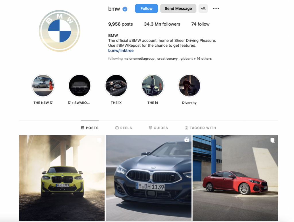
In addition, BMW has also experimented with newer social media features and platforms, such as Instagram stories and TikTok. For example, the company has created short videos showcasing its latest models and design features on these platform, which has helped to reach younger audiences and stay relevant on a rapidly evolving social media landscape.
Branding Strategy of BMW
The branding strategy of this premium car manufacturer focuses on providing high-quality products that highlight innovation, excellent engineering, and cutting-edge technology. Here are a few points that BMW has in its marketing mix:
1. Premium Pricing
BMW positions itself as a premium brand manufacturing premium cars which is reflected in its pricing strategy. Its cars are prices higher than those of its competitors, but the brand’s reputation for quality and engineering justifies the premium.
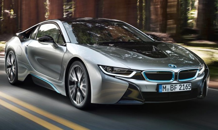
2. Performance-oriented
The company is known for producing high-performance vehicles, which reinforces the brand’s image as a leader in engineering and innovation. BMW’s focus on performance is also reflected in its advertising.
Here’s the ad for the first-ever BMW M5 CS Sedan, an excellent example of how the company showcases the performance of its German miracle car:
Advertising Strategy of BMW
As for its advertising strategy, BMW has traditionally focused on creating memorable campaigns that emphasize the brand’s premium positioning and performance-oriented focus.
The brand’s key elements for its advertising strategy are:
1. Emotional Appeal
BMW’s advertising often seeks to connect with consumers on an emotional level. This includes emphasizing the joy of driving, the thrill of high-performance vehicles, and the sense of freedom and independence that comes with owning a BMW.
Below, find the ad where the brand used its creative storytelling strategies to engage with its audience:
2. Product-focused
BMW’s advertising campaigns often focus on the features and benefits of specific models. This includes highlighting performance features, technological innovations, and design elements that make BMW cars stand out from the competition.
BMW iX1 – Electrify Your Dreams
3. Consistent messaging
Just like its branding strategy, BMW’s advertising is characterized by consistent messaging that reinforces the brand’s premium positioning and performance focus. The brand has consistently communicated its brand identity through all its marketing efforts. This includes a consistent visual identity, brand voice and messaging that emphasizes BMW’s engineering excellence and innovative spirit.
“BMW is fortunate-we don’t have too much of a dilemma as to what we’re going to call our cars.” – Jim McDowell, Vice President of Marketing at BMW
The fact that BMW marketing strategy concentrates on high-end segments on a global scale and consistently defines premium brand identification renders success. Trendsetting and attractive product range deliberately targets affluent customers and demonstrates the success of the automaker’s global marketing strategy. If you want to build a strong marketing strategy for your company just like BMW, make sure to check out automotive marketing agencies to find the suitable agency to partner with.
Responding sensitively to the unique values and purchasing behavior enabled BMW to transcend intended performance. So to specifically present, below we have listed brilliant examples of BMW commercials released in recent years and their underlying marketing tactics behind them.
6 Outputs from BMW’s Marketing Strategy
1. Artistic Approaches and Creativity is a Must
As the leading brand of Mini-Cooper, creativity and true representation of the brand identity is essential for BMW. Plus, the style accents of the vehicles and the global marketing identity are truly based on art and creativity. That’s why almost in every ad campaign, we see a feature that imposes something different and artsy which connects strongly with high-end technology and an unusual concept of the artistic elements.
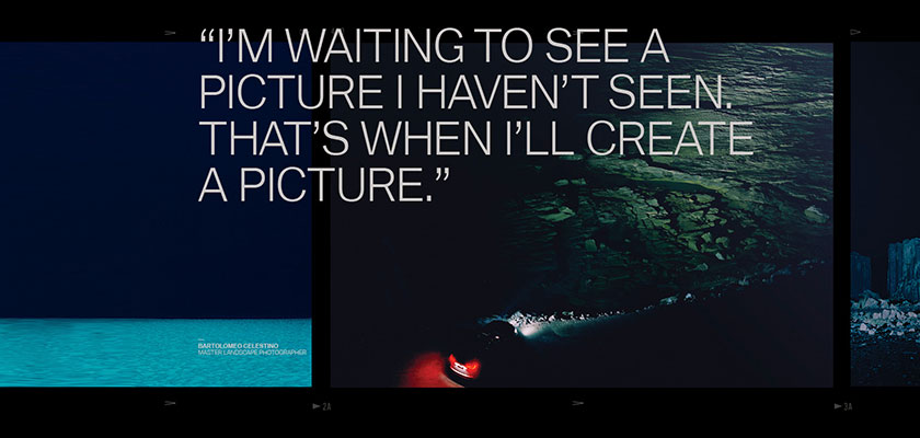
The jaw-dropping images and the video of the campaign show and explain that BMW is also good and powerful in art when collaborating with Clemenger BBDO and photographing the Australian landscapes.
2. Ambassador and Proud Presenter of the Latest Technologies
Considered as one of the biggest tech-savvy brands among their industry, BMW always follows the latest technologies as well as
3. Eager to Follow Content Marketing as a Flagship Marketing Strategy of BMW
BMW is eager to widen their potential audience by creating content that engages consumers beyond cars and “gets to the point”.
The brand sees a mobile-first, content-oriented approach which will help attract a broader audience and claims the recent relaunch of its website has already increased mobile visitors by 27%.
Speaking at Mobile World Congress 2019, the German
Based on data-driven insights we wanted to create relevant and
snackable content in helpful and entertaining ways. That way the business hopes to reach both existing customers and those that might be considering BMW but don’t yet own one. We were thinking customer, consumer-first, which means for us mobile-first with speed. We did it by combining two technologies, accelerated mobile pages and progressive web apps, to bring both ends together on one site.
It also shows when creative and engineering prioritizes speed from the beginning of the project, before the first line of code is written. – Jorg Poggenpohl
4. Using Guest Stars in BMW Marketing Campaigns
One of the most traditional and best-known marketing tip for brands to use celebrities as the brand ambassadors. In the automotive industry, this is frequently working for the new features and models of the products to especially identify with the new products as well. This also doubles the connection to customers.
In the campaign of M2 Coupe, BMW released its digital-first campaign and enlisted model Gigi Hadid in an interactive 360 degree film. The film, which debuted on YouTube and Facebook, was directed by Marc Forster, who directed films such as “James Bond – Quantum of Solace” and “World War Z”.
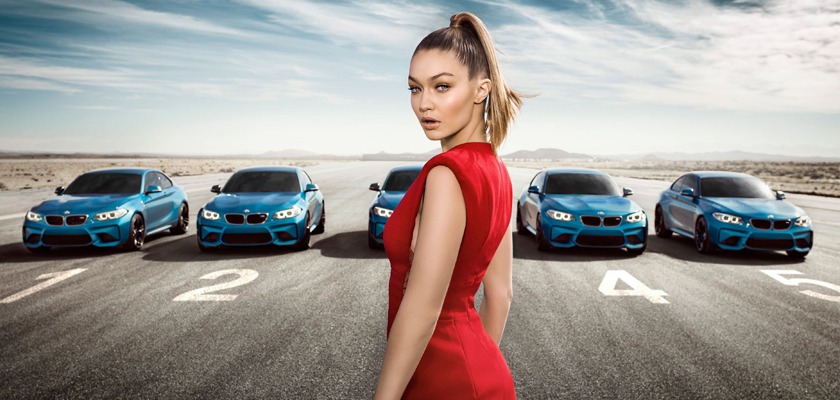
Hadid was immediately impressed:
BMW is such an iconic brand. The fact that I get to be the face of this campaign is definitely a career highlight for me. The M2 is such a cool, fun car
I had a blast working on this project.
5. Showing off The Competitive Side
As known being famous for its
BMW’s new ad is routing Tesla’s new model for its timeless waiting lists. The question for the users is, “Will you wait, or drive?”
Famous for its sarcastic marketing approaches, BMW is caving in Tesla’s Model 3 with its competitor-model 330e plug-in hybrid because of the release problems. The teasing is just because BMW already in-use with its product, while Tesla is not, so the fastest aired-one wins this competition.
“You’ll do your taxes twice, maybe more… You’ll ring in the New Year twice, maybe more…” Here, the ad is trying to explain the postponed dates for the Tesla 3 model.
“You can pay deposit and wait, you can put your name on a list, and wait… or you can drive…” We see the Tesla Superchargers in the ad but without the cars on, thus strengthening the BMW’s brand-image.
Tesla’s marketing strategy; however, is no different than any other car manufacturer, we must say!
6. Deep Knowledge About Who To Reach and How-To
Heading into 2020, millennial works and marketing techniques are essential to apply and contribute even among the authentic brands, and BMW is known that they effectively use social media and 3rd wave communication platforms such as Twitter, Instagram and Snapchat when in popularity.
BMW designed a car inside Snapchat’s AR lenses, that almost looks like it’s real and ‘driveable’. The automobile brand is the first to create a 3D augmented reality kind of a product partnering with Snapchat to roll out the new advert campaign to launch the BMW X2. Last week, the LA based company, Snap Inc, began seeing ads from BMW that link to the AR version of the new car, which lets customers foresee how products look in the real world before buying them.
As part of the project, Snapchat users can customize the augmented-reality version of the car. They can make changes
BMW is the first brand to launch
BMW positions itself as a pioneer in using the newest technology and following the biggest updates in the digital marketing industry. If you like to see more BMW’s marketing campaigns, make sure to have a look. There is a bittersweet competition between the well-known car brands so we also recommend you to check out mercedes marketing strategy to get inspired!